Qt QML 菜单/目录/工具栏的全面攻略
所有的热爱都要不遗余力,真正喜欢它便给它更高的优先级,和更多的时间吧!
QML其它文章请点击这里: QT QUICK QML 学习笔记
百度云源码在最后,欢迎下载,这里可以跳转
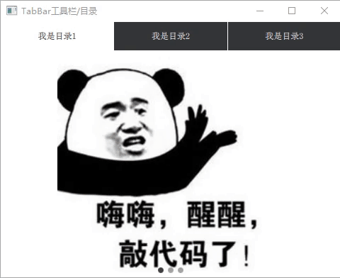
1. TabBar的工具栏/目录
1.1 演示
1.2 关键控件
TabBar 提供了一个tab-based的导航模型,由TabButton来填充内容。
TabButton 与Button相似,都是从AbstractButton继承它的API,一般用在TabBar中。
SwipeView :使用一组页面填充。一次只能看到一个页面。用户可以通过横向滑动在页面之间导航。
PageIndicator :SwipeView本身完全是非可视的。与PageIndicator结合使用后,给用户一个有多个页面的视觉提示。
1.3 源码
如下为TabBar、TabButton放入header中的实例:
import QtQuick          2.12
import QtQuick.Window   2.12
import QtQuick.Controls 2.5
import QtQuick.Layouts  1.12

ApplicationWindow  {


    visible: true
    width: 480
    height: 360
    title: qsTr("TabBar工具栏")

    ///--1. ApplicationWindow 中才有 header
    ///--2. QtQuick.Controls 2.0 版本后才有header
    ///--3. TabBar不一定要用在header中
    header: TabBar {


        id:             tabBar
        TabButton {

     text: qsTr("我是目录1") }
        TabButton {

     text: qsTr("我是目录2") }
        TabButton {

     text: qsTr("我是目录3") }
    }

    SwipeView {


        id: view
        currentIndex: tabBar.currentIndex
        anchors.fill: parent

		onCurrentIndexChanged: {


			tabBar.currentIndex = currentIndex
			indicator.currentIndex  = currentIndex
        }
        //第一页
        Image {


            id:                 firstPage
            smooth:             true
            mipmap:             true
            antialiasing:       true
            fillMode:           Image.PreserveAspectFit
            sourceSize.height:  height
            source:             "/images/code"
        }
        //第二页
        Image {


            id:                 secondPage
            smooth:             true
            mipmap:             true
            antialiasing:       true
            fillMode:           Image.PreserveAspectFit
            sourceSize.height:  height
            source:             "/images/working"
        }
        //第三页
        Image {


            id:                 thirdPage
            smooth:             true
            mipmap:             true
            antialiasing:       true
            fillMode:           Image.PreserveAspectFit
            sourceSize.height:  height
            source:             "/images/focus"
        }
    }

    PageIndicator {


        id: indicator
        count: view.count
        anchors.bottom: view.bottom
        anchors.horizontalCenter: parent.horizontalCenter
    }
}
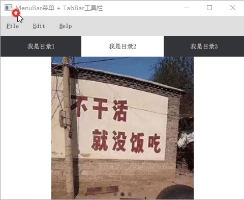
2 MenuBar 菜单
2.1 演示
在上述中增加一个MenuBar菜单条:
2.2 关键控件
MenuBar 菜单栏由下拉菜单组成,通常位于窗口的顶部边缘。
Menu 菜单有两个主要用例,其一为文本菜单; 桌面右键单击后显示的菜单,推荐的打开菜单的方法是调用popup();其二为弹出菜单,例如,在顶部菜单栏中,单击按钮后显示的菜单。
Action 表示一个抽象的用户界面操作,该操作可以具有快捷键,也可以分配给菜单项和工具栏按钮。
MenuItem 与Button相似,都是从AbstractButton继承它的API,一般用在Menu菜单中。
MenuSeparator 是通过用一行线来分隔菜单中的不同项
2.3 源码
在TabBar的导航模型中加入以下代码即可,以下都未绑定触发事件
    //不用 "menuBar:" 就不会固定在header的上方
    menuBar: MenuBar {


        Menu {


            title: qsTr("&File")
            Action {

     text: qsTr("&New...") }
            Action {

     text: qsTr("&Open...") }
            Action {

     text: qsTr("&Save") }
            Action {

     text: qsTr("Save &As...") }
            MenuSeparator {

     }
            Action {

     text: qsTr("&Quit") }
        }
        Menu {


            title: qsTr("&Edit")
            MenuItem {


                text: "Cut"
                //快捷键,QtQuick.Controls 2.0后没有了,当然可以用其他方式实现
//                shortcut: "Ctrl+X"
                onTriggered: {

    }
            }
            MenuItem {

     text: "Copy" }
            MenuItem {

     text: "Paste" }
        }
        Menu {


            title: qsTr("&Help")
            Action {

     text: qsTr("&About") }
        }
    }
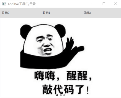
3 ToolBar 工具栏/目录
3.1 演示
与TabBar 相似:
3.2 关键控件
ToolBar :常用在页眉或页脚作导航按钮和搜索字段。它通常要与布局,一起使用,如通过创建RowLayout。
ToolButton :继承于Button按钮,但是提供了更适合在工具栏中使用的外观。
RowLayout :能自动调整的横向排列。
3.3 源码
ToolBar 与 TabBar相似,ToolBar 主要没有tabBar.currentIndex属性,需要自定义。在上述代码中作如下修改,其一替换了"header" ,其二为修改控件之间的触发逻辑。(可搜索 “[ToolBar修改]” )
import QtQuick          2.12
import QtQuick.Window   2.12
import QtQuick.Controls 2.5
import QtQuick.Layouts 1.12

ApplicationWindow  {


    visible: true
    width: 480
    height: 360
    title: qsTr("3.ToolBar工具栏")

    //[ToolBar修改]1: 替换header
    /*  ///--1 TabBar工具栏
    header: TabBar {
        id:             tabBar
        TabButton { text: qsTr("我是目录1") }
        TabButton { text: qsTr("我是目录2") }
        TabButton { text: qsTr("我是目录3") }
    }
    */
    ///--2.ToolBar
    header: ToolBar {


        id:     toolBar
        RowLayout {


            id:     rowLayout
            anchors.fill: parent
            ToolButton {


                text: qsTr("目录0")
                onClicked: view.currentIndex = 0
            }
            ToolButton {


                text: qsTr("目录1")
                onClicked: view.currentIndex = 1
            }
            ToolButton {


                text: qsTr("目录2")
                onClicked: view.currentIndex = 2
            }
        }
    }

    SwipeView {


        id: view
        anchors.fill: parent
        //[ToolBar修改]2: 修改控件之间的触发逻辑
        //currentIndex: tabBar.currentIndex
        onCurrentIndexChanged: {


            //tabBar.currentIndex = currentIndex
            for (var i=0; i<rowLayout.children.length; i++) {


                rowLayout.children[i].checked = false
            }
            rowLayout.children[currentIndex].checked = true

            indicator.currentIndex = currentIndex
        }
        //第一页
        Image {


            id:                 firstPage
            smooth:             true
            mipmap:             true
            antialiasing:       true
            fillMode:           Image.PreserveAspectFit
            sourceSize.height:  height
            source:             "/images/code"
        }
        //第二页
        Image {


            id:                 secondPage
            smooth:             true
            mipmap:             true
            antialiasing:       true
            fillMode:           Image.PreserveAspectFit
            sourceSize.height:  height
            source:             "/images/working"
        }
        //第三页
        Image {


            id:                 thirdPage
            smooth:             true
            mipmap:             true
            antialiasing:       true
            fillMode:           Image.PreserveAspectFit
            sourceSize.height:  height
            source:             "/images/focus"
        }
    }
    PageIndicator {


        id: indicator
        count: view.count
        anchors.bottom: view.bottom
        anchors.horizontalCenter: parent.horizontalCenter
    }
}
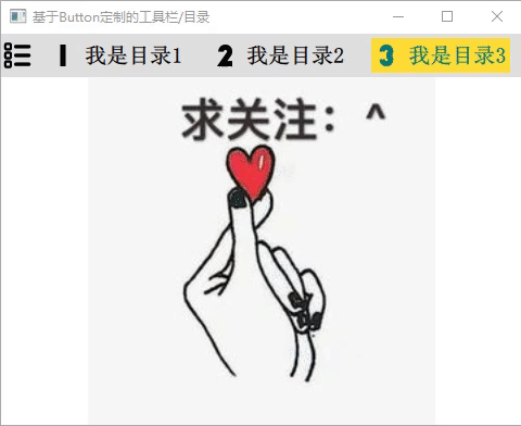
4. 基于Button定制的工具栏/目录
4.1 演示
4.2 关键控件
MyButton :在 “Button” 上的定制,包括背景、内部的文字,图片等。
ColoredImage :彩色图片,之前的文章已经讲过,对普通的 “image” 加一层 “ColorOverlay” 颜色覆盖即可,后续不再讲述。 QML 图像颜色渐变和颜色覆盖
Loader :加载器,动态的加载QML文件,也可以根据需要创建QML,此处为最简单的Loader的加载。
4.3 源码
main.qml:
import QtQuick          2.12
import QtQuick.Window   2.3
import QtQuick.Controls 2.5
import QtQuick.Layouts  1.12

ApplicationWindow {


    visible:                        true
    width:                          480
    height:                         360
    title:                          qsTr("4. 定制Button")
    minimumWidth:                   450
    minimumHeight:                  240
    property int index:             1

    header: ToolBar {


        id:                         tabBar
        RowLayout {


            id:                     rowLayout
            anchors.fill:           parent
            spacing:                10
            //head
            ColoredImage {


                id:                 innerImage
                width:              30
                height:             width
                source:             "/images/menu"
                color:              "black"
            }
            //first Button
            MyButton {


                id:                 firstButton
                text:               qsTr("我是目录1")
                icon.source:        "/images/1"
                onClicked: {


                    clearAllChecks()
                    checked = true
                    index = 1
                }
            }
            //second Button
            MyButton {


                text:               qsTr("我是目录2")
                icon.source:        "/images/2"
                onClicked: {


                    clearAllChecks()
                    checked = true
                    index = 2
                }
            }
            //third Button
            MyButton {


                text:               qsTr("我是目录3")
                icon.source:        "/images/3"
                onClicked: {


                    clearAllChecks()
                    checked = true
                    index = 3
                }
            }
        }
    }

    Component.onCompleted: {


        firstButton.checked = true
    }

    function clearAllChecks() {


        for (var i=0; i<rowLayout.children.length; i++) {


           if (rowLayout.children[i].toString().startsWith("MyButton"))
                rowLayout.children[i].checked = false
            }
    }

    //界面的显示的形式有多种多样的,这里不做多说明。如前三个用的SwipeView。
    Loader {


        id:             firstPage
        anchors.fill:   parent
        visible:        index==1
        source:         "TestPage1.qml"
    }
    Loader {


        id:             secondPage
        anchors.fill:   parent
        visible:        index==2
        source:         "TestPage2.qml"
    }
    TestPage3 {


        id:             thirdPage
        anchors.fill:   parent
        visible:        index==3
    }
}
MyButton.qml:
import QtQuick          2.9
import QtQuick.Controls 2.5

Button {


    id:                         button
    height:                     20
    leftPadding:                4
    rightPadding:               4
    checkable:                  false

    property alias  labelColor: _label.color

    onCheckedChanged: checkable = false

    background: Rectangle {


        anchors.fill: parent
        color:  button.checked ? "#FFDC35" : Qt.rgba(0,0,0,0)
    }

    contentItem: Row {

                  //可修改为Column
        spacing:                    10
        anchors.verticalCenter:     button.verticalCenter

        ColoredImage {


            id:                     innerImage
            width:                  20
            height:                 width
            source:                 button.icon.source
            color:                  button.checked ?  "#007979" : "black"
        }

        Text {


            id:                         _label
            visible:                    text !== ""
            text:                       button.text
            anchors.verticalCenter:     parent.verticalCenter
            color:                      button.checked ? "#007979" : "black"
            font.bold:                  true
            font.pointSize:             15
        }
    }
}
ColoredImage.qml 就不贴出了,具体见源码。
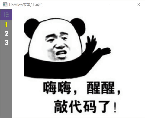
5. 基于Listview的侧边目录/工具栏
5.1 演示
5.2 控件
ListView :ListView有一个模型(model)和一个委托(delegate),前者定义要显示的数据,后者定义数据应该如何显示。列表视图中的项目可以水平放置,也可以垂直放置。此处ListView放与左侧且垂直排列。
MouseArea 鼠标区域是一个不可见的项,通常与可见项一起使用,以便为该项提供鼠标处理。
Connections :信号连接器,其它文章也已讲过,此处为连接根目录的listIndex信号。
5.3 核心源码
整体结构是通过ListView来确定的。通过点击事件,触发每一个modelData的listIndex信号,来改变checked的值,来确认是否点击,还可以确保其它model的互斥。主要逻辑如下:
    property alias listModel:       leftListView.model
    signal listIndex(int idx);

    ListView{


        id:             leftListView
		...
        delegate:       listDelegate
    }

    Component{


        id: listDelegate
        Rectangle{


            property bool checked: 		false
			...
    	    Connections{


            	target:                     _leftMenu
            	onListIndex:                listItem.checked = (idx===index);
	        }
	        ...
	        MouseArea {


				...
	            onClicked: {


	                listIndex(index)
	            }
	        }
        }
	}
5.4 源码
main.qml: (省去部分非关键代码)
import QtQuick 2.12
import QtQuick.Controls 2.5
import QtQuick.Window 2.12

Window {


    id:                         root
    visible:                    true
    width:                      480
    height:                     360
    minimumWidth:               450
    minimumHeight:              240
    title:                      qsTr("ListView菜单/工具栏")

    property int    pageIndex:          0
    property bool   fullMenuShow:       false
    property real   menuWidthShort:     40

    //三个图片界面:
    Item {


        id: page
        height:                 parent.height
        anchors.left:           parent.left
        anchors.leftMargin:     40
        anchors.right:          parent.right
        //firstPage
        Image {


            id:                 firstPage
            anchors.fill:       parent
            smooth:             true
            mipmap:             true
            antialiasing:       true
            fillMode:           Image.PreserveAspectFit
            sourceSize.height:  height
            source:             "/images/code"
            visible:            pageIndex == 0

        }
        //secondPage
        Image {


            id:                 secondPage
            ...
            source:             "/images/working"
            visible:            pageIndex == 1
        }
        //thirdPage
        Image {


            id:                 thirdPage
            ...
            source:             "/images/focus"
            visible:            pageIndex == 2
        }
    }

    //左侧工具栏/目录的外框
    Rectangle {


        id:                     rectMenu
        width:                  fullMenuShow ? 40*4 : 40
        height:                 parent.height
        anchors.left:           parent.left
        anchors.top:            parent.top
        color:                  "gray"

        MouseArea {


            anchors.fill:       parent
            hoverEnabled:       true
            onEntered:          fullMenuShow = true
            onExited:           fullMenuShow = false
        }
//        Behavior on width {


//            NumberAnimation { duration: 200 }
//        }
    }

    //左侧工具栏/目录
    ListviewMenu {


        id:                     listViewMenu
        width:                  rectMenu.width
        listViewIndex:          0;
        color:                  "gray"
        listModel:   [
            {


                name:           qsTr("我是目录1"),
                iconSource:     "/images/1.png",
            },
            {


                name:           qsTr("我是目录2"),
                iconSource:     "/images/2.png",
            },
            {


                name:           qsTr("我是目录3"),
                iconSource:     "/images/3.png",
            }
        ]

        onListIndex: {

     //使用信号连接器都可以
            pageIndex = idx;
        }
    }
}
ListviewMenu.qml: (省去部分非关键代码)
import QtQuick 2.7
import QtQuick.Controls 1.2
import QtGraphicalEffects 1.0

Item {


    id:                             _leftMenu
    visible:                        true
    height:                         leftMunu.height;

    property alias color:           leftMunu.color
    property alias listViewIndex:   leftListView.currentIndex;
    property alias listModel:       leftListView.model

    property bool bMenuShown:       false
    property real listItemHeight:   30

    signal listIndex(int idx);

    Component.onCompleted: {


        listIndex(0)
    }

    Rectangle {


        id:                                 leftMunu
        height:                             rectHeader.height + leftItem.anchors.margins + leftItem.height
        width:                              parent.width
        ///--header
        Rectangle {


            id:                             rectHeader
            height:                         35
            width:                          parent.width
            color:                          "#5D478B"  //紫色
            Row {


                id:                         _rowHeader
                ...
                Image {


                   id:                      innerImageHeader
                   source:                  "/images/menu.png"
                   ...
                }
                Label {


                   id:                      innerTextHeader
                   ...
                   text:                    qsTr("目  录")
                   visible:                 root.fullMenuShow ? true : false
                }
            }
            Image {


                id:                         dottedlineHeader
                ...
                source:                     "/images/line.png"
                visible:                    root.fullMenuShow ? true : false
            }
        }
        ///--list view
        Item {


            id:                 leftItem
            height:             listItemHeight * leftListView.count
            width:              parent.width
            anchors.top:        rectHeader.bottom
            ListView{


                id:             leftListView
                anchors.fill:   parent
                delegate:       listDelegate
            }
        }
    }

    Component{


        id: listDelegate

        Rectangle{


            id: listItem
            property bool checked: false
            color:                          _leftMenu.color
            width:                          parent.width
            height:                         listItemHeight

            Connections{


                target:                     _leftMenu
                onListIndex:                listItem.checked = (idx===index);
            }

            Row {


                id:                         _row
                anchors.centerIn:           parent
                height:                     parent.height * 0.6
                width:                      parent.width
                spacing:                    6

                ColoredImage {


                    id:                     innerImage
                    width:                  menuWidthShort
                    height:                 parent.height
                    source:                 modelData.iconSource
                    color:                  listItem.checked?  "yellow" : "white"
                }
                Text {


                   id:                      innerText
                   text:                    modelData.name
                   color:                   listItem.checked?  "yellow" : "white"  //"#5DB6EA"
                   font.family:             "Microsoft Yahei" //友情提醒:商业用途会收费的
                   font.pointSize:          15
                   anchors.verticalCenter:  parent.verticalCenter
                   visible:                 root.fullMenuShow ? true : false
                }
            }
            Image {


                id:                         dottedline
                ...
                fillMode:                   Image.Stretch
                source:                     "/images/line.png"
                visible:                    root.fullMenuShow ? true : false
            }
            MouseArea {


                anchors.fill: parent
                hoverEnabled: true
                onEntered: {


                    root.fullMenuShow = true
                    color = "green"
                }
                onExited: {


                    root.fullMenuShow = false
                    color  = _leftMenu.color
                }
                onClicked: {


                    listIndex(index)
                }
            }
        }
    }
}
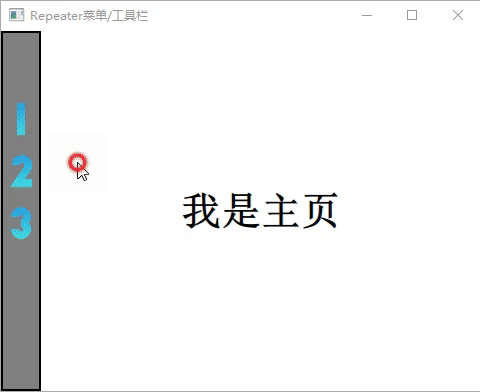
6. 基于Repeater的目录/工具栏
6.1 演示
6.2 关键控件
Repeater Repeater类型用于创建大量类似的项。与上文中ListView一样,Repeater有一个模型(model)和一个委托(delegate):前者定义要显示的数据,后者定义数据应该如何显示。
LinearGradient :彩色渐变图片,之前的文章已经讲过,使用它也是对其它知识点的学习。 QML 图像颜色渐变和颜色覆盖
6.3 关键源码
结构与ListView相似,逻辑上也基本一样,多了一个当前项自身的互斥(ListView也可以实现的),配合Column等排列,使用是来更加灵活,其主要结构和逻辑代码如下:
    Column {

             //改为Row RowLoyout等都行
        ...
        Repeater {


			...
            delegate:                   listDelegate
        }
    }
    Component{


        id:                     listDelegate
        Rectangle {


        	property bool checked: false
            property bool oldChecked: false
			Connections{


			    target:             menu
			    onGetListIndex: {


			        //idx: click item ---- index: every item
			        if(idx === index ) {


			            //与前一次互斥事件, 大部分目录都是此逻辑
			            if(idx!==3) {


			                if(!listItem.oldChecked) {


			                    listItem.checked = true
			                    pageSig(idx)
			                }
			                else {


			                    listItem.checked = false
			                    pageSig(9)      //关闭此目录(回到主页)/工具
			                }
			            }
			            //可添加:连续点击事件 (工具栏中,需要此逻辑,如放大缩小)
			            else  {


			                listItem.checked = true
			                pageSig(idx)
			            }
			        }
		        //所有的子Item互斥
		        else {


		            listItem.checked = false
		        }
		        listItem.oldChecked = listItem.checked
		    }
}
	...
          MouseArea {


		      ...
              onClicked: {


                  getListIndex(index)
              }
}
6.4 源码
main.qml(删除不必要文件)
import QtQuick 2.12
import QtQuick.Controls 2.5
import QtQuick.Window 2.12

//import "qrc:/qml/slider/SlidierMain.qml"

Window {


    visible:                        true
    width:                          480
    height:                         360
    title:                          qsTr("Repeater菜单/工具栏")
    minimumWidth:                   450
    minimumHeight:                  240
    property int pageIndex:         3

    //三个图片界面 + 主界面:
    Item {


        id: page
        height:                 parent.height
        anchors.left:           parent.left
        anchors.leftMargin:     40
        anchors.right:          parent.right
        //miantPage
        Text {


            id:                 mainPage
            anchors.centerIn:   parent
            text:               "我是主页"
            font.pointSize:     30
            font.bold:          true
            visible:            (pageIndex != 0) ||  (pageIndex != 1) ||  (pageIndex != 2)
        }
        //firstPage
        Image {


            id:                 firstPage
            anchors.fill:       parent
            smooth:             true
            mipmap:             true
            antialiasing:       true
            fillMode:           Image.PreserveAspectFit
            sourceSize.height:  height
            source:             "/images/code"
            visible:            pageIndex == 0

        }
        //secondPage
        Image {


            id:                 secondPage
            ...
            source:             "/images/working"
            visible:            pageIndex == 1
        }
        //thirdPage
        Image {


            id:                 thirdPage
            ...
            source:             "/images/focus"
            visible:            pageIndex == 2
        }
    }

    Rectangle {


        id:                     rectMenu
        width:                  40
        height:                 parent.height
        anchors.left:           parent.left
        anchors.top:            parent.top
        color:                  "gray"
        border.color:           "black"
        border.width:           2
    }

    RepeaterMenu {


        id:                     repeaterMenu
        anchors.fill:           rectMenu
        maxWidth:               rectMenu.width
        maxHeight:              rectMenu.height
        listMode: [
            {


                name:           qsTr("我是目录1"),
                iconSource:     "/images/1.png",
            },
            {


                name:           qsTr("我是目录2"),
                iconSource:     "/images/2.png",
            },
            {


                name:           qsTr("我是目录3"),
                iconSource:     "/images/3.png",
            }
        ]
        ///--信号连接器
        Connections {


            target:             repeaterMenu
            onPageSig : {


                pageIndex = idx //idx为pageSig信号的输入参数
            }
        }
    }
}
RepeaterMenu.qml(删除不重要代码)
import QtQuick.Layouts  1.2
import QtPositioning    5.2
import QtQuick 2.7
import QtQuick.Controls 2.0
import QtGraphicalEffects 1.2

Item {


    id:                 menu
    visible:            true

    property real       maxHeight           ///< Maximum height for control, determines whether text is hidden to make control shorter
    property real       maxWidth
    property alias      listMode:            _repeater.model

    signal getListIndex(int idx);
    signal pageSig(int idx);

    Column {

             //改为Row RowLoyout等都行
        id:                             rowItem
        ...
        spacing:                        20
        Repeater {


            id:                         _repeater
            anchors.left:               parent.left
            delegate:                   listDelegate
        }
    }

    Component{


        id:                     listDelegate
        Rectangle {


            id:                 listItem
            property bool checked: false
            property bool oldChecked: false
            property int  clickCnt: 0

            width:                  innerImage.width
            height:                 innerImage.height
            color:                  Qt.rgba(0,0,0,0)  //无色
            opacity:                0.8               //透明度

            Connections{


                target:             menu
                onGetListIndex: {


                    //idx: click item ---- index: every item
                    if(idx === index ) {


                        //与前一次互斥事件, 大部分目录都是此逻辑
                        if(idx!==3) {


                            if(!listItem.oldChecked) {


                                listItem.checked = true
                                pageSig(idx)
                            }
                            else {


                                listItem.checked = false
                                pageSig(9)      //关闭此目录(回到主页)/工具
                            }
                        }
                        //可添加:连续点击事件 (工具栏中,需要此逻辑,如放大缩小)
                        else  {


                            listItem.checked = true
                            pageSig(idx)
                        }
                    }
                    //所有的子Item互斥
                    else {


                        listItem.checked = false
                    }
                    listItem.oldChecked = listItem.checked
                }
            }

            //水平线性渐变
            LinearGradient
            {


                id:                      innerImage
                ...
                source: Image {


                    source:             modelData.iconSource
                }
                gradient: Gradient {


                    ...
            }

            Rectangle {


                id:                     innerRect
                ...
                color:                  "green"//Qt.rgba(0,0,0,0)
                border.color:           "black"

                Text {


                    id:                     _label
                    ...
                    text:                   modelData.name
                    font.family:            "Microsoft Yahei" //友情提醒:商业用途会收费的
                    font.pointSize:         15
                    color:                  "blue"
                }
            }

            MouseArea {


                anchors.fill: innerImage
                hoverEnabled: true
                onEntered: {


                    innerRect.visible = true
                }
                onExited: {


                    innerRect.visible = false
                }
                onClicked: {


                    getListIndex(index)
                }
            }
        }
    }
}
7. 总结
本文一共介绍了六种菜单/目录/工具栏,各有优缺点,越是集成高的如TabBar、ToolBar ,就更方便使用,但不灵活,这个时候就可以考虑控件的定制呢。 上述对自己所使用过的目录的总结,也是对使用过的控件的一些归纳,颜色配色还不够舒服,源码稍长,还请见谅~
老板CSDN积分有多,请点击 这里
百度云链接: https://pan.baidu.com/s/1_9YFVOFM7z4BufrYr84Lng 提取码:f92f
QML其它文章请点击这里: QT QUICK QML 学习笔记
本文用到了添加文件组,和别名的管理,可以参考以下: