1、标题
<h1> ~ <h6>,所有标题的行高都是 1.1(也就是 font-size 的 1.1 倍)。
2、副标题
<small>,行高都是 1,灰色(#999)。
<h1>
    主标题
    <small>副标题</small>
</h1>3、Body 样式
body {
    font-family: "Helvetica Neue", Helvetica, Arial, sans-serif;
    font-size: 14px;
    line-height: 1.42857143;
    color: #333;
    background-color: #fff;
}4、<p>,段落样式
p { margin: 0 0 10px; }5、强调样式 .lend
.lead {
    margin-bottom: 20px;
    font-size: 16px;
    font-weight: 200;
    line-height: 1.4;
}
6、粗体 <b>、<strong>
b, strong {
    font-weight: bold; /*文本加粗*/
}
7、斜体 <i>、<em>
<em>、<strong> 一般是展现给爬虫看的(偏重语义),<i>、<b> 是展现给用户的(偏重视觉效果)。
8、字体颜色

.text-muted:提示,使用浅灰色(#999).text-primary:主要,使用蓝色(#428bca).text-success:成功,使用浅绿色(#3c763d).text-info:通知信息,使用浅蓝色(#31708f).text-warning:警告,使用黄色(#8a6d3b).text-danger:危险,使用褐色(#a94442)
9、文字对齐方式
.text-left {
    text-align: left;
}

.text-right {
    text-align: right;
}

.text-center {
    text-align: center;
}

.text-justify {
    text-align: justify;
}
10、列表去点 .list-unstyled
.list-unstyled {
    padding-left: 0;
    list-style: none;
}
11、水平导航 .list-inline
.list-inline {
    padding-left: 0;
    margin-left: -5px;
    list-style: none;
}

.list-inline > li {
    display: inline-block;
    padding-right: 5px;
    padding-left: 5px;
}
<ul class="list-inline">
<li>1</li>
<li>2</li>
<li>3</li>
<li>4</li>
</ul>12、定义列表
<dl>
    <dt>主题一</dt>
    <dd>内容一</dd>
    <dt>主题二</dt>
    <dd>内容二</dd>
</dl>
水平定义列表 .dl-horizontal。
13、输入代码样式
(1)<code>:一般是针对于单个单词或单个句子的代码
(2)<pre>:一般是针对于多行代码(也就是成块的代码)
(3)<kbd>:一般是表示用户要通过键盘输入的内容
14、表格样式
.table:基础表格 - 不可缺少.table-striped:斑马线表格.table-bordered:带边框的表格.table-hover:鼠标悬停高亮的表格 - 可以与其他表格样式叠加使用.table-condensed:紧凑型表格.table-responsive:响应式表格 - 小屏添加滚动条
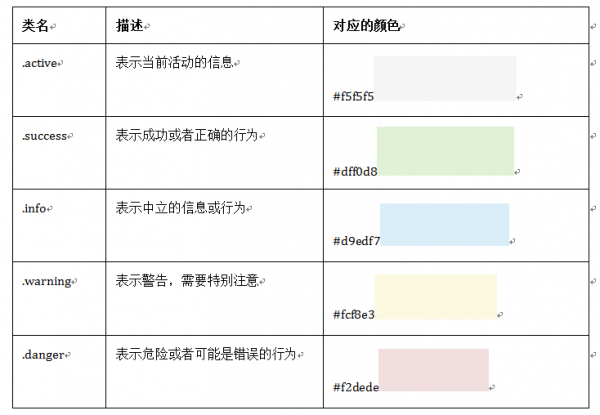
表格背景颜色
15、基础表单
role 是一个 html5 的属性,role="form" 告诉辅助设备(如屏幕阅读器)这个元素所扮演的角色是个表单。
16、水平表单
类名 .form-horizontal
17、内联表单
<div class="form-group">
  <label >QQQ</label>
  <input type="">
</div>
18、输入框 input
输入类型 - email
email 输入类型用于应该包含电邮地址的输入字段。
当提交表单时,会自动地对 email 字段的值进行验证。
19、复选框 checkbox 和单选择按钮 radio
.checkbox
<div class="checkbox">
    <label>
      <input type="checkbox" value="">
      QQQ
    </label>
</div>
.radio
<div class="radio">
    <label>
      <input type="radio" value="love" checked>
      CCC
    </label>
</div>
水平显示
<div class="form-group">
    <label class="radio-inline">
        <input type="radio" value="mazey" name="mazey">
        男性
    </label>
    <label class="radio-inline">
        <input type="radio" value="mazey" name="mazey">
        中性
    </label>
    <label class="radio-inline">
        <input type="radio" value="mazey" name="mazey">
        女性
    </label>
</div>- 如果
checkbox需要水平排列,只需要在label标签上添加类名checkbox-inline。 - 如果
radio需要水平排列,只需要在label标签上添加类名radio-inline。
20、表单控件大小 - 仅改变高度
input-sm:让控件比正常大小更小input-lg:让控件比正常大小更大
21、表单验证状态
.has-warning:警告状态(黄色).has-error:错误状态(红色).has-success:成功状态(绿色)
显示勾号叉号要加 .has-feedback
<div class="form-group has-success has-feedback">
      <label class="control-label" for="qqq">E-Mail地址</label>
      <input type="text" class="form-control" id="qqq" placeholder="qqq">
      <span class="glyphicon glyphicon-remove form-control-feedback"></span>
</div>
表单提示文字 .help-block
<div class="form-group has-error has-feedback">
    <label class="control-label" for="inputError1">错误状态</label>
    <input type="text" class="form-control" id="inputError1" placeholder="错误状态">
    <span class="help-block">你输入的信息是错误的</span>
    <span class="glyphicon glyphicon-remove form-control-feedback"></span>
</div>
22、按钮样式
.btn、.btn-default 可以用在 a、span、div 等标签中。
<button class="btn" type="button">基础按钮.btn</button>
<button class="btn btn-default" type="button">默认按钮.btn-default</button>
<button class="btn btn-primary" type="button">主要按钮.btn-primary</button>
<button class="btn btn-success" type="button">成功按钮.btn-success</button>
<button class="btn btn-info" type="button">信息按钮.btn-info</button>
<button class="btn btn-warning" type="button">警告按钮.btn-warning</button>
<button class="btn btn-danger" type="button">危险按钮.btn-danger</button>
<button class="btn btn-link" type="button">链接按钮.btn-link</button>
HTML <button> 标签的 type 属性值描述:
submit该按钮是提交按钮(除了 Internet Explorer,该值是其他浏览器的默认值)。button该按钮是可点击的按钮(Internet Explorer 的默认值)。reset该按钮是重置按钮(清除表单数据)
23、按钮大小
<button class="btn btn-primary btn-lg" type="button">大型按钮.btn-lg</button>
<button class="btn btn-primary" type="button">正常按钮</button>
<button class="btn btn-primary btn-sm" type="button">小型按钮.btn-sm</button>
<button class="btn btn-primary btn-xs" type="button">超小型按钮.btn-xs</button>
24、块状按钮
.btn-block 使按钮充满整个容器(父级元素)。
25、按钮状态
当按钮处理正在点击状态(也就是鼠标按下的未松开的状态),对于 <button> 元素是通过 :active 伪类实现,而对于 <a> 这样的标签元素则是通过添加类名 .active 来实现。
禁用状态 .disabled
disabled="disabled" 用类禁用可能有禁用样式,但没有禁用效果,依然可以点。
26、图像
img-responsive:响应式图片,主要针对于响应式设计img-rounded:圆角图片img-circle:圆形图片img-thumbnail:缩略图片
由于样式没有对图片做大小上的样式限制,所以在实际使用的时候,需要通过其他的方式来处理图片大小。比如说控制图片容器大小。(注意不可以通过 CSS 样式直接修改 img 图片的大小,这样操作就不响应了)对于圆角图片和圆形图片效果,因为是使用了 CSS3 的圆角样式来实现的,所以注意对于 IE8 以及其以下版本不支持,是没有圆角效果的。
27、图标
这里说的图标就是 Web 制作中常看到的小 icon 图标,可以说这些小 icon 图标是一个优秀 Web 中不可缺少的一部分,起到画龙点睛的效果。在 Bootstrap 框架中也为大家提供了近 200 个不同的 icon 图片,而这些图标都是使用 CSS3 的 @font-face 属性配合字体来实现的 icon 效果。
<span class="glyphicon glyphicon-search"></span>
<span class="glyphicon glyphicon-asterisk"></span>
<span class="glyphicon glyphicon-plus"></span>
<span class="glyphicon glyphicon-cloud"></span>
还有 Font Awesome 字体。
定制图标网站:https://www.runoob.com/try/demo_source/bootstrap-glyph-customization.htm
附录: