文章目录
前言
本文主要结合一个Demo的演示来对对Material Design中的常用控件和常用控件做一个介绍。整理这篇文章之前,我查了Material Design相关的文章,可以说这个题材的文章是真的多,其中也有很多非常优秀的文章,相关链接我会在文末给出,可以 点击这里跳到文末。
提示:以下是本篇文章正文内容
一、Material Design概念
是将经典的设计原则和科技、创新相结合而创造的设计语言。
是一个能在不同平台、不同设备上提供一致的体验的底层系统,它代表了一种设计规范。
说白了就是一套ui设计,ios有自己的一套ui规范,Android不也得有自己的一套嘛。Material Design可以形象地翻译成原材料设计,有个特点是加入了z轴的效果,防光照设计。
二、常用属性
直接看图(示例):

三、常用控件
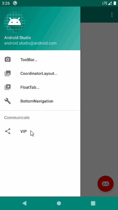
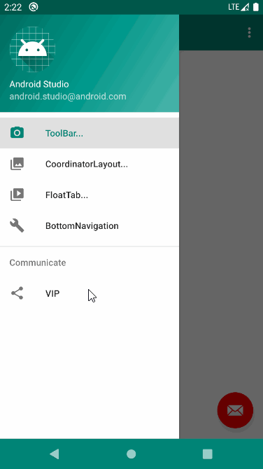
1、toolbar
代码如下(示例):
<androidx.appcompat.widget.Toolbar
    android:id="@+id/tb_at_toolbar"
    android:layout_width="match_parent"
    android:layout_height="?attr/actionBarSize"
    android:background="@color/colorPrimary"
    android:theme="@style/ThemeOverlay.AppCompat.Dark.ActionBar"
    app:layout_scrollFlags="scroll|enterAlways"
    app:logo="@mipmap/ic_launcher"
    app:popupTheme="@style/ThemeOverlay.AppCompat.Light"
    app:subtitle="副标题"
    app:subtitleTextColor="#fff"
    app:title="标题"
    app:titleTextColor="#fff">

    <TextView
        android:layout_width="match_parent"
        android:layout_height="?attr/actionBarSize"
        android:gravity="center"
        android:text="View"
        android:textColor="@color/white"/>

</androidx.appcompat.widget.Toolbar>
2、DrawerLayout
代码如下(示例):
 //Toolbar关联侧滑菜单
 dlAtDrawLayout = findViewById(R.id.dl_at_draw_layout);
 ActionBarDrawerToggle toggle = new ActionBarDrawerToggle(
         this, dlAtDrawLayout, tbAtToolbar, R.string.navigation_drawer_open, R.string.navigation_drawer_close);
 dlAtDrawLayout.addDrawerListener(toggle);
 toggle.syncState();
启动
dlAtDrawLayout.openDrawer(Gravity.START);
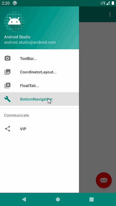
3、NavigationView/BottomNavigationView
代码如下(示例):
<!-- 侧滑菜单-->
<com.google.android.material.navigation.NavigationView
    android:id="@+id/nav_view"
    android:layout_width="wrap_content"
    android:layout_height="match_parent"
    android:layout_gravity="start"
    android:fitsSystemWindows="true"
    app:headerLayout="@layout/nav_header_main"
    app:menu="@menu/activity_main_drawer"/>
<com.google.android.material.bottomnavigation.BottomNavigationView
    android:id="@+id/navigation"
    android:layout_width="0dp"
    android:layout_height="wrap_content"
    android:layout_marginStart="0dp"
    android:layout_marginEnd="0dp"
    android:background="?android:attr/windowBackground"
    app:layout_constraintBottom_toBottomOf="parent"
    app:layout_constraintLeft_toLeftOf="parent"
    app:layout_constraintRight_toRightOf="parent"
    app:menu="@menu/navigation"/>
//导航栏菜单点击监听
private BottomNavigationView.OnNavigationItemSelectedListener mOnNavigationItemSelectedListener
        = new BottomNavigationView.OnNavigationItemSelectedListener() {


    @Override
    public boolean onNavigationItemSelected(@NonNull MenuItem item) {


        switch (item.getItemId()) {


            case R.id.navigation_home:
                mTextMessage.setText(R.string.title_home);
                return true;
            case R.id.navigation_dashboard:
                mTextMessage.setText(R.string.title_dashboard);
                return true;
            case R.id.navigation_notifications:
                mTextMessage.setText(R.string.title_notifications);
                return true;
        }
        return false;
    }
};
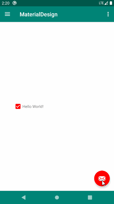
4、FloatingActionButton
代码如下(示例):
<com.google.android.material.floatingactionbutton.FloatingActionButton
    android:id="@+id/fab_at_action"
    android:layout_width="wrap_content"
    android:layout_height="wrap_content"
    android:layout_gravity="bottom|end"
    android:layout_margin="16dp"
    android:src="@drawable/add"
    app:elevation="8dp"/>
5、Snackbar
代码如下(示例):
//弹出提示
Snackbar.make(v, "snack action ", 1000)
        //Snackbar点击响应
        .setAction("Toast", new View.OnClickListener() {


            @Override
            public void onClick(View v) {


                Toast.makeText(ToolbarActivity.this, " to do ", Toast.LENGTH_SHORT).show();
            }
        }).show();
6、CardView
代码如下(示例):
<!-- cardBackgroundColor 卡片背景色 -->
<!-- cardCornerRadius 卡片圆角效果 -->
<!-- cardElevation 卡片阴影效果 -->
<!-- contentPadding 卡片内容四周间距 -->
<androidx.cardview.widget.CardView
    android:layout_width="match_parent"
    android:layout_height="180dp"
    android:foreground="?android:attr/selectableItemBackground"
    app:cardBackgroundColor="#f2f2f2"
    app:cardCornerRadius="8dp"
    app:cardElevation="0dp"
    app:contentPadding="8dp">
    。。。
</androidx.cardview.widget.CardView>
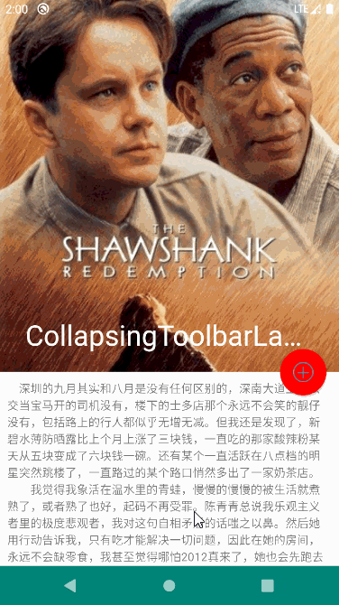
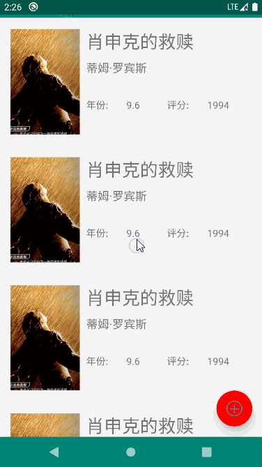
7、CoordinatorLayout/AppBarLayout/CollapsingToolbarLayout
结合代码如下(示例):
<?xml version="1.0" encoding="utf-8"?>
<androidx.drawerlayout.widget.DrawerLayout
    xmlns:android="http://schemas.android.com/apk/res/android"
    xmlns:app="http://schemas.android.com/apk/res-auto"
    android:id="@+id/dl_at_draw_layout"
    android:layout_width="match_parent"
    android:layout_height="match_parent">

    <androidx.coordinatorlayout.widget.CoordinatorLayout
        android:layout_width="match_parent"
        android:layout_height="match_parent"
        android:fitsSystemWindows="true">

        <com.google.android.material.appbar.AppBarLayout
            android:id="@+id/appBar"
            android:layout_width="match_parent"
            android:layout_height="450dp"
            android:fitsSystemWindows="true">

            <!-- AppBarLayout的直接子控件可以设置的属性:layout_scrollFlags(滚动模式) -->
            <!-- 1.scroll|exitUntilCollapsed:如果AppBarLayout的直接子控件设置该属性,该子控件可以滚动,向上滚动NestedScrollView出父布局(一般为CoordinatorLayout)时,会折叠到顶端,向下滚动时NestedScrollView必须滚动到最上面的时候才能拉出该布局
                 2.scroll|enterAlways:只要向下滚动该布局就会显示出来,只要向上滑动该布局就会向上收缩
                 3.scroll|enterAlwaysCollapsed:向下滚动NestedScrollView到最底端时该布局才会显示出来
                 4.scroll|snap:表示一个吸附效果,可以确保childView不会滑动停止在中间的状态
                 5.如果不设置该属性,则该布局不能滑动 -->
            <com.google.android.material.appbar.CollapsingToolbarLayout
                android:id="@+id/collapsingToolbarLayout"
                android:layout_width="match_parent"
                android:layout_height="match_parent"
                android:fitsSystemWindows="true"
                app:contentScrim="?attr/colorPrimary"
                app:layout_scrollFlags="scroll|snap">

                <!-- CollapsingToolbarLayout的直接子布局可以使用的属性:layout_collapseMode(折叠模式) -->
                <!-- 1.pin:在滑动过程中,此自布局会固定在它所在的位置不动,直到CollapsingToolbarLayout全部折叠或者全部展开
                     2.parallax:视差效果,在滑动过程中,不管上滑还是下滑都会有视察效果,不知道什么事视察效果自己看gif图(layout_collapseParallaxMultiplier视差因子 0~1之间取值,当设置了parallax时可以配合这个属性使用,调节自己想要的视差效果)
                     3.不设置:跟随NestedScrollView的滑动一起滑动,NestedScrollView滑动多少距离他就会跟着走多少距离 -->
                <ImageView
                    android:id="@+id/iv_movie_icon"
                    android:layout_width="match_parent"
                    android:layout_height="match_parent"
                    android:fitsSystemWindows="true"
                    android:scaleType="centerCrop"
                    android:src="@drawable/ic"
                    android:transitionName="basic"/>

                <androidx.appcompat.widget.Toolbar
                    android:id="@+id/tb_amd_toolbar"
                    android:layout_width="match_parent"
                    android:layout_height="?attr/actionBarSize"
                    app:layout_collapseMode="pin"
                    app:subtitleTextColor="#ff4081"
                    app:titleTextColor="#ff4081"/>

            </com.google.android.material.appbar.CollapsingToolbarLayout>

        </com.google.android.material.appbar.AppBarLayout>


        <androidx.core.widget.NestedScrollView
            android:layout_width="match_parent"
            android:layout_height="match_parent"
            app:layout_behavior="@string/appbar_scrolling_view_behavior">

            <LinearLayout
                android:layout_width="match_parent"
                android:layout_height="wrap_content"
                android:orientation="vertical">

                <TextView
                    android:id="@+id/tv_content"
                    android:layout_width="wrap_content"
                    android:layout_height="wrap_content"
                    android:layout_margin="10dp"/>

            </LinearLayout>
        </androidx.core.widget.NestedScrollView>

        <com.google.android.material.floatingactionbutton.FloatingActionButton
            android:layout_width="wrap_content"
            android:layout_height="wrap_content"
            android:layout_margin="16dp"
            android:src="@drawable/add"
            app:layout_anchor="@id/appBar"
            app:layout_anchorGravity="bottom|end"/>

    </androidx.coordinatorlayout.widget.CoordinatorLayout>

    <TextView
        android:layout_width="match_parent"
        android:layout_height="match_parent"
        android:layout_gravity="start"
        android:background="@color/colorPrimary"
        android:gravity="center"
        android:text="this is menu"
        android:textColor="#fff"
        android:textSize="38sp"/>

</androidx.drawerlayout.widget.DrawerLayout>

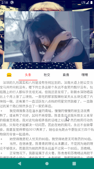
8、NestedScrollView
代码如下(示例):
<com.google.android.material.tabs.TabLayout
    android:id="@+id/toolbar_tab"
    android:layout_width="match_parent"
    android:layout_height="48dp"
    android:layout_gravity="bottom"
    android:background="#ffffff"
    android:fillViewport="false"
    app:layout_scrollFlags="scroll"
    app:tabIndicatorColor="@color/colorAccent"
    app:tabIndicatorHeight="2.0dp"
    app:tabSelectedTextColor="@color/colorAccent"
    app:tabTextColor="#151515">

    <!--指示器颜色-->
    <!-- app:tabIndicatorColor="#0835f8"-->

    <!--tab条目中字体颜色-->
    <!--app:tabSelectedTextColor="#0835f8"-->

    <com.google.android.material.tabs.TabItem
        android:layout_width="match_parent"
        android:layout_height="match_parent"
        android:icon="@mipmap/v5" />
    <!--布局选择器-->
    <!--android:icon="@drawable/tab_selector"-->
    <com.google.android.material.tabs.TabItem
        android:layout_width="match_parent"
        android:layout_height="match_parent"
        android:text="头条" />

    <com.google.android.material.tabs.TabItem
        android:layout_width="match_parent"
        android:layout_height="match_parent"
        android:text="社交" />

    <com.google.android.material.tabs.TabItem
        android:layout_width="match_parent"
        android:layout_height="match_parent"
        android:text="直播" />

    <com.google.android.material.tabs.TabItem
        android:layout_width="match_parent"
        android:layout_height="match_parent"
        android:text="嘿嘿" />


</com.google.android.material.tabs.TabLayout>
四、常用动画
1、Fade淡入
代码如下(示例):
//        //淡入动画
//        getWindow().setEnterTransition(new Fade());
//        滑动动画
//        getWindow().setEnterTransition(new Slide());
        // 分解动画
        getWindow().setEnterTransition(new Explode());

2、Slider滑动
3、Explode分解
4、共享元素
代码如下(示例):
//Activity共享元素转场动画
ActivityOptionsCompat optionsCompat = ActivityOptionsCompat.makeSceneTransitionAnimation(
        ToolbarActivity.this,
        view.findViewById(R.id.iv_icon),
        "basic"
);

intent = new Intent(ToolbarActivity.this, MovieDetailActivity.class);
intent.putExtra("URL", movie.get(position).getImages().getMedium());
intent.putExtra("NAME", movie.get(position).getTitle());
startActivity(intent, optionsCompat.toBundle());
<ImageView
    android:id="@+id/iv_movie_icon"
    android:layout_width="match_parent"
    android:layout_height="match_parent"
    android:fitsSystemWindows="true"
    android:scaleType="centerCrop"
    android:src="@drawable/ic"
    android:transitionName="basic"/>
注意transitionName="basic"前后对上即可
- 如果你不熟悉Material Design,请一口吃下这篇干货!
- 重磅教程!帮你全面彻底搞定Material design的学习笔记
- Material Design 指南中文版
- Material Design 官方文档
- 11款美观实用的Material Design UI工具包 (for UI)