文章目录
一、外边距塌陷描述
在 标准流的父盒子 中 , 添加一个 标准流子盒子 ;
如果 子盒子设置 100 像素的外边距 , 父盒子也会被带下来 , 这就是外边距塌陷 ;
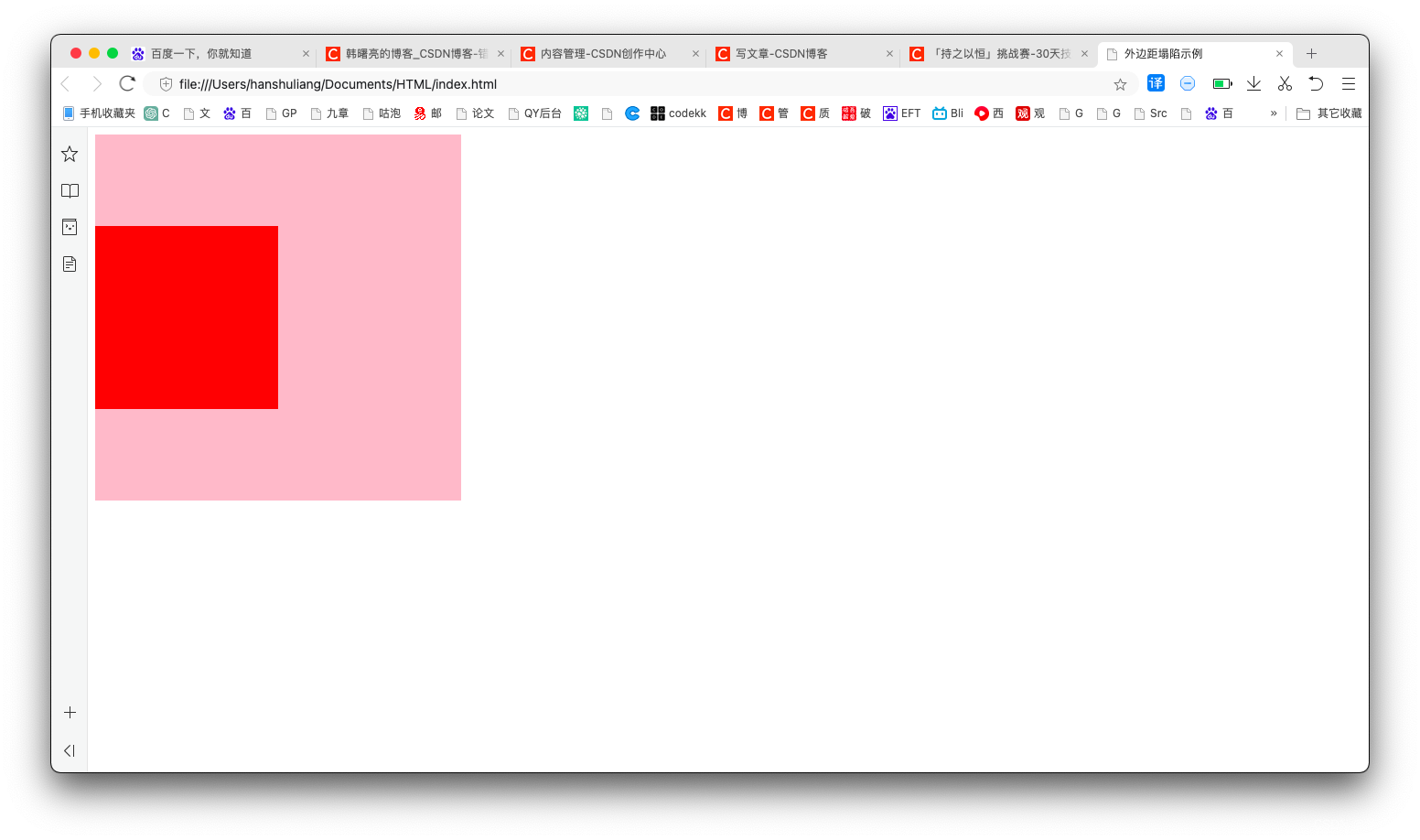
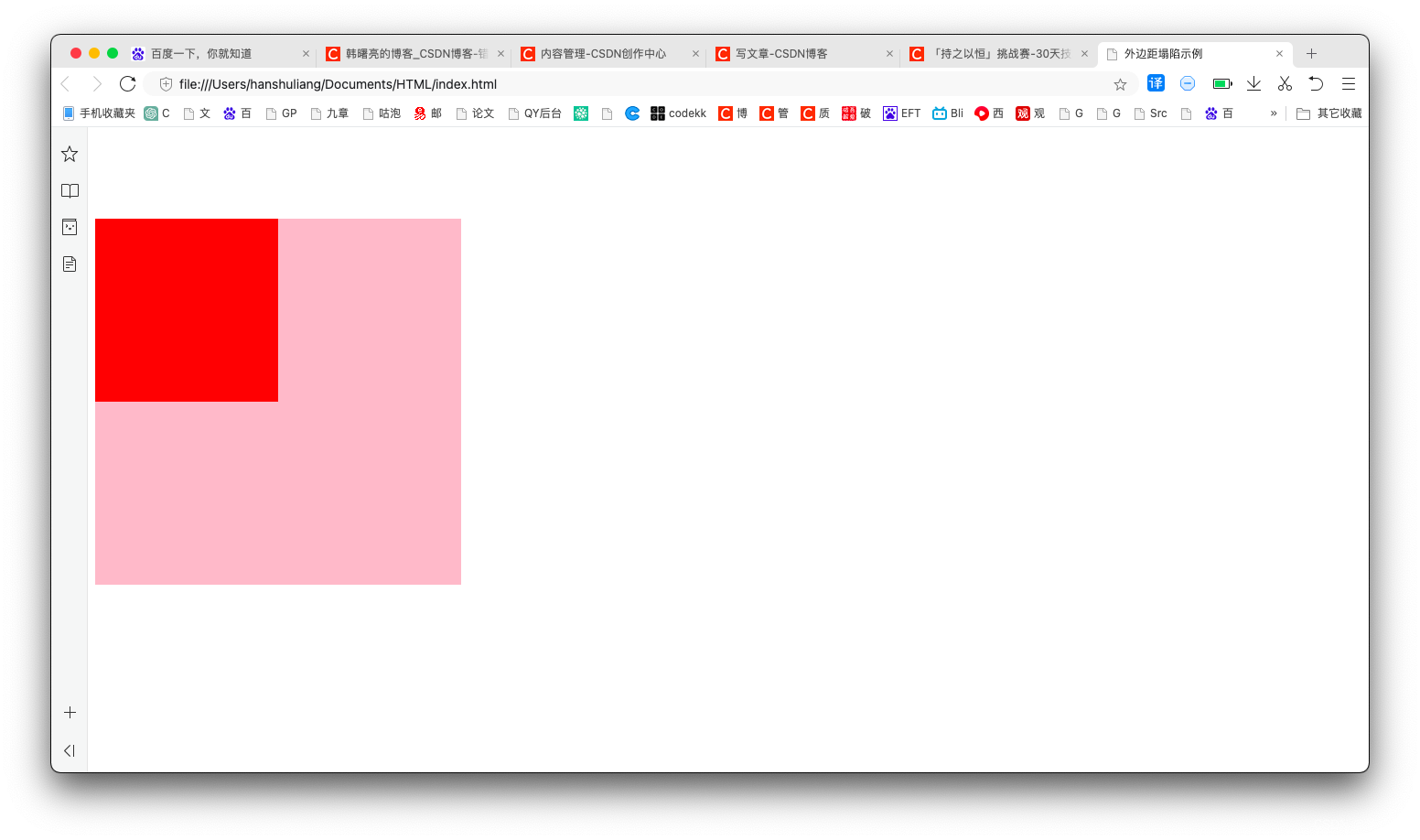
下面的示例 1 中 , 父盒子 和 子盒子 没有添加任何外边距 , 没有塌陷 ;
示例 2 中 , 为子盒子设置了 上外边距 , 结果将 父盒子也带下来了 ;
1、没有塌陷的情况
代码示例 :
<!DOCTYPE html>
<html lang="en">
<head>
	<meta charset="UTF-8">
	<title>外边距塌陷示例</title>
	<style>
		.father {


			width: 400px;
			height: 400px;
			background-color: pink;
		}
		.son {


			width: 200px;
			height: 200px;
			background-color: red;
		}
	</style>
</head>
<body>
	<div class="father">
		<div class="son"></div>
	</div>
</body>
</html>
展示效果 :
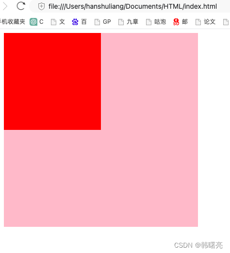
2、外边距塌陷情况
在子盒子中设置了 100 像素的上外边距 , 出现了外边距塌陷的情况 ;
/* 子盒子添加上外边距 出现塌陷情况 */
margin-top: 100px;
代码示例 :
<!DOCTYPE html>
<html lang="en">
<head>
	<meta charset="UTF-8">
	<title>外边距塌陷示例</title>
	<style>
		.father {


			width: 400px;
			height: 400px;
			background-color: pink;
		}
		.son {


			width: 200px;
			height: 200px;
			background-color: red;

			/* 子盒子添加上外边距 出现塌陷情况 */
			margin-top: 100px;
		}
	</style>
</head>
<body>
	<div class="father">
		<div class="son"></div>
	</div>
</body>
</html>
展示效果 :
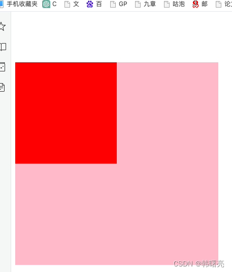
二、传统方法解决外边距塌陷 - 为父容器 / 子元素设置内边距 / 边框
这里使用传统方法 : 为 父容器 / 子元素 设置 内边距 / 边框 ;
下面是 为父容器设置 1 像素的 内边距 ;
		.father {


			width: 400px;
			height: 400px;
			background-color: pink;

			/* 为父容器 / 子元素设置内边距 / 边框 */
			padding: 1px;
		}
完整代码如下 :
<!DOCTYPE html>
<html lang="en">
<head>
	<meta charset="UTF-8">
	<title>外边距塌陷示例</title>
	<style>
		.father {


			width: 400px;
			height: 400px;
			background-color: pink;

			/* 为父容器 / 子元素设置内边距 / 边框 */
			padding: 1px;
		}
		.son {


			width: 200px;
			height: 200px;
			background-color: red;

			/* 子盒子添加上外边距 出现塌陷情况 */
			margin-top: 100px;
		}
	</style>
</head>
<body>
	<div class="father">
		<div class="son"></div>
	</div>
</body>
</html>
展示效果 :

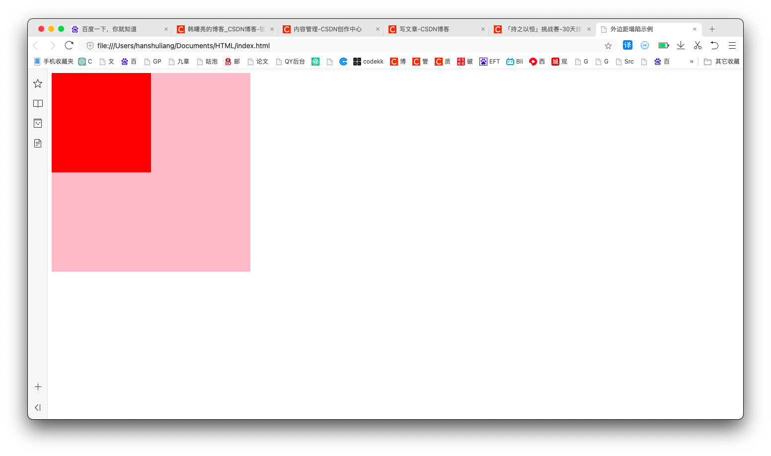
三、使用浮动解决外边距塌陷 - 为子元素设置浮动
为子元素设置浮动 , 可以解决 外边距 塌陷问题 ;
代码示例 :
<!DOCTYPE html>
<html lang="en">
<head>
	<meta charset="UTF-8">
	<title>外边距塌陷示例</title>
	<style>
		.father {


			width: 400px;
			height: 400px;
			background-color: pink;

			/* 为父容器 / 子元素设置内边距 / 边框 */
			/*padding: 1px;*/
		}
		.son {


			/* 为子元素设置浮动 解决外边距塌陷问题 */
			float: left;

			width: 200px;
			height: 200px;
			background-color: red;

			/* 子盒子添加上外边距 出现塌陷情况 */
			margin-top: 100px;
		}
	</style>
</head>
<body>
	<div class="father">
		<div class="son"></div>
	</div>
</body>
</html>
执行结果 :

四、使用绝对定位解决外边距塌陷 - 为子元素设置绝对定位
为子元素设置绝对定位 , 可以解决 外边距 塌陷问题 ;
代码示例 :
<!DOCTYPE html>
<html lang="en">
<head>
	<meta charset="UTF-8">
	<title>外边距塌陷示例</title>
	<style>
		.father {


			width: 400px;
			height: 400px;
			background-color: pink;

			/* 为父容器 / 子元素设置内边距 / 边框 */
			/*padding: 1px;*/
		}
		.son {


			/* 为子元素设置绝对定位 解决外边距塌陷问题 */
			/* 注意 : 为子元素设置相对定位 仍然会出现外边距塌陷问题 */
			position: absolute;

			/* 为子元素设置浮动 解决外边距塌陷问题 */
			/*float: left;*/

			width: 200px;
			height: 200px;
			background-color: red;

			/* 子盒子添加上外边距 出现塌陷情况 */
			margin-top: 100px;
		}
	</style>
</head>
<body>
	<div class="father">
		<div class="son"></div>
	</div>
</body>
</html>
展示效果 :