什么是自适应?
自适应:让同一个页面自动适应不同大小的设备,从而解决为不同设备提供不同版本页面的问题。
自适应布局:解决在不同大小的设备上呈现相同网页的问题
两列自适应布局
1、Html结构中–左右两个盒子;
2、左边固定宽度,右侧宽度100%;
3、为左侧盒子设置position:absolute;
4、为右侧盒子添加子盒,设置padding-left,属性值为左侧盒子的宽度。
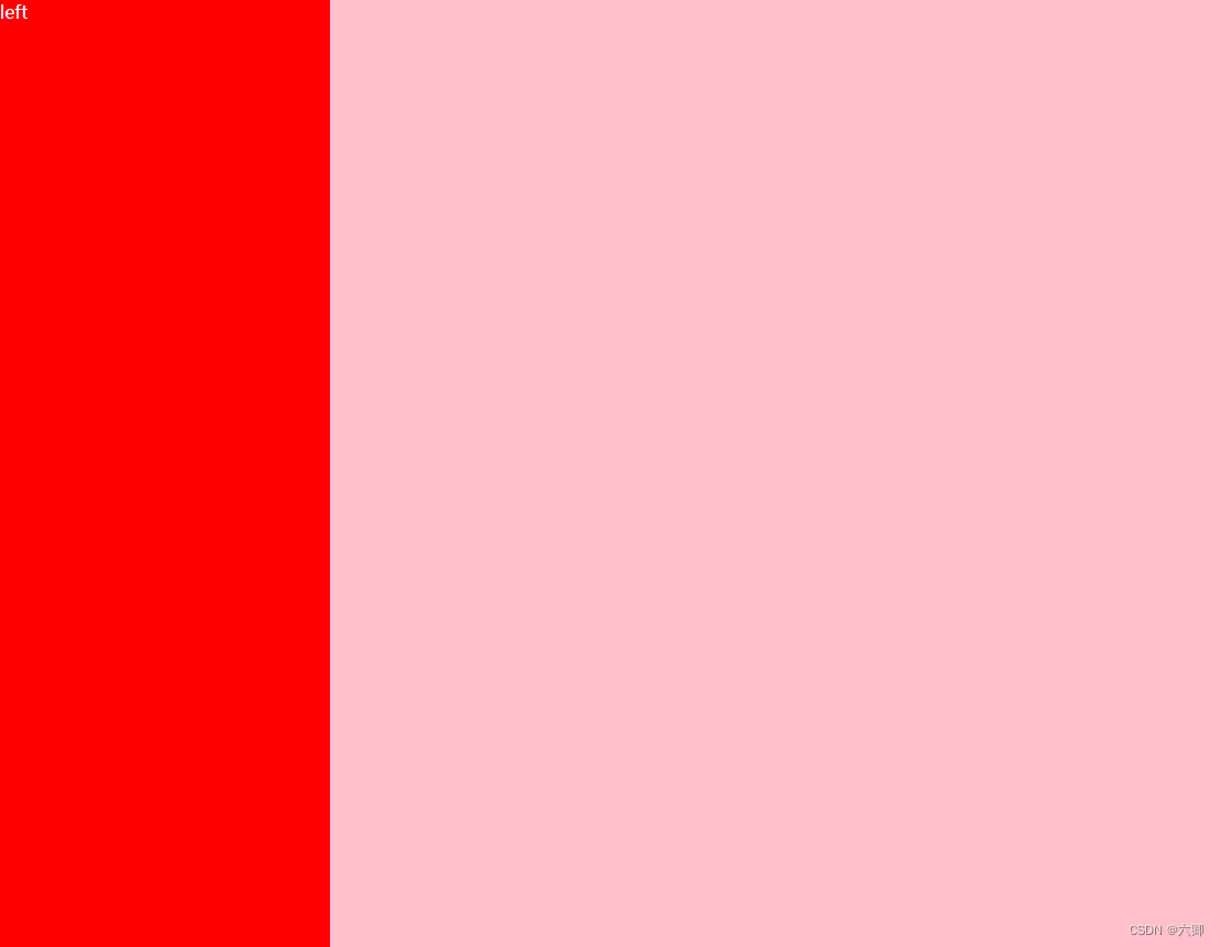
页面:
代码:
<!DOCTYPE html>
<html lang="en">

<head>
  <meta charset="UTF-8">
  <meta http-equiv="X-UA-Compatible" content="IE=edge">
  <meta name="viewport" content="width=device-width, initial-scale=1.0">
  <title>LiuQing</title>
  <style>
    html,
    body {


      width: 100%;
      height: 100%;
      padding: 0;
      margin: 0;
    }

    .left {


      position: absolute;
      left: 0;
      width: 300px;
      background-color: red;
      color: #fff;
      height: 100%;
    }

    .right {


      background-color: pink;
      width: 100%;
      height: 100%;
    }
  </style>
</head>

<body>
  <div class="left">left</div>
  <div class="right">right</div>
</body>

</html>
但是发现一个问题就是right盒子的文本看不到了,因为left盒子脱离了文档流,层级比right高。
我们虽然还没学习flex,但是我们可以提前开一下怎么写的:
<!DOCTYPE html>
<html lang="en">

<head>
  <meta charset="UTF-8">
  <meta http-equiv="X-UA-Compatible" content="IE=edge">
  <meta name="viewport" content="width=device-width, initial-scale=1.0">
  <title>LiuQing</title>
  <style>
    html,
    body {


      width: 100%;
      height: 100%;
      padding: 0;
      margin: 0;
      display: flex;
    }

    .left {


      width: 300px;
      background-color: red;
      color: #fff;
      height: 100%;
    }

    .right {


      flex: 1;
      background-color: pink;
      width: 100%;
      height: 100%;
    }
  </style>
</head>

<body>
  <div class="left">left</div>
  <div class="right">right</div>
</body>

</html>
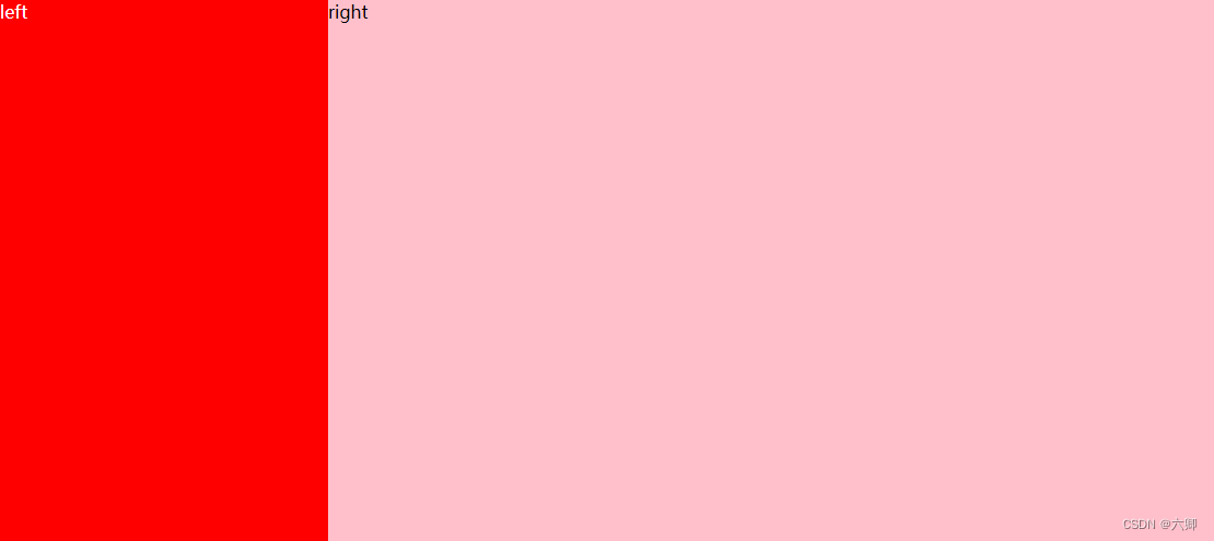
页面效果:
圣杯布局—三列布局
1、Html结构中–先主体内容后侧边栏
2、两侧固定宽度 中间内容宽度设置width:100%;
3、 主题内容和左右侧边栏之间分别加float:left
4、 左侧设置margin-left:-100%;
5、 右侧设置margin-left:-自身宽度;
6、 将中间内容露出来在外面的大盒子上padding: 0 右侧边的宽度 0 左侧边的宽度;
7、分别为左侧边和右侧边设置position:relative;左侧设置left”-左侧边的宽度; 还原左侧边。右侧边设置right:-右侧边的宽度;还原右侧边
主要利用浮动,padding属性实现,上面的方法虽然能实现,但是太过复杂,这里不再实现,哈哈哈哈哈哈…
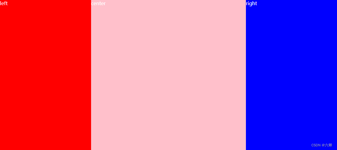
下面看flex实现:
<!DOCTYPE html>
<html lang="en">

<head>
  <meta charset="UTF-8">
  <meta http-equiv="X-UA-Compatible" content="IE=edge">
  <meta name="viewport" content="width=device-width, initial-scale=1.0">
  <title>LiuQing</title>
  <style>
    html,
    body {


      width: 100%;
      height: 100%;
      padding: 0;
      margin: 0;
      display: flex;
    }

    .left {


      width: 300px;
      background-color: red;
      color: #fff;
      height: 100%;
    }

    .center {


      flex: 1;
      background-color: pink;
      color: #fff;
      height: 100%;
    }

    .right {


      width: 300px;
      height: 100%;
      background-color: blue;
      color: #fff;
    }
  </style>
</head>

<body>
  <div class="left">left</div>
  <div class="center">center</div>
  <div class="right">right</div>
</body>

</html>
双飞翼布局–三列布局
1、Html结构中–先主体内容 后侧边;
2、两侧固定宽度 中间内容宽度设置width:100%;
3、主题内容和左右侧边栏之间分别加float:left;
4、左侧设置margin-left:-100%;将左侧拉到最左边
5、右侧设置margin-left:-自身宽度; 吧右侧边拉到最右边
6、在主体内容的子盒上设置margin:0 右侧边的宽度 0 左侧宽度;将中间内容露出来
和圣杯布局八九不离十,还是推荐flex。
等高布局
1.内外间距相抵消,为父元素设置overflow:hidden;
实现每一列需要
背景颜色由padding撑开
padding-bottom:1000px; 每一列使用padding撑开
margin-bottom:-1000px; 每一列由margin抵消
给父级盒子家overflow:hidden;
优点:结构简单,兼容所有浏览器
缺点: 伪等高,需要合理控制margin和padding值
2.利用内容撑开父级元素的特点,为每一列添加对应的容器,进行相互嵌套,并在每天一个容器中添加背景颜色
三个嵌套的div负责背景,三列放在最内侧的div盒子中;
通过相对定位分配三列的背景的位置;
通过margin负值,将内容移到对应背景的位置;
父元素溢出隐藏;
优缺点:扩展性好,可以实现自适应,结构嵌套复杂
<div class="box"> overflow:hidden超出隐藏
      <div class="wrap1">
          <div class="wrap2"> 置背景 position:ralative left:200px 使背景显示出来
             <div class="wrap3"> 设置背景 设置背景 position:ralative left:500px 使背景显示出来
                  <div class="left">左边</div> 设置宽度 左浮动  200px   margin-left=-700px
                  <div class="conter">中间</div>设置宽度 左浮动 500px   margin-left=-500px
                  <div class="right">右边</div>设置宽度 左浮动  300px
              </div>
          </div>
      </div>
 </div>
都是内容撑开的高度 所以会是实现高度的统一
背景处于wrap1、wrap2、wrap3 一层一层出来用相对定位实现背景颜色的宽度,并用margin负值实现内容和背景吻合