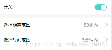
效果图:
wxml:
<view>
  <view class="bold-border li">
    <text>开关</text>
    <!-- switch 自定义样式 -->
    <switch checked bindchange="switch1Change" color="#44d4d1" />
  </view>

     <!-- picker 同一页面多个单项选择 -->
  <view class="li" wx:for="{{objArray}}" wx:for-item="itm" wx:for-index="idx">
    {{itm.title}}
    <picker bindchange="bindChange_select" value="{{itm.index}}" data-current="{{idx}}" range="{{itm.option}}">
      <view class='setcontext'> {{itm.option[itm.index]}} </view>
    </picker>

    <!-- iconfont 图标的引用 -->
     <text class="iconfont icon-gengduo"></text>

  </view>
</view>
js:
const util = require('../../utils/util.js')

Page({
  data: {

objArray: [
      {
        index: 0,
        title: '选择距离范围',
        option: ['50米内', '100米内', '150米内', '200米内'],
      },
      {
        index: 0,
        title: '选择时间范围',
        option: ['5分钟内', '10分钟内', '15分钟内', '20分钟内'],
      },
    ]
  },

  bindChange_select: function (ev) {
    const curindex = ev.target.dataset.current
    this.data.objArray[curindex].index = ev.detail.value
    this.setData({
      objArray: this.data.objArray
    })
  },

})
wxss:
.bold-border {
  border-bottom: 24rpx solid #f6f6f6 !important;
}

.li {
  font-size: 30rpx;
  display: flex;
  justify-content: space-between;
  height: 100rpx;
  line-height: 100rpx;
  margin: 0;
  padding: 0 3%;
  border-bottom: 1px solid #f6f6f6;
  background-color: #fff;
}

.setcontext {
  position: relative;
  left: 55%;
  top: -100%;
  width: 200rpx;
  text-align: right;
  color: #888;
}

.icon-gengduo, .right {
  display: inline-block;
  color: #bbb;
}

switch {
  float: right;
}


/*swtich自定义样式大小*/
.wx-switch-input {
  width: 82rpx !important;
  height: 40rpx !important;
}

/*白色样式(false的样式)*/

.wx-switch-input::before {
  width: 80rpx !important;
  height: 38rpx !important;
}

/*绿色样式(true的样式)*/

.wx-switch-input::after {
  width: 39rpx !important;
  height: 38rpx !important;
}