pages.json

上面可以看到tabbar我使用的原生的,但是值配置了pagepath,并且page里三个首页都可以自定义顶部导航栏,当然如果删掉custom那一行代码,就切换成原生顶部导航栏了。
下面拿一个首页作为代码演示:(顶部自定义导航栏组件和底部导航栏组件会放在最后)
下图组件没有引入,是使用了easyCom,官网详解
<template>
	<div>
		<tabbarTop :data="tabbarTopData"></tabbarTop>
		<tabbarBottom :current="0"></tabbarBottom>
	</div>
</template>

<script>
	import { mapState } from 'vuex';
	export default {
		data() {
			return {
				tabbarTopData: {
					title: "家园首页"
				}
			}
		},
		components: {},
		computed: {
			...mapState(["hasLogin"])
		},
		onLoad() {},
		onShow() {},
		methods: {

		}
	}
</script>

<style lang="scss" scoped>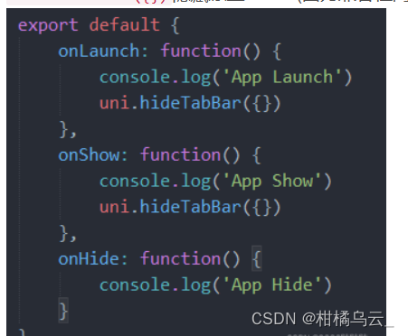
</style>需要在App.vue中onLaunch和onShow方法后面加上uni.hideTabbar({})隐藏原生tabbar(因为兼容性问题两个地方必须都加上)
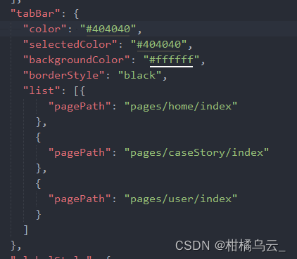
特别需要留意的"navigationStyle": "default" 只能控制顶部导航栏是否自定义,而底部导航栏是由下图选项控制,如果要隐藏可以通过 uni.hideTabBar() 隐藏掉,其实就是使用原生的底部导航栏,只不过通过api隐藏掉,然后每个tabbar页面都写上自定义的底部导航栏,
修改大小
根据需要修改了u-tabbar和u-tabbar-item宽度高度,这些基本属性在uni_modules/uview-ui/components/u-tabbar/u-tabbar.vue和uni_modules/uview-ui/components/u-tabbar-item/u-tabbar-item.vue中都有相应的注释,写得很清楚,自行修改就好
修改u-tabbar的高度,我使用的是深度选择器,只不过需要在自定义底部导航栏组件里面开启一个option,我封装的自定义底部导航栏组件代码如下:
<template>
	<div class="tabBox">
		<u-tabbar :placeholder="false" :value="current?current:0" @change="tabbarChange" :safeAreaInsetBottom="true" :border="false">
			<u-tabbar-item text="首页">
				<image class="u-page__item__slot-icon" slot="active-icon" src="@/static/img/橘子.svg">
				</image>
				<image class="u-page__item__slot-icon" slot="inactive-icon" src="@/static/img/布丁.svg">
				</image>
			</u-tabbar-item>
			<u-tabbar-item text="案例">
				<image class="u-page__item__slot-icon" slot="active-icon" src="@/static/img/煎蛋.svg">
				</image>
				<image class="u-page__item__slot-icon" slot="inactive-icon" src="@/static/img/冰淇淋.svg">
				</image>
			</u-tabbar-item>
			<u-tabbar-item text=" ">
				<image class="u-page__item__slot-icon shopTabar" slot="active-icon" src="@/static/img/香蕉.svg">
				</image>
				<image class="u-page__item__slot-icon" slot="inactive-icon" src="@/static/img/胡萝卜.svg">
				</image>
			</u-tabbar-item>
			<u-tabbar-item text="评测">
				<image class="u-page__item__slot-icon" slot="active-icon" src="@/static/img/香蕉.svg">
				</image>
				<image class="u-page__item__slot-icon" slot="inactive-icon" src="@/static/img/胡萝卜.svg">
				</image>
			</u-tabbar-item>
			<u-tabbar-item text="我的">
				<image class="u-page__item__slot-icon" slot="active-icon" src="@/static/img/香蕉.svg">
				</image>
				<image class="u-page__item__slot-icon" slot="inactive-icon" src="@/static/img/胡萝卜.svg">
				</image>
			</u-tabbar-item>
		</u-tabbar>
	</div>
</template>

<script>
	export default {
		options: { styleIsolation: 'shared' },
		data() {
			return {
				list: [
					{ path: "pages/home/index" },
					{ path: "pages/caseStory/index" },
					{ path: "pages/shop/index" },
					{ path: "pages/evaluation/index" },
					{ path: 'pages/user/index' },
				]
			}
		},
		props: {
			current: Number
		},
		components: {},
		onLoad() {

		},
		onShow() {

		},
		methods: {
			tabbarChange(e) {
				console.log(e, '/' + this.list[e].path);
				uni.switchTab({
					url: '/' + this.list[e].path
				})
			}
		}
	}
</script>

<style lang="scss" scoped>
	.u-page__item__slot-icon {
		width: 54rpx;
		height: 54rpx;
	}

	.tabBox {

		::v-deep .u-tabbar__content__item-wrapper {
			height: 163rpx;
		}

		::v-deep .u-tabbar__content__item-wrapper .u-tabbar-item:nth-child(3) .u-page__item__slot-icon {
			width: 102rpx;
			height: 102rpx;
		}
	}
</style>至于为什么使用option选项:看这篇文章
如果还需要添加底部导航栏按下出现阴影的css效果:参考
自定义导航栏封装的组件:
<template>
<div>
<u-navbar :title="data.title" :safeAreaInsetTop="true" :fixed="true">
<view class="u-nav-slot" slot="left">
<u-icon name="home" size="40"></u-icon>
</view>
</u-navbar>
</div>
</template>
<script>
export default {
data() {
return {
}
},
props: {
data: Object
},
components: {},
onMounted() {
},
onShow() {
},
methods: {
}
}
</script>
<style lang="scss" scoped>
::v-deep.u-navbar__content__left {
.uicon-home {
font-size: 80rpx !important;
}
}
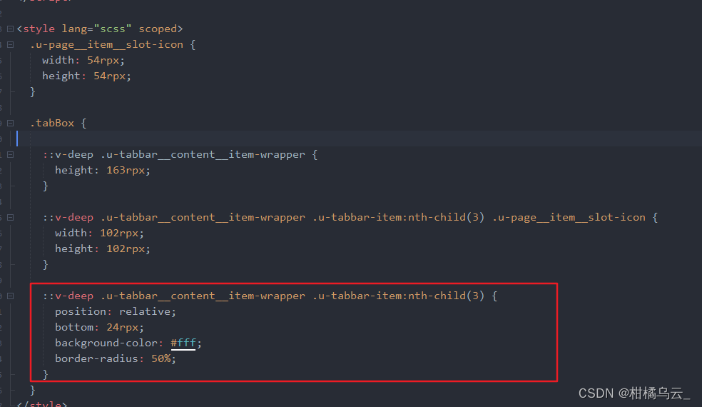
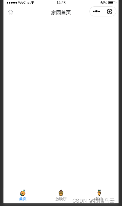
</style>后续产品让把tabbar设置成五个,中间的一个设置为圆的并且突出显示,如下图:

只需要在上面封装的tabbar代码里面用深度选择器改一下第三个item: