文章目录
一、引言
- 描述:构建布局是UI界面开发的基础,如何使界面看起来优雅简洁?编辑程序时不迷路?都离不开一个好的布局思路和习惯。
- 难度:简单
- 任务:
- 1、认识线性布局Row/Column、层叠布局Stack、弹性布局Flex、相对布局RelativeContainer。
- 2、拿生活中的一些发布的软件进行练手。
二、构建布局
1、线性布局(Row/Column)
如果布局内子元素为复数个,且能够以某种方式线性排列时优先考虑此布局。
(1)任务
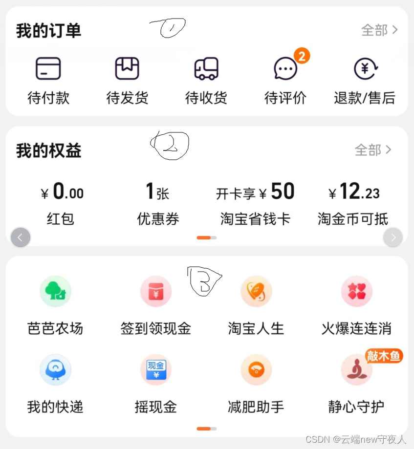
如下图,这是某宝购物软件的个人中心。那么需要使用线性布局设计出其底层模板,标准为图中表示的数字。
(2)实现
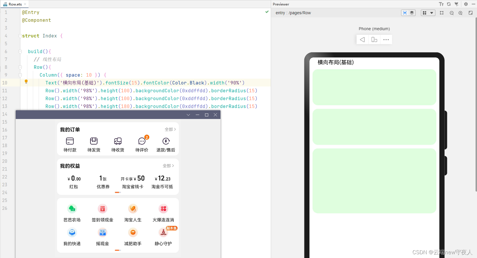
横向布局(Row)
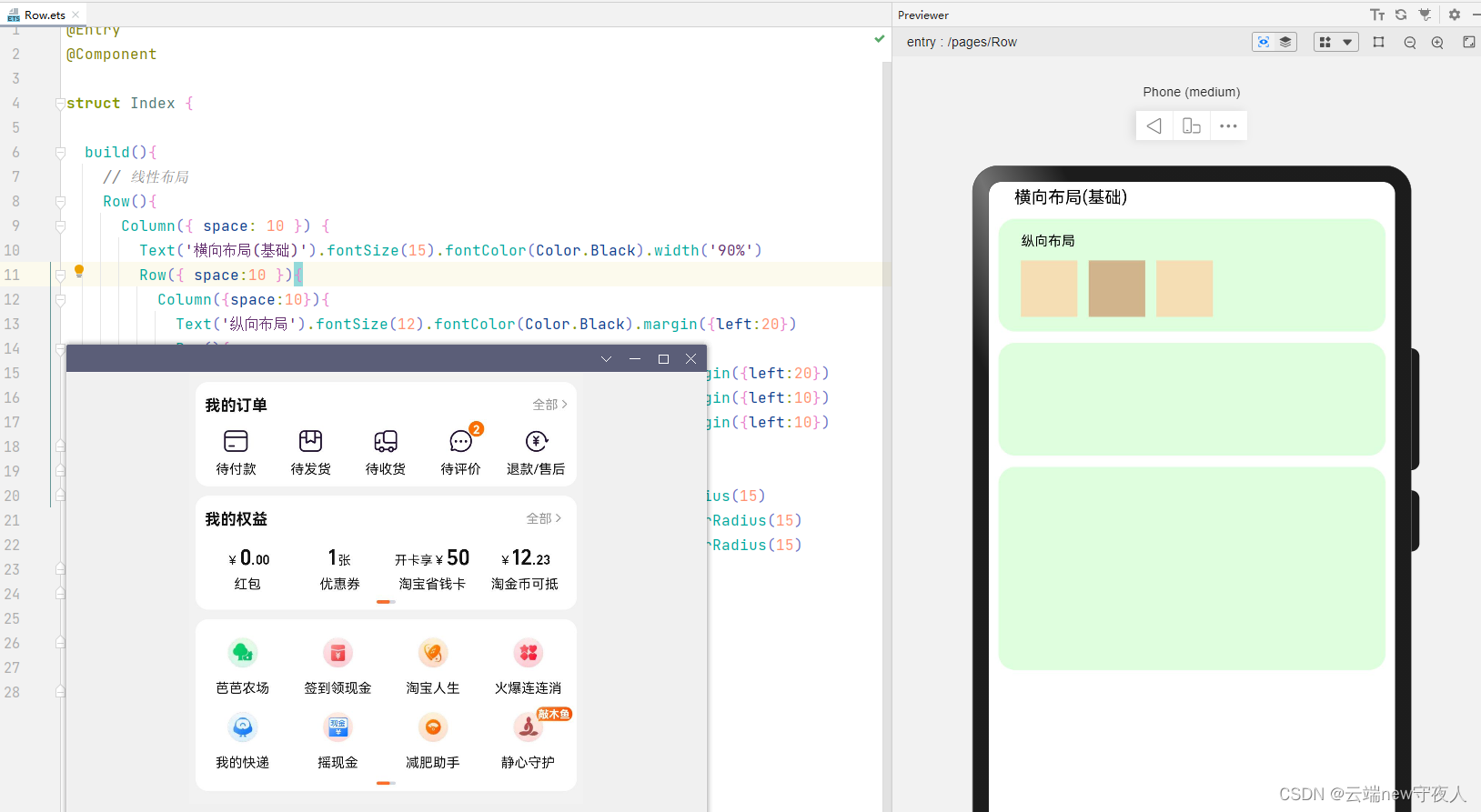
纵向布局(Column),这里的实现我比较推荐使用适配器(Adapter),在ArkUI里也提供了组件的方法。为了命题还是按照要求处理需求。
(3)代码
横向布局(Row)
@Entry
@Component

struct Index {


  build(){


    // 线性布局
    Row(){


      Column({

     space: 10 }) {


        Text('横向布局(基础)').fontSize(15).fontColor(Color.Black).width('90%')
        Row().width('98%').height(100).backgroundColor(0xddffdd).borderRadius(15)
        Row().width('98%').height(100).backgroundColor(0xddffdd).borderRadius(15)
        Row().width('98%').height(180).backgroundColor(0xddffdd).borderRadius(15)
      }.width('100%').padding(5)
    }
  }

}
纵向布局(Column)
@Entry
@Component

struct Index {


  build(){


    // 线性布局
    Row(){


      Column({

     space: 10 }) {


        Text('横向布局(基础)').fontSize(15).fontColor(Color.Black).width('90%')
        Row({

     space:10 }){


          Column({

    space:10}){


            Text('纵向布局').fontSize(12).fontColor(Color.Black).margin({

    left:20})
            Row(){


              Row().width(50).height(50).backgroundColor(0xF5DEB3).margin({

    left:20})
              Row().width(50).height(50).backgroundColor(0xD2B48C).margin({

    left:10})
              Row().width(50).height(50).backgroundColor(0xF5DEB3).margin({

    left:10})
            }
          }.alignItems(HorizontalAlign.Start)
        }.width('98%').height(100).backgroundColor(0xddffdd).borderRadius(15)
        Row().width('98%').height(100).backgroundColor(0xddffdd).borderRadius(15)
        Row().width('98%').height(180).backgroundColor(0xddffdd).borderRadius(15)
      }.width('100%').padding(5)
    }
  }

}
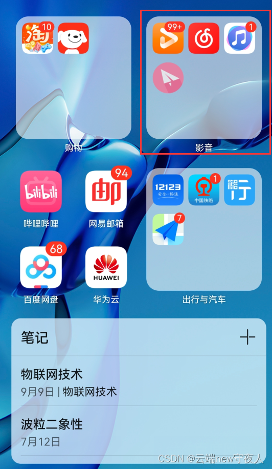
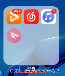
2、层叠布局(Stack)
组件需要有堆叠效果时优先考虑此布局,层叠布局的堆叠效果不会占用或影响其他同容器内子组件的布局空间。
(1)任务
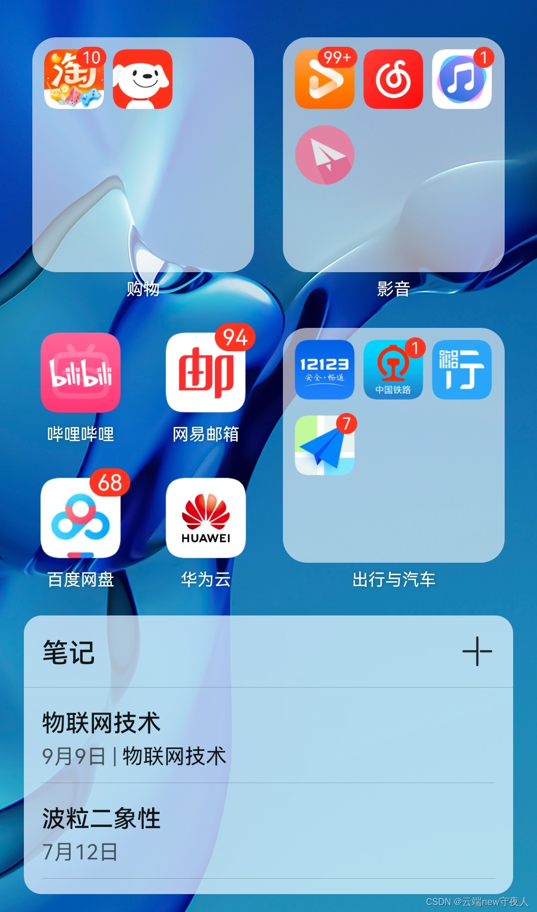
如下图,这是一张我的手机界面应用图,那么我们如何实现最小的图片的层叠效果(以其中的淘某为例)。当然正常设计肯定是适配器+容器思想。
(2)实现
设计的这个图标有点大,按道理一个容器里一行要有三个,如果设计三个会不会超出容器内部呢?这就需要学习到后面的弹性布局(flex)
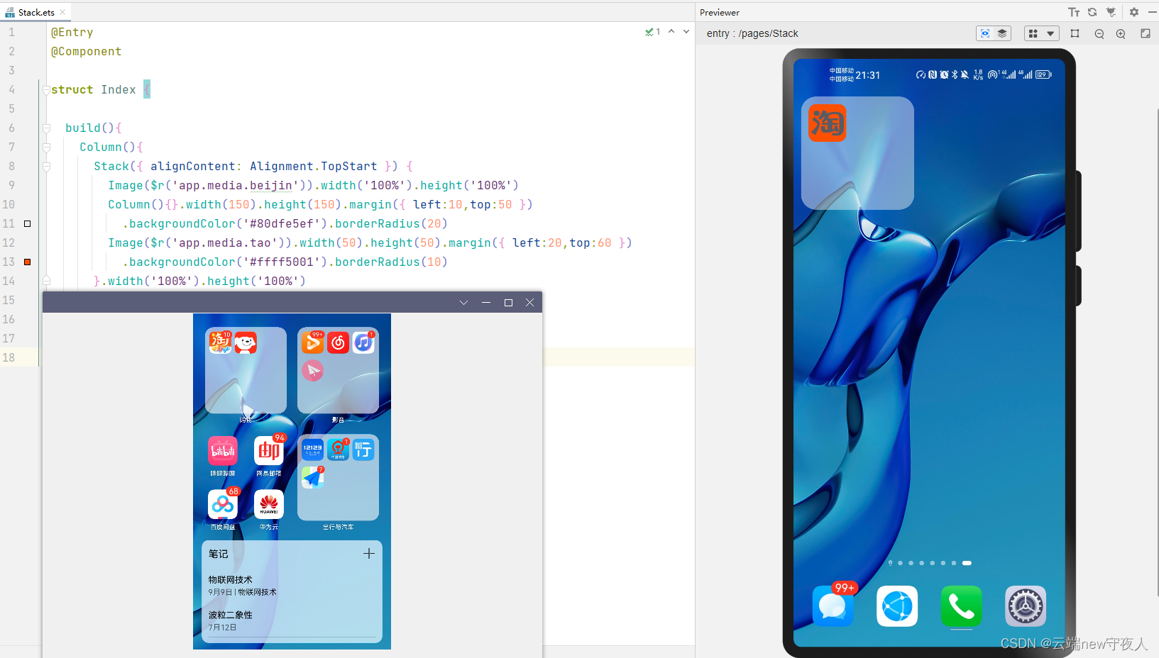
(3)代码
@Entry
@Component

struct Index {


  build(){


    Column(){


      Stack({

     alignContent: Alignment.TopStart }) {


        Image($r('app.media.beijin')).width('100%').height('100%')
        Column(){

    }.width(150).height(150).margin({

     left:10,top:50 })
          .backgroundColor('#80dfe5ef').borderRadius(20)
        Image($r('app.media.tao')).width(50).height(50).margin({

     left:20,top:60 })
          .backgroundColor('#ffff5001').borderRadius(10)
      }.width('100%').height('100%')
    }
  }

}
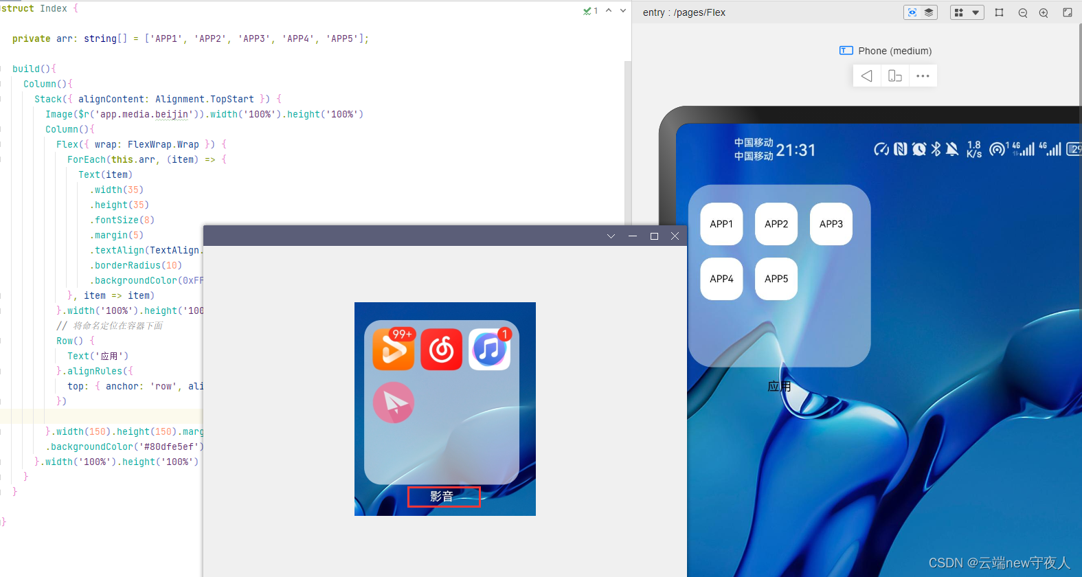
3、弹性布局(Flex)
弹性布局是与线性布局类似的布局方式。区别在于弹性布局默认能够使子组件压缩或拉伸。在子组件需要计算拉伸或压缩比例时优先使用此布局,可使得多个容器内子组件能有更好的视觉上的填充容器效果。
(1)任务
如红框内容,使用弹性布局在容器里生成多个APP(模拟)
(2)实现
(3)代码
@Entry
@Component

struct Index {


  private arr: string[] = ['APP1', 'APP2', 'APP3', 'APP4', 'APP5'];

  build(){


    Column(){


      Stack({

     alignContent: Alignment.TopStart }) {


        Image($r('app.media.beijin')).width('100%').height('100%')
        Column(){


          Flex({

     wrap: FlexWrap.Wrap }) {


            ForEach(this.arr, (item) => {


              Text(item)
                .width(35)
                .height(35)
                .fontSize(8)
                .margin(5)
                .textAlign(TextAlign.Center)
                .borderRadius(10)
                .backgroundColor(0xFFFFFF)
            }, item => item)
          }.width('100%').height('100%').margin({

     left:10,top:10 })
        }.width(150).height(150).margin({

     left:10,top:50 })
        .backgroundColor('#80dfe5ef').borderRadius(20)
      }.width('100%').height('100%')
    }
  }

}
4、相对布局(RelativeContainer)
相对布局是在二维空间中的布局方式,不需要遵循线性布局的规则,布局方式更为自由。通过在子组件上设置锚点规则(AlignRules)使子组件能够将自己在横轴、纵轴中的位置与容器或容器内其他子组件的位置对齐。设置的锚点规则可以天然支持子元素压缩、拉伸,堆叠或形成多行效果。在页面元素分布复杂或通过线性布局会使容器嵌套层数过深时推荐使用。
(1)任务
将命名相对定位在容器之下
(2)实现
(3)代码
@Entry
@Component

struct Index {


  private arr: string[] = ['APP1', 'APP2', 'APP3', 'APP4', 'APP5'];

  build(){


    Column(){


      Stack({

     alignContent: Alignment.TopStart }) {


        Image($r('app.media.beijin')).width('100%').height('100%')
        Column(){


          Flex({

     wrap: FlexWrap.Wrap }) {


            ForEach(this.arr, (item) => {


              Text(item)
                .width(35)
                .height(35)
                .fontSize(8)
                .margin(5)
                .textAlign(TextAlign.Center)
                .borderRadius(10)
                .backgroundColor(0xFFFFFF)
            }, item => item)
          }.width('100%').height('100%').margin({

     left:10,top:10 }).id('row')
          // 将命名定位在容器下面
          Row() {


            Text('应用')
          }.alignRules({


            top: {

     anchor: 'row', align: VerticalAlign.Bottom },
          })

        }.width(150).height(150).margin({

     left:10,top:50 })
        .backgroundColor('#80dfe5ef').borderRadius(20)
      }.width('100%').height('100%')
    }
  }

}
5、栅格布局
关于栅格布局主要还是适配横纵屏,这就涉及到了后面的兼容问题,这里就先不写,用于后面的项目实际中展示。