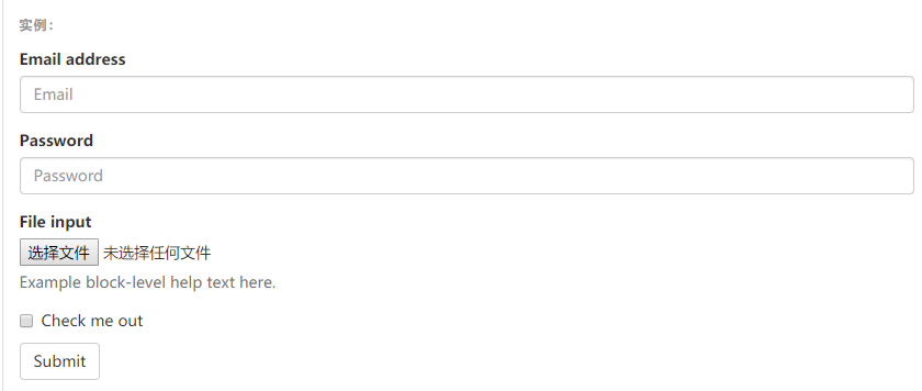
基本实例
单独的表单控件会被自动赋予一些全局样式。所有设置了
.form-control类的<input>、<textarea>和<select>元素都将被默认设置宽度属性为width: 100%;。 将label元素和前面提到的控件包裹在.form-group中可以获得最好的排列。


<form>
  <div class="form-group">
    <label for="exampleInputEmail1">Email address</label>
    <input type="email" class="form-control" id="exampleInputEmail1" placeholder="Email">
  </div>
  <div class="form-group">
    <label for="exampleInputPassword1">Password</label>
    <input type="password" class="form-control" id="exampleInputPassword1" placeholder="Password">
  </div>
  <div class="form-group">
    <label for="exampleInputFile">File input</label>
    <input type="file" id="exampleInputFile">
    <p class="help-block">Example block-level help text here.</p>
  </div>
  <div class="checkbox">
    <label>
      <input type="checkbox"> Check me out
    </label>
  </div>
  <button type="submit" class="btn btn-default">Submit</button>
</form>
内联表单
为
<form>元素添加.form-inline类可使其内容左对齐并且表现为inline-block级别的控件。只适用于视口(viewport)至少在 768px 宽度时(视口宽度再小的话就会使表单折叠)。
<form class="form-inline">
  <div class="form-group">
    <label for="exampleInputName2">Name</label>
    <input type="text" class="form-control" id="exampleInputName2" placeholder="Jane Doe">
  </div>
  <div class="form-group">
    <label for="exampleInputEmail2">Email</label>
    <input type="email" class="form-control" id="exampleInputEmail2" placeholder="[email protected]">
  </div>
  <button type="submit" class="btn btn-default">Send invitation</button>
</form>
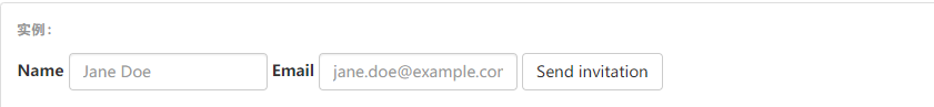
可以看出 对于每一个输入控件 都要加上 .form-control的CSS
对于按钮来说要加上btn 和一种样式 上图是btn-default
<form class="form-inline">
  <div class="form-group">
    <label class="sr-only" for="exampleInputAmount">Amount (in dollars)</label>
    <div class="input-group">
      <div class="input-group-addon">$</div>
      <input type="text" class="form-control" id="exampleInputAmount" placeholder="Amount">
      <div class="input-group-addon">.00</div>
    </div>
  </div>
  <button type="submit" class="btn btn-primary">Transfer cash</button>
</form>
效果:
可以看出 在input的前后可以加入div并class为input-group-addon就能有一个前后的效果
对于这里的输入组 可以在这里查看详情
水平排列的表单
通过为表单添加
.form-horizontal类,并联合使用 Bootstrap 预置的栅格类,可以将label标签和控件组水平并排布局。这样做将改变.form-group的行为,使其表现为栅格系统中的行(row),因此就无需再额外添加.row了。
同样的 结合之前学习的栅格布局,就可以做出这种布局
<form class="form-horizontal">
  <div class="form-group">
    <label for="inputEmail3" class="col-sm-2 control-label">Email</label>
    <div class="col-sm-10">
      <input type="email" class="form-control" id="inputEmail3" placeholder="Email">
    </div>
  </div>
  <div class="form-group">
    <label for="inputPassword3" class="col-sm-2 control-label">Password</label>
    <div class="col-sm-10">
      <input type="password" class="form-control" id="inputPassword3" placeholder="Password">
    </div>
  </div>
  <div class="form-group">
    <div class="col-sm-offset-2 col-sm-10">
      <div class="checkbox">
        <label>
          <input type="checkbox"> Remember me
        </label>
      </div>
    </div>
  </div>
  <div class="form-group">
    <div class="col-sm-offset-2 col-sm-10">
      <button type="submit" class="btn btn-default">Sign in</button>
    </div>
  </div>
</form>
效果: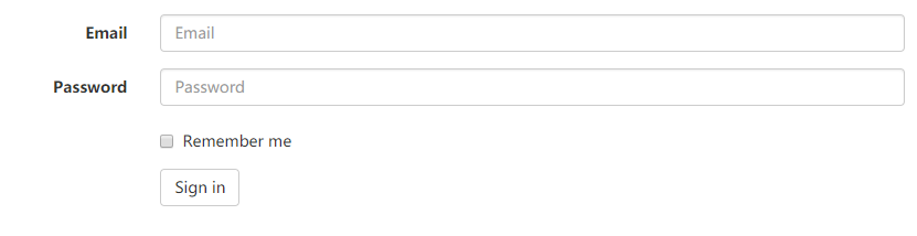
被支持的控件
表单布局实例中展示了其所支持的标准表单控件。
输入框
包括大部分表单控件、文本输入域控件,还支持所有 HTML5 类型的输入控件:
text、password、datetime、datetime-local、date、month、time、week、number、url、search、tel和color。
校验状态
Bootstrap 对表单控件的校验状态,如 error、warning 和 success 状态,都定义了样式。使用时,添加
.has-warning、.has-error或.has-success类到这些控件的父元素即可。任何包含在此元素之内的.control-label、.form-control和.help-block元素都将接受这些校验状态的样式。
<div class="form-group has-success">
  <label class="control-label" for="inputSuccess1">Input with success</label>
  <input type="text" class="form-control" id="inputSuccess1" aria-describedby="helpBlock2">
  <span id="helpBlock2" class="help-block">A block of help text that breaks onto a new line and may extend beyond one line.</span>
</div>
<div class="form-group has-warning">
  <label class="control-label" for="inputWarning1">Input with warning</label>
  <input type="text" class="form-control" id="inputWarning1">
</div>
<div class="form-group has-error">
  <label class="control-label" for="inputError1">Input with error</label>
  <input type="text" class="form-control" id="inputError1">
</div>
<div class="has-success">
  <div class="checkbox">
    <label>
      <input type="checkbox" id="checkboxSuccess" value="option1">
      Checkbox with success
    </label>
  </div>
</div>
<div class="has-warning">
  <div class="checkbox">
    <label>
      <input type="checkbox" id="checkboxWarning" value="option1">
      Checkbox with warning
    </label>
  </div>
</div>
<div class="has-error">
  <div class="checkbox">
    <label>
      <input type="checkbox" id="checkboxError" value="option1">
      Checkbox with error
    </label>
  </div>
</div>
效果: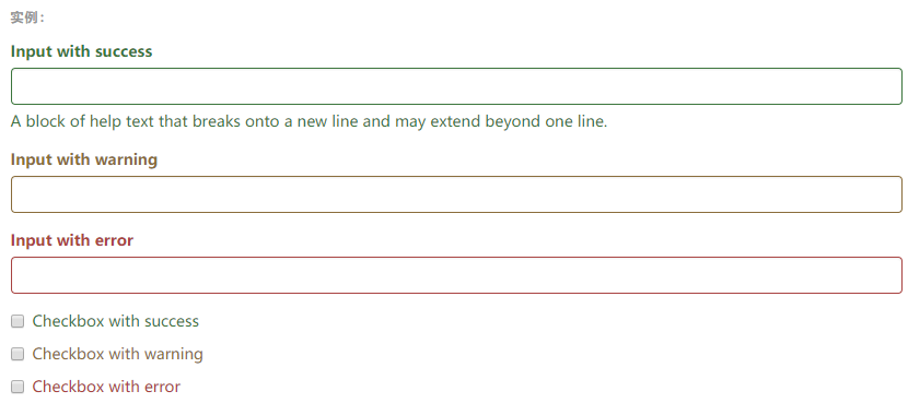
有明显(?)的绿黄红颜色加持
控件尺寸
通过
.input-lg类似的类可以为控件设置高度,通过.col-lg-*类似的类可以为控件设置宽度。高度尺寸
创建大一些或小一些的表单控件以匹配按钮尺寸。
<input class="form-control input-lg" type="text" placeholder=".input-lg">
<input class="form-control" type="text" placeholder="Default input">
<input class="form-control input-sm" type="text" placeholder=".input-sm">

<select class="form-control input-lg">...</select>
<select class="form-control">...</select>
<select class="form-control input-sm">...</select>
效果: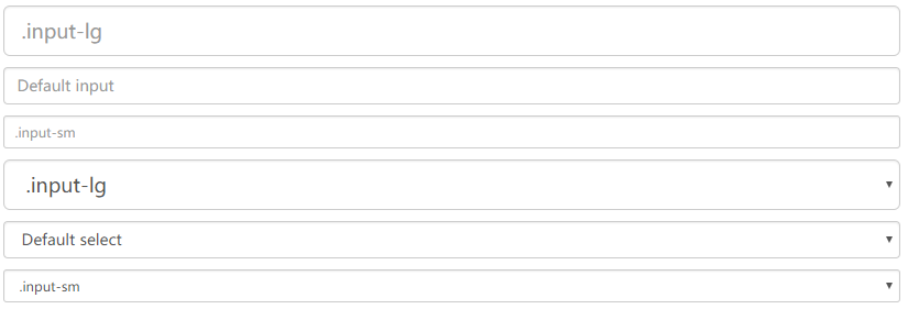
水平排列的表单组的尺寸
通过添加
.form-group-lg或.form-group-sm类,为.form-horizontal包裹的label元素和表单控件快速设置尺寸。
<form class="form-horizontal">
  <div class="form-group form-group-lg">
    <label class="col-sm-2 control-label" for="formGroupInputLarge">Large label</label>
    <div class="col-sm-10">
      <input class="form-control" type="text" id="formGroupInputLarge" placeholder="Large input">
    </div>
  </div>
  <div class="form-group form-group-sm">
    <label class="col-sm-2 control-label" for="formGroupInputSmall">Small label</label>
    <div class="col-sm-10">
      <input class="form-control" type="text" id="formGroupInputSmall" placeholder="Small input">
    </div>
  </div>
</form>
效果: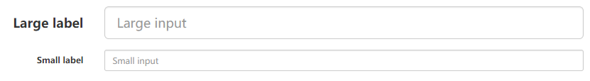
调整列(column)尺寸
用栅格系统中的列(column)包裹输入框或其任何父元素,都可很容易的为其设置宽度。
<div class="row">
  <div class="col-xs-2">
    <input type="text" class="form-control" placeholder=".col-xs-2">
  </div>
  <div class="col-xs-3">
    <input type="text" class="form-control" placeholder=".col-xs-3">
  </div>
  <div class="col-xs-4">
    <input type="text" class="form-control" placeholder=".col-xs-4">
  </div>
</div>
效果:
------------按钮---------------------------------
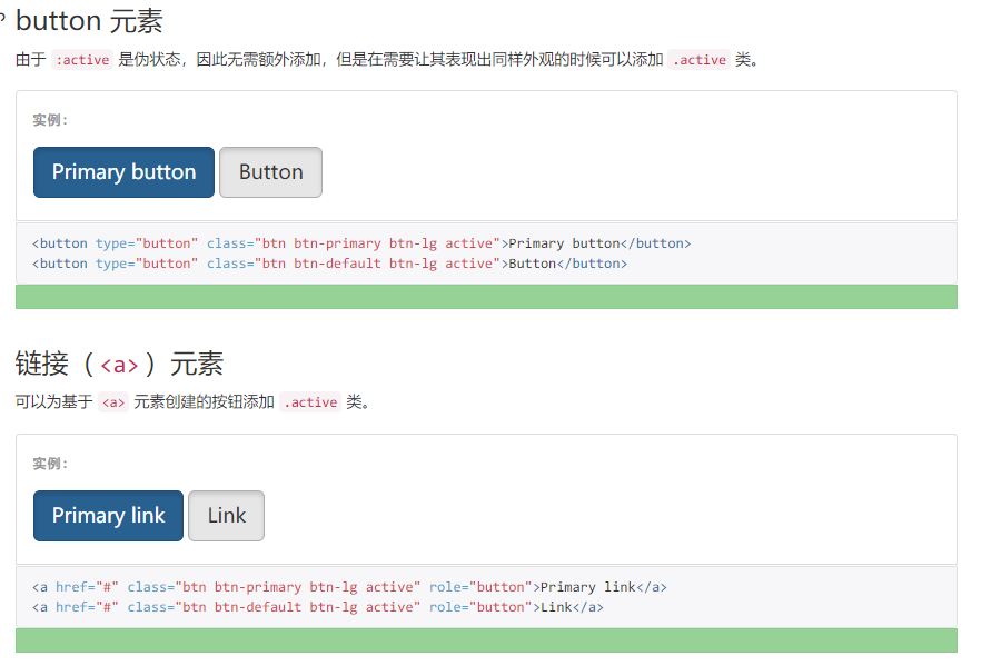
按钮
可作为按钮使用的标签或元素
为
<a>、<button>或<input>元素添加按钮类(button class)即可使用 Bootstrap 提供的样式。
<a class="btn btn-default" href="#" role="button">Link</a>
<button class="btn btn-default" type="submit">Button</button>
<input class="btn btn-default" type="button" value="Input">
<input class="btn btn-default" type="submit" value="Submit">
效果:
预定义样式
使用下面列出的类可以快速创建一个带有预定义样式的按钮。
<!-- Standard button -->
<button type="button" class="btn btn-default">(默认样式)Default</button>

<!-- Provides extra visual weight and identifies the primary action in a set of buttons -->
<button type="button" class="btn btn-primary">(首选项)Primary</button>

<!-- Indicates a successful or positive action -->
<button type="button" class="btn btn-success">(成功)Success</button>

<!-- Contextual button for informational alert messages -->
<button type="button" class="btn btn-info">(一般信息)Info</button>

<!-- Indicates caution should be taken with this action -->
<button type="button" class="btn btn-warning">(警告)Warning</button>

<!-- Indicates a dangerous or potentially negative action -->
<button type="button" class="btn btn-danger">(危险)Danger</button>

<!-- Deemphasize a button by making it look like a link while maintaining button behavior -->
<button type="button" class="btn btn-link">(链接)Link</button>
效果:
可以看出通过设置类 可以有不同的基础样式
激活状态
当按钮处于激活状态时,其表现为被按压下去(底色更深、边框夜色更深、向内投射阴影)。对于
<button>元素,是通过:active状态实现的。对于<a>元素,是通过.active类实现的。然而,你还可以将.active应用到<button>上(包含aria-pressed="true"属性)),并通过编程的方式使其处于激活状态。
就是class里面添加一个active 就可以有下面的效果:
禁用状态
通过为按钮的背景设置
opacity属性就可以呈现出无法点击的效果。
如下图
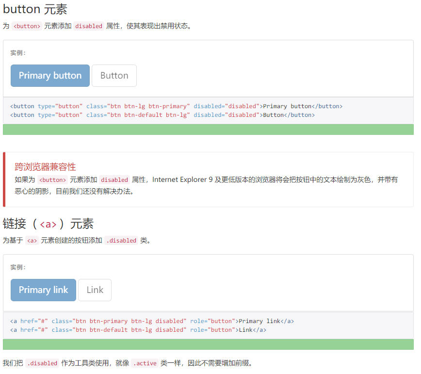
按钮就直接disabled属性设置下 其他就class里加个disabled类
本节结束