vue、vue 所有图标属性、vue Icon 所有图标属性、vue 图标所有类型属性、vue 自定义图标 Icon属性
使用方法
	<!--使用时将属性type换成对应的图标名字即可-->
	<a-icon type="step-backward" />
	<a-icon type="step-forward" />
	<a-icon type="fast-backward" />
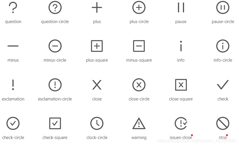
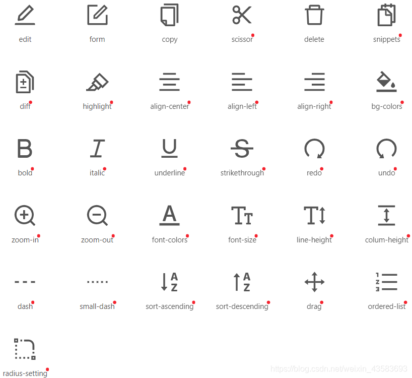
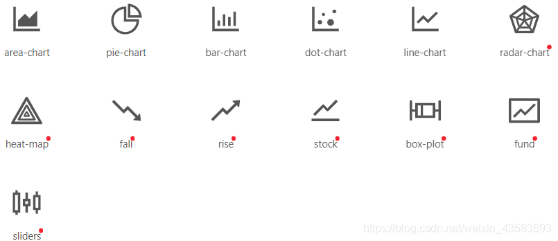
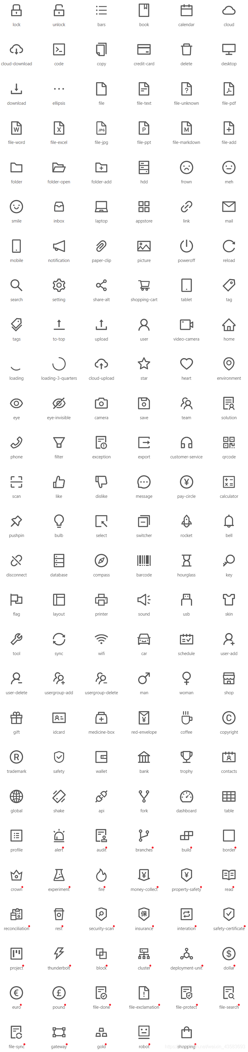
1.线框风格
1.方向性图标

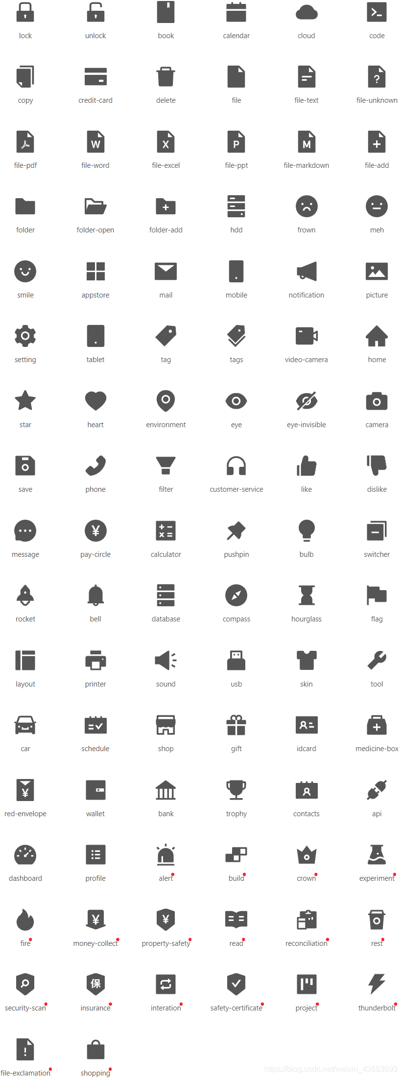
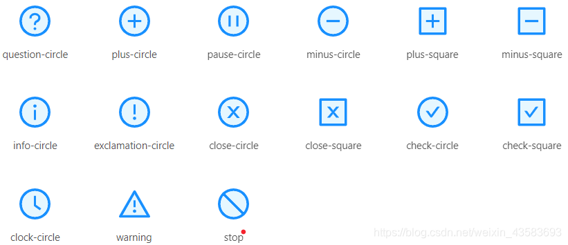
2.提示建议性图标
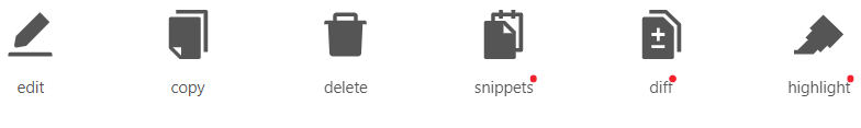
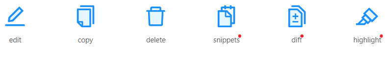
3.编辑类图标
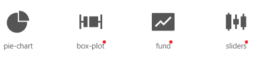
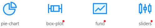
4.数据类图标
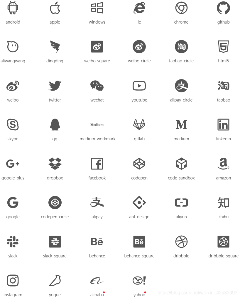
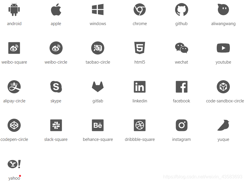
5.网站通用图标
6.品牌和标识
2.实底风格
1.方向性图标

2.提示建议性图标

3.编辑类图标
4.数据类图标
5.网站通用图标
6.品牌和标识
3.双色风格
1.方向性图标

2.提示建议性图标
3.编辑类图标
4.数据类图标
5.网站通用图标
6.品牌和标识

4.使用方法
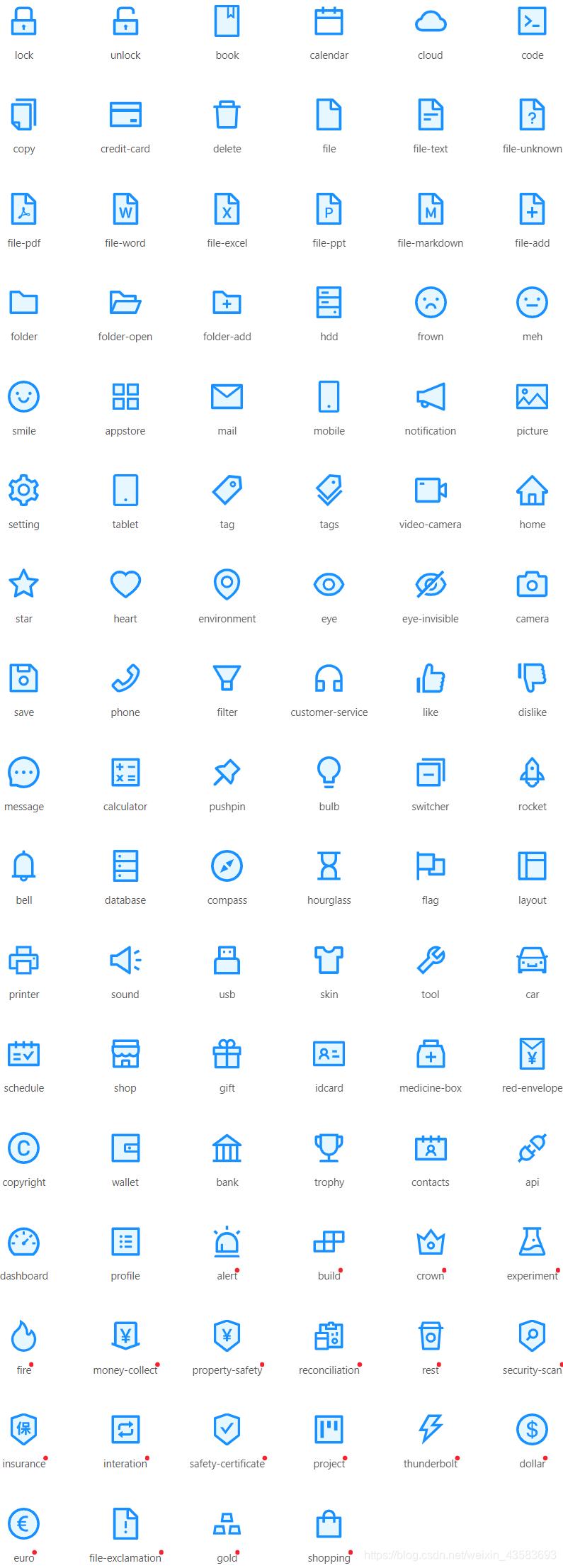
1.基本用法
<template>
  <div class="icons-list">
    <a-icon type="home" />
    <a-icon type="setting" theme="filled" />
    <a-icon type="smile" theme="outlined" />
    <a-icon type="sync" spin />
    <a-icon type="loading" />
  </div>
</template>
<style scoped>
.icons-list >>> .anticon {
  margin-right: 6px;
  font-size: 24px;
}
</style>
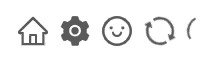
2.自定义图标
<template>
  <div class="custom-icons-list">
    <heart-icon :style="{ color: 'hotpink' }" />
    <panda-icon :style="{ fontSize: '32px' }" />
  </div>
</template>
<script>
const HeartSvg = {
  template: `
    <svg width="1em" height="1em" fill="currentColor" viewBox="0 0 1024 1024">
      <path d="M923 283.6c-13.4-31.1-32.6-58.9-56.9-82.8-24.3-23.8-52.5-42.4-84-55.5-32.5-13.5-66.9-20.3-102.4-20.3-49.3 0-97.4 13.5-139.2 39-10 6.1-19.5 12.8-28.5 20.1-9-7.3-18.5-14-28.5-20.1-41.8-25.5-89.9-39-139.2-39-35.5 0-69.9 6.8-102.4 20.3-31.4 13-59.7 31.7-84 55.5-24.4 23.9-43.5 51.7-56.9 82.8-13.9 32.3-21 66.6-21 101.9 0 33.3 6.8 68 20.3 103.3 11.3 29.5 27.5 60.1 48.2 91 32.8 48.9 77.9 99.9 133.9 151.6 92.8 85.7 184.7 144.9 188.6 147.3l23.7 15.2c10.5 6.7 24 6.7 34.5 0l23.7-15.2c3.9-2.5 95.7-61.6 188.6-147.3 56-51.7 101.1-102.7 133.9-151.6 20.7-30.9 37-61.5 48.2-91 13.5-35.3 20.3-70 20.3-103.3 0.1-35.3-7-69.6-20.9-101.9z" />
    </svg>
  `
}
const PandaSvg = {
  template: `
    <svg viewBox="0 0 1024 1024" width="1em" height="1em" fill="currentColor">
      <path d="M99.096 315.634s-82.58-64.032-82.58-132.13c0-66.064 33.032-165.162 148.646-148.646 83.37 11.91 99.096 165.162 99.096 165.162l-165.162 115.614zM924.906 315.634s82.58-64.032 82.58-132.13c0-66.064-33.032-165.162-148.646-148.646-83.37 11.91-99.096 165.162-99.096 165.162l165.162 115.614z" fill="#6B676E" p-id="1143" />
      <path d="M1024 561.548c0 264.526-229.23 429.42-512.002 429.42S0 826.076 0 561.548 283.96 66.064 512.002 66.064 1024 297.022 1024 561.548z" fill="#FFEBD2" p-id="1144" />
      <path d="M330.324 842.126c0 82.096 81.34 148.646 181.678 148.646s181.678-66.55 181.678-148.646H330.324z" fill="#E9D7C3" p-id="1145" />
      <path d="M644.13 611.098C594.582 528.516 561.55 512 512.002 512c-49.548 0-82.58 16.516-132.13 99.096-42.488 70.814-78.73 211.264-49.548 247.742 66.064 82.58 165.162 33.032 181.678 33.032 16.516 0 115.614 49.548 181.678-33.032 29.18-36.476-7.064-176.93-49.55-247.74z" fill="#FFFFFF" p-id="1146" />
      <path d="M611.098 495.484c0-45.608 36.974-82.58 82.58-82.58 49.548 0 198.194 99.098 198.194 165.162s-79.934 144.904-148.646 99.096c-49.548-33.032-132.128-148.646-132.128-181.678zM412.904 495.484c0-45.608-36.974-82.58-82.58-82.58-49.548 0-198.194 99.098-198.194 165.162s79.934 144.904 148.646 99.096c49.548-33.032 132.128-148.646 132.128-181.678z" fill="#6B676E" p-id="1147" />
      <path d="M512.002 726.622c-30.06 0-115.614 5.668-115.614 33.032 0 49.638 105.484 85.24 115.614 82.58 10.128 2.66 115.614-32.944 115.614-82.58-0.002-27.366-85.556-33.032-115.614-33.032z" fill="#464655" p-id="1148" />
      <path d="M330.324 495.484m-33.032 0a33.032 33.032 0 1 0 66.064 0 33.032 33.032 0 1 0-66.064 0Z" fill="#464655" p-id="1149" />
      <path d="M693.678 495.484m-33.032 0a33.032 33.032 0 1 0 66.064 0 33.032 33.032 0 1 0-66.064 0Z" fill="#464655" p-id="1150" />
    </svg>
  `
}

const HeartIcon = {
  template: `
    <a-icon :component="HeartSvg" />
  `,
  data() {
    return {
      HeartSvg
    }
  }
}

const PandaIcon = {
  template: `
    <a-icon :component="PandaSvg" />
  `,
  data() {
    return {
      PandaSvg
    }
  }
}

export default {
  components: {
    HeartIcon,
    PandaIcon,
  }
}
</script>
<style scoped>
.custom-icons-list >>> .anticon {
  margin-right: 6px;
}
</style>
3.使用 iconfont.cn
<template>
  <div class="icons-list">
    <a-icon type="smile" theme="twoTone" />
    <a-icon type="heart" theme="twoTone" twoToneColor="#eb2f96" />
    <a-icon type="check-circle" theme="twoTone" twoToneColor="#52c41a" />
  </div>
</template>
<style scoped>
.icons-list >>> .anticon {
  margin-right: 6px;
  font-size: 24px;
}
</style>
5.API
| 参数 | 说明 | 类型 | 默认值 |
|---|---|---|---|
type |
图标类型。遵循图标的命名规范 | string |
- |
style |
设置图标的样式,例如 fontSize 和color |
CSSProperties |
- |
theme |
图标主题风格。可选实心、描线、双色等主题风格,适用于官方图标 | 'filled' | 'outlined' | 'twoTone' |
'outlined' |
spin |
是否有旋转动画 | boolean |
false |
component |
控制如何渲染图标,通常是一个渲染根标签为 <svg> 的 Vue 组件,会使 type 属性失效 |
ComponentType<CustomIconComponentProps> |
- |
twoToneColor |
仅适用双色图标。设置双色图标的主要颜色 | string (十六进制颜色) |
- |
SVG 图标
在 1.2.0 之后,我们使用了 SVG 图标替换了原先的 font 图标,从而带来了以下优势:
- 完全离线化使用,不需要从 CDN 下载字体文件,图标不会因为网络问题呈现方块,也无需字体文件本地部署。
- 在低端设备上 SVG 有更好的清晰度。
- 支持多色图标。
- 对于内建图标的更换可以提供更多 API,而不需要进行样式覆盖。
更多讨论可参考:#10353。
⚠️ 1.2.0 之后我们全量引入了所有图标,导致 antd 默认的包体积有一定增加,我们会在不远的>未来增加新的 API 来实现图标的按需使用,更多相关讨论可关注:#12011。
其中theme,component,twoToneColor的英文1.2.x版本新增加的属性最佳实践的英文给使用的。<Icon />组件传入属性theme以明确图标种植的主题风格例如:
的所有图标种植都会以<svg>标签渲染,使用可以style状语从句:class设置图标种植的大小单色状语从句:图标种植的颜色例如:
双色图标主色
对于双色图标,通过可以使用`Icon.getTwoToneColor()`状语从句:`Icon.setTwoToneColor(colorString)`来全局设置图标种植主色。import { Icon } from 'ant-design-vue'
Icon.setTwoToneColor('#eb2f96');
Icon.getTwoToneColor(); // #eb2f96
自定义字体图标#
在1.2.0之后,提供我们一个了createFromIconfontCN方法,开发网求方便者调用在iconfont.cn上自行管理的图标种植。
const MyIcon = Icon.createFromIconfontCN({
  scriptUrl: '//at.alicdn.com/t/font_8d5l8fzk5b87iudi.js', // 在 iconfont.cn 上生成
});
new Vue({
  el: '#app',
  template: '<my-icon type="icon-example" />',
  components: {
    'my-icon': MyIcon,
  }
})
其本质上是创建了一个使用 <use> 标签来渲染图标的组件。
options 的配置项如下:
| 参数 | 说明 | 类型 | 默认值 |
|---|---|---|---|
scriptUrl |
iconfont.cn 项目在线生成的 js 地址 | string |
- |
extraCommonProps |
给所有的 svg 图标 <Icon /> 组件设置额外的属性 |
{ class, attrs, props, on, style } |
{} |
在 scriptUrl 都设置有效的情况下,组件在渲染前会自动引入 iconfont.cn 项目中的图标符号集,无需手动引入。
见 iconfont.cn 使用帮助 查看如何生成 js 地址。
自定义SVG图标
如果使用vue cli 3,可以通过配置VUE-SVG-装载机来将svg图标种植作为Vue组件导入。更多vue-svg-loader的使用方式请参阅文档。
// vue.config.js
module.exports = {
  chainWebpack: (config) => {
    const svgRule = config.module.rule('svg');

    svgRule.uses.clear();

    svgRule
      .use('vue-svg-loader')
      .loader('vue-svg-loader');
  },
};
import MessageSvg from 'path/to/message.svg'; // path to your '*.svg' file.

new Vue({
  el: '#app',
  template: '<a-icon :component="MessageSvg" />',
  data() {
    return {
      MessageSvg
    }
  }
})
Icon的中component组件的接受的属性如下:
| 字段 | 说明 | 类型 | 只读值 |
|---|---|---|---|
width |
svg 元素宽度 |
string | number |
'1em' |
height |
svg 元素高度 |
string | number |
'1em' |
fill |
svg 元素填充的颜色 |
string |
'currentColor' |
class |
计算后的 svg 类名 |
string |
- |
style |
计算后的 svg 元素样式 |
string |
- |
