饭后Android 第五餐-BottomBarLayout轻量级的底部导航栏(BottomBarLayout简介,使用方法(滑动,显示未读数、提示小红点、提示消息),点击旋转动画)
1.BottomBarLayout简介
作者有话说:
目前市场上的App,几乎都有底部页签导航栏,所以我们在开发的时候经常需要用到这个,虽然github上有不少已经封装好的底部导航栏的工具,例如bottombar,alphaIndicator(仿微信滑动渐变底部控件)等,但是这些控件由于功能太多,而且也没有给予详细的介绍文档,所以用起来不是特别容易,有时候我们仅仅只是想要一个简简单单的底部导航,但是又不想去自己在布局中搞一个个LinearLayout或者RadioGroup,然后切换页签的时候更换图标,让ViewPager跳转到对应的页面等一系列繁琐的操作,这时候,你可以使用BottomBarLayout,简简单单就可以实现以下效果:
就我而言:
在现在的很多app开发中,基本的ui设计,都会有底部导航,通过底部导航来实现页面的切换,微信,qq,总而言之,现在几乎所有的app开发,都需要底部导航,而在我以往的开发中,都是通过约束布局的嵌套来实现的,将图片和文字写在一个约束布局里面,然后再写对应的资源文件,虽然原理很简单,但是每次设计都略显无聊,也觉得挺麻烦,所以就想来学习一下底部导航的开源控件,所以现在,让我们一起来学习这个BottomBarLayout轻量级的底部导航栏吧
更新说明

xml属性介绍
    <!--默认状态下的图标-->
    <attr name="iconNormal" format="reference"/>
    <!--选中状态下的图标-->
    <attr name="iconSelected" format="reference"/>
    <!--底部文字-->
    <attr name="itemText" format="string"/>
    <!--文字大小-->
    <attr name="itemTextSize" format="dimension"/>
    <!--默认状态下的文字颜色-->
    <attr name="textColorNormal" format="color"/>
    <!--选中状态下的文字颜色-->
    <attr name="textColorSelected" format="color"/>
    <!--文字和图标的顶部距离-->
    <attr name="itemMarginTop" format="dimension"/>
    <!--是否开启触摸背景效果-->
    <attr name="openTouchBg" format="boolean"/>
    <!--设置触摸背景-->
    <attr name="touchDrawable" format="reference"/>
    <!--设置图标的宽度-->
    <attr name="iconWidth" format="dimension"/>
    <!--设置图标的高度-->
    <attr name="iconHeight" format="dimension"/>
    <!--设置BottomBarItem的padding-->
    <attr name="itemPadding" format="dimension"/>
	 <!--设置未读数字体大小-->
    <attr name="unreadTextSize" format="dimension"/>
    <!--设置提示消息字体大小-->
    <attr name="msgTextSize" format="dimension"/>
    //设置提示点背景
    app:notifyPointBg="@drawable/shape_notify_point"
2.使用方法
1.导入maven仓库地址
在项目根目录下的build.gradle中的allprojects{}中,添加jitpack仓库地址,如下
maven {

     url 'https://jitpack.io' }//添加jitpack仓库地址

2.添加依赖
打开app的module中的build.gradle,在dependencies{}中,添加依赖,如下:
compile 'com.github.chaychan:BottomBarLayout:2.0.2' //建议使用最新版本

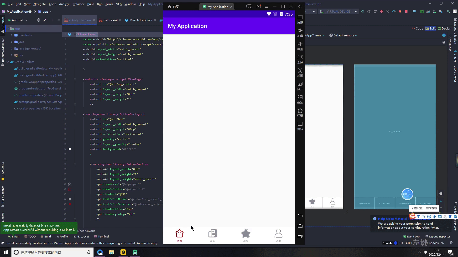
3.添加布局文件
<LinearLayout
    xmlns:android="http://schemas.android.com/apk/res/android"
    xmlns:app="http://schemas.android.com/apk/res-auto"
    android:layout_width="match_parent"
    android:layout_height="match_parent"
    android:orientation="vertical"

    >

    <androidx.viewpager.widget.ViewPager
        android:id="@+id/vp_content"
        android:layout_width="match_parent"
        android:layout_height="0dp"
        android:layout_weight="1"
        />

    <com.chaychan.library.BottomBarLayout
        android:id="@+id/bbl"
        android:layout_width="match_parent"
        android:layout_height="60dp"
        android:orientation="horizontal"
        android:gravity="center"
        android:layout_gravity="center"
        android:background="#ffffff"
        >

        <com.chaychan.library.BottomBarItem
            android:layout_width="0dp"
            android:layout_weight="1"
            android:layout_height="match_parent"
            app:iconNormal="@mipmap/b2"
            app:iconSelected="@mipmap/b1"
            app:itemText="首页"
            app:textColorNormal="@color/tab_normal_color"
            app:textColorSelected="@color/tab_selected_color"
            app:itemTextSize="8sp"
            app:itemMarginTop="5dp"
            />

        <com.chaychan.library.BottomBarItem
            android:layout_width="0dp"
            android:layout_weight="1"
            android:layout_height="match_parent"
            app:iconNormal="@mipmap/b3"
            app:iconSelected="@mipmap/b4"
            app:itemText="看点"
            app:textColorNormal="@color/tab_normal_color"
            app:textColorSelected="@color/tab_selected_color"
            app:itemTextSize="8sp"
            app:itemMarginTop="5dp"
            />


        <com.chaychan.library.BottomBarItem
            android:layout_width="0dp"
            android:layout_weight="1"
            android:layout_height="match_parent"
            app:iconNormal="@mipmap/b6"
            app:iconSelected="@mipmap/b5"
            app:itemText="动态"
            app:textColorNormal="@color/tab_normal_color"
            app:textColorSelected="@color/tab_selected_color"
            app:itemTextSize="8sp"
            app:itemMarginTop="5dp"
            />

        <com.chaychan.library.BottomBarItem
            android:layout_width="0dp"
            android:layout_weight="1"
            android:layout_height="match_parent"
            app:iconNormal="@mipmap/b10"
            app:iconSelected="@mipmap/b9"
            app:itemText="我的"
            app:textColorNormal="@color/tab_normal_color"
            app:textColorSelected="@color/tab_selected_color"
            app:itemTextSize="8sp"
            app:itemMarginTop="5dp"
            />

    </com.chaychan.library.BottomBarLayout>

</LinearLayout>
运行(这样底部的切换就已经实现了)
4.关联fragment
第一步先实例化控件,拿到对应的viewpager
第二步.创建viewpager的适配器
第三步创建所需要的fragment
第四步添加数据到适配器中,将fragment放入list数组
第五步将adapter绑定到viewpager上


MainActivity 代码
public class MainActivity extends AppCompatActivity {


    ViewPager mViewPager;
    BottomBarLayout mBottomBarLayout;
     List<Fragment> pageLists;

    @Override
    protected void onCreate(Bundle savedInstanceState) {


        super.onCreate(savedInstanceState);
        setContentView(R.layout.activity_main);

        mBottomBarLayout=findViewById(R.id.bbl);
        mViewPager=findViewById(R.id.vp_content);
        initData();

    }

    private void initData() {


        pageLists=new ArrayList<>();//list里面fragment,
        pageLists.add(new HeadFragment());
        pageLists.add(new NewsFragment());
        pageLists.add(new DongtaiFragment());
        pageLists.add(new MineFragment());

        mViewPager.setAdapter(new fragmentAdapter(getSupportFragmentManager()));
        mBottomBarLayout.setViewPager(mViewPager);//底部bottombar;

    }
    /*
     *
     * viewpager适配器
     *
     * */
    public class fragmentAdapter extends FragmentPagerAdapter {


        public fragmentAdapter(FragmentManager fm) {


            super(fm);
        }

        @Override
        public Fragment getItem(int position) {


            return pageLists.get(position);
        }

        @Override
        public int getCount() {


            return pageLists.size();
        }
    }
}
运行
5.开启滑动效果
一句代码,滑动效果默认是关闭的,打开就好
mBottomBarLayout.setSmoothScroll(true);//开启滑动效果
运行

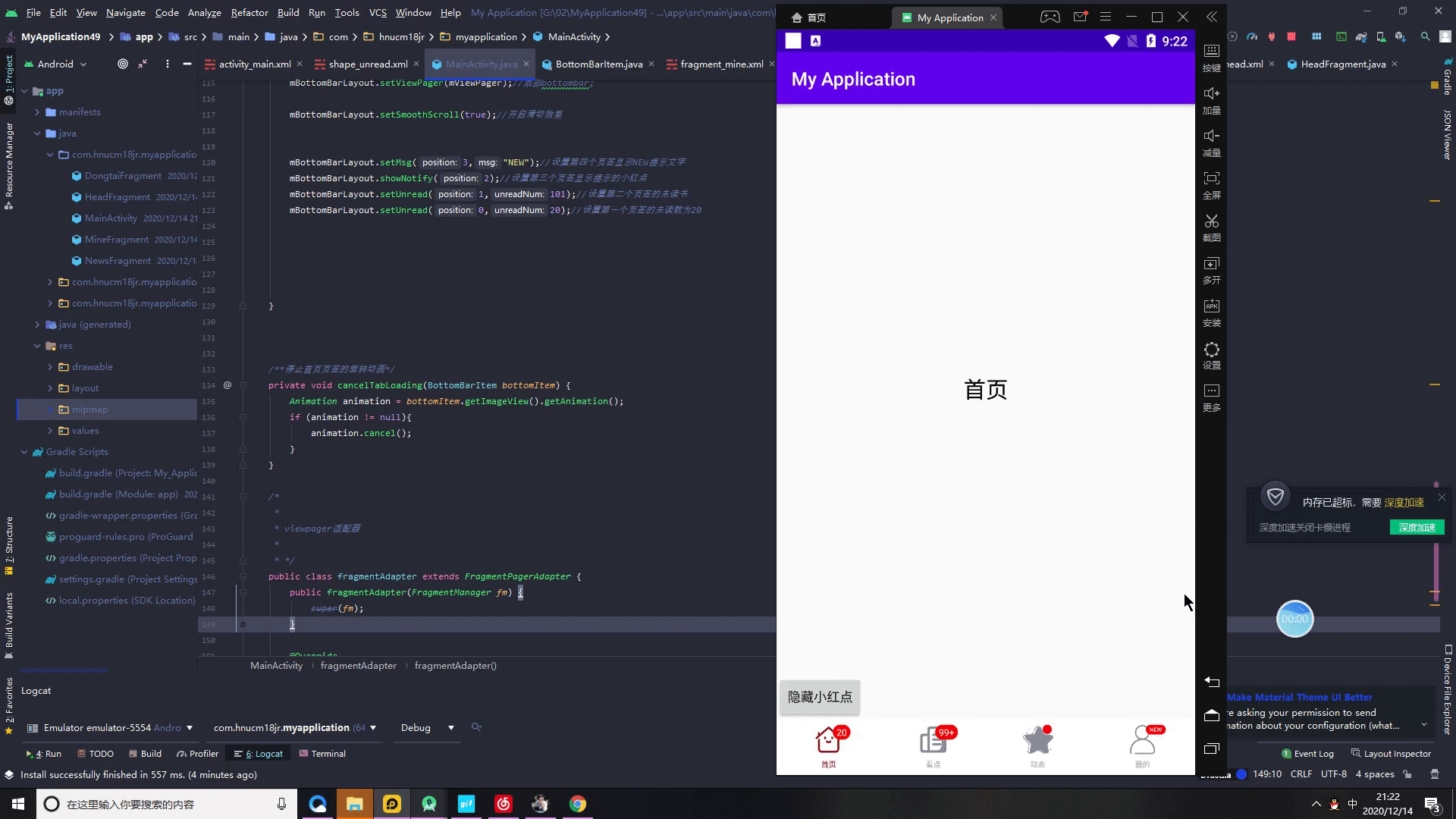
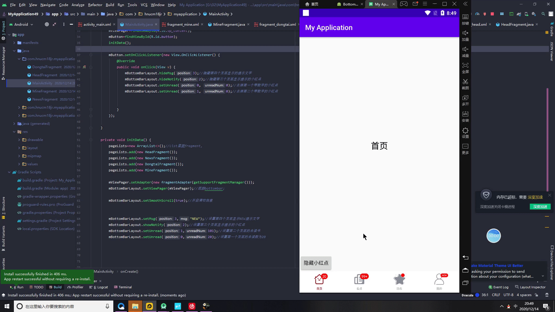
6.显示未读数、提示小红点、提示消息
当设置的未读数小于或等于0时,消失未读数的小红点将会消失;
当未读数为1-99时,则显示对应的数字;
当未读数大于99时,显示99+;
  mBottomBarLayout.setMsg(3,"NEW");//设置第四个页签显示NEW提示文字
        mBottomBarLayout.showNotify(2);//设置第三个页签显示提示的小红点
        mBottomBarLayout.setUnread(1,101);//设置第二个页签的未读书
        mBottomBarLayout.setUnread(0,20);//设置第一个页签的未读数为20

隐藏提示小红点、提示消息的方法
hideMsg-隐藏文字
hideNotify-隐藏红点
setUnread-设置红点数为0
  mBottomBarLayout.hideMsg(3);//隐藏第四个页签显示的提示文字
                mBottomBarLayout.hideNotify(2);//隐藏第三个页签显示提示的小红点
                mBottomBarLayout.setUnread(0, 0);//去掉第一个带数字的小红点
                mBottomBarLayout.setUnread(1, 0);//去掉第二个带数字的小红点

这里我们为了测试,添加一个按钮
3.BottomBarItem介绍(点击旋转动画)
BottomBarItem继承于LinearLayout,其子View有显示图标的ImageView和展示文字的TextView,分别可以通过getImageView()和getTextView()方法获取到对应的子控件。github上不少底部导航栏的控件都没能获取到对应的子控件,所以在需要对子控件进行操作的时候极不方便,有一些的思路并不是用ImageView和TextView,而是用绘制的,所以也不能获取到对应的显示图标的控件或展示文字的控件,造成无法获取到该控件,无法进行一些业务上的操作,比如类似今日头条的底部的首页,点击首页的页签,会更换成加载中的图标,执行旋转动画,BottomBarLayout可以轻松地做到这个需求。
代码
Handler mHandler = new Handler();
    RotateAnimation mRotateAnimation;

 mBottomBarLayout.setOnItemSelectedListener(new BottomBarLayout.OnItemSelectedListener() {


            @Override
            public void onItemSelected(final BottomBarItem bottomBarItem, int previousPosition, final int currentPosition) {


                Log.i("MainActivity", "position: " + currentPosition);
                if (currentPosition == 0) {


                    //如果是第一个,即首页
                    if (previousPosition == currentPosition) {


                        //如果是在原来位置上点击,更换首页图标并播放旋转动画
                        if (mRotateAnimation != null && !mRotateAnimation.hasEnded()){


                            //如果当前动画正在执行
                            return;
                        }

                        bottomBarItem.setSelectedIcon(R.mipmap.zhuan);//更换成加载图标

                        //播放旋转动画
                        if (mRotateAnimation == null) {


                            mRotateAnimation = new RotateAnimation(0, 360,
                                    Animation.RELATIVE_TO_SELF, 0.5f, Animation.RELATIVE_TO_SELF,
                                    0.5f);
                            mRotateAnimation.setDuration(800);
                            mRotateAnimation.setRepeatCount(-1);
                        }
                        ImageView bottomImageView = bottomBarItem.getImageView();
                        bottomImageView.setAnimation(mRotateAnimation);
                        bottomImageView.startAnimation(mRotateAnimation);//播放旋转动画

                        //模拟数据刷新完毕
                        mHandler.postDelayed(new Runnable() {


                            @Override
                            public void run() {


                                boolean tabNotChanged = mBottomBarLayout.getCurrentItem() == currentPosition; //是否还停留在当前页签
                                bottomBarItem.setSelectedIcon(R.mipmap.b1);//更换成首页原来选中图标
                                cancelTabLoading(bottomBarItem);
                            }
                        }, 3000);
                        return;
                    }
                }

                //如果点击了其他条目
                BottomBarItem bottomItem = mBottomBarLayout.getBottomItem(0);
                bottomItem.setSelectedIcon(R.mipmap.b1);//更换为原来的图标

                cancelTabLoading(bottomItem);//停止旋转动画
            }
        });

    /**停止首页页签的旋转动画*/
    private void cancelTabLoading(BottomBarItem bottomItem) {


        Animation animation = bottomItem.getImageView().getAnimation();
        if (animation != null){


            animation.cancel();
        }
    }

运行

ok关于底部导航BottomBarLayout的介绍就到这里啦,谢谢您的阅读和支持
博主为了可以学到更多的Android知识,创建了一个安卓知识交流群,欢迎大佬入群,当然也欢迎和我一样的安卓小白,我们可以一起交流,最重要的是快乐水群,记得定个小目标,冲击bat