文章目录
参考 3.4 按钮
Button
Flutter 提供了三个基本的按钮控件,即 FloatingActionButton、FlatButton 、RaisedButton、OutlineButton、IconButton。
按钮提供了点击onPressed和长按onLongPress事件
FloatingActionButton
圆形的按钮,一般出现在屏幕内容的前面,用来处理界面中最常用、最基础的用户动作。
FloatingActionButton(
  onPressed: () {},
  tooltip: 'Increment',
  child: Icon(Icons.add),
),

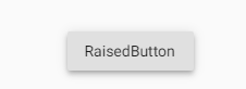
RaisedButton
凸起的按钮,默认带有灰色背景,被点击后灰色背景会加深。
RaisedButton(
  child: Text("RaisedButton"),
  onPressed: () {},
),

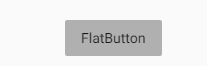
FlatButton
扁平化的按钮,默认透明背景,被点击后会呈现灰色背景。
FlatButton(
	child: Text("FlatButton"),
	onPressed: () {},
),

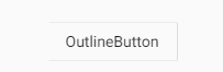
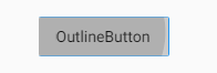
OutlineButton
OutlineButton默认有一个边框,不带阴影且背景透明。按下后,边框颜色会变亮、同时出现背景和阴影(较弱),
OutlineButton(
  child: Text("OutlineButton"),
  onPressed: () {},
),
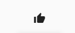
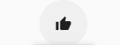
IconButton
IconButton是一个可点击的Icon,不包括文字,默认没有背景,获取焦点后显示背景。
IconButton(
  icon: Icon(Icons.thumb_up),
  onPressed: () {},
),
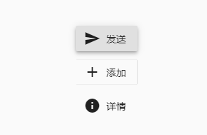
带图标的按钮
RaisedButton、FlatButton、OutlineButton都有一个icon 构造函数,通过它可以创建带图标的按钮。
例如:
RaisedButton.icon(
 icon: Icon(Icons.send),
  label: Text("发送"),
  onPressed: () {},
),
OutlineButton.icon(
  icon: Icon(Icons.add),
  label: Text("添加"),
  onPressed: () {},
),
FlatButton.icon(
  icon: Icon(Icons.info),
  label: Text("详情"),
  onPressed: () {},
),
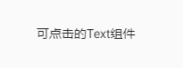
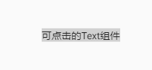
InkWell
给其他控件添加水波纹点击效果
InkWell(
  onTap: () {},
  child:Text(
   "可点击的Text组件"
  ),
)
按钮的样式定制
查看FlatButton源码了解button有哪些属性:
 const FlatButton({
    Key key,
    @required VoidCallback onPressed, // 点击回调
    VoidCallback onLongPress,//长按回调
    ValueChanged<bool> onHighlightChanged,
    ButtonTextTheme textTheme,
    Color textColor,//按钮文字颜色
    Color disabledTextColor,//按钮禁用时的文字颜色
    Color color,//按钮背景颜色
    Color disabledColor,//按钮禁用时的背景颜色
    Color focusColor,//按钮按下时的背景颜色
    Color hoverColor,//悬停时的背景颜色
    Color highlightColor,//高亮时背景颜色
    Color splashColor,//点击时,水波动画中水波的颜色
    Brightness colorBrightness,//按钮主题,默认是浅色主题
    EdgeInsetsGeometry padding,//按钮的内边距
    ShapeBorder shape,//外形
    Clip clipBehavior = Clip.none,
    FocusNode focusNode,
    bool autofocus = false,
    MaterialTapTargetSize materialTapTargetSize,
    @required Widget child,//按钮的内容
  })
其中shape有下面三种:
- RoundedRectangleBorder:圆形矩形边框
- ContinuousRectangleBorder:连续矩形边框
- BeveledRectangleBorder : 斜角矩形边框
RoundedRectangleBorder 圆角按钮

 RaisedButton(
	  color: Colors.blue, // 按钮背景色
	  highlightColor: Colors.blue[700],// 按钮高亮后的背景色
	  colorBrightness: Brightness.dark,// 使用深色主题,保证按钮文字颜色为浅色
	  splashColor: Colors.grey,// 点击时,水波动画中水波的颜色
	  child: Text("Submit"),// 文本
	  shape: RoundedRectangleBorder(
	      borderRadius: BorderRadius.circular(20.0)), //圆角矩形
	  onPressed: () {},
)
ContinuousRectangleBorder 连续矩形边框
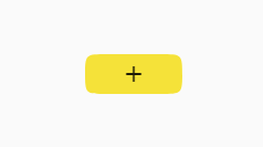
FlatButton(
   color: Colors.yellow, //设置背景色为黄色
   shape: ContinuousRectangleBorder(
       borderRadius: BorderRadius.circular(20.0)), //设置斜角矩形边框
   colorBrightness: Brightness.light, //使用亮色主题,保证按钮文字颜色为深色
   onPressed: () {},
   child: Icon(Icons.add)
)
BeveledRectangleBorder 斜角矩形按钮
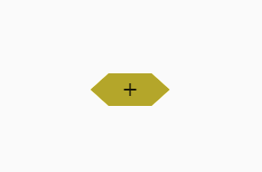
FlatButton(
    color: Colors.yellow, //设置背景色为黄色
    shape: BeveledRectangleBorder(
        borderRadius: BorderRadius.circular(20.0)), //设置斜角矩形边框
    colorBrightness: Brightness.light, //使用亮色主题,保证按钮文字颜色为深色
    onPressed: () {},
    child: Icon(Icons.add)
)
完~
