先引用一段W3C的文档:
那么脱离文档流是什么样子的呢?下面是上锤子的时间~ 以前面文档里写的三种布局方式为例
下文中文档的HTML代码如下:
9.3 Positioning schemes来源: Visual formatting modelIn CSS 2.1, a box may be laid out according to three positioning schemes:
- Normal flow. In CSS 2.1, normal flow includes block formatting of block-level boxes, inline formatting of inline-level boxes, and relative positioning of block-level and inline-level boxes.
- Floats. In the float model, a box is first laid out according to the normal flow, then taken out of the flow and shifted to the left or right as far as possible. Content may flow along the side of a float.
- Absolute positioning. In the absolute positioning model, a box is removed from the normal flow entirely (it has no impact on later siblings) and assigned a position with respect to a containing block.
An element is called out of flow if it is floated, absolutely positioned, or is the root element. An element is called in-flow if it is not out-of-flow. The flow of an element A is the set consisting of A and all in-flow elements whose nearest out-of-flow ancestor is A.
Q: 脱离文档流就不占据空间了吗?
A: 可以这么说。更准确地一点说,是一个元素脱离文档流(out of normal flow)之后,其他的元素在定位的时候会当做没看见它,两者位置重叠都是可以的。Q: 脱离文档流是不是指该元素从dom树中脱离?
A: 不是,用浏览器的审查元素就可以看到脱离文档流的元素(例如被float了)依然会出现在dom树里,下面的截图里也可以看到。那么脱离文档流是什么样子的呢?下面是上锤子的时间~ 以前面文档里写的三种布局方式为例
下文中文档的HTML代码如下:
<body>
    <div id="outofnormal">
        Out of normal:
        Lorem ipsum dolor sit amet, consectetur adipisicing elit. Sequi esse impedit autem praesentium magni culpa, amet corporis, veniam consequatur voluptates temporibus. Voluptates eius similique asperiores cupiditate fugit hic atque quisquam?
    </div>
    <h2>Normal Content</h2>
    <p>Lorem ipsum dolor sit amet, consectetur adipisicing elit. Nostrum praesentium nam tempora beatae quis nobis laboriosam alias aliquid, tenetur exercitationem. Odio, aperiam, illo! Eveniet natus dignissimos architecto velit eligendi id!</p>
    <p>Lorem ipsum dolor sit amet, consectetur adipisicing elit. Rem reprehenderit velit nam delectus distinctio at unde aliquid officia illo, tempore vitae et incidunt non, ut eos nesciunt quaerat. Enim, minus.</p>
</body>
#outofnormal {
    width: 200px;
    background-color: cyan;
    padding: 10px;
}
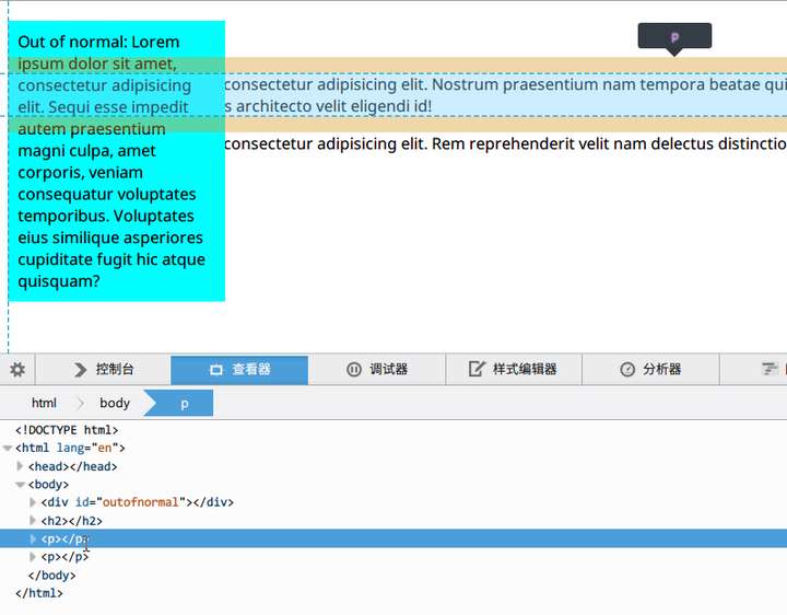
首先普通情况下(也就是在normal flow里)是这样的
要被玩的div: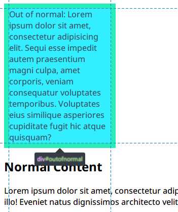

跟在后面的h2:

可以看到两者是垂直排列,padding互相顶着。3D视图的话就是这样,大家排排坐:


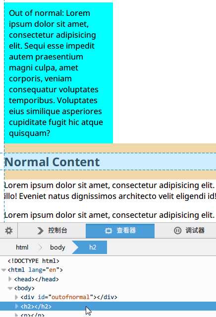
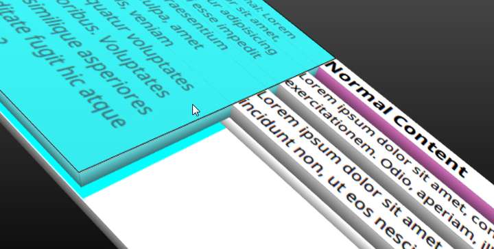
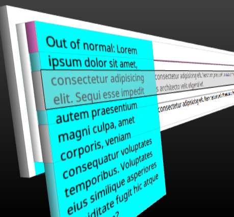
第二种情况加上float:left之后:
加上float:left了之后,蓝色的div就脱离文档流了,变成了这样:
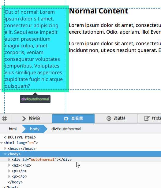
因为蓝色的div脱离了文档流,跟在后面的h2和p的
盒子都当做没看到这个div的样子去定位,所以他们都顶着浏览器左边和顶部的边框。但是有趣的是,h2和p里面的
文本(属于content flow)却都看到了这个被float的div,在自己的盒子里往右推,飘到了蓝色div的边上。这就是float的特性,其他盒子看不见被float的元素,但是其他盒子里的文本看得见。

3D视图的话就是这样。我插~


我插~

我插~

为什么能插呢?因为蓝色div被旁边的盒子无视了呀~
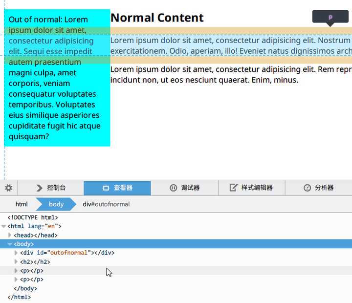
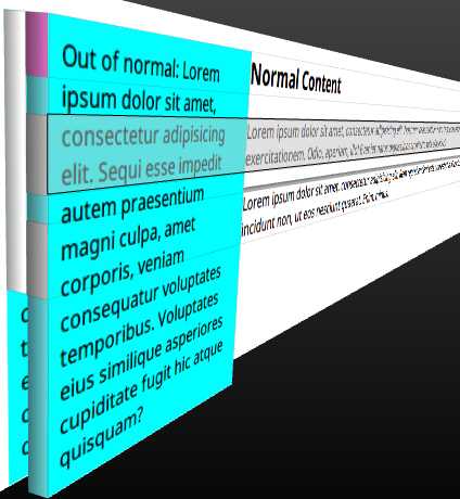
第三种情况:absolute positioning。
删掉float: left,加上postion: absolute。和float一样的是,旁边的盒子无视了蓝色div的存在,也是顶着左边边框定位。但是~ 文本也无视了蓝色div的存在,顶着左边边框定位!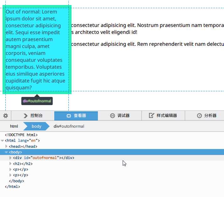

3D视图下也是成功无视之,插入~

总结:
脱离文档流,也就是将元素从普通的布局排版中拿走,其他盒子在定位的时候,会当做脱离文档流的元素不存在而进行定位。需要注意的是,使用float脱离文档流时,其他盒子会无视这个元素,但其他盒子内的文本依然会为这个元素让出位置,环绕在周围。而对于使用absolute positioning脱离文档流的元素,其他盒子与其他盒子内的文本都会无视它。参考