现在大部分android手机都是android4.4以上,都支持开发者可以自定义状态栏色值,原来的黑底白字时代已过去。在android5.0上我们还可以自定义状态栏文字色值,让其显示深色字体。
一、沉浸式状态栏的实现
实现沉浸式状态栏效果,一般有两种方式:
1、设置系统主题,在styles.xml中设置,在相应需要实现的界面里设置其android:theme主题。
需要根据不同机器版本设置多个styles.xml文件。
下面是values-v21下的styles.xml—android5.0以上机器适用的主题
 <style name="AppTheme" parent="AppTheme.Base">
        <item name="android:colorPrimary">@color/colorPrimary</item>
        <item name="android:colorPrimaryDark">@color/colorPrimaryDark</item>
        <item name="android:colorAccent">@color/colorAccent</item>
        <item name="android:windowDrawsSystemBarBackgrounds">false</item>
        <item name="android:windowTranslucentStatus">true</item>
    </style>
- 1
- 2
- 3
- 4
- 5
- 6
- 7
在values-v19中的styles.xml中设置如下:
<style name="AppTheme"parent="@style/BaseAppTheme">
    <item name="android:windowTranslucentStatus">true</item>
</style>
- 1
- 2
- 3
而在values的styles.xml中则不设置任何属性。
2、在代码中设置界面,也需要区分不同的android版本
5.0以上并设置界面全屏,并设置状态栏背景颜色,在4.4的机器上,则设置FLAG_TRANSLUCENT_STATUS属性。
具体设置代码如下:
protected void setStatusBar() {
        if (Build.VERSION.SDK_INT >= Build.VERSION_CODES.LOLLIPOP) {//5.0及以上
            View decorView = getWindow().getDecorView();
            int option = View.SYSTEM_UI_FLAG_LAYOUT_FULLSCREEN
                    | View.SYSTEM_UI_FLAG_LAYOUT_STABLE;
            decorView.setSystemUiVisibility(option);
            getWindow().setStatusBarColor(getResources().getColor(R.color.colorTheme));
        } else if (Build.VERSION.SDK_INT >= Build.VERSION_CODES.KITKAT) {//4.4到5.0
            WindowManager.LayoutParams localLayoutParams = getWindow().getAttributes();
            localLayoutParams.flags = (WindowManager.LayoutParams.FLAG_TRANSLUCENT_STATUS | localLayoutParams.flags);
        }
    }
- 1
- 2
- 3
- 4
- 5
- 6
- 7
- 8
- 9
- 10
- 11
- 12
若要背景图也延伸到系统窗口,一般通过将状态栏设成透明色,这样就可以实现背景图延伸到状态栏。
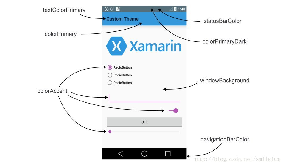
下面对以上用到的一些属性进行归纳总结:
| 属性 | 注意事项 | 优缺点 | 失效情况 | 适用情况 |
|---|---|---|---|---|
| windowTranslucentStatus | 透明状态栏(Android 4.4系统效果为透明状态,5.0及其以后系统效果为半透明状态)在styles.xml(v19)中设置 | |||
| windowTranslucentNavigation | 透明导航栏(android4.4以上支持),在styles.xml(v19)中设置 | |||
| windowDrawsSystemBarBackgrounds | 使导航栏和状态栏可绘制(android5.0以上支持),即状态栏是否覆盖在ContentView上,在styles.xml(v21)中设置 | |||
| android:statusBarColor | 状态栏颜色 | |||
| android:colorPrimary | 标题栏背景颜色 | |||
| android:colorPrimaryDark | 状态栏透明层颜色 | |||
| android:colorAccent | 一般如floatingActionBar按钮的颜色,RadioButton/输入框聚焦/进度条等色值 | |||
| android:textColorPrimary | 标题栏文字色值 | |||
| android:windowBackground | 窗口背景色 |
对应在界面上效果是:
二、fitSystemWindows属性
android:fitsSystemWindows设置成true确保应用内容不会和系统窗口(状态栏和底下的虚拟导般栏)重叠。通过在 View 上设置和系统窗口一样高度的边框(padding )来确保应用内容不会出现到系统窗口下面。
注意事项:如果多个View设置了android:fitsSystemWindows=”true”,则只有初始的view起作用,都是从第一个设置了fitsSystemWindows的view开始计算paddin(即如果在布局中不是最外层控件设置fitsSystemWindows,那么设置的那个控件高度会多出一个状态栏高度);View 的其他 padding 值被重新改写了,在使用 fitsSystemWindows 为 true 的View 上设置 padding 值(paddingLeft/paddingTop/ 等)是没有效果。
优点:系统会自己计算好布局距状态栏的高度,使界面内容布局位于状态栏下方和导航栏上方。
缺点:若有背景图需要延伸到系统窗口(状态栏)时无法实现,需要借助如DrawerLayout,NavigationView,coordinatorlayout等控件,这些控件对dispatchApplyWindowInsets进行了处理。
如下图所示,如果没有借助上述的控件,则上面的图片无法延伸至状态栏。
三、使背景图片延伸至状态栏
如果我们可以不借助上述控件,但也希望上面的图片延伸到状态栏呢,我们可以将状态栏设置成透明状态,不使用fitSystemWindow属性,并将标题栏设置paddingTop状态栏的高度。
/**
* 获取状态栏高度
* @return
*/
private int getStatusBarHeight() {
    int result = 0;
    int resourceId = getResources().getIdentifier("status_bar_height", "dimen", "android");
    if (resourceId > 0) {
        result = getResources().getDimensionPixelSize(resourceId);
    }
    return result;
}

//设置布局距离状态栏高度
public static void setLayoutPadding(Activity activity, DrawerLayout drawerLayout) {
ViewGroup contentLayout = (ViewGroup) drawerLayout.getChildAt(0);
        contentLayout.getChildAt(1)
                    .setPadding(contentLayout.getPaddingLeft(), getStatusBarHeight() + contentLayout.getPaddingTop(),
                            contentLayout.getPaddingRight(), contentLayout.getPaddingBottom());
    }
- 1
- 2
- 3
- 4
- 5
- 6
- 7
- 8
- 9
- 10
- 11
- 12
- 13
- 14
- 15
- 16
- 17
- 18
- 19
- 20
- 21
优点:背景图可以延伸到状态栏
缺点:不同的android版本需要计算titlebar高度,稍微复杂一些
实现效果如下:
四、标题栏折叠实现
若要使上图2中的页面,向上滑动时,头图慢慢消失,当要显示现在的列表时,标题栏显示在最顶上,如下图效果,就需要结合CoordinatorLayout与CollapsingToolbarLayout结合使用。

具体实现布局如下:
 <android.support.design.widget.CoordinatorLayout xmlns:android="http://schemas.android.com/apk/res/android"
        xmlns:app="http://schemas.android.com/apk/res-auto"
        android:id="@+id/main_content"
        android:layout_width="match_parent"
        android:layout_height="match_parent"
        android:fitsSystemWindows="true">

        <android.support.design.widget.AppBarLayout
            android:id="@+id/appbar"
            android:layout_width="match_parent"
            android:layout_height="200dp"
            android:fitsSystemWindows="true"
            android:theme="@style/ThemeOverlay.AppCompat.Dark.ActionBar">

            <android.support.design.widget.CollapsingToolbarLayout
                android:id="@+id/collapsing_toolbar"
                android:layout_width="match_parent"
                android:layout_height="match_parent"
                android:fitsSystemWindows="true"
                app:contentScrim="?attr/colorPrimary"
                app:expandedTitleMarginEnd="64dp"
                app:expandedTitleMarginStart="48dp"
             app:layout_scrollFlags="scroll|exitUntilCollapsed">

                <ImageView
                    android:id="@+id/logo"
                    android:layout_width="match_parent"
                    android:layout_height="match_parent"
                    android:background="@mipmap/header_img"
                    android:contentDescription="@null"
                    android:fitsSystemWindows="true"
                    android:scaleType="fitCenter"
                    app:layout_collapseMode="parallax"
                    app:layout_collapseParallaxMultiplier="0.1" />

                <android.support.v7.widget.Toolbar
                    android:id="@+id/toolbar"
                    android:layout_width="match_parent"
                    android:layout_height="?attr/actionBarSize"
                    app:layout_collapseMode="pin"
                    app:popupTheme="@style/ThemeOverlay.AppCompat.Light" />

            </android.support.design.widget.CollapsingToolbarLayout>

        </android.support.design.widget.AppBarLayout>

        <android.support.v4.widget.NestedScrollView
            android:id="@+id/nested_scroll_view"
            android:layout_width="match_parent"
            android:layout_height="match_parent"
            app:layout_behavior="@string/appbar_scrolling_view_behavior">

            <TextView
                android:layout_width="match_parent"
                android:layout_height="wrap_content"
                android:text="@string/large_text" />

        </android.support.v4.widget.NestedScrollView>

        <android.support.design.widget.FloatingActionButton
            android:id="@+id/floating_action_button"
            android:layout_width="wrap_content"
            android:layout_height="wrap_content"
            android:layout_margin="@dimen/fab_margin"
            android:clickable="true"
            android:src="@mipmap/ic_star_black_24dp"
            app:layout_anchor="@id/appbar"
            app:layout_anchorGravity="bottom|right|end" />

    </android.support.design.widget.CoordinatorLayout>
- 1
- 2
- 3
- 4
- 5
- 6
- 7
- 8
- 9
- 10
- 11
- 12
- 13
- 14
- 15
- 16
- 17
- 18
- 19
- 20
- 21
- 22
- 23
- 24
- 25
- 26
- 27
- 28
- 29
- 30
- 31
- 32
- 33
- 34
- 35
- 36
- 37
- 38
- 39
- 40
- 41
- 42
- 43
- 44
- 45
- 46
- 47
- 48
- 49
- 50
- 51
- 52
- 53
- 54
- 55
- 56
- 57
- 58
- 59
- 60
- 61
- 62
- 63
- 64
- 65
- 66
- 67
- 68
- 69
- 70
具体使用方法:CoordinatorLayout作为最外层容器,AppBarLayout作为第一个子view,还包含一个NestedScrollView作为一起滑动的控件,CollapsingToolbarLayout嵌套在AppBarLayout里,AppBarLayout里面又嵌套ImageView和Toolbar。
1、CoordinatorLayout
CoordinatorLayout是用来协调其子view们之间动作的一个父view。
类似于FrameLayout,根布局,能实现的效果:
1) 让浮动操作按钮上下滑动,为Snackbar留出空间。
2) 扩展或者缩小Toolbar或者头部,让主内容区域有更多的空间。
3) 控制哪个view应该扩展还是收缩,以及其显示大小比例,包括视差滚动效果动画。
我们在NestedScrollView中设置了behavior属性,
它主要用来给CoordinatorLayout的子view们实现交互的。
2、AppBarLayout
AppBarLayout是一种支持响应滚动手势的app bar布局(比如工具栏滚出或滚入屏幕);与AppBarLayout组合的滚动布局有(Recyclerview、NestedScrollView等),这需要相应的控件设置app:layout_behavior=”@string/appbar_scrolling_view_behavior”(上面代码中NestedScrollView控件所设置的)。没有设置的话,AppBarLayout将不会响应滚动布局的滚动事件。
3、CollapsingToolbarLayout
CollapsingToolbarLayout是专门用来实现子布局内不同元素响应滚动细节的布局。
在CollapsingToolbarLayout中,设置了以下以个参数:
1) //当完全CollapsingToolbarLayout折叠(收缩)后的背景颜色。
app:contentScrim=”?attr/colorPrimary”
2) //设置扩张时候(还没有收缩时)title距离左边的距离
app:expandedTitleMarginStart=”48dp”
3) //设置扩张时候(还没有收缩时)title距离右边的距离
app:expandedTitleMarginEnd=”64dp”
4)//scroll:设置该控件能滚动, exitUntilCollapsed: 向上滚动时收缩View,Toolbar一直固定在上面
app:layout_scrollFlags=”scroll|exitUntilCollapsed”
具体layout_scrollFlags还有其他三个设置:
1) enterAlways - 实现quick return效果, 当向下移动时,立即显示View(比如Toolbar)。
2) enterAlwaysCollapsed - 当你的View已经设置minHeight属性又使用此标志时,那么view将在到达这个最小高度的时候开始显示,并且从这个时候开始慢慢展开,当滚动到顶部的时候展开完。
3) snap:当一个滚动事件结束,如果视图是部分可见的,那么它将被滚动到收缩或展开。例如,如果视图只有底部25%显示,它将折叠。相反,如果它的底部75%可见,那么它将完全展开。
CollapsingToolbarLayout还可以进行一些其他设置:
1) app:contentScrim:设置折叠时标题栏布局的颜色,默认colorPrimary的色值
2) app:statusBarScrim:设置折叠时状态栏的颜色。默认colorPrimaryDark的色值。
4、Toolbar
这里设置了app:layout_collapseMode=”pin”
pp:layout_collapseMode有三种设置:
1) off:这个是默认属性,布局将正常显示,没有折叠的行为。
2) pin:CollapsingToolbarLayout折叠后,此布局将固定在顶部。
3) parallax:CollapsingToolbarLayout折叠时,此布局也会有视差折叠效果。
若设置了parallax模式时,还可以通过app:layout_collapseParallaxMultiplier设置视差滚动因子,值为:0~1。
5、NestedScrollView
这里设置了app:layout_behavior属性,
app:layout_behavior=”@string/appbar_scrolling_view_behavior”
behavior属性主要是设置了ScrollView与AppBarLayout的相互依赖关系,以非侵入的为View添加动态的依赖布局,和处理父布局(CoordinatorLayout)滑动手势。
具体原码如下:
/**
     * Behavior which should be used by {@link View}s which can scroll vertically and support
     * nested scrolling to automatically scroll any {@link AppBarLayout} siblings.
     */
     public static class ScrollingViewBehavior extends HeaderScrollingViewBehavior {

        public ScrollingViewBehavior() {}

        public ScrollingViewBehavior(Context context, AttributeSet attrs) {

        }

        @Override
        public boolean layoutDependsOn(CoordinatorLayout parent, View child, View dependency) {
            // We depend on any AppBarLayouts
            return dependency instanceof AppBarLayout;
        }

        @Override
        public boolean onDependentViewChanged(CoordinatorLayout parent, View child,
                View dependency) {
            offsetChildAsNeeded(parent, child, dependency);
            return false;
        }

        @Override
        public boolean onRequestChildRectangleOnScreen(CoordinatorLayout parent, View child,
                Rect rectangle, boolean immediate) {

        }

        private void offsetChildAsNeeded(CoordinatorLayout parent, View child, View dependency) {

        }

        @Override
        float getOverlapRatioForOffset(final View header) {

        }

        private static int getAppBarLayoutOffset(AppBarLayout abl) {

        }

        @Override
        AppBarLayout findFirstDependency(List<View> views) {

        }

        @Override
        int getScrollRange(View v) {

        }
    }
- 1
- 2
- 3
- 4
- 5
- 6
- 7
- 8
- 9
- 10
- 11
- 12
- 13
- 14
- 15
- 16
- 17
- 18
- 19
- 20
- 21
- 22
- 23
- 24
- 25
- 26
- 27
- 28
- 29
- 30
- 31
- 32
- 33
- 34
- 35
- 36
- 37
- 38
- 39
- 40
- 41
- 42
- 43
- 44
- 45
- 46
- 47
- 48
- 49
- 50
- 51
- 52
- 53
- 54
下面给出一个实现沉浸式状态栏的demo,欢迎star
https://github.com/xiewenfeng/CollapseToolBar
        <link rel="stylesheet" href="https://csdnimg.cn/release/phoenix/template/css/markdown_views-ea0013b516.css">
            </div>
现在大部分android手机都是android4.4以上,都支持开发者可以自定义状态栏色值,原来的黑底白字时代已过去。在android5.0上我们还可以自定义状态栏文字色值,让其显示深色字体。
一、沉浸式状态栏的实现
实现沉浸式状态栏效果,一般有两种方式:
1、设置系统主题,在styles.xml中设置,在相应需要实现的界面里设置其android:theme主题。
需要根据不同机器版本设置多个styles.xml文件。
下面是values-v21下的styles.xml—android5.0以上机器适用的主题
 <style name="AppTheme" parent="AppTheme.Base">
        <item name="android:colorPrimary">@color/colorPrimary</item>
        <item name="android:colorPrimaryDark">@color/colorPrimaryDark</item>
        <item name="android:colorAccent">@color/colorAccent</item>
        <item name="android:windowDrawsSystemBarBackgrounds">false</item>
        <item name="android:windowTranslucentStatus">true</item>
    </style>
- 1
- 2
- 3
- 4
- 5
- 6
- 7
在values-v19中的styles.xml中设置如下:
<style name="AppTheme"parent="@style/BaseAppTheme">
    <item name="android:windowTranslucentStatus">true</item>
</style>
- 1
- 2
- 3
而在values的styles.xml中则不设置任何属性。
2、在代码中设置界面,也需要区分不同的android版本
5.0以上并设置界面全屏,并设置状态栏背景颜色,在4.4的机器上,则设置FLAG_TRANSLUCENT_STATUS属性。
具体设置代码如下:
protected void setStatusBar() {
        if (Build.VERSION.SDK_INT >= Build.VERSION_CODES.LOLLIPOP) {//5.0及以上
            View decorView = getWindow().getDecorView();
            int option = View.SYSTEM_UI_FLAG_LAYOUT_FULLSCREEN
                    | View.SYSTEM_UI_FLAG_LAYOUT_STABLE;
            decorView.setSystemUiVisibility(option);
            getWindow().setStatusBarColor(getResources().getColor(R.color.colorTheme));
        } else if (Build.VERSION.SDK_INT >= Build.VERSION_CODES.KITKAT) {//4.4到5.0
            WindowManager.LayoutParams localLayoutParams = getWindow().getAttributes();
            localLayoutParams.flags = (WindowManager.LayoutParams.FLAG_TRANSLUCENT_STATUS | localLayoutParams.flags);
        }
    }
- 1
- 2
- 3
- 4
- 5
- 6
- 7
- 8
- 9
- 10
- 11
- 12
若要背景图也延伸到系统窗口,一般通过将状态栏设成透明色,这样就可以实现背景图延伸到状态栏。
下面对以上用到的一些属性进行归纳总结:
| 属性 | 注意事项 | 优缺点 | 失效情况 | 适用情况 |
|---|---|---|---|---|
| windowTranslucentStatus | 透明状态栏(Android 4.4系统效果为透明状态,5.0及其以后系统效果为半透明状态)在styles.xml(v19)中设置 | |||
| windowTranslucentNavigation | 透明导航栏(android4.4以上支持),在styles.xml(v19)中设置 | |||
| windowDrawsSystemBarBackgrounds | 使导航栏和状态栏可绘制(android5.0以上支持),即状态栏是否覆盖在ContentView上,在styles.xml(v21)中设置 | |||
| android:statusBarColor | 状态栏颜色 | |||
| android:colorPrimary | 标题栏背景颜色 | |||
| android:colorPrimaryDark | 状态栏透明层颜色 | |||
| android:colorAccent | 一般如floatingActionBar按钮的颜色,RadioButton/输入框聚焦/进度条等色值 | |||
| android:textColorPrimary | 标题栏文字色值 | |||
| android:windowBackground | 窗口背景色 |
对应在界面上效果是:
二、fitSystemWindows属性
android:fitsSystemWindows设置成true确保应用内容不会和系统窗口(状态栏和底下的虚拟导般栏)重叠。通过在 View 上设置和系统窗口一样高度的边框(padding )来确保应用内容不会出现到系统窗口下面。
注意事项:如果多个View设置了android:fitsSystemWindows=”true”,则只有初始的view起作用,都是从第一个设置了fitsSystemWindows的view开始计算paddin(即如果在布局中不是最外层控件设置fitsSystemWindows,那么设置的那个控件高度会多出一个状态栏高度);View 的其他 padding 值被重新改写了,在使用 fitsSystemWindows 为 true 的View 上设置 padding 值(paddingLeft/paddingTop/ 等)是没有效果。
优点:系统会自己计算好布局距状态栏的高度,使界面内容布局位于状态栏下方和导航栏上方。
缺点:若有背景图需要延伸到系统窗口(状态栏)时无法实现,需要借助如DrawerLayout,NavigationView,coordinatorlayout等控件,这些控件对dispatchApplyWindowInsets进行了处理。
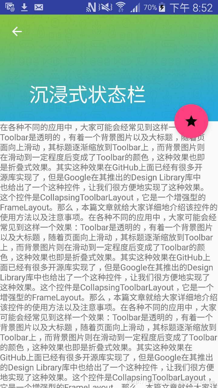
如下图所示,如果没有借助上述的控件,则上面的图片无法延伸至状态栏。
三、使背景图片延伸至状态栏
如果我们可以不借助上述控件,但也希望上面的图片延伸到状态栏呢,我们可以将状态栏设置成透明状态,不使用fitSystemWindow属性,并将标题栏设置paddingTop状态栏的高度。
/**
* 获取状态栏高度
* @return
*/
private int getStatusBarHeight() {
    int result = 0;
    int resourceId = getResources().getIdentifier("status_bar_height", "dimen", "android");
    if (resourceId > 0) {
        result = getResources().getDimensionPixelSize(resourceId);
    }
    return result;
}

//设置布局距离状态栏高度
public static void setLayoutPadding(Activity activity, DrawerLayout drawerLayout) {
ViewGroup contentLayout = (ViewGroup) drawerLayout.getChildAt(0);
        contentLayout.getChildAt(1)
                    .setPadding(contentLayout.getPaddingLeft(), getStatusBarHeight() + contentLayout.getPaddingTop(),
                            contentLayout.getPaddingRight(), contentLayout.getPaddingBottom());
    }
- 1
- 2
- 3
- 4
- 5
- 6
- 7
- 8
- 9
- 10
- 11
- 12
- 13
- 14
- 15
- 16
- 17
- 18
- 19
- 20
- 21
优点:背景图可以延伸到状态栏
缺点:不同的android版本需要计算titlebar高度,稍微复杂一些
实现效果如下:
四、标题栏折叠实现
若要使上图2中的页面,向上滑动时,头图慢慢消失,当要显示现在的列表时,标题栏显示在最顶上,如下图效果,就需要结合CoordinatorLayout与CollapsingToolbarLayout结合使用。
具体实现布局如下:
 <android.support.design.widget.CoordinatorLayout xmlns:android="http://schemas.android.com/apk/res/android"
        xmlns:app="http://schemas.android.com/apk/res-auto"
        android:id="@+id/main_content"
        android:layout_width="match_parent"
        android:layout_height="match_parent"
        android:fitsSystemWindows="true">

        <android.support.design.widget.AppBarLayout
            android:id="@+id/appbar"
            android:layout_width="match_parent"
            android:layout_height="200dp"
            android:fitsSystemWindows="true"
            android:theme="@style/ThemeOverlay.AppCompat.Dark.ActionBar">

            <android.support.design.widget.CollapsingToolbarLayout
                android:id="@+id/collapsing_toolbar"
                android:layout_width="match_parent"
                android:layout_height="match_parent"
                android:fitsSystemWindows="true"
                app:contentScrim="?attr/colorPrimary"
                app:expandedTitleMarginEnd="64dp"
                app:expandedTitleMarginStart="48dp"
             app:layout_scrollFlags="scroll|exitUntilCollapsed">

                <ImageView
                    android:id="@+id/logo"
                    android:layout_width="match_parent"
                    android:layout_height="match_parent"
                    android:background="@mipmap/header_img"
                    android:contentDescription="@null"
                    android:fitsSystemWindows="true"
                    android:scaleType="fitCenter"
                    app:layout_collapseMode="parallax"
                    app:layout_collapseParallaxMultiplier="0.1" />

                <android.support.v7.widget.Toolbar
                    android:id="@+id/toolbar"
                    android:layout_width="match_parent"
                    android:layout_height="?attr/actionBarSize"
                    app:layout_collapseMode="pin"
                    app:popupTheme="@style/ThemeOverlay.AppCompat.Light" />

            </android.support.design.widget.CollapsingToolbarLayout>

        </android.support.design.widget.AppBarLayout>

        <android.support.v4.widget.NestedScrollView
            android:id="@+id/nested_scroll_view"
            android:layout_width="match_parent"
            android:layout_height="match_parent"
            app:layout_behavior="@string/appbar_scrolling_view_behavior">

            <TextView
                android:layout_width="match_parent"
                android:layout_height="wrap_content"
                android:text="@string/large_text" />

        </android.support.v4.widget.NestedScrollView>

        <android.support.design.widget.FloatingActionButton
            android:id="@+id/floating_action_button"
            android:layout_width="wrap_content"
            android:layout_height="wrap_content"
            android:layout_margin="@dimen/fab_margin"
            android:clickable="true"
            android:src="@mipmap/ic_star_black_24dp"
            app:layout_anchor="@id/appbar"
            app:layout_anchorGravity="bottom|right|end" />

    </android.support.design.widget.CoordinatorLayout>
- 1
- 2
- 3
- 4
- 5
- 6
- 7
- 8
- 9
- 10
- 11
- 12
- 13
- 14
- 15
- 16
- 17
- 18
- 19
- 20
- 21
- 22
- 23
- 24
- 25
- 26
- 27
- 28
- 29
- 30
- 31
- 32
- 33
- 34
- 35
- 36
- 37
- 38
- 39
- 40
- 41
- 42
- 43
- 44
- 45
- 46
- 47
- 48
- 49
- 50
- 51
- 52
- 53
- 54
- 55
- 56
- 57
- 58
- 59
- 60
- 61
- 62
- 63
- 64
- 65
- 66
- 67
- 68
- 69
- 70
具体使用方法:CoordinatorLayout作为最外层容器,AppBarLayout作为第一个子view,还包含一个NestedScrollView作为一起滑动的控件,CollapsingToolbarLayout嵌套在AppBarLayout里,AppBarLayout里面又嵌套ImageView和Toolbar。
1、CoordinatorLayout
CoordinatorLayout是用来协调其子view们之间动作的一个父view。
类似于FrameLayout,根布局,能实现的效果:
1) 让浮动操作按钮上下滑动,为Snackbar留出空间。
2) 扩展或者缩小Toolbar或者头部,让主内容区域有更多的空间。
3) 控制哪个view应该扩展还是收缩,以及其显示大小比例,包括视差滚动效果动画。
我们在NestedScrollView中设置了behavior属性,
它主要用来给CoordinatorLayout的子view们实现交互的。
2、AppBarLayout
AppBarLayout是一种支持响应滚动手势的app bar布局(比如工具栏滚出或滚入屏幕);与AppBarLayout组合的滚动布局有(Recyclerview、NestedScrollView等),这需要相应的控件设置app:layout_behavior=”@string/appbar_scrolling_view_behavior”(上面代码中NestedScrollView控件所设置的)。没有设置的话,AppBarLayout将不会响应滚动布局的滚动事件。
3、CollapsingToolbarLayout
CollapsingToolbarLayout是专门用来实现子布局内不同元素响应滚动细节的布局。
在CollapsingToolbarLayout中,设置了以下以个参数:
1) //当完全CollapsingToolbarLayout折叠(收缩)后的背景颜色。
app:contentScrim=”?attr/colorPrimary”
2) //设置扩张时候(还没有收缩时)title距离左边的距离
app:expandedTitleMarginStart=”48dp”
3) //设置扩张时候(还没有收缩时)title距离右边的距离
app:expandedTitleMarginEnd=”64dp”
4)//scroll:设置该控件能滚动, exitUntilCollapsed: 向上滚动时收缩View,Toolbar一直固定在上面
app:layout_scrollFlags=”scroll|exitUntilCollapsed”
具体layout_scrollFlags还有其他三个设置:
1) enterAlways - 实现quick return效果, 当向下移动时,立即显示View(比如Toolbar)。
2) enterAlwaysCollapsed - 当你的View已经设置minHeight属性又使用此标志时,那么view将在到达这个最小高度的时候开始显示,并且从这个时候开始慢慢展开,当滚动到顶部的时候展开完。
3) snap:当一个滚动事件结束,如果视图是部分可见的,那么它将被滚动到收缩或展开。例如,如果视图只有底部25%显示,它将折叠。相反,如果它的底部75%可见,那么它将完全展开。
CollapsingToolbarLayout还可以进行一些其他设置:
1) app:contentScrim:设置折叠时标题栏布局的颜色,默认colorPrimary的色值
2) app:statusBarScrim:设置折叠时状态栏的颜色。默认colorPrimaryDark的色值。
4、Toolbar
这里设置了app:layout_collapseMode=”pin”
pp:layout_collapseMode有三种设置:
1) off:这个是默认属性,布局将正常显示,没有折叠的行为。
2) pin:CollapsingToolbarLayout折叠后,此布局将固定在顶部。
3) parallax:CollapsingToolbarLayout折叠时,此布局也会有视差折叠效果。
若设置了parallax模式时,还可以通过app:layout_collapseParallaxMultiplier设置视差滚动因子,值为:0~1。
5、NestedScrollView
这里设置了app:layout_behavior属性,
app:layout_behavior=”@string/appbar_scrolling_view_behavior”
behavior属性主要是设置了ScrollView与AppBarLayout的相互依赖关系,以非侵入的为View添加动态的依赖布局,和处理父布局(CoordinatorLayout)滑动手势。
具体原码如下:
/**
     * Behavior which should be used by {@link View}s which can scroll vertically and support
     * nested scrolling to automatically scroll any {@link AppBarLayout} siblings.
     */
     public static class ScrollingViewBehavior extends HeaderScrollingViewBehavior {

        public ScrollingViewBehavior() {}

        public ScrollingViewBehavior(Context context, AttributeSet attrs) {

        }

        @Override
        public boolean layoutDependsOn(CoordinatorLayout parent, View child, View dependency) {
            // We depend on any AppBarLayouts
            return dependency instanceof AppBarLayout;
        }

        @Override
        public boolean onDependentViewChanged(CoordinatorLayout parent, View child,
                View dependency) {
            offsetChildAsNeeded(parent, child, dependency);
            return false;
        }

        @Override
        public boolean onRequestChildRectangleOnScreen(CoordinatorLayout parent, View child,
                Rect rectangle, boolean immediate) {

        }

        private void offsetChildAsNeeded(CoordinatorLayout parent, View child, View dependency) {

        }

        @Override
        float getOverlapRatioForOffset(final View header) {

        }

        private static int getAppBarLayoutOffset(AppBarLayout abl) {

        }

        @Override
        AppBarLayout findFirstDependency(List<View> views) {

        }

        @Override
        int getScrollRange(View v) {

        }
    }
- 1
- 2
- 3
- 4
- 5
- 6
- 7
- 8
- 9
- 10
- 11
- 12
- 13
- 14
- 15
- 16
- 17
- 18
- 19
- 20
- 21
- 22
- 23
- 24
- 25
- 26
- 27
- 28
- 29
- 30
- 31
- 32
- 33
- 34
- 35
- 36
- 37
- 38
- 39
- 40
- 41
- 42
- 43
- 44
- 45
- 46
- 47
- 48
- 49
- 50
- 51
- 52
- 53
- 54
下面给出一个实现沉浸式状态栏的demo,欢迎star
https://github.com/xiewenfeng/CollapseToolBar
        <link rel="stylesheet" href="https://csdnimg.cn/release/phoenix/template/css/markdown_views-ea0013b516.css">
            </div>