完成本节内容需做如下准备工作:
- 清理之前测试写的内容,还原 src\pages\index\index.vue:
<template>
  <div>
  </div>
</template>

<script>
export default {
}
</script>

<style lang="scss" scoped>
</style>
- static文件夹下只保留.gitkeep
一、首页视觉稿
http://www.youbaobao.xyz/mpvue-design/preview/#artboard10
二、搜索组件
可交互的搜索框
1.组件样式开发
- 在
src\app.json中的"usingComponents"新增一条
"usingComponents": {
    "van-icon": "vant-weapp/dist/icon/index"
  }
- 新建:src\components\home\SearchBar.vue
<template>
  <div class="search-bar">
    <div class="search-bar-wrapper">
      <van-icon
        class="search"
        name="search"
        size="16px"
        color="#858C96"
      ></van-icon>
      <input class="search-bar-input" />
      <van-icon
        class="clear"
        name="clear"
        size="16px"
        color="#858C96"
      ></van-icon>
    </div>
  </div>
</template>

<script>
export default {
}
</script>

<style lang="scss" scoped>
  .search-bar {
    padding: 15px 15.5px;
    .search-bar-wrapper {
      display: flex;  /*默认横向排列*/
      align-items: center;  /*垂直居中*/
      height: 40px;
      box-sizing: border-box;
      background: #F5F7F9;
      border-radius: 20px;
      padding: 12px 17px;
      .search-bar-input {
        flex: 1;  /*撑满剩余空间*/
        margin: 0 8px;
      }
      .search .clear {
        display: flex;  /*默认横向排列*/
        align-items: center;  /*垂直居中*/
        height: 100%;
      }
    }
  }
</style>
- 在src\pages\index\index.vue中引入SearchBar组件:
<template>
  <div class="home">
    <SearchBar />
  </div>
</template>

<script>
import SearchBar from '../../components/home/SearchBar'
export default {
  components: {
    SearchBar
  },
  methods: {
  }
}
</script>
编写过程中可以把编辑框分为两块儿竖屏:右击对应编辑框标签,选择Split Vertically
拓展:
2.组件功能开发
| 组件名称 | 属性 | 参数 | 用途 | 默认值 |
|---|---|---|---|---|
| SearchBar | props | focus | 搜索框是否获得焦点 | false |
| disabled | 搜索框是否可交互 | false | ||
| limit | 搜索框最大可输入字符数 | 50 | ||
| hotSearch | 热门搜索词 | (空) | ||
| data | searchWord | 搜索关键字 | (空) | |
| method | onSearchBarClick | 搜索框点击事件 | - | |
| onClearClick | 点击清空事件 | - | ||
| onChange | 输入监听事件 | - | ||
| onConfirm | 点击虚拟键盘搜索事件 | - | ||
| setValue | 对输入框关键字赋值 | - | ||
| getValue | 获取输入框的关键字 | - |
扫描二维码关注公众号,回复:
11217150 查看本文章

:focus="focus"::focus是小程序提供的组件原生参数;- 有些功能在开发工具中无法模拟,例如这种;
- 尽量将vant组件的参数绑定到原生参数;
focus: {
  type: Boolean,
  default: true
},
:disabled="disabled":搜索框是否可交互
disabled: {
  type: Boolean,
  default: false
},
:maxlength="limit":limit搜索框最大可输入字符数与小程序原生的maxlength对应
limit: {
  type: Number,
  default: 10
},
:placeholder="hotSearch.length === 0 ? '搜索' : hotSearch":hotSearch热门搜索词与小程序原生的placeholder对应- 这里加入了一个判空处理
hotSearch: {
  type: String,
  default: ''
}
v-model="searchWord":searchWord是搜索关键字,这里与数据源进行双向绑定
data () {
  return {
    searchWord: ''
  }
},
onSearchBarClick () { this.$emit('onClick') },:整个搜索框的点击事件@click="onClearClick":
onClearClick () {
  this.searchWord = ''	// 输入框的值清空
  this.$emit('onClear')	// 调用原生`onClear`方法
},
@input="onChange":onChange输入监听事件与原生input事件对应
onChange (e) {	// e是回调参数
  const { value } = e.mp.detail	// 通过console.log(e)知道所输入值得存放位置,然后通过解构的方式把它拿出来
  this.$emit('onChange', value)	// 接下来的事情交给原生处理
}
confirm-type="search":设置键盘右下角按钮的文字@confirm="onConfirm":点击虚拟键盘搜索按钮时触发- 在文档(input | 微信开放文档)中搜索confirm可找到我们需要的内容:
- confirm-type:设置键盘右下角按钮的文字,仅在type='text’时生效
- confirm-hold:点击键盘右下角按钮时是否保持键盘不收起
- bindconfirm:点击完成按钮时触发
- confirm-type 的合法值:
- send 右下角按钮为“发送”
- search 右下角按钮为“搜索”
- next 右下角按钮为“下一个”
- go 右下角按钮为“前往”
- done 右下角按钮为“完成”
- 在mpvue中使用的是
confirm而不是bindconfirm
- 在文档(input | 微信开放文档)中搜索confirm可找到我们需要的内容:
- setValue:对输入框关键字赋值 -
- getValue:获取输入框的关键字
setValue (v) {
  this.searchWord = v
},
getValue (v) {
  return this.searchWord
}
placeholder-style="color: #ADB4BE":指定 placeholder 的样式v-if="searchWord.length > 0"使搜索框的删除按钮在没有输入内容时隐藏
接下来修改src\pages\index\index.vue
@onClick="onSearchBarClick":为整个搜索框绑定点击事件
onSearchBarClick () {
  // 跳转到搜索页面
}
目前src\pages\index\index.vue所有代码如下:
<template>
  <div class="home">
    <SearchBar
      :disabled="false"
      @onClick="onSearchBarClick"
    />
  </div>
</template>

<script>
import SearchBar from '../../components/home/SearchBar'
export default {
  components: {
    SearchBar
  },
  methods: {
    onSearchBarClick () {
      // 跳转到搜索页面
    }
  }
}
</script>

<style lang="scss" scoped>
</style>
目前src\components\home\SearchBar.vue所有代码如下:
<template>
  <div class="search-bar">
    <div class="search-bar-wrapper">
      <van-icon
        class="search"
        name="search"
        size="16px"
        color="#858C96"
      ></van-icon>
      <input
        class="search-bar-input"
        :focus="focus"
        :disabled="disabled"
        :maxlength="limit"
        :placeholder="hotSearch.length === 0 ? '搜索' : hotSearch"
        v-model="searchWord"
        @input="onChange"
        confirm-type="search"
        @confirm="onConfirm"
        placeholder-style="color: #ADB4BE"
      />
      <van-icon
        class="clear"
        name="clear"
        size="16px"
        color="#858C96"
        @click="onClearClick"
        v-if="searchWord.length > 0"
      ></van-icon>
    </div>
  </div>
</template>

<script>
export default {
  props: {
    focus: {
      type: Boolean,
      default: true
    },
    disabled: {
      type: Boolean,
      default: false
    },
    limit: {
      type: Number,
      default: 10
    },
    hotSearch: {
      type: String,
      default: ''
    }
  },
  data () {
    return {
      searchWord: ''
    }
  },
  methods: {
    onSearchBarClick () {
      this.$emit('onClick')
    },
    onClearClick () {
      this.searchWord = '' // 输入框的值清空
      this.$emit('onClear') // 调用原生`onClear`方法
    },
    onChange (e) {
      const { value } = e.mp.detail // 通过console.log(e)知道所输入值得存放位置,然后通过解构的方式把它拿出来
      this.$emit('onChange', value) // 接下来的事情交给原生处理
    },
    onConfirm (e) {
      const { value } = e.mp.detail // 通过console.log(e)知道所输入值得存放位置,然后通过解构的方式把它拿出来
      this.$emit('onConfirm', value) // 接下来的事情交给原生处理
    },
    setValue (v) {
      this.searchWord = v
    },
    getValue (v) {
      return this.searchWord
    }
  }
}
</script>

<style lang="scss" scoped>
  .search-bar {
    padding: 15px 15.5px;
    .search-bar-wrapper {
      display: flex;  /*默认横向排列*/
      align-items: center;  /*垂直居中*/
      height: 40px;
      box-sizing: border-box;
      background: #F5F7F9;
      border-radius: 20px;
      padding: 12px 17px;
      .search-bar-input {
        flex: 1;  /*撑满剩余空间*/
        margin: 0 8px;
      }
      .search .clear {
        display: flex;  /*默认横向排列*/
        align-items: center;  /*垂直居中*/
        height: 100%;
      }
    }
  }
</style>
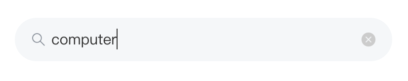
预览效果如下:

拓展:
三、读书卡片组件
展示用户信息、签到、书架图书和书架入口


| 组件名称 | 属性 | 参数 | 用途 | 默认值 |
|---|---|---|---|---|
| HomeCard | props | data | 界面需要展示的数据,userInfo为用户信息,bookList为推荐图书信息,num为书架图书数量 | null |
| hasSign | 今天是否签到 | false | ||
| signDay | 连续签到天数 | 0 | ||
| method | gotoShelf | 跳转到书架列表 | - | |
| onBookClick | 图书点击事件 | - | ||
| sign | 签到事件 | - |
新建src\components\home\HomeCard.vue:
<template>
  <div class="home-card">
    <div class="home-card-inner">
      <div class="user-info">
        <div class="avatar-wrapper">
          <ImageView
            src="https://www.youbaobao.xyz/mpvue-res/logo.jpg"
            round
          />
        </div>
        <div class="nickname">{{'米老鼠'}}</div>
        <div class="shelf-text">书架共有{{3}}本好书</div>
        <div class="round-item"></div>
        <div class="shelf-text">特别精选</div>
      </div>
      <div class="book-info">
        <div class="book-wrapper">
          <div class="book-img-wrapper">
            <ImageView
              src="https://www.youbaobao.xyz/book/res/img//EarthSciences/978-981-10-3713-9_CoverFigure.jpg"
            />
          </div>
          <div class="book-img-wrapper">
            <ImageView
              src="https://www.youbaobao.xyz/book/res/img//EarthSciences/978-981-10-3713-9_CoverFigure.jpg"
            />
          </div>
          <div class="book-img-wrapper">
            <ImageView
              src="https://www.youbaobao.xyz/book/res/img//EarthSciences/978-981-10-3713-9_CoverFigure.jpg"
            />
          </div>
        </div>
        <div class="shelf-wrapper">
          <div class="shelf">书架</div>
          <van-icon
            class="arrow"
            name="arrow"
            size="11px"
            color="#828489"
          ></van-icon>
        </div>
      </div>
      <div class="feedback-wrapper"></div>
      <div class="feedback-text" @click="onFeedBackClick">反馈</div>
    </div>
    <van-dialog id="van-dialog"></van-dialog>
  </div>
</template>

<script>
import ImageView from '../base/ImageView'
import Dialog from 'vant-weapp/dist/dialog/dialog'

export default {
  components: {ImageView},
  props: {
    data: Object,
    hasSign: {
      type: Boolean,
      default: false
    },
    signDay: {
      type: Number,
      default: 0
    }
  },
  methods: {
    gotoShelf() {
    },
    onBookClick() {
    },
    sign() {
    },
    onFeedBackClick() {
      Dialog.confirm({
        title: '反馈',
        message: '您是否确认提交反馈信息?',
        confirmButtonText: '是',
        cancelButtonText: '否'
      }).then(() => {
        console.log('点击是之后的事件')
      }).catch(() => {
        console.log('点击否之后的事件')
      })
    }
  }
}
</script>

<style lang="scss" scoped>
  .home-card {
    background-image: linear-gradient(-90deg, #54575F 0%, #595B60 100%);
    border-radius: 15px;
    margin: 22px 20px 0;

    .home-card-inner {
      position: relative;
      padding: 21.5px 17px 20px 20px;
      box-sizing: border-box;

      .user-info {
        display: flex;
        align-items: center;

        .avatar-wrapper {
          width: 20px;
          height: 20px;
        }

        .nickname, .shelf-text {
          font-size: 12px;
          color: #FFF;
        }

        .nickname {
          margin: 0 8.5px;
        }

        .shelf-text {
          opacity: 0.7;
        }

        .round-item {
          width: 4px;
          height: 4px;
          background: #A2A2A2;
          border-radius: 50%;
          margin: 0 8px;
        }
      }

      .book-info {
        display: flex;
        margin-top: 16.5px;

        .book-wrapper {
          flex: 1;
          display: flex;
          justify-content: space-around;
          .book-img-wrapper {
            width: 72px;
            height: 101px;
          }
        }

        .shelf-wrapper {
          display: flex;
          align-items: center;

          .shelf {
            width: 11px;
            font-size: 11px;
            word-break: break-word; /*断字点换行*/
            color: #FFF;
            opacity: .8;
          }
        }
      }

      .feedback-wrapper {
        position: absolute;
        top: 19.5px;
        right: 0;
        width: 44.5px;
        height: 23.5px;
        background: #D8D8D8;
        opacity: .3;
        border-radius: 100px 0 0 100px;
      }

      .feedback-text {
        position: absolute;
        top: 19.5px;
        right: 0;
        width: 44.5px;
        height: 23.5px;
        line-height: 23.5px;
        text-align: center;
        color: #FFF;
        font-size: 11px;
      }
    }
  }
</style>
要点:
- 为防止
feedback部分的透明样式对wrapper和text造成同步影响,可将两部分并列而不是包含(另外设置颜色也可) - 边距设定默认
- 上边距
margin-top定 - 其他
padding定 - 不设下边距
- 上边距
van-dialog组件:- 必须要在
template中有节点:<van-dialog id="van-dialog"></van-dialog> script中引入:import Dialog from 'vant-weapp/dist/dialog/dialog'- 事件触发:
- 必须要在
onFeedBackClick() {
  Dialog.confirm({
    title: '反馈',
    message: '您是否确认提交反馈信息?',
    confirmButtonText: '是',
    cancelButtonText: '否'
  }).then(() => {
    console.log('点击是之后的事件')
  }).catch(() => {
    console.log('点击否之后的事件')
  })
}
- 查看效果需要在
src\pages\index\index.vue中添加标签<HomeCard /> - 目前效果:

测试图片地址:
.eslintrc.js的设置最好与代码格式化保持一致:
'space-before-function-paren': ["error", "never"]=> 解决Missing space before function parentheses
四、图片组件
提供图片懒加载、预加载等功能
| 组件名称 | 属性 | 参数 | 用途 | 默认值 |
|---|---|---|---|---|
| ImageView | props | src | 图片地址 | (空) |
| mode | 图片伸缩模式 | widthFix | ||
| lazyLoad | 是否启动懒加载 | true | ||
| round | 是否为圆形图片 | false | ||
| height | 图片高度 | auto | ||
| watch | src | 监听src变化,如果src变化,则将isLoading置为true | - | |
| data | isLoading | 图片是否处于加载状态 | true | |
| error | 是否加载失败 | false | ||
| methods | onClick | 图片点击事件 | - | |
| onError | 图片加载失败事件 | - | ||
| onLoad | 图片加载成功事件 | - |
新建src\components\base\ImageView.vue
<template>
  <div class="image-view" @click="onClick">
    <img
      :class="round ? 'round image' : 'image'"
      :style="{ height }"
      :src="src"
      :mode="mode"
      :lazy-load="lazyLoad"
      @load="onLoad"
      @error="onError"
      v-show="!isLoading && !error"
    />
    <img
      :class="round ? 'round image' : 'image'"
      :style="{ height }"
      :src="'https://www.youbaobao.xyz/book/img/loading2.ae9e5924.jpeg'"
      :mode="mode"
      :lazy-load="lazyLoad"
      v-show="isLoading || error"
    />
  </div>
</template>

<script>
export default {
  props: {
    src: {
      type: String,
      default: ''
    },
    mode: {
      type: String,
      default: 'widthFix'
    },
    lazyLoad: {
      type: Boolean,
      default: true
    },
    round: {
      type: Boolean,
      default: false
    },
    height: {
      type: String,
      default: 'auto'
    }
  },
  watch: {
    src (newValue, preValue) {}
  },
  data () {
    return {
      isLoading: true,
      error: false
    }
  },
  methods: {
    onClick () {
      this.$emit('onClick')
    },
    onLoad () {
      this.isLoading = false
      this.error = false
    },
    onError () {
      this.error = true
      this.isLoading = false
    }
  }
}
</script>

<style lang="scss" scoped>
  .image-view {
    width: 100%;
    .image {
      width: 100%;
      &.round {
        border-radius: 50%;
      }
    }
  }
</style>
要点:
v-show="!isLoading && !error":图片在加载结束且无错情况下显示v-show="isLoading || error":图片在未加载结束或有错情况下显示占位图- 设置宽度布满父组件,如果是圆形图片需要加圆角:
.image-view {
    width: 100%;
    .image {
      width: 100%;
      &.round {
        border-radius: 50%;
      }
    }
  }
图片标签小程序默认
<image/>而mpvue是<img/>
资源下载地址
