说明
过渡动画截图

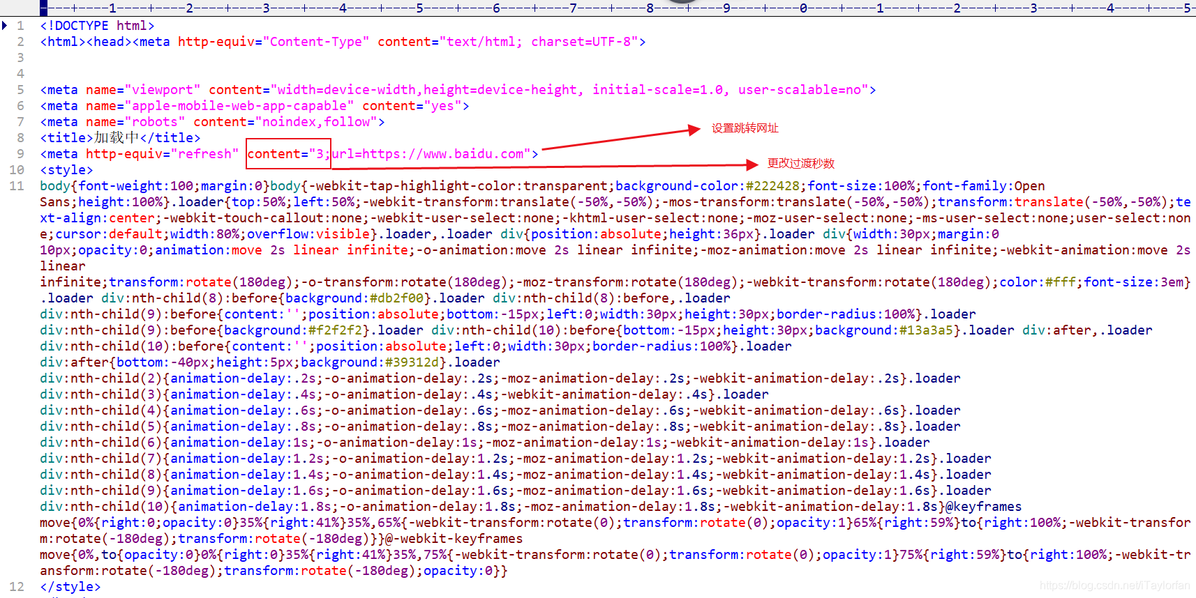
源码
<!DOCTYPE html>
<html>
<head>
    <meta http-equiv="Content-Type" content="text/html; charset=UTF-8">
    <meta name="viewport" content="width=device-width,height=device-height, initial-scale=1.0, user-scalable=no">
    <meta name="apple-mobile-web-app-capable" content="yes">
    <meta name="robots" content="noindex,follow">
    <title>加载中</title>
    <meta http-equiv="refresh" content="3;url=https://www.baidu.com">
    <style>
        body {
            font-weight: 100;
            margin: 0
        }

        body {
            -webkit-tap-highlight-color: transparent;
            background-color: #222428;
            font-size: 100%;
            font-family: Open Sans;
            height: 100%
        }

        .loader {
            top: 50%;
            left: 50%;
            -webkit-transform: translate(-50%, -50%);
            -mos-transform: translate(-50%, -50%);
            transform: translate(-50%, -50%);
            text-align: center;
            -webkit-touch-callout: none;
            -webkit-user-select: none;
            -khtml-user-select: none;
            -moz-user-select: none;
            -ms-user-select: none;
            user-select: none;
            cursor: default;
            width: 80%;
            overflow: visible
        }

        .loader, .loader div {
            position: absolute;
            height: 36px
        }

        .loader div {
            width: 30px;
            margin: 0 10px;
            opacity: 0;
            animation: move 2s linear infinite;
            -o-animation: move 2s linear infinite;
            -moz-animation: move 2s linear infinite;
            -webkit-animation: move 2s linear infinite;
            transform: rotate(180deg);
            -o-transform: rotate(180deg);
            -moz-transform: rotate(180deg);
            -webkit-transform: rotate(180deg);
            color: #fff;
            font-size: 3em
        }

        .loader div:nth-child(8):before {
            background: #db2f00
        }

        .loader div:nth-child(8):before, .loader div:nth-child(9):before {
            content: '';
            position: absolute;
            bottom: -15px;
            left: 0;
            width: 30px;
            height: 30px;
            border-radius: 100%
        }

        .loader div:nth-child(9):before {
            background: #f2f2f2
        }

        .loader div:nth-child(10):before {
            bottom: -15px;
            height: 30px;
            background: #13a3a5
        }

        .loader div:after, .loader div:nth-child(10):before {
            content: '';
            position: absolute;
            left: 0;
            width: 30px;
            border-radius: 100%
        }

        .loader div:after {
            bottom: -40px;
            height: 5px;
            background: #39312d
        }

        .loader div:nth-child(2) {
            animation-delay: .2s;
            -o-animation-delay: .2s;
            -moz-animation-delay: .2s;
            -webkit-animation-delay: .2s
        }

        .loader div:nth-child(3) {
            animation-delay: .4s;
            -o-animation-delay: .4s;
            -webkit-animation-delay: .4s
        }

        .loader div:nth-child(4) {
            animation-delay: .6s;
            -o-animation-delay: .6s;
            -moz-animation-delay: .6s;
            -webkit-animation-delay: .6s
        }

        .loader div:nth-child(5) {
            animation-delay: .8s;
            -o-animation-delay: .8s;
            -moz-animation-delay: .8s;
            -webkit-animation-delay: .8s
        }

        .loader div:nth-child(6) {
            animation-delay: 1s;
            -o-animation-delay: 1s;
            -moz-animation-delay: 1s;
            -webkit-animation-delay: 1s
        }

        .loader div:nth-child(7) {
            animation-delay: 1.2s;
            -o-animation-delay: 1.2s;
            -moz-animation-delay: 1.2s;
            -webkit-animation-delay: 1.2s
        }

        .loader div:nth-child(8) {
            animation-delay: 1.4s;
            -o-animation-delay: 1.4s;
            -moz-animation-delay: 1.4s;
            -webkit-animation-delay: 1.4s
        }

        .loader div:nth-child(9) {
            animation-delay: 1.6s;
            -o-animation-delay: 1.6s;
            -moz-animation-delay: 1.6s;
            -webkit-animation-delay: 1.6s
        }

        .loader div:nth-child(10) {
            animation-delay: 1.8s;
            -o-animation-delay: 1.8s;
            -moz-animation-delay: 1.8s;
            -webkit-animation-delay: 1.8s
        }

        @keyframes move {
            0% {
                right: 0;
                opacity: 0
            }
            35% {
                right: 41%
            }
            35%, 65% {
                -webkit-transform: rotate(0);
                transform: rotate(0);
                opacity: 1
            }
            65% {
                right: 59%
            }
            to {
                right: 100%;
                -webkit-transform: rotate(-180deg);
                transform: rotate(-180deg)
            }
        }

        @-webkit-keyframes move {
            0%, to {
                opacity: 0
            }
            0% {
                right: 0
            }
            35% {
                right: 41%
            }
            35%, 75% {
                -webkit-transform: rotate(0);
                transform: rotate(0);
                opacity: 1
            }
            75% {
                right: 59%
            }
            to {
                right: 100%;
                -webkit-transform: rotate(-180deg);
                transform: rotate(-180deg);
                opacity: 0
            }
        }
    </style>
</head>
<body class="ie8">
<div class="loader">
    <div> L</div>
    <div> O</div>
    <div> A</div>
    <div> D</div>
    <div> I</div>
    <div> N</div>
    <div> G</div>
    <div></div>
    <div></div>
    <div></div>
</div>

</body>
</html>