transform属性


代码示例:
<!DOCTYPE html>
<html lang="en">
<head>
    <meta charset="UTF-8">
    <meta name="viewport" content="width=device-width, initial-scale=1.0">
    <title>Document</title>
    <style>
        div{


            display: inline-block;
            width: 60px;
            height: 60px;
            background-color: #bbbbbb;
            border: 2px solid black;
            margin: 20px;
            /* transition: all; */
        }
    </style>
</head>
<body>
    <div>文字</div>旋转30度
    <div style="transform: rotate(30deg);">文字</div><br>
    <div>文字</div>旋转45度
    <div style="transform: rotate(45deg);">文字</div><br>
    <div>文字</div>绕x轴旋转60度
    <div style="transform: rotateX(60deg);">文字</div><br>
    <div>文字</div>绕Y轴旋转60度
    <div style="transform: rotateY(60deg);">文字</div><br>
    <div>文字</div>绕Z轴旋转60度
    <div style="transform: rotateZ(60deg);">文字</div><br>
    <div>文字</div>绕X、Z轴同时旋转60度
    <div style="transform: rotateX(60deg); rotateZ(60deg);">文字</div><br>
    <div>文字</div>绕Y、Z轴同时旋转60度
    <div style="transform: rotateY(60deg); rotateZ(60deg);">文字</div><br>

</body>
</html>
效果图示:


动态实现多种变形效果
<!DOCTYPE html>
<html lang="en">
<head>
    <meta charset="UTF-8">
    <meta name="viewport" content="width=device-width, initial-scale=1.0">
    <title>Document</title>
    <style>
        div{


            display: inline-block;
            width: 60px;
            height: 60px;
            background-color: #bbbbbb;
            border: 2px solid black;
            margin: 20px;
            transition: all 2s ease;
        }
        div:hover{


             transform:rotate(30deg) translate(260px,60px) scale(2.4,0.4);
        }
    </style>
</head>
<body>
    <div>文字</div><br>
</body>
</html>
指定变换中心点


3D变换:perspective

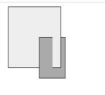
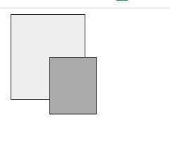
transform-style属性
代码示例:
<!DOCTYPE html>
<html lang="en">
<head>
    <meta charset="UTF-8">
    <meta name="viewport" content="width=device-width, initial-scale=1.0">
    <title>Document</title>
    <style>
        div{


            position: absolute;
            border: 1px solid black;
        }
        div#a{


            padding: 60px;
            background-color: #eee;
            transform: rotateY(30deg);
            transform-style: preserve-3d;
        }
        div#b{


            padding: 40px;
            background-color: #aaa;
            transform: rotateY(20deg);
        }

    </style>
</head>
<body>
    <div id="a">
        <div id="b"></div>
    </div>
</body>
</html>
效果图示:
有3d效果
无3d效果
旋转后背面是否可见
transition属性

代码示例:
<!DOCTYPE html>
<html lang="en">
<head>
    <meta charset="UTF-8">
    <meta name="viewport" content="width=device-width, initial-scale=1.0">
    <title>Document</title>
    <style>
        img#target{


            position: absolute;
            transition: left 5s linear, top 5s linear;
        }
    </style>
</head>
<body>
    <img src="军事.png" alt="" id="target">
    <script>
        var target=document.getElementById("target");
        target.style.left="0px";
        target.style.top="0px";
        document.onmousedown = function (evt){


            target.style.left=evt.pageX+"px";
            target.style.top=evt.pageY+"px";
        }
    </script>
</body>
</html>
效果:自动追踪鼠标点击的位置的坐标,然后图片会缓慢的移动过去
animation动画
可以定义过程,到整个过程的百分之多少呈现什么样的画面

代码示例:
<!DOCTYPE html>
<html lang="en">
<head>
    <meta charset="UTF-8">
    <meta name="viewport" content="width=device-width, initial-scale=1.0">
    <title>Document</title>
    <style>
        @keyframes complex {


            0%{


                transform: rotate(0deg) scale(1);
                background-color: #f00;
            }
            40%{


                transform: rotate(720deg) scale(0.11);
                background-color: #ff0;
            }
            80%{


                transform: rotate(1080deg) scale(4);
                background-color: #f0f;
            }
            100%{


                transform: rotate(0deg) scale(1);
                background-color: #00f;
            }
        }
        div{


            background-color: gray;
            border: 1px solid black;
            position: absolute;
            left: 160px;
            top: 120px;
            width: 60px;
            height: 60px;
        }
        div:hover{


            /* 指定执行fkjava动画 */
            animation-name: complex;
            /* 指定动画执行时间 */
            animation-duration: 8s;
            /* 指定动画循环次数 */
            animation-iteration-count: 1;
        }

    </style>
</head>
<body>
    <div>
        鼠标悬停,开始动画
    </div>
</body>
</html>