一、概述
Qt的样式表是从Qt4.2开始引入的描述窗口部件外观的机制,类似于HTML的层叠样式表(Cascading Style Sheets,CSS)。样式表在Qt的风格之上起作用(如果使用了样式表,QWidget::style()返回的QStyle为“style sheet”),提供了比QPalette更为灵活、更强大的机制。样式表使用文本描述,可以在应用程序级别和widget级别设置样式表。如果在不同的级别都设置了样式表,则Qt继承所有有效的样式,这就是层叠(cascading)。
1.1 样式表语法
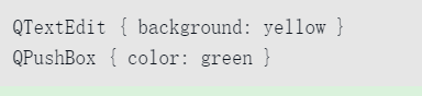
样式表的语法和HTML CSS基本是一致的。Qt的样式表对大小写不敏感,但对类名、对象名和属性名大小写敏感。如下的示例设置了所有QTextEdit对象背景是黄色的,所有QPushBox对象文本为绿色:
1.1.1 样式规则
样式表包含一系列的规则,一个样式规则由选择符和定义组成。选择符(selector)确定哪些窗口部件受规则影响,定义说明了在窗口部件上应用哪些属性。

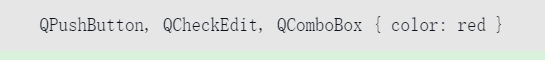
在这条规则里,QRadioButton是选择符,{color:red}是定义。这条规则说明了QRadioButton和它的子类应该使用红色作为前景色。几个选择符可以使用一个定义,使用逗号分隔选择符,例如:
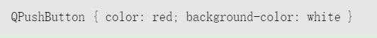
定义由一个或多个属性和值对组成,中间用分号隔开,例如:
1.1.2.选择符类型
Qt支持CSS2中所有的选择符,表14-14给出了常用的选择符。

1.1.3.子控件
对于复杂控件,可以访问它的子控件,如QComboBox上的下拉按钮,QSpinBox上的向上和向下箭头,例如:[插图]上面的代码使用了自定义的下拉按钮图像,::是CSS3中的伪元素。

上面的代码使用了自定义的下拉按钮图像,::是CSS3中的伪元素。
1.1.4.伪状态
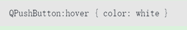
选择符可以包含伪装态来表示widget的状态,伪状态在选择符之后,以冒号分隔,下面定义了当鼠标在QPushButton上悬停时的规则:
1.1.5.冲突解决
当不同的规则应用到相同的属性时,样式表就产生了冲突。在这种情况下,特定的规则比通用的规则优先,伪状态比没有伪状态的优先,如果级别相同,则最后一个规则优先。冲突解决按照CSS2规范进行。
1.1.6.层叠样式表
可以在QApplication级别设置,也可以在父widget、子widget级别设置。实际应用样式时,则合并这几个级别的样式。当有冲突时,widget自身的样式优先使用,接下来是父widget、祖先widget,依此类推。
1.1.7.盒子模型
窗口部件和子窗口部件支持背景(background)、边框(border)、边距(margin)、填衬(padding),图1显示了样式表的盒子模型。

可以看出边距、边框、填衬和内容之间的关系。默认情况下,margin、border-width、padding属性为0,也就是说这几个矩形框是重合的。如果指定了窗口部件的背景,默认情况下,背景只对边框内部区域起作用,但可以通过改变background-clip属性来指定不同的区域填充。
二 、StyleSheet的使用
StyleSheet文件的默认后缀名为qss,可以通过命令行参数 -stylesheet filename.qss 来设置样式表,也可以通过QApplication::setStyleSheet 或 QWidget::setStyleSheet来设置应用程序或特定控件要使用的样式表。
::setStyleSheet函数的参数是字符串(不是qss文件的名字,而是样式表的内容),所以直接使用的话,不方便一次设置大量的规则,但是可以使用资源文件将qss样式表嵌入到程序中,然后通过QApplication::setStyleSheet来使用,例如:
 //! 加载样式表
    QFile file(":/qss/psblack.css");
    if (file.open(QFile::ReadOnly)) {
        QString qss = QLatin1String(file.readAll());
        qApp->setStyleSheet(qss);
        file.close();
    }
一条样式表规则由选择器 (Selector)和属性定义(declaration)组成。
QComboBox#myComboBox::down-arrow:pressed {
    position: relative;
    top: 1px; left: 1px;
}
这部分是选择器,用于指定样式表规则的应用对象,细分开来:
- QComboBox#myComboBox 这一部分叫类型选择器(Type Selector),QComboBox指定了对象类名,#name指定对象的实例名(非必须)其它的选择器语法请参考官方文档。
- down-arrow 子控件描述符(subcontrol),和前面的字段用::隔开,这里表示组合框的下拉按键
- pressed 伪状态(Pseudo-States)描述符,和前面的字段用:隔开,这里表示压下状态
以上除了第一个字段,都不是必须,而是进一步限制规则适用范围
2.1 样式表规则的范围和优先级关系
规则冲突
多条规则制定了不同的内容,可能的情况有很多,比如
QPushButton:hover { color: white }
QPushButton { color: red }
这种情况,其实可以不算冲突,更加具体的类型描述符定义的规则拥有更高优先级,所以一个有鼠标悬停的按钮的文本颜色就是白色的,否则为红色
QPushButton:hover { color: white }
QPushButton:enabled { color: red }
这里就可能发生规则冲突,当一个使能的按钮有鼠标悬停的时候,颜色的定义是什么呢? QStyleSheet的判断原则是,后面规则的优先级高于前面的规则,所以这种情况颜色为红色
QPushButton { color: red }
QAbstractButton { color: gray }
这个相对难发现,一个基类及其子类都定义了针对文本颜色的规则,那么子类应用哪一条规则呢?你可能会认为自然是子类用自己的规则了,很可惜不是,样式表不考虑类的继承层级优先关系,所以还是后一条规则优先级高于前一条规则。如果确实要单独设定子类的规则,需要交换规则的顺序。
样式表层叠 Cascading
因为样式表可以应用在QApplication上,也可以单独应用在控件上,所以最终应用到一个具体控件的样式表,是通过叠加合并所有的父控件乃至应用程序的样式表设定来得到的。这种情况下,也有可能发生规则冲突, 例如:
qApp->setStyleSheet("QPushButton { color: white }");
myPushButton->setStyleSheet("* { color: blue }");
这种情况下,控件自身的样式表的优先级高于父控件或应用程序的样式表
样式表继承 Inheritance
在标准的CSS样式表中,一个控件的字体和颜色属性如果没有明确设定,那么将自动继承自父控件,而在QT的样式表中,不会自动继承,例如:
qApp->setStyleSheet("QGroupBox { color: red; } ");
这种情况下,对于GroupBox中的添加的子控件,不会自动设置其颜色属性,如果要设置子控件的属性,需要明确设定:
qApp->setStyleSheet("QGroupBox, QGroupBox * { color: red; }");
注意,这里的继承和上面的层叠不一样,层叠指不同样式表设置同一个对象,继承指的则是样式表规则中选择器对控件层级关系的影响
三、经典案例
/*
 * The MIT License (MIT)
 *
 * Copyright (c) <2013-2014> <Colin Duquesnoy>
 *
 * Permission is hereby granted, free of charge, to any person obtaining a copy
 * of this software and associated documentation files (the "Software"), to deal
 * in the Software without restriction, including without limitation the rights
 * to use, copy, modify, merge, publish, distribute, sublicense, and/or sell
 * copies of the Software, and to permit persons to whom the Software is
 * furnished to do so, subject to the following conditions:
 * The above copyright notice and this permission notice shall be included in
 * all copies or substantial portions of the Software.
 * THE SOFTWARE IS PROVIDED "AS IS", WITHOUT WARRANTY OF ANY KIND, EXPRESS OR
 * IMPLIED, INCLUDING BUT NOT LIMITED TO THE WARRANTIES OF MERCHANTABILITY,
 * FITNESS FOR A PARTICULAR PURPOSE AND NONINFRINGEMENT. IN NO EVENT SHALL THE
 * AUTHORS OR COPYRIGHT HOLDERS BE LIABLE FOR ANY CLAIM, DAMAGES OR OTHER
 * LIABILITY, WHETHER IN AN ACTION OF CONTRACT, TORT OR OTHERWISE, ARISING FROM,
 * OUT OF OR IN CONNECTION WITH THE SOFTWARE OR THE USE OR OTHER DEALINGS IN
 * THE SOFTWARE.
 */
QToolTip
{
    border: 1px solid #76797C;
    background-color: rgb(90, 102, 117);;
    color: white;
    padding: 5px;
    opacity: 200;
}
QWidget
{
    color: #eff0f1;
    background-color: #31363b;
    selection-background-color:#3daee9;
    selection-color: #eff0f1;
    background-clip: border;
    border-image: none;
    outline: 0;
}
QWidget:item:hover
{
    background-color: #3daee9;
    color: #eff0f1;
}
QWidget:item:selected
{
    background-color: #3daee9;
}
QCheckBox
{
    spacing: 5px;
    outline: none;
    color: #eff0f1;
    margin-bottom: 2px;
}
QCheckBox:disabled
{
    color: #76797C;
}
QCheckBox::indicator,
QGroupBox::indicator
{
    width: 18px;
    height: 18px;
}
QGroupBox::indicator
{
    margin-left: 2px;
}
QCheckBox::indicator:unchecked
{
    image: url(:/qss_icons/rc/checkbox_unchecked.png);
}
QCheckBox::indicator:unchecked:hover,
QCheckBox::indicator:unchecked:focus,
QCheckBox::indicator:unchecked:pressed,
QGroupBox::indicator:unchecked:hover,
QGroupBox::indicator:unchecked:focus,
QGroupBox::indicator:unchecked:pressed
{
  border: none;
    image: url(:/qss_icons/rc/checkbox_unchecked_focus.png);
}
QCheckBox::indicator:checked
{
    image: url(:/qss_icons/rc/checkbox_checked.png);
}
QCheckBox::indicator:checked:hover,
QCheckBox::indicator:checked:focus,
QCheckBox::indicator:checked:pressed,
QGroupBox::indicator:checked:hover,
QGroupBox::indicator:checked:focus,
QGroupBox::indicator:checked:pressed
{
  border: none;
    image: url(:/qss_icons/rc/checkbox_checked_focus.png);
}
QCheckBox::indicator:indeterminate
{
    image: url(:/qss_icons/rc/checkbox_indeterminate.png);
}
QCheckBox::indicator:indeterminate:focus,
QCheckBox::indicator:indeterminate:hover,
QCheckBox::indicator:indeterminate:pressed
{
    image: url(:/qss_icons/rc/checkbox_indeterminate_focus.png);
}
QCheckBox::indicator:checked:disabled,
QGroupBox::indicator:checked:disabled
{
    image: url(:/qss_icons/rc/checkbox_checked_disabled.png);
}
QCheckBox::indicator:unchecked:disabled,
QGroupBox::indicator:unchecked:disabled
{
    image: url(:/qss_icons/rc/checkbox_unchecked_disabled.png);
}
QRadioButton
{
    spacing: 5px;
    outline: none;
    color: #eff0f1;
    margin-bottom: 2px;
}
QRadioButton:disabled
{
    color: #76797C;
}
QRadioButton::indicator
{
    width: 21px;
    height: 21px;
}
QRadioButton::indicator:unchecked
{
    image: url(:/qss_icons/rc/radio_unchecked.png);
}
QRadioButton::indicator:unchecked:hover,
QRadioButton::indicator:unchecked:focus,
QRadioButton::indicator:unchecked:pressed
{
    border: none;
    outline: none;
    image: url(:/qss_icons/rc/radio_unchecked_focus.png);
}
QRadioButton::indicator:checked
{
    border: none;
    outline: none;
    image: url(:/qss_icons/rc/radio_checked.png);
}
QRadioButton::indicator:checked:hover,
QRadioButton::indicator:checked:focus,
QRadioButton::indicator:checked:pressed
{
    border: none;
    outline: none;
    image: url(:/qss_icons/rc/radio_checked_focus.png);
}
QRadioButton::indicator:checked:disabled
{
    outline: none;
    image: url(:/qss_icons/rc/radio_checked_disabled.png);
}
QRadioButton::indicator:unchecked:disabled
{
    image: url(:/qss_icons/rc/radio_unchecked_disabled.png);
}
QMenuBar
{
    background-color: #31363b;
    color: #eff0f1;
}
QMenuBar::item
{
    background: transparent;
}
QMenuBar::item:selected
{
    background: transparent;
    border: 1px solid #76797C;
}
QMenuBar::item:pressed
{
    border: 1px solid #76797C;
    background-color: #3daee9;
    color: #eff0f1;
    margin-bottom:-1px;
    padding-bottom:1px;
}
QMenu
{
    border: 1px solid #76797C;
    color: #eff0f1;
    margin: 2px;
}
QMenu::icon
{
    margin: 5px;
}
QMenu::item
{
    padding: 5px 30px 5px 30px;
    margin-left: 5px;
    border: 1px solid transparent; /* reserve space for selection border */
}
QMenu::item:selected
{
    color: #eff0f1;
}
QMenu::separator {
    height: 2px;
    background: lightblue;
    margin-left: 10px;
    margin-right: 5px;
}
QMenu::indicator {
    width: 18px;
    height: 18px;
}
/* non-exclusive indicator = check box style indicator
   (see QActionGroup::setExclusive) */
QMenu::indicator:non-exclusive:unchecked {
    image: url(:/qss_icons/rc/checkbox_unchecked.png);
}
QMenu::indicator:non-exclusive:unchecked:selected {
    image: url(:/qss_icons/rc/checkbox_unchecked_disabled.png);
}
QMenu::indicator:non-exclusive:checked {
    image: url(:/qss_icons/rc/checkbox_checked.png);
}
QMenu::indicator:non-exclusive:checked:selected {
    image: url(:/qss_icons/rc/checkbox_checked_disabled.png);
}
/* exclusive indicator = radio button style indicator (see QActionGroup::setExclusive) */
QMenu::indicator:exclusive:unchecked {
    image: url(:/qss_icons/rc/radio_unchecked.png);
}
QMenu::indicator:exclusive:unchecked:selected {
    image: url(:/qss_icons/rc/radio_unchecked_disabled.png);
}
QMenu::indicator:exclusive:checked {
    image: url(:/qss_icons/rc/radio_checked.png);
}
QMenu::indicator:exclusive:checked:selected {
    image: url(:/qss_icons/rc/radio_checked_disabled.png);
}
QMenu::right-arrow {
    margin: 5px;
    image: url(:/qss_icons/rc/right_arrow.png)
}
QWidget:disabled
{
    color: #454545;
    background-color: #31363b;
}
QAbstractItemView
{
    alternate-background-color: #31363b;
    color: #eff0f1;
    border: 1px solid 3A3939;
    border-radius: 2px;
}
QWidget:focus, QMenuBar:focus
{
    border: 1px solid #3daee9;
}
QTabWidget:focus, QCheckBox:focus, QRadioButton:focus, QSlider:focus
{
    border: none;
}
QLineEdit
{
    background-color: #232629;
    padding: 5px;
    border-style: solid;
    border: 1px solid #76797C;
    border-radius: 2px;
    color: #eff0f1;
}
QGroupBox {
    border:1px solid #76797C;
    border-radius: 2px;
    margin-top: 20px;
}
QGroupBox::title {
    subcontrol-origin: margin;
    subcontrol-position: top center;
    padding-left: 10px;
    padding-right: 10px;
    padding-top: 10px;
}
QAbstractScrollArea
{
    border-radius: 2px;
    border: 1px solid #76797C;
    background-color: transparent;
}
QScrollBar:horizontal
{
    height: 15px;
    margin: 3px 15px 3px 15px;
    border: 1px transparent #2A2929;
    border-radius: 4px;
    background-color: #2A2929;
}
QScrollBar::handle:horizontal
{
    background-color: #605F5F;
    min-width: 5px;
    border-radius: 4px;
}
QScrollBar::add-line:horizontal
{
    margin: 0px 3px 0px 3px;
    border-image: url(:/qss_icons/rc/right_arrow_disabled.png);
    width: 10px;
    height: 10px;
    subcontrol-position: right;
    subcontrol-origin: margin;
}
QScrollBar::sub-line:horizontal
{
    margin: 0px 3px 0px 3px;
    border-image: url(:/qss_icons/rc/left_arrow_disabled.png);
    height: 10px;
    width: 10px;
    subcontrol-position: left;
    subcontrol-origin: margin;
}
QScrollBar::add-line:horizontal:hover,QScrollBar::add-line:horizontal:on
{
    border-image: url(:/qss_icons/rc/right_arrow.png);
    height: 10px;
    width: 10px;
    subcontrol-position: right;
    subcontrol-origin: margin;
}
QScrollBar::sub-line:horizontal:hover, QScrollBar::sub-line:horizontal:on
{
    border-image: url(:/qss_icons/rc/left_arrow.png);
    height: 10px;
    width: 10px;
    subcontrol-position: left;
    subcontrol-origin: margin;
}
QScrollBar::up-arrow:horizontal, QScrollBar::down-arrow:horizontal
{
    background: none;
}
QScrollBar::add-page:horizontal, QScrollBar::sub-page:horizontal
{
    background: none;
}
QScrollBar:vertical
{
    background-color: #2A2929;
    width: 15px;
    margin: 15px 3px 15px 3px;
    border: 1px transparent #2A2929;
    border-radius: 4px;
}
QScrollBar::handle:vertical
{
    background-color: #605F5F;
    min-height: 5px;
    border-radius: 4px;
}
QScrollBar::sub-line:vertical
{
    margin: 3px 0px 3px 0px;
    border-image: url(:/qss_icons/rc/up_arrow_disabled.png);
    height: 10px;
    width: 10px;
    subcontrol-position: top;
    subcontrol-origin: margin;
}
QScrollBar::add-line:vertical
{
    margin: 3px 0px 3px 0px;
    border-image: url(:/qss_icons/rc/down_arrow_disabled.png);
    height: 10px;
    width: 10px;
    subcontrol-position: bottom;
    subcontrol-origin: margin;
}
QScrollBar::sub-line:vertical:hover,QScrollBar::sub-line:vertical:on
{
    border-image: url(:/qss_icons/rc/up_arrow.png);
    height: 10px;
    width: 10px;
    subcontrol-position: top;
    subcontrol-origin: margin;
}
QScrollBar::add-line:vertical:hover, QScrollBar::add-line:vertical:on
{
    border-image: url(:/qss_icons/rc/down_arrow.png);
    height: 10px;
    width: 10px;
    subcontrol-position: bottom;
    subcontrol-origin: margin;
}
QScrollBar::up-arrow:vertical, QScrollBar::down-arrow:vertical
{
    background: none;
}
QScrollBar::add-page:vertical, QScrollBar::sub-page:vertical
{
    background: none;
}
QTextEdit
{
    background-color: #232629;
    color: #eff0f1;
    border: 1px solid #76797C;
}
QPlainTextEdit
{
    background-color: #232629;;
    color: #eff0f1;
    border-radius: 2px;
    border: 1px solid #76797C;
}
QHeaderView::section
{
    background-color: #76797C;
    color: #eff0f1;
    padding: 5px;
    border: 1px solid #76797C;
}
QSizeGrip {
    image: url(:/qss_icons/rc/sizegrip.png);
    width: 12px;
    height: 12px;
}
QMainWindow::separator
{
    background-color: #31363b;
    color: white;
    padding-left: 4px;
    spacing: 2px;
    border: 1px dashed #76797C;
}
QMainWindow::separator:hover
{
    background-color: #787876;
    color: white;
    padding-left: 4px;
    border: 1px solid #76797C;
    spacing: 2px;
}
QMenu::separator
{
    height: 1px;
    background-color: #76797C;
    color: white;
    padding-left: 4px;
    margin-left: 10px;
    margin-right: 5px;
}
QFrame
{
    border-radius: 2px;
    border: 1px solid #76797C;
}
QFrame[frameShape="0"]
{
    border-radius: 2px;
    border: 1px transparent #76797C;
}
QStackedWidget
{
    border: 1px transparent black;
}
QToolBar {
    border: 1px transparent #393838;
    background: 1px solid #31363b;
    font-weight: bold;
}
QToolBar::handle:horizontal {
    image: url(:/qss_icons/rc/Hmovetoolbar.png);
}
QToolBar::handle:vertical {
    image: url(:/qss_icons/rc/Vmovetoolbar.png);
}
QToolBar::separator:horizontal {
    image: url(:/qss_icons/rc/Hsepartoolbar.png);
}
QToolBar::separator:vertical {
    image: url(:/qss_icons/rc/Vsepartoolbars.png);
}
QPushButton
{
    color: #eff0f1;
    background-color: #31363b;
    border-width: 1px;
    border-color: #76797C;
    border-style: solid;
    padding: 5px;
    border-radius: 2px;
    outline: none;
}
QPushButton:disabled
{
    background-color: #31363b;
    border-width: 1px;
    border-color: #454545;
    border-style: solid;
    padding-top: 5px;
    padding-bottom: 5px;
    padding-left: 10px;
    padding-right: 10px;
    border-radius: 2px;
    color: #454545;
}
QPushButton:focus {
    background-color: #3daee9;
    color: white;
}
QPushButton:pressed
{
    background-color: #3daee9;
    padding-top: -15px;
    padding-bottom: -17px;
}
QComboBox
{
    selection-background-color: #3daee9;
    border-style: solid;
    border: 1px solid #76797C;
    border-radius: 2px;
    padding: 5px;
    min-width: 75px;
}
QPushButton:checked{
    background-color: #76797C;
    border-color: #6A6969;
}
QComboBox:hover,QPushButton:hover,QAbstractSpinBox:hover,QLineEdit:hover,QTextEdit:hover,QPlainTextEdit:hover,QAbstractView:hover,QTreeView:hover
{
    border: 1px solid #3daee9;
    color: #eff0f1;
}
QComboBox:on
{
    padding-top: 3px;
    padding-left: 4px;
    selection-background-color: #4a4a4a;
}
QComboBox QAbstractItemView
{
    background-color: #232629;
    border-radius: 2px;
    border: 1px solid #76797C;
    selection-background-color: #3daee9;
}
QComboBox::drop-down
{
    subcontrol-origin: padding;
    subcontrol-position: top right;
    width: 15px;
    border-left-width: 0px;
    border-left-color: darkgray;
    border-left-style: solid;
    border-top-right-radius: 3px;
    border-bottom-right-radius: 3px;
}
QComboBox::down-arrow
{
    image: url(:/qss_icons/rc/down_arrow_disabled.png);
}
QComboBox::down-arrow:on, QComboBox::down-arrow:hover,
QComboBox::down-arrow:focus
{
    image: url(:/qss_icons/rc/down_arrow.png);
}
QAbstractSpinBox {
    padding: 5px;
    border: 1px solid #76797C;
    background-color: #232629;
    color: #eff0f1;
    border-radius: 2px;
    min-width: 75px;
}
QAbstractSpinBox:up-button
{
    background-color: transparent;
    subcontrol-origin: border;
    subcontrol-position: center right;
}
QAbstractSpinBox:down-button
{
    background-color: transparent;
    subcontrol-origin: border;
    subcontrol-position: center left;
}
QAbstractSpinBox::up-arrow,QAbstractSpinBox::up-arrow:disabled,QAbstractSpinBox::up-arrow:off {
    image: url(:/qss_icons/rc/up_arrow_disabled.png);
    width: 10px;
    height: 10px;
}
QAbstractSpinBox::up-arrow:hover
{
    image: url(:/qss_icons/rc/up_arrow.png);
}
QAbstractSpinBox::down-arrow,QAbstractSpinBox::down-arrow:disabled,QAbstractSpinBox::down-arrow:off
{
    image: url(:/qss_icons/rc/down_arrow_disabled.png);
    width: 10px;
    height: 10px;
}
QAbstractSpinBox::down-arrow:hover
{
    image: url(:/qss_icons/rc/down_arrow.png);
}
QLabel
{
    border: 0px solid black;
}
QTabWidget{
    border: 0px transparent black;
}
QTabWidget::pane {
    border: 1px solid #76797C;
    padding: 5px;
    margin: 1px;
}
QTabBar
{
    qproperty-drawBase: 0;
    left: 5px; /* move to the right by 5px */
    border-radius: 3px;
}
QTabBar:focus
{
    border: 0px transparent black;
}
QTabBar::close-button  {
    image: url(:/qss_icons/rc/close.png);
    background: transparent;
}
QTabBar::close-button:hover
{
    image: url(:/qss_icons/rc/close-hover.png);
    background: transparent;
}
QTabBar::close-button:pressed {
    image: url(:/qss_icons/rc/close-pressed.png);
    background: transparent;
}
/* TOP TABS */
QTabBar::tab:top {
    color: #eff0f1;
    border: 1px solid #76797C;
    border-bottom: 1px transparent black;
    background-color: #31363b;
    padding: 5px;
    min-width: 50px;
    border-top-left-radius: 2px;
    border-top-right-radius: 2px;
}
QTabBar::tab:top:!selected
{
    color: #eff0f1;
    background-color: #54575B;
    border: 1px solid #76797C;
    border-bottom: 1px transparent black;
}
QTabBar::tab:top:!selected:hover {
    background-color: #3daee9;
}
/* BOTTOM TABS */
QTabBar::tab:bottom {
    color: #eff0f1;
    border: 1px solid #76797C;
    border-top: 1px transparent black;
    background-color: #31363b;
    padding: 5px;
    border-bottom-left-radius: 2px;
    border-bottom-right-radius: 2px;
    min-width: 50px;
}
QTabBar::tab:bottom:!selected
{
    color: #eff0f1;
    background-color: #54575B;
    border: 1px solid #76797C;
    border-top: 1px transparent black;
    border-bottom-left-radius: 2px;
    border-bottom-right-radius: 2px;
}
QTabBar::tab:bottom:!selected:hover {
    background-color: #3daee9;
}
/* LEFT TABS */
QTabBar::tab:left {
    color: #eff0f1;
    border: 1px solid #76797C;
    border-left: 1px transparent black;
    background-color: #31363b;
    padding: 5px;
    border-top-right-radius: 2px;
    border-bottom-right-radius: 2px;
    min-height: 50px;
}
QTabBar::tab:left:!selected
{
    color: #eff0f1;
    background-color: #54575B;
    border: 1px solid #76797C;
    border-left: 1px transparent black;
    border-top-right-radius: 2px;
    border-bottom-right-radius: 2px;
}
QTabBar::tab:left:!selected:hover {
    background-color: #3daee9;
}
/* RIGHT TABS */
QTabBar::tab:right {
    color: #eff0f1;
    border: 1px solid #76797C;
    border-right: 1px transparent black;
    background-color: #31363b;
    padding: 5px;
    border-top-left-radius: 2px;
    border-bottom-left-radius: 2px;
    min-height: 50px;
}
QTabBar::tab:right:!selected
{
    color: #eff0f1;
    background-color: #54575B;
    border: 1px transparent #76797C;
    border-right: 1px transparent black;
    border-top-left-radius: 0px;
    border-bottom-left-radius: 0px;
}
QTabBar::tab:right:!selected:hover {
    background-color: #3daee9;
}
QTabBar QToolButton::right-arrow:enabled {
     image: url(:/qss_icons/rc/right_arrow.png);
 }
 QTabBar QToolButton::left-arrow:enabled {
     image: url(:/qss_icons/rc/left_arrow.png);
 }
QTabBar QToolButton::right-arrow:disabled {
     image: url(:/qss_icons/rc/right_arrow_disabled.png);
 }
 QTabBar QToolButton::left-arrow:disabled {
     image: url(:/qss_icons/rc/left_arrow_disabled.png);
 }
QDockWidget {
    background: #31363b;
    border: 1px solid #403F3F;
    titlebar-close-icon: url(:/qss_icons/rc/close.png);
    titlebar-normal-icon: url(:/qss_icons/rc/undock.png);
}
QDockWidget::close-button, QDockWidget::float-button {
    border: 1px solid transparent;
    border-radius: 2px;
    background: transparent;
}
QDockWidget::close-button:hover, QDockWidget::float-button:hover {
    background: rgba(255, 255, 255, 10);
}
QDockWidget::close-button:pressed, QDockWidget::float-button:pressed {
    padding: 1px -1px -1px 1px;
    background: rgba(255, 255, 255, 10);
}
QTreeView, QListView
{
    border: 1px solid #76797C;
    background-color: #232629;
}
QTreeView:branch:selected, QTreeView:branch:hover
{
    background: url(:/qss_icons/rc/transparent.png);
}
QTreeView::branch:has-siblings:!adjoins-item {
    border-image: url(:/qss_icons/rc/transparent.png);
}
QTreeView::branch:has-siblings:adjoins-item {
    border-image: url(:/qss_icons/rc/transparent.png);
}
QTreeView::branch:!has-children:!has-siblings:adjoins-item {
    border-image: url(:/qss_icons/rc/transparent.png);
}
QTreeView::branch:has-children:!has-siblings:closed,
QTreeView::branch:closed:has-children:has-siblings {
    image: url(:/qss_icons/rc/branch_closed.png);
}
QTreeView::branch:open:has-children:!has-siblings,
QTreeView::branch:open:has-children:has-siblings  {
    image: url(:/qss_icons/rc/branch_open.png);
}
QTreeView::branch:has-children:!has-siblings:closed:hover,
QTreeView::branch:closed:has-children:has-siblings:hover {
    image: url(:/qss_icons/rc/branch_closed-on.png);
    }
QTreeView::branch:open:has-children:!has-siblings:hover,
QTreeView::branch:open:has-children:has-siblings:hover  {
    image: url(:/qss_icons/rc/branch_open-on.png);
    }
QListView::item:!selected:hover, QListView::item:!selected:hover, QTreeView::item:!selected:hover  {
    background: rgba(0, 0, 0, 0);
    outline: 0;
    color: #eff0f1
}
QListView::item:selected:hover, QListView::item:selected:hover, QTreeView::item:selected:hover  {
    background: #3daee9;
    color: #eff0f1;
}
QSlider::groove:horizontal {
    border: 1px solid #565a5e;
    height: 4px;
    background: #565a5e;
    margin: 0px;
    border-radius: 2px;
}
QSlider::handle:horizontal {
    background: #232629;
    border: 1px solid #565a5e;
    width: 16px;
    height: 16px;
    margin: -8px 0;
    border-radius: 9px;
}
QSlider::groove:vertical {
    border: 1px solid #565a5e;
    width: 4px;
    background: #565a5e;
    margin: 0px;
    border-radius: 3px;
}
QSlider::handle:vertical {
    background: #232629;
    border: 1px solid #565a5e;
    width: 16px;
    height: 16px;
    margin: 0 -8px;
    border-radius: 9px;
}
QToolButton {
    background-color: transparent;
    border: 1px transparent #76797C;
    border-radius: 2px;
    margin: 3px;
    padding: 5px;
}
QToolButton[popupMode="1"] { /* only for MenuButtonPopup */
 padding-right: 20px; /* make way for the popup button */
 border: 1px #76797C;
 border-radius: 5px;
}
QToolButton[popupMode="2"] { /* only for InstantPopup */
 padding-right: 10px; /* make way for the popup button */
 border: 1px #76797C;
}
QToolButton:hover, QToolButton::menu-button:hover {
    background-color: transparent;
    border: 1px solid #3daee9;
    padding: 5px;
}
QToolButton:checked, QToolButton:pressed,
        QToolButton::menu-button:pressed {
    background-color: #3daee9;
    border: 1px solid #3daee9;
    padding: 5px;
}
/* the subcontrol below is used only in the InstantPopup or DelayedPopup mode */
QToolButton::menu-indicator {
    image: url(:/qss_icons/rc/down_arrow.png);
    top: -7px; left: -2px; /* shift it a bit */
}
/* the subcontrols below are used only in the MenuButtonPopup mode */
QToolButton::menu-button {
    border: 1px transparent #76797C;
    border-top-right-radius: 6px;
    border-bottom-right-radius: 6px;
    /* 16px width + 4px for border = 20px allocated above */
    width: 16px;
    outline: none;
}
QToolButton::menu-arrow {
    image: url(:/qss_icons/rc/down_arrow.png);
}
QToolButton::menu-arrow:open {
    border: 1px solid #76797C;
}
QPushButton::menu-indicator  {
    subcontrol-origin: padding;
    subcontrol-position: bottom right;
    left: 8px;
}
QTableView
{
    border: 1px solid #76797C;
    gridline-color: #31363b;
    background-color: #232629;
}
QTableView, QHeaderView
{
    border-radius: 0px;
}
QTableView::item:pressed, QListView::item:pressed, QTreeView::item:pressed  {
    background: #3daee9;
    color: #eff0f1;
}
QTableView::item:selected:active, QTreeView::item:selected:active, QListView::item:selected:active  {
    background: #3daee9;
    color: #eff0f1;
}
QHeaderView
{
    background-color: #31363b;
    border: 1px transparent;
    border-radius: 0px;
    margin: 0px;
    padding: 0px;
}
QHeaderView::section  {
    background-color: #31363b;
    color: #eff0f1;
    padding: 5px;
    border: 1px solid #76797C;
    border-radius: 0px;
    text-align: center;
}
QHeaderView::section::vertical::first, QHeaderView::section::vertical::only-one
{
    border-top: 1px solid #76797C;
}
QHeaderView::section::vertical
{
    border-top: transparent;
}
QHeaderView::section::horizontal::first, QHeaderView::section::horizontal::only-one
{
    border-left: 1px solid #76797C;
}
QHeaderView::section::horizontal
{
    border-left: transparent;
}
QHeaderView::section:checked
 {
    color: white;
    background-color: #334e5e;
 }
 /* style the sort indicator */
QHeaderView::down-arrow {
    image: url(:/qss_icons/rc/down_arrow.png);
}
QHeaderView::up-arrow {
    image: url(:/qss_icons/rc/up_arrow.png);
}
QTableCornerButton::section {
    background-color: #31363b;
    border: 1px transparent #76797C;
    border-radius: 0px;
}
QToolBox  {
    padding: 5px;
    border: 1px transparent black;
}
QToolBox::tab {
    color: #eff0f1;
    background-color: #31363b;
    border: 1px solid #76797C;
    border-bottom: 1px transparent #31363b;
    border-top-left-radius: 5px;
    border-top-right-radius: 5px;
}
QToolBox::tab:selected { /* italicize selected tabs */
    font: italic;
    background-color: #31363b;
    border-color: #3daee9;
 }
QStatusBar::item {
    border: 1px solid #76797C;
    border-radius: 2px;
 }
QFrame[height="3"], QFrame[width="3"] {
    background-color: #76797C;
}
QSplitter::handle {
    border: 1px dashed #76797C;
}
QSplitter::handle:hover {
    background-color: #787876;
    border: 1px solid #76797C;
}
QSplitter::handle:horizontal {
    width: 1px;
}
QSplitter::handle:vertical {
    height: 1px;
}
QProgressBar {
    border: 1px solid #76797C;
    border-radius: 5px;
    text-align: center;
}
QProgressBar::chunk {
    background-color: #05B8CC;
}