
名词解释
AliOS Things: 阿里云智能IoT团队自研的物联网操作系统
HaaS:全称是Hardware as a Service,阿里云智能IoT团队基于AliOS Things系统推出的硬件即服务
HaaS UI:全称是Hardware as a Service User Interface,是源自AliOS Things操作系统上的一套应用&图形解决方案,支持C/C++和 JS两种开发语言
1、前言
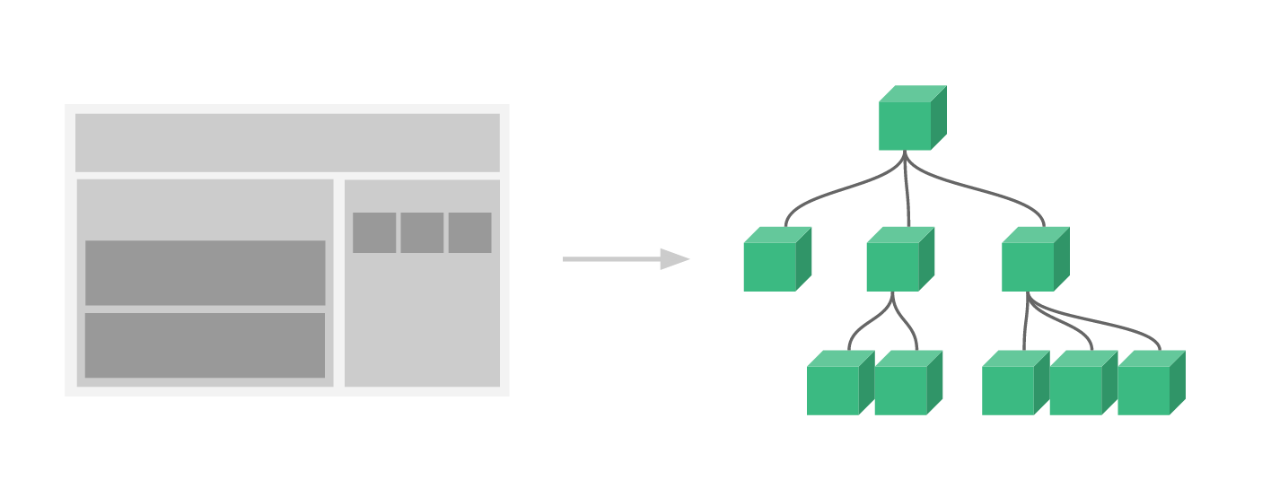
前面已经介绍过通过HaaS UI内置的组件库来搭建页面,而组件(Component)是 Vue.js 最强大的功能之一。 组件可以扩展 HTML 元素(在HaaS UI里就是扩展基础组件库),封装可重用的代码。 组件系统让我们可以用独立可复用的小组件来构建大型应用。
几乎任意类型的应用的界面都可以抽象为一个组件树:
2、自定义组件
Vue.js注册自定义组件支持全局组件和局部组件,全局组件是指在页面入口统一注册,所有组件都能使用,局部组件是在需要使用的地方进行注册。目前HaaS UI支持局部组件注册。
注册一个自定义组件的方法:
<script>
// 导入一个自定义vue组件
import Switch from "./switch.vue";
export default {
  // 注册自定义组件,只在当前实例中使用
  components: { Switch },
}
</script>
3、组件Prop
prop 是子组件用来接受父组件传递过来的数据的一个自定义属性。 父组件的数据需要通过 props 把数据传给子组件,子组件需要显式地用 props 选项声明 "prop":
<script>
export default {
  name: 'Child',
  props: {
    message: {                          // 属性名
      type: String,             // 属性类型
      default: '',              // 默认值
      validator(val) {      // 属性值合法验证
        return true;
      }
    },
    }
}
</script>
3.1、Prop类型
属性类型type可以是下面原生构造器:
String Number Boolean Array Object Date Function Symbol
也可以是一个自定义构造器,使用 instanceof 检测。
3.2、动态Prop
组件prop也可以使用动态绑定方式传递,类似于用 v-bind 绑定到一个表达式,也可以用 v-bind 动态绑定 props 的值到父组件的数据中。每当父组件的数据变化时,该变化也会传导给子组件:
<template>
  <div @click="click">
    <!-- 动态prop -->
    <Child v-bind:message="message" />
  </div>
</template>
<script>
import Child from "./child.vue";
export default {
  // 注册自定义Child组件
  components: {
    Child,
  },
  data() {
    return {
      message: 'Hello world',
    };
  },
  methods: {
    click(r) {
      // 修改message,child自动响应式更新
      this.message = 'message changed';
    },
  },
};
</script>
3.3、第一个自定义组件
根据上面介绍的相关内容,搭建一个自定义组件child.vue:
<template>
<text>{
{message}}</text>
</template>
<script>
export default {
name: 'Child',
props: {
message: { // 属性名
type: String, // 属性类型
default: '', // 默认值
validator(val) { // 属性值合法验证
return true;
}
},
}
}
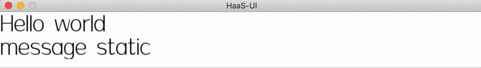
</script>父组件容器:
<template>
  <div @click="click">
    <!-- 动态prop -->
    <Child v-bind:message="message" />
    <!-- 静态prop -->
    <Child message="message static" />
  </div>
</template>
<script>
import Child from "./child.vue";
export default {
  // 注册自定义Child组件,当前实例内可复用
  components: {
    Child,
  },
  data() {
    return {
      message: 'Hello world',
    };
  },
  methods: {
    click(r) {
      // 修改message,child自动响应式更新
      this.message = 'message changed';
    },
  },
};
</script>
运行效果如下:
4、扩展一个Switch组件
了解了如何扩展一个自定义组件,我们开始尝试扩展一个更加实用的switch组件,这个组件一般用于做开关控制,是一个非常常用的组件。效果如下:
4.1、Switch组件
直接上代码:
<template>
  <!-- box为组件外框 -->
  <div class='box' :style="{'width': width + 'px', 'height': height + 'px', 'background-color': internalChecked ? colorChecked : colorNormal}" @click="toggle">
    <!-- button为内部圆球 -->
    <div class='button' :style="{'width': (height-4) + 'px', 'height': (height-4) + 'px', 'transform': `translateX(${internalChecked ? (width - height) + 'px' : (0 + 'px')})`, 'background-color' : colorButton}"></div>
  </div>
</template>
<script>
export default {
  name: 'FlSwitch',
  model:{           // v-model双向数据绑定
    prop: 'checked',
    event: 'change'
  },
  props: {
    colorChecked: { // 选中时的背景色
      type: String,
      default: '#108ee9'
    },
    colorNormal: {  // 默认未选中时的背景色
      type: String,
      default: '#fff'
    },
    colorButton: {  // 按钮颜色
      type: String,
      default: '#fff'
    },
    width: {        // 宽度(px),需大于高度,设置整体组件宽度
      type: Number,
      default: 50
    },
    height: {       // 高度(px),需小于宽度,设置组件高度
      type: Number,
      default: 25
    },
    checked: {      // 是否选中
      type: Boolean,
      default: false,
    }
  },
  data() {
    return {
      internalChecked : this.checked
    };
  },
  methods: {
    toggle() {
      this.internalChecked = !this.internalChecked;
    }
  },
  watch: {
    checked() {
      this.internalChecked = this.checked;
    },
    internalChecked() {
      this.$emit('change', this.internalChecked);
    }
  }
}
</script>
<style scoped>
.box {  /* switch背景样式 */
  border-style: solid;
  border-width: 1px;
  border-color: #888;
  border-radius: 1000px;
  box-sizing: border-box;
  transition-property: background-color;
  transition-duration: 100ms;
  padding: 1px;
}
.button { /* switch圆球样式 */
  border-radius: 1000px;
  box-shadow: 0px 0px 5px #888;
  transition-property: transform;
  transition-duration: 100ms;
}
</style>
以上,为switch组件定义了6个属性
- colorChecked:组件选中态的背景颜色
- colorNormal:组件未选中时的默认背景色
- colorButton:switch中间圆球的颜色
- width:组件整体宽度
- height:组件整体高度
- checked:默认的选中态true/false
以及通过v-model支持checked属性的双向数据绑定,可用于与父组件的变量绑定。
并通过transition样式为组件提供切换动效。
4.2、使用Switch组件
以上实现了一个Switch组件,接下来就可以在任意页面或者组件中引进来使用了。使用方法就是上面介绍的先import进来,然后注册到vue里面就行。
通过以下方法,就可以实现上面动图的效果:
<template>
<div class="page">
<div class="list-item">
<FlSwitch v-model="switch1" /><text class="list-item-text">{
{switch1Value}}</text>
</div>
</div>
</template>
<script>
import FlSwitch from "../packages/switch/index.vue";
export default {
components: {
FlSwitch,
},
data() {
return {
switch1: true,
};
},
computed: {
switch1Value() {
return this.switch1 ? 'checked' : 'unchecked';
},
}
};
</script>
<style scoped>
.page {
padding: 30px;
}
.list-item {
flex-direction: row;
align-items: center;
}
.list-item-text {
font-size: 20px;
margin-left: 30px;
}
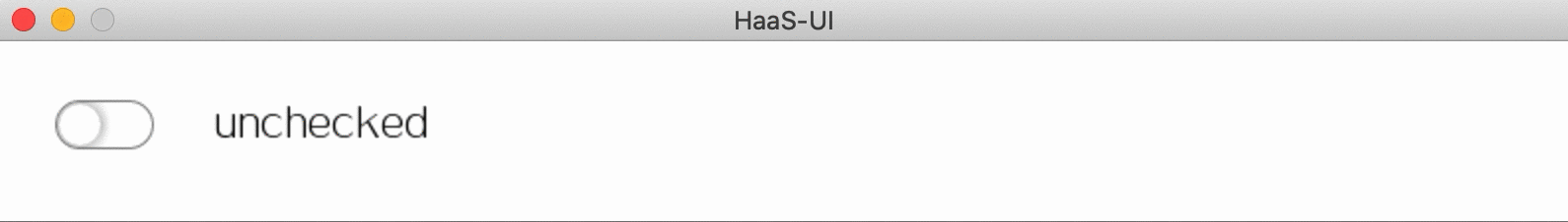
</style>4.3、更多用法
switch组件中定义了一些可定制的属性,在使用时就可以按照组件属性的方式来定制switch显示的样式和事件了:
<template>
  <div class="page">
    <div class="list-item">
      <text class="list-item-title">普通样式:</text>
      <FlSwitch v-model="switch1" /><text class="list-item-text">{

   {switch1Value}}</text>
    </div>
    <div class="list-item">
      <text class="list-item-title">双向绑定:</text>
      <FlSwitch v-model="switch1" /><text class="list-item-text">{

   {switch1Value}}</text>
    </div>
    <div class="list-item">
      <text class="list-item-title">修改样式:</text>
      <FlSwitch v-model="switch2" colorChecked="red" colorButton="green" colorNormal="#ccc"/><text class="list-item-text">{

   {switch2Value}}</text>
    </div>
    <div class="list-item">
      <text class="list-item-title">修改大小:</text>
      <FlSwitch v-model="switch3" :width="200" :height="100"/><text class="list-item-text">{

   {switch3Value}}</text>
    </div>
    <div class="list-item">
      <text class="list-item-title">事件监听:</text>
      <FlSwitch v-model="switch4" @change="switchChange"/><text class="list-item-text">{

   {switch4Value}}</text>
    </div>
  </div>
</template>
<script>
import FlSwitch from "../packages/switch/index.vue";
export default {
  components: {
    FlSwitch,
  },
  data() {
    return {
      switch1: true,
      switch2: false,
      switch3: false,
      switch4: false,
    };
  },
  computed: {
    switch1Value() {
      return this.switch1 ? 'checked' : 'unchecked';
    },
    switch2Value() {
      return this.switch2 ? 'checked' : 'unchecked';
    },
    switch3Value() {
      return this.switch3 ? 'checked' : 'unchecked';
    },
    switch4Value() {
      return this.switch4 ? 'checked' : 'unchecked';
    },
  },
  methods: {
    switchChange(c) {
      let modal = $falcon.jsapi.modal;
      modal.toast({
        content: 'switchChange ' + c,
        duration: 1000
      });
    }
  }
};
</script>
<style scoped>
.page {
  padding: 30px;
}
.list-item {
  flex-direction: row;
  margin-bottom: 30px;
  align-items: center;
}
.list-item-title {
  font-size: 20px;
  margin-right: 30px;
  width: 100px;
}
.list-item-text {
  font-size: 20px;
  color: red;
  margin-left: 30px;
}
</style>
以上代码就是使用了switch组件不同属性,运行效果如下:

5、开发者技术支持
如需更多技术支持,可加入钉钉开发者群,或者关注微信公众号
更多技术与解决方案介绍,请访问阿里云AIoT首页https://iot.aliyun.com/