rem适配方案
主流方案
| 技术方案1 | 技术方案2(推荐) |
|---|---|
| less 媒体查询 rem |
flexible.js(淘宝技术) rem |
rem计算公式
页面元素的px / html 字体大小 (建议50)
less中rem使用举例
@baseFont: 50;
.search{
   width: 15rem;
   height: 88rem / @baseFont;
}
补充说明:
88为图片设计图中的元素高度,单位为px。单此处我们的计算结果需要转成rem,所以此处的写法为:88rem / @baseFont
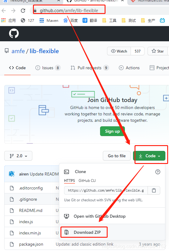
flexible.js github地址
github地址:https://github.com/amfe/lib-flexible
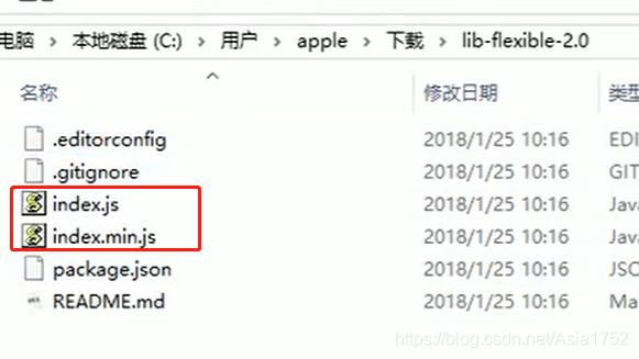
解压后文件结构
使用flexible.js时,超过750px时,如何自主控制
@media screen and (min-width:750px){
    html{
        // 使用important提高权重
        font-size: 75px!important;
    }
}