常用可视化R包
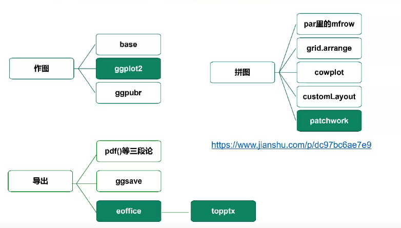
image.png
#作图分三类

#1.基础包 略显陈旧 了解一下

plot(iris[,1],iris[,3],col = iris[,5])
#
text(6.5,4, labels = 'hello')
##坐标上面标记字
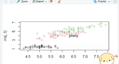
image.png
boxplot(iris[,1]~iris[,5])

dev.off()
#关闭画板


#2.ggplot2 中坚力量 学起来有点难
test = iris
if(!require(ggplot2))install.packages('ggplot2')
library(ggplot2)
ggplot(data = test)+
  geom_point(mapping = aes(x = Sepal.Length,
                           y = Petal.Length,
                           color = Species))

#3.ggpubr 江湖救急 ggplot2简化和美化 褒贬不一

if(!require(ggpubr))install.packages('ggpubr')
library(ggpubr)

ggscatter(iris,
          x="Sepal.Length",
          y="Petal.Length",
          color="Species")

# STHDA美图中心:www.sthda.com
test = iris
#1.入门级绘图模板
ggplot(data = test)+
  geom_point(mapping = aes(x = Sepal.Length,
                           y = Petal.Length))
#2.映射


library(ggplot2)
test = iris
#1.入门级绘图模板
ggplot(data = test)+
  geom_point(mapping = aes(x = Sepal.Length,
                           y = Petal.Length)) ##只需要提供作图的数据,作图的横坐标和纵坐标
#2.映射
ggplot(data = test)+
  geom_point(mapping = aes(x = Sepal.Length,
                           y = Petal.Length,
                           color = Species))
##按照数据框的某一列来定义属性,只需要按照某一列分配颜色,不需要具体说哪一种颜色

ggplot(data = test)+
  geom_point(mapping = aes(x = Sepal.Length,
                           y = Petal.Length,
                           color = Species),
             shape = 23,fill = "black")
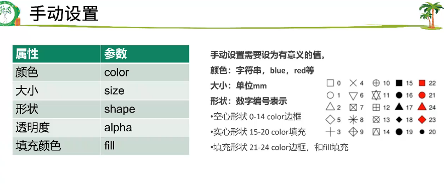
image.png

映射要写在aes里面,手动设置写在aes的外面
ggplot2 统计变换
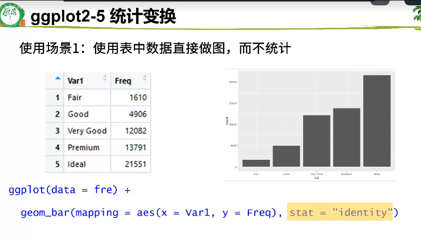
image.png

image.png
#5.统计变换-直方图
View(diamonds)
table(diamonds$cut)


ggplot(data = diamonds) +
  geom_bar(mapping = aes(x = cut))  #可以发现只有X没有Y
#geom_bar 是以画图
 #可以发现只有X没有Y。只需要给出要统计的那一列的

#上下两行的代码运行结果是一模一样的
ggplot(data = diamonds) +
  stat_count(mapping = aes(x = cut))  #每个geom函数都有其对应的stat函数
##以统计变换为出发点的stat_count


library(ggplot2)

#统计变换使用场景
#5.1.不统计,数据直接做图
fre = as.data.frame(table(diamonds$cut))
fre

ggplot(data = fre) +
  geom_bar(mapping = aes(x = Var1, y = Freq), stat = "identity")  ##stat = "identity"意思是给的数据是多少就写多少,要自己指定
#5.2count改为prop
ggplot(data = diamonds) +
  geom_bar(mapping = aes(x = cut, y = ..prop.., group = 1))  #..prop..看起来很别扭
#6.位置关系

# 6.1抖动的点图
ggplot(data = mpg,mapping = aes(x = class,
                                y = hwy,
                                group = class)) +
  geom_boxplot()+
  geom_point()

ggplot(data = mpg,mapping = aes(x = class,
                                y = hwy,
                                group = class)) +
  geom_boxplot()+
  geom_jitter()   #将geom_point()换成 geom_jitter()

# 6.2堆叠直方图
ggplot(data = diamonds) +
  geom_bar(mapping = aes(x = cut,fill=clarity))

# 6.3 并列直方图
ggplot(data = diamonds) +
  geom_bar(mapping = aes(x = cut, fill = clarity), position = "dodge")
##position = "dodge")就是变成并列的意思
#7.坐标系

#翻转coord_flip()

ggplot(data = mpg, mapping = aes(x = class, y = hwy)) +
  geom_boxplot() +
  coord_flip()     #翻转与coord_flip()
#极坐标系coord_polar()
bar <- ggplot(data = diamonds) +
  geom_bar(
    mapping = aes(x = cut, fill = cut),
    show.legend = FALSE,
    width = 1
  ) +
  theme(aspect.ratio = 1) +
  labs(x = NULL, y = NULL)
bar + coord_flip()
bar + coord_polar()

总结

image.png