废话不多说,直接上效果图
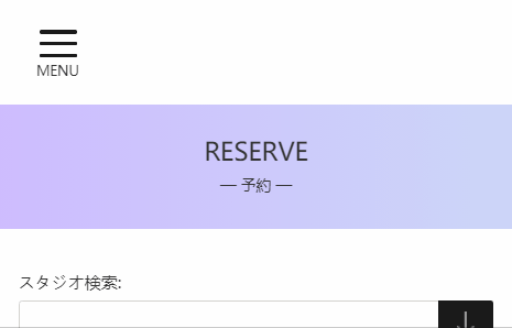
1.侧边栏滑动效果
这里我用到了vue自带的transition标签,具体使用方法可参考:https://cn.vuejs.org/v2/guide/transitions.html
    <transition name="sidebartransition"> //transition标签
      <div class="sidebarbgc" v-if="sidebarIsShow">
        <div :class="{ graybgc: true, graybgcactive: sidebarIsShow }"></div> //外层的半透明灰色背景
        <div class="sidebarwhite"> //侧边栏白色背景主体区域
          <div class="mbloginbefore" v-if="!isLoginFn"> //与本例无关的一些占位内容↓↓↓
            <div class="mblogin">
              <button @click="gotoLogin()">LOGIN</button>
            </div>
            <div class="freeexp">
              <button>無料体験会 / 体験予約</button>
            </div>
          </div>
        </div>
      </div>
    </transition>
首先,整体.sidebarbgc做好fix定位
.sidebarbgc{
  position: fixed;
  top: 0;
  left: 0;
  width: 100%;
  height: 100%;
}
然后就可以利用transition组件做过渡效果了,在scss中:
.sidebartransition {
  &-enter {
    transform: translateX(-100%);  //整体划入之前隐藏在最左侧
  }
  &-enter-active {
    transition: all 0.5s ease;  //划入过渡,用时0.5s
  }
  &-leave-to {
    transform: translateX(-120%); //整体划出之后隐藏在最左侧,之所以设置为-120%,见后文
  }
  &-leave-active {
    transition: all 0.5s ease; //划出过渡,用时0.5s
  }
}
设置灰色半透明滑块的样式:
  .graybgc {
    position: absolute;
    width: 100%;
    height: 100%;
    z-index: -1;
    background-color: rgba($color: #000000, $alpha: 0.5);
  }
  .graybgcactive {
    width: 120%; //当侧边栏显示时,即sidebarIsShow为true时,灰色滑块变动宽度为120%
  }
上文之所以设置为划出的最终位移为-120%,是为了配合半透明灰色滑块的变宽效果,可以看到,当侧边栏在中途时,灰色半透明滑块宽度的视觉效果是变动的
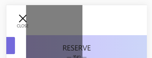
2.三条杠变叉号
首先,三条杠我是用单独的一条div线,然后用伪元素做出其他的两条线。
    <div class="menu" @click="menuClick()">
      <div :class="{ menuline: true, menulineactive: menulineact }">
          <div class="middleline"></div> //中间的线
      </div>
      <p v-if="menuIsShow">MENU</p>
      <p v-if="closeIsShow">CLOSE</p>
    </div>
三条杠的scss样式:
.middleline {
      display: inline-block;
      line-height: 65px;
      width: 55px;
      height: 5px;
      border-radius: 3px;
      background-color: $black;
      position: relative;
      transition: all 0.5s ease;
      &::before {  //前一条线
        content: "";
        position: absolute;
        width: 55px;
        height: 5px;
        bottom: 17px;
        border-radius: 3px;
        background-color: $black;
        transition: all 0.5s ease;
      }
      &::after {  //后一条线
        content: "";
        position: absolute;
        width: 55px;
        height: 6px;
        top: 17px;
        border-radius: 3px;
        background-color: $black;
        transition: all 0.5s ease;
      }
    }
当点击菜单,显示侧边栏时,绑定动态class:menulineactive,该class所有的三条线都添加过渡效果,即:
    .middleline {
      display: inline-block;
      line-height: 65px;
      width: 55px;
      height: 5px;
      border-radius: 3px;
      background-color: $black;
      position: relative;
      transform: rotate(45deg);   //中间的线顺时针旋转45°
      transition: all 0.5s ease;
      &::before {
        content: "";
        position: absolute;
        width: 55px;
        height: 5px;
        bottom: 0px;
        border-radius: 3px;
        background-color: $black;
        transform: rotate(-90deg); //上方的线逆时针旋转90°
        transition: all 0.5s ease;
      }
      &::after {
        opacity: 0; //底部的线隐藏
      }
    }
点击close关闭侧边栏的效果便也完成了。