写一个底部导航栏独立组件,便于以后项目中的使用
分为创建和封装两步
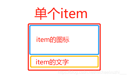
需求:独立、图标可改、名称可改、flex布局
①分析:首先是TabBar
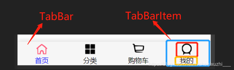
TabBar是导航栏的主框架,包裹整个导航栏
创建tabbar -> Tabbar.vue
<template>
<div id="tab-bar">
// 这里啥都没有
</div>
</template>
<script>
export default {
name: "Tabbar"
}
</script>
<style scoped>
#tab-bar {
display: flex; /
background-color: #f6f6f6;
position: fixed;
left: 0;
right: 0;
bottom: 0;
box-shadow: 0 -3px 10px rgba(100, 100, 100, .2);
}
</style>
创建主导航栏区域 MainTabBar.vue,这里其实是将导航栏的区域Tabbar.vue做成一个独立组件,让它在MainTabBar中展示,因为后续还要在导航栏区域内实现TabBarItem,所以全都做了抽离和独立。
MainTabBar.vue
<template>
    <tab-bar></tab-bar>
</template>

<script>
  import TabBar from "./tabbar/Tabbar";

  export default {


    name: "MainTabBar",
    components:{


      TabBar
    }
  }
</script>

<style scoped>

</style>
再在App.vue中引用MainTabBar组件
<template>
  <div id="app">
    <main-tab-bar></main-tab-bar>
  </div>
</template>

<script>
import MainTabBar from '../components/MainTabBar.vue'
export default {


  name:'App',
  components: {


    MainTabBar
  }
}
</script>
到这里为止,是创建了一个底部导航栏区域,但是里面没有内容,所以Tabbar.vue的高度是0的,也就看不到任何效果,只要给Tabbar.vue的样式加上一点高度,就可以知道现在导航栏区域的样子了,后续会去除这个写死的高度,由TabBarItem的内容来撑开导航栏
height: 50px;

②接着创建TabBarItem,也就是每一个选项
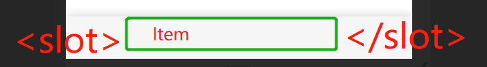
这些选项都是要插进Tabbar.vue中的,所以Tabbar.vue要设置插槽,让每个Item能添加进去
<slot></slot>
tabbar -> TabbarItem.vue
导航栏中已经设置 display:flex;这里item就设置flex:1; item的高度给到49px,这是通常导航栏的高度,有高度就可以撑开导航栏了,还要设置item中图标的样式
<template>
<div class="tab-bar-item" @click="itemClick">
</div>
</template>
<script>
export default {
name: "TabbarItem",
data(){
return{
},
methods:{
itemClick(){
}
}
}
</script>
<style scoped>
.tab-bar-item {
flex: 1;
text-align: center;
height: 49px;
font-size: 14px;
}
.tab-bar-item img {
margin-top: 3px;
width: 24px;
height: 24px;
vertical-align: middle;
margin-bottom: 2px;
}
</style>
item中用来插入图标和文字
item的图标设置
<div class="tab-bar-item" @click="itemClick">
<div v-if="!isActive" slot="item-icon">
<slot name="item-icon"></slot>
</div>
<div v-else slot="item-icon-active">
<slot name="item-icon-active"></slot>
</div>
</div>
item的文字设置
<div slot="item-text" :style="activeStyle">
   <slot name="item-text"></slot>
</div>
给图片和文字使用具名slot是因为TabBarItem也是一个抽离出来的单独组件,最终TabBar.vue和TabBarItem.vue都会集中在MainTabBar中引用并呈现。
<template>
<tab-bar>
<tab-bar-item path="/home" activeColor="blue">
<img slot="item-icon" src="@assets/img/tabbar/home.svg" alt="">
<img slot="item-icon-active" src="@assets/img/tabbar/home_active.svg" alt="">
<div slot="item-text">首页</div>
</tab-bar-item>
<tab-bar-item path="/category" activeColor="green">
<img slot="item-icon" src="@assets/img/tabbar/category.svg" alt="">
<img slot="item-icon-active" src="@assets/img/tabbar/category_active.svg" alt="">
<div slot="item-text">分类</div>
</tab-bar-item>
</tab-bar>
</template>
<script>
import TabBar from "./tabbar/Tabbar";
import TabBarItem from "./tabbar/TabbarItem";
export default {
name: "MainTabBar",
components:{
TabBar,
TabBarItem
}
}
</script>
<style scoped>
</style>
层级关系是:
img、text -> tab-bar-item ≈ tab-bar -> main-tab-bar -> App
在MainTabBar.vue中引用并使用了这两个组件,并给子层传递了参数,所以在子层中要用props来接收一下:
这是TabBarItem的逻辑处理
<script>
export default {
name: "TabbarItem",
props:{
path: String,
activeColor:{
type:String,
default : 'red'
}
},
data(){
return{
}
},
computed : {
isActive() {
return this.$route.path.indexOf(this.path) !== -1
},
activeStyle() {
return this.isActive ? {
color : this.activeColor} : {
}
}
},
methods:{
itemClick(){
this.$router.replace(this.path)
}
}
}
</script>
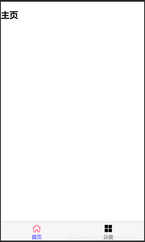
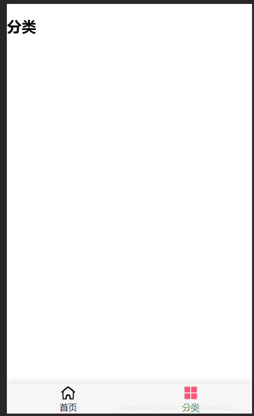
该组件的最终实现需要:导航栏中对应的每一项图标和对应的展示页面
图标的路径在MainTabBar.vue中自行修改,对应的展示页面的话,需要安装vue-router并进行配置
这里结合懒加载简单配置“首页”和“分类”两个对应页面
import Vue from 'vue'
import VueRouter from 'vue-router'
Vue.use(VueRouter)
const Home = () => import('../views/home/Home');
const Category = () => import("../views/category/Category");
const routes = [
{
path: '',
redirect : '/home'
},
{
path: '/home',
component : Home
},
{
path: '/category',
component : Category
}
]
const router = new VueRouter({
mode : 'history',
routes
})
export default router
最终实现