布局一个 widget
重点是什么?
- 即使应用程序本身也是一个 widget.
- 创建一个widget并将其添加到布局widget中是很简单的.
- 要在设备上显示widget,请将布局widget添加到 app widget中。
- 使用Scaffold是最容易的,它是 Material Components库中的一个widget,它提供了一个默认banner,背景颜色,并且具有添加drawer,snack bar和底部sheet的API。
- 如果您愿意,可以构建仅使用标准widget库中的widget来构建您的应用程序
在Flutter中,只需几个步骤即可在屏幕上放置文本,图标或图像。
-
选择一个widget来保存该对象。
根据您想要对齐或约束可见窗口小部件的方式,从各种布局widget中进行选择, 因为这些特性通常会传递到所包含的widget中。这个例子使用Center,它可以将内容水平和垂直居中。 -
创建一个widget来容纳可见对象
注意:Flutter应用程序是用Dart语言编写的。如果您了解Java或类似的面向对象编程语言,Dart会感到非常熟悉。 如果不了解的话,你可以试试 DartPad-一个可以在任何浏览器上使用的交互式Dart playground。 Dart 语言之旅是一篇介绍Dart语言特性的概述。
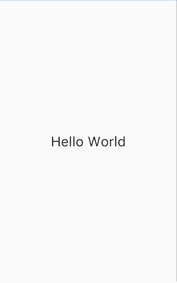
例如,创建一个Text widget:
new Text('Hello World', style: new TextStyle(fontSize: 32.0))创建一个 Image widget:
new Image.asset('images/myPic.jpg', fit: BoxFit.cover)创建一个 Icon widget:
new Icon(Icons.star, color: Colors.red[500])3.将可见widget添加到布局widget.
所有布局widget都有一个child属性(例如Center或Container),或者一个 children属性,如果他们需要一个widget列表(例如Row,Column,ListView或Stack)。
将Text widget添加到Center widget:
new Center(
  child: new Text('Hello World', style: new TextStyle(fontSize: 32.0))
4.将布局widget添加到页面.
Flutter应用本身就是一个widget,大部分widget都有一个build()方法。在应用程序的build方法中创建会在设备上显示的widget。 对于Material应用程序,您可以将Center widget直接添加到body属性中
class _MyHomePageState extends State<MyHomePage> {
  @override
  Widget build(BuildContext context) {
    return new Scaffold(
      appBar: new AppBar(
        title: new Text(widget.title),
      ),
      body: new Center(
        child: new Text('Hello World', style: new TextStyle(fontSize: 32.0)),
      ),
    );
  }
}
Note: 在设计用户界面时,您可以使用标准widget库中的widget,也可以使用Material Components中的widget。 您可以混合使用两个库中的widget,可以自定义现有的widget,也可以构建一组自定义的widget。
对于非Material应用程序,您可以将Center widget添加到应用程序的build()方法中:
-
请注意,默认情况下,非Material应用程序不包含AppBar,标题或背景颜色。 如果您想在非Material应用程序中使用这些功能,您必须自己构建它们。此应用程序将背景颜色更改为白色,将文本更改为深灰色以模仿Material应用程序。
好了! 当你运行这个应用时,你会看到:
垂直和水平放置多个widget
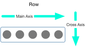
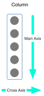
最常见的布局模式之一是垂直或水平排列widget。您可以使用行(Row)水平排列widget,并使用列(Column)垂直排列widget。
重点是什么?
- 行和列是两种最常用的布局模式。
- 行和列都需要一个子widget列表。
- 子widget本身可以是行、列或其他复杂widget。
- 您可以指定行或列如何在垂直或水平方向上对齐其子项
- 您可以拉伸或限制特定的子widget.
- 您可以指定子widget如何使用行或列的可用空间.
Contents
您可以控制行或列如何使用mainAxisAlignment和crossAxisAlignment属性来对齐其子项。 对于行(Row)来说,主轴是水平方向,横轴垂直方向。对于列(Column)来说,主轴垂直方向,横轴水平方向。
MainAxisAlignment 和CrossAxisAlignment 类提供了很多控制对齐的常量.
注意: 将图片添加到项目时,需要更新pubspec文件才能访问它们 - 此示例使用Image.asset显示图像。 有关更多信息,请参阅此示例的pubspec.yaml文件, 或在Flutter中添加资源和图像。如果您使用的是网上的图片,则不需要执行此操作,使用Image.network即可。
在以下示例中,3个图像中的每一个都是100像素宽。渲染盒(在这种情况下,整个屏幕)宽度超过300个像素, 因此设置主轴对齐方式为spaceEvenly,它会在每个图像之间,之前和之后均匀分配空闲的水平空间。
appBar: new AppBar(
  title: new Text(widget.title),
),
body: new Center(
  child: new Row(
    mainAxisAlignment: MainAxisAlignment.spaceEvenly,
    children: [
      new Image.asset('images/pic1.jpg'),
列的工作方式与行相同。以下示例显示了一列,包含3个图片,每个图片高100个像素。 渲染盒(在这种情况下,整个屏幕)的高度大于300像素,因此设置主轴对齐方式为spaceEvenly,它会在每个图像之间,上方和下方均匀分配空闲的垂直空间。
appBar: new AppBar(
  title: new Text(widget.title),
),
body: new Center(
  child: new Column(
    mainAxisAlignment: MainAxisAlignment.spaceEvenly,
    children: [
      new Image.asset('images/pic1.jpg'),
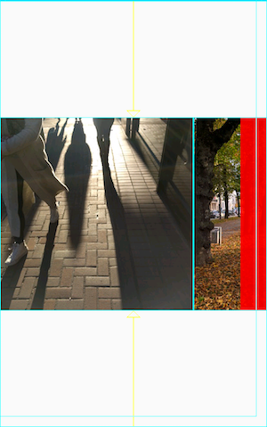
*注意: 如果布局太大而不适合设备,则会在受影响的边缘出现红色条纹。例如,以下截图中的行对于设备的屏幕来说太宽:
通过使用Expanded widget,可以将widget的大小设置为适和行或列,这在下面的调整 widgets 部分进行了描述。
也许你想要一个widget占据其兄弟widget两倍的空间。您可以将行或列的子项放置在Expandedwidget中, 以控制沿着主轴方向的widget大小。Expanded widget具有一个flex属性,它是一个整数,用于确定widget的弹性系数,默认弹性系数是1。
例如,要创建一个由三个widget组成的行,其中中间widget的宽度是其他两个widget的两倍,将中间widget的弹性系数设置为2:
appBar: new AppBar(
  title: new Text(widget.title),
),
body: new Center(
  child: new Row(
    crossAxisAlignment: CrossAxisAlignment.center,
    children: [
      new Expanded(
        child: new Image.asset('images/pic1.jpg'),
      ),
      new Expanded(
        flex: 2,
        child: new Image.asset('images/pic2.jpg'),
      ),
      new Expanded(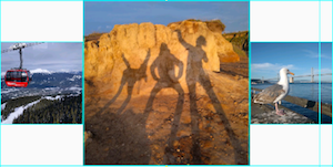
要修复上一节中的示例:其中一行有3张图片,行对于其渲染框太宽,并且导致右边出现红色条中的问题,可以使用Expanded widget来包装每个widget。 默认情况下,每个widget的弹性系数为1,将行的三分之一分配给每个小部件。
appBar: new AppBar(
  title: new Text(widget.title),
),
body: new Center(
  child: new Row(
    crossAxisAlignment: CrossAxisAlignment.center,
    children: [
      new Expanded(
        child: new Image.asset('images/pic1.jpg'),
      ),
      new Expanded(
        child: new Image.asset('images/pic2.jpg'),
      ),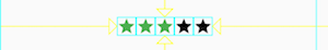
new Expanded(默认情况下,行或列沿着其主轴会尽可能占用尽可能多的空间,但如果要将孩子紧密聚集在一起,可以将mainAxisSize设置为MainAxisSize.min。 以下示例使用此属性将星形图标聚集在一起(如果不聚集,五张星形图标会分散开)。
class _MyHomePageState extends State<MyHomePage> {
  @override
  Widget build(BuildContext context) {
    var packedRow = new Row(
      mainAxisSize: MainAxisSize.min,
      children: [
        new Icon(Icons.star, color: Colors.green[500]),
        new Icon(Icons.star, color: Colors.green[500]),
        new Icon(Icons.star, color: Colors.green[500]),
        new Icon(Icons.star, color: Colors.black),
        new Icon(Icons.star, color: Colors.black),
      ],
    );

  // ...
}布局框架允许您根据需要在行和列内部再嵌套行和列。让我们看下面红色边框圈起来部分的布局代码:
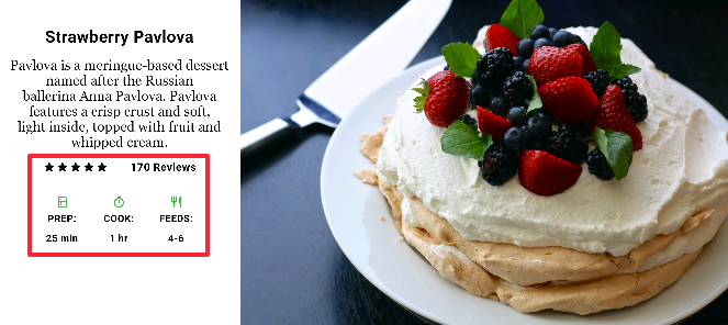
红色边框部分的布局通过两个行来实现。评级行包含五颗星和评论数量。图标行包含三列图标和文本。
评级行的widget树:
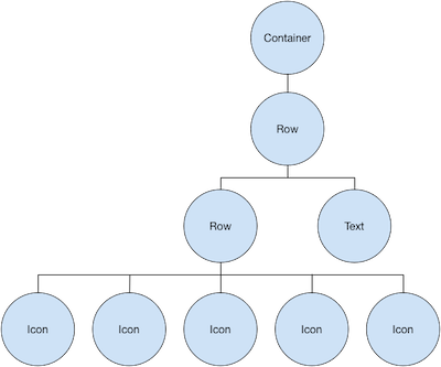
该ratings变量创建一个包含5个星形图标和一个文本的行:
class _MyHomePageState extends State<MyHomePage> {
  @override
  Widget build(BuildContext context) {
    //...

    var ratings = new Container(
      padding: new EdgeInsets.all(20.0),
      child: new Row(
        mainAxisAlignment: MainAxisAlignment.spaceEvenly,
        children: [
          new Row(
            mainAxisSize: MainAxisSize.min,
            children: [
              new Icon(Icons.star, color: Colors.black),
              new Icon(Icons.star, color: Colors.black),
              new Icon(Icons.star, color: Colors.black),
              new Icon(Icons.star, color: Colors.black),
              new Icon(Icons.star, color: Colors.black),
            ],
          ),
          new Text(
            '170 Reviews',
            style: new TextStyle(
              color: Colors.black,
              fontWeight: FontWeight.w800,
              fontFamily: 'Roboto',
              letterSpacing: 0.5,
              fontSize: 20.0,
            ),
          ),
        ],
      ),
    );
    //...
  }
}
提示: 为了最大限度地减少由嵌套严重的布局代码导致的视觉混淆,可以在变量和函数中实现UI的各个部分。
评级行下方的图标行包含3列; 每个列都包含一个图标和两行文本,您可以在其widget树中看到:
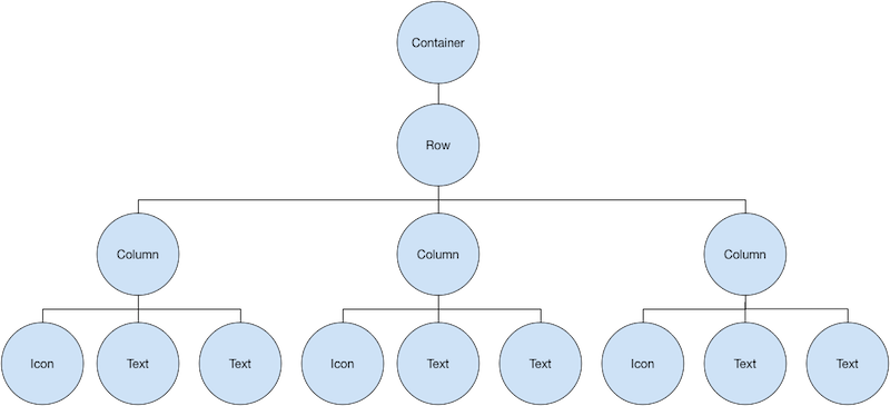
该iconList变量定义了图标行:
class _MyHomePageState extends State<MyHomePage> {
  @override
  Widget build(BuildContext context) {
    // ...

    var descTextStyle = new TextStyle(
      color: Colors.black,
      fontWeight: FontWeight.w800,
      fontFamily: 'Roboto',
      letterSpacing: 0.5,
      fontSize: 18.0,
      height: 2.0,
    );

    // DefaultTextStyle.merge可以允许您创建一个默认的文本样式,该样式会被其
    // 所有的子节点继承
    var iconList = DefaultTextStyle.merge(
      style: descTextStyle,
      child: new Container(
        padding: new EdgeInsets.all(20.0),
        child: new Row(
          mainAxisAlignment: MainAxisAlignment.spaceEvenly,
          children: [
            new Column(
              children: [
                new Icon(Icons.kitchen, color: Colors.green[500]),
                new Text('PREP:'),
                new Text('25 min'),
              ],
            ),
            new Column(
              children: [
                new Icon(Icons.timer, color: Colors.green[500]),
                new Text('COOK:'),
                new Text('1 hr'),
              ],
            ),
            new Column(
              children: [
                new Icon(Icons.restaurant, color: Colors.green[500]),
                new Text('FEEDS:'),
                new Text('4-6'),
              ],
            ),
          ],
        ),
      ),
    );
    // ...
  }
}该leftColumn变量包含评分和图标行,以及描述Pavlova的标题和文字:
class _MyHomePageState extends State<MyHomePage> {
  @override
  Widget build(BuildContext context) {
    //...

    var leftColumn = new Container(
      padding: new EdgeInsets.fromLTRB(20.0, 30.0, 20.0, 20.0),
      child: new Column(
        children: [
          titleText,
          subTitle,
          ratings,
          iconList,
        ],
      ),
    );
    //...
  }
}
左列放置在容器中以约束其宽度。最后,用整个行(包含左列和图像)放置在一个Card内构建UI:
Pavlova图片来自 Pixabay ,可以在Creative Commons许可下使用。 您可以使用Image.network直接从网上下载显示图片,但对于此示例,图像保存到项目中的图像目录中,添加到pubspec文件, 并使用Images.asset。 有关更多信息,请参阅在Flutter中添加Asserts和图片。
body: new Center(
  child: new Container(
    margin: new EdgeInsets.fromLTRB(0.0, 40.0, 0.0, 30.0),
    height: 600.0,
    child: new Card(
      child: new Row(
        crossAxisAlignment: CrossAxisAlignment.start,
        children: [
          new Container(
            width: 440.0,
            child: leftColumn,
          ),
          mainImage,
        ],
      ),
    ),
  ),
),