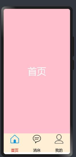
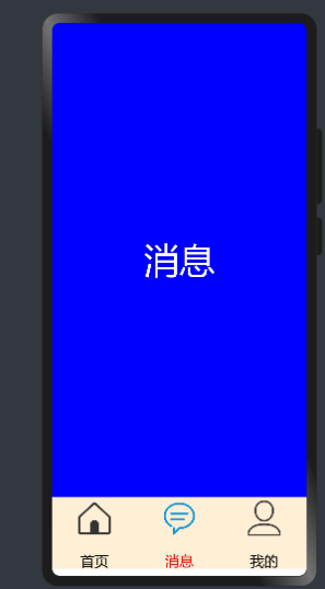
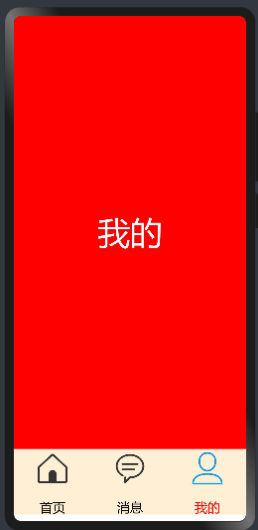
在鸿蒙开发中tab切换功能(如下图所示)是非常常见一个功能,今天描述如下功能怎么实现?开发中需要准备哪些资料?
今天我们从“资料准备”,“Tabs功能实现”,“底部按钮功能实现”,“运行效果”四个方面进行描述
1. 开发准备
1.1资料准备 想要实现如上图功能的话,需要学习“Tabs”,“TabContent”,“ Row”,“Column”,等等相关技术
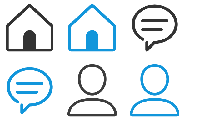
1.2 图片准备 准备六张图片(图片如下)放在resources/base/media/目录下
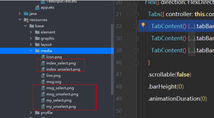
图片存放的位置
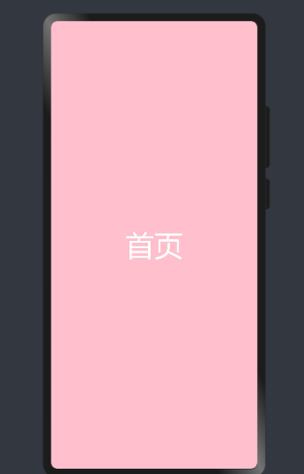
2. Tabs功能实现
2.1详细资料参考“Tabs”,“TabContent”的官方文档
代码如下
@Entry
@Component
struct MyNewsIndex {
  private controller: TabsController = new TabsController()

  build() {
    Flex({ direction: FlexDirection.Column, alignItems: ItemAlign.Center, justifyContent: FlexAlign.Center }) {
      Tabs({ controller: this.controller }) {
        TabContent() {
          Text("首页")
            .width('100%').height('100%')
            .fontSize(50)
            .textAlign(TextAlign.Center)
            .fontColor(Color.White)
            .backgroundColor(Color.Pink)
        }.tabBar('首页')
        TabContent() {
          Text("消息")
            .width('100%').height('100%')
            .fontSize(50)
            .textAlign(TextAlign.Center)
            .fontColor(Color.White)
            .backgroundColor(Color.Blue)
        }.tabBar('消息')
        TabContent() {
          Text("我的")
            .width('100%').height('100%')
            .fontSize(50)
            .textAlign(TextAlign.Center)
            .fontColor(Color.White)
            .backgroundColor(Color.Red)
        }.tabBar('我的')
      }
      .scrollable(false)
      .barHeight(0)
      .animationDuration(0)


      }.alignItems(VerticalAlign.Bottom).width('100%').height(120).margin({top:0,right:0,bottom:10,left:0})
    }
    .width('100%')
    .height('100%')
  }
}
效果如下
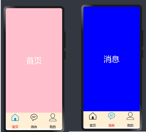
3底部按钮功能实现
3.1底部功能实现主要使用“Row”,“Column”,“Text”,“Image”等相关技术实现,代码如下
Row() {
        Column(){
          Image($r('app.media.index_select'))
            .width(60).height(60)
          Text('首页')
            .size({ width: '100%', height: 60 }).textAlign(TextAlign.Center)
            .fontSize(20)
            .fontColor(Color.Red)
        }
        .layoutWeight(1)
        .backgroundColor(0xFFEFD5)
        .height("100%")

        Column(){
          Image($r('app.media.msg_unselect'))
            .width(60).height(60)
          Text('消息')
            .size({ width: '100%', height: 60 }).textAlign(TextAlign.Center)
            .fontSize(20)
            .fontColor(Color.Black)
        }
        .layoutWeight(1)
        .backgroundColor(0xFFEFD5)
        .height("100%")

        Column(){
          Image($r('app.media.my_unselect'))
            .width(60).height(60)
          Text('我的')
            .size({ width: '100%', height: 60 }).textAlign(TextAlign.Center)
            .fontSize(20)
            .fontColor(Color.Black)
        }
        .layoutWeight(1)
        .backgroundColor(0xFFEFD5)
        .height("100%")
      }.alignItems(VerticalAlign.Bottom).width('100%').height(120).margin({top:0,right:0,bottom:10,left:0})
4运行效果
4.1 Tabs和按钮联动问题实现
我们在定义一个全局变量SelectPos为当前选择的索引,当点击按钮的时候对当前索引进行赋值,并对Image和字体颜色进行改变,全部代码如下
@Entry
@Component
struct MyNewsIndex {
private controller: TabsController = new TabsController()
@State SelectPos:number=0;
public IndexClick(){
this.SelectPos=0;
this.controller.changeIndex(0)
}
public messageClick(){
this.SelectPos=1;
this.controller.changeIndex(1)
}
public myClick(){
this.SelectPos=2;
this.controller.changeIndex(2)
}
build() {
Flex({ direction: FlexDirection.Column, alignItems: ItemAlign.Center, justifyContent: FlexAlign.Center }) {
Tabs({ controller: this.controller }) {
TabContent() {
Text("首页")
.width('100%').height('100%')
.fontSize(50)
.textAlign(TextAlign.Center)
.fontColor(Color.White)
.backgroundColor(Color.Pink)
}.tabBar('首页')
TabContent() {
Text("消息")
.width('100%').height('100%')
.fontSize(50)
.textAlign(TextAlign.Center)
.fontColor(Color.White)
.backgroundColor(Color.Blue)
}.tabBar('消息')
TabContent() {
Text("我的")
.width('100%').height('100%')
.fontSize(50)
.textAlign(TextAlign.Center)
.fontColor(Color.White)
.backgroundColor(Color.Red)
}.tabBar('我的')
}
.scrollable(false)
.barHeight(0)
.animationDuration(0)
Row() {
Column(){
Image((this.SelectPos==0?$r('app.media.index_select'):$r('app.media.index_unselect')))
.width(60).height(60)
Text('首页')
.size({ width: '100%', height: 60 }).textAlign(TextAlign.Center)
.fontSize(20)
.fontColor((this.SelectPos==0?Color.Red:Color.Black))
}
.layoutWeight(1)
.backgroundColor(0xFFEFD5)
.height("100%")
.onClick(this.IndexClick.bind(this))
Column(){
Image((this.SelectPos==1?$r('app.media.msg_select'):$r('app.media.msg_unselect')))
.width(60).height(60)
Text('消息')
.size({ width: '100%', height: 60 }).textAlign(TextAlign.Center)
.fontSize(20)
.fontColor((this.SelectPos==1?Color.Red:Color.Black))
}
.layoutWeight(1)
.backgroundColor(0xFFEFD5)
.height("100%")
.onClick(this.messageClick.bind(this))
Column(){
Image((this.SelectPos==2?$r('app.media.my_select'):$r('app.media.my_unselect')))
.width(60).height(60)
Text('我的')
.size({ width: '100%', height: 60 }).textAlign(TextAlign.Center)
.fontSize(20)
.fontColor((this.SelectPos==2?Color.Red:Color.Black))
}
.layoutWeight(1)
.backgroundColor(0xFFEFD5)
.height("100%")
.onClick(this.myClick.bind(this))
}.alignItems(VerticalAlign.Bottom).width('100%').height(120).margin({top:0,right:0,bottom:10,left:0})
}
.width('100%')
.height('100%')
}
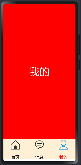
}运行效果如下
{{o.name}}
{{m.name}}