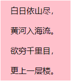
模糊化之前效果:
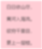
模糊化之后效果:
css实现模糊化:
.blur {
	position: relative;
	filter: blur(5px);
	user-select: none;
}
在需要加模糊化的元素上面加上blur类即可生效。
css实现模糊化后加遮罩:
.blur::after {
	position: absolute;
	top: 0;
	left: 0;
	width: 100%;
	height: 100%;
	content: '';
	display: block;
	background: rgba(255, 253, 253, 0);
}
强化功能,如果模糊对象存在点击事件,可以加次遮罩禁止点击事件。
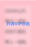
场景拓展,比如在模糊化上面增加‘开通VIP查看’等字样:
css实现:
.tip {
	position: relative;
	top: 80px;
	font-weight: 700;
	text-align: center;
	font-size: 16px;
	color: #2878ff;
}
兼容性:
由于用ie不支持::after这种伪类,所以ie中不支持此方法,ie中可以配合模糊化图片进行处理。
完整代码示例:
<!DOCTYPE html>
<html>
	<head>
		<meta charset="utf-8">
		<title>内容模糊化</title>
		<style type="text/css">
			* {
				padding: 0;
				margin: 0;
				list-style: none;
			}
			.wraper {
				position: relative;
				width: 100px;
				margin: 100px auto;
				padding: 0 20px;
				background-color: pink;
			}
			ul {
				width: 100%;
			}
			ul li {
				height: 40px;
				line-height: 40px;
			}
			.tip {
				position: relative;
				top: 80px;
				font-weight: 700;
				text-align: center;
				font-size: 16px;
				color: #2878ff;
			}
			.blur {
				position: relative;
				filter: blur(5px);
				user-select: none;
			}
			.blur::after {
				position: absolute;
				top: 0;
				left: 0;
				width: 100%;
				height: 100%;
				content: '';
				display: block;
				background: rgba(255, 253, 253, 0.2);
			}
		</style>
	</head>
	<body>
		<div class="wraper">
			<p class="tip">开通VIP查看</p>
			<ul class="blur">
				<li>白日依山尽,</li>
				<li>黄河入海流。</li>
				<li>欲穷千里目,</li>
				<li>更上一层楼。</li>
			</ul>
		</div>
	</body>
</html>
关注我,不迷路
小伙伴,用你可爱的小手,点个赞,关注我了解更多知识!!!
如果任何疑问的可以在评论区留言或者私聊。
可以加QQ群交流:568984539,加群备注‘地区-名字-技术类型’。
更多前端、uniapp、nodejs等相关知识可关注我个人博客:https://blog.csdn.net/qq_42961150?spm=1011.2124.3001.5343