在线demo演示地址:https://rondsjinhuajin.github.io/demo/index.html
个人博客主页:KinHKin的博客_CSDN博客-vue,中秋活动,性能优化领域博主
使用人群:前端面试,日常开发小技巧
目录
2、使用position + transform: translate(-50%,-50%)实现
3、使用position+margin减去子元素宽高的一半实现
5、使用grid+align-self+justify-self实现
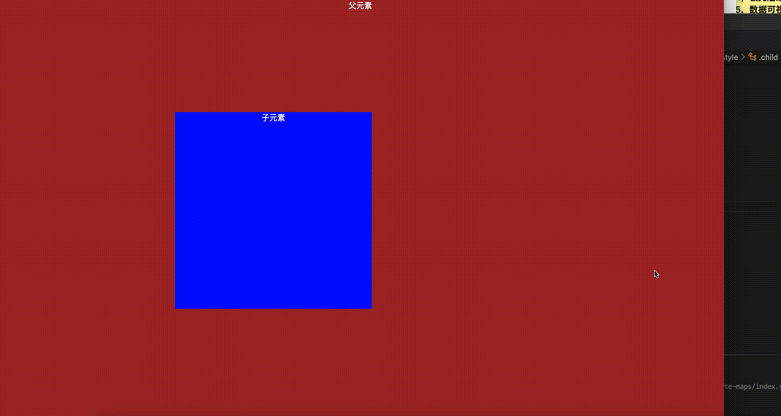
1、效果演示如下
注意:一个元素要想实现垂直水平居中,必须要有一个参照物,这个参照物要么是父级div元素,要么就是body元素。本文为父元素高度未知,子元素垂直水平居中方案。以下所有的css都经过博主亲自测验通过才发出,请放心使用❤️
    <!-- dom元素 -->
    <div class="parent">
      父元素
      <div class="child">子元素</div>
    </div>
以下是css部分:
1、使用display:flex实现
   .parent {
        width: 100%;
        height: 100%;
        background-color: brown;
        display: flex;
        align-items: center;
        justify-content: center;
      }
      .child {
        width: 400px;
        height: 400px;
        background-color: blue;
      }
2、使用position + transform: translate(-50%,-50%)实现
   .parent {
        width: 100%;
        height: 100%;
        background-color: brown;
        position: relative;
      }
      .child {
        width: 400px;
        height: 400px;
        background-color: blue;
        position: absolute;
        left: 50%;
        top: 50%;
        transform: translate(-50%,-50%);
      }
3、使用position+margin减去子元素宽高的一半实现
   .parent {
        width: 100%;
        height: 100%;
        background-color: brown;
         /* 第一种 */
        /* display: flex;
        align-items: center;
        justify-content: center; */
        position: relative;
      }
      .child {
        width: 400px;
        height: 400px;
        background-color: blue;
        /* 第二种 */
        /* position: absolute;
        left: 50%;
        top: 50%;
        transform: translate(-50%,-50%); */
        /* 第三种 */
        position: absolute;
        left: 50%;
        top: 50%;
        margin: -200px 0 0 -200px;
      }
4、使用position+margin:auto实现
     .parent {
        width: 100%;
        height: 100%;
        background-color: brown;
         /* 第一种 */
        /* display: flex;
        align-items: center;
        justify-content: center; */
        position: relative;
      }
      .child {
        width: 400px;
        height: 400px;
        background-color: blue;
        /* 第二种 */
        /* position: absolute;
        left: 50%;
        top: 50%;
        transform: translate(-50%,-50%); */
        /* 第三种 */
        /* position: absolute;
        left: 50%;
        top: 50%;
        margin: -200px 0 0 -200px; */
        /* 第四种 */
        position: absolute;
        top: 0;
        left: 0;
        right: 0;
        bottom: 0;
        margin: auto;
      }
5、使用grid+align-self+justify-self实现
注意:这种方式父元素要没有其他的子元素或者是内容
效果图如下:
代码如下:
.parent {
        width: 100%;
        height: 100%;
        background-color: brown;
        display: grid;
      }
      .child {
        width: 400px;
        height: 400px;
        background-color: blue;
        align-self: center;
        justify-self: center;
      }
6、使用css-table实现
注意:这种方式其实是父元素要固定宽高,我这里是用vh来定,类似于百分比
.parent {
        width: 100vw;
        height: 100vh;
        background-color: brown;

         /* 第六种 */
         display: table-cell;
          text-align: center;
          vertical-align: middle;

      }
      .child {
        width: 400px;
        height: 400px;
        background-color: blue;
        /* 第六种 */
        display: inline-block;
      }
7、总结
这里实现了比较常用的垂直水平居中的方案,十分有用,希望对于面试必考题来说,只要熟练掌握前面三种,基本上是没有问题了,源码我会放在本人主页的资源里面,供大家免费下载,创作不易,关注一下,后续将带来vue版本大屏可视化解决方案。敬请期待吧~~~❤️