说明
【跟月影学可视化】学习笔记。
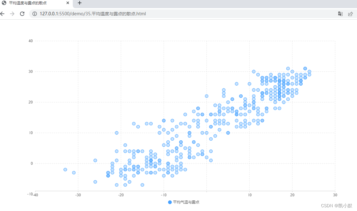
分清信息主次,建立视觉层次
用醒目的颜色突出显示数据,把被淡化的其他视觉元素当作背景。
比如:平均温度与露点的散点例子
<!DOCTYPE html>
<html lang="en">
    <head>
        <meta charset="UTF-8" />
        <meta name="viewport" content="width=device-width, initial-scale=1.0" />
        <title>平均温度与露点的散点</title>
    </head>
    <body>
        <div id="app" style="width: 1200px; height: 600px"></div>
        <script src="https://d3js.org/d3.v6.js"></script>
        <script src="https://unpkg.com/spritejs/dist/spritejs.min.js"></script>
        <script src="https://unpkg.com/@qcharts/core/dist/index.js"></script>
        <script>
            (async function () {


                // 通过 fetch 读取 csv 的数据
                const rawData = await (
                    await fetch("./data/beijing_2014.csv")
                ).text();
                console.log(rawData);
                // 使用 d3 的 csvParse 方法,将数据解析成 JSON 数组
                const data = d3.csvParse(rawData);

                const dataset = data.map(d => {


                    return {


                        temperature: Number(d['Temperature(Celsius)(avg)']),
                        tdp: Number(d['Dew Point(Celsius)(avg)']),
                        category: '平均气温与露点'
                    }
                });

                const {

       Chart, Scatter, Legend, Tooltip, Axis } = qcharts;
                // 创建图表(Chart)并传入数据
                const chart = new Chart({


                    container: "#app",
                });
                let clientRect = {

       bottom: 50 };
                chart.source(dataset, {


                    row: "category",
                    value: "temperature",
                    text: "tdp",
                });

                // 创建横、纵两个坐标轴(Axis)、提示(ToolTip)和一个图例(Legend)
                const scatter = new Scatter({


                    clientRect,
                    showGuideLine: true,
                });
                const toolTip = new Tooltip({


                    title: (data) => data.category,
                    formatter: (data) => {


                        return `温度:${
        data.value}C  露点:${
        data.tdp}% `
                    }
                });
                const legend = new Legend();
                const axisLeft = new Axis({

       orient: "left", clientRect })
                    .style("axis", false)
                    .style("scale", false);
                const axisBottom = new Axis();
                // 将图形、坐标轴、提示和图例都添加到图表上
                chart.append([scatter, axisBottom, axisLeft, toolTip, legend]);
            })();
        </script>
    </body>
</html>
下面就是一个有鲜明视觉层次感的图表:
- 使用比较鲜明的蓝色来突出图形
- 用比较淡的灰黑色来显示左侧和下方的坐标轴
- 用存在感最弱的辅助线背景来辅助用户更认真地阅读图表、理解数值
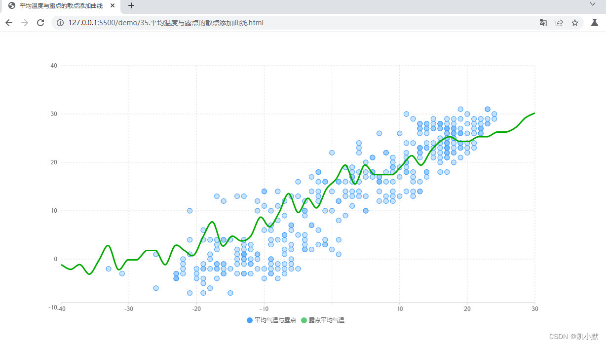
再此基础上可以添加曲线图来引导用户关注到平均气温与露点的正相关性特点
<!DOCTYPE html>
<html lang="en">
    <head>
        <meta charset="UTF-8" />
        <meta name="viewport" content="width=device-width, initial-scale=1.0" />
        <title>平均温度与露点的散点添加曲线</title>
    </head>
    <body>
        <div id="app" style="width: 1200px; height: 600px"></div>
        <script src="https://d3js.org/d3.v6.js"></script>
        <script src="https://unpkg.com/spritejs/dist/spritejs.min.js"></script>
        <script src="https://unpkg.com/@qcharts/core/dist/index.js"></script>
        <script>
            (async function () {


                // 通过 fetch 读取 csv 的数据
                const rawData = await (
                    await fetch("./data/beijing_2014.csv")
                ).text();
                console.log(rawData);
                // 使用 d3 的 csvParse 方法,将数据解析成 JSON 数组
                const data = d3.csvParse(rawData);

                const dataset = data.map((d) => {


                    return {


                        temperature: Number(d["Temperature(Celsius)(avg)"]),
                        tdp: Number(d["Dew Point(Celsius)(avg)"]),
                        category: "平均气温与露点",
                    };
                }).sort((a, b) => a.tdp - b.tdp);

                // 露点排序
                let dataset2 = [...dataset]

                // 对相同露点的温度进行分组
                dataset2 = dataset2.reduce((a, b) => {


                    let curr = a[a.length - 1];
                    if (curr && curr.tdp === b.tdp) {


                        curr.temperature.push(b.temperature);
                    } else {


                        a.push({


                            temperature: [b.temperature],
                            tdp: b.tdp,
                        });
                    }
                    return a;
                }, []);

                // 最后将露点平均温度计算出来
                dataset2 = dataset2.map((d) => {


                    d.category = "露点平均气温";
                    d.temperature = Math.round(
                        d.temperature.reduce((a, b) => a + b) /
                            d.temperature.length
                    );
                    return d;
                });

                console.log("最后将露点平均温度计算出来--->", dataset2)

                const {

       Chart, Scatter, Line, Legend, Tooltip, Axis } = qcharts;
                // 创建图表(Chart)并传入数据
                const chart = new Chart({


                    container: "#app",
                });
                let clientRect = {

       bottom: 50 };
                chart.source([...dataset, ...dataset2], {


                    row: "category",
                    value: "temperature",
                    text: "tdp",
                });

                const ds = chart.dataset;
                const d1 = ds.selectRows("平均气温与露点");
                const d2 = ds.selectRows("露点平均气温");

                // 散点图
                const scatter = new Scatter({


                    clientRect,
                    showGuideLine: true,
                }).source(d1);

                // 曲线图
                const line = new Line().source(d2);
                line.style("line", function (attrs, data, i) {


                    return {

       smooth: true, lineWidth: 3, strokeColor: "#0a0" };
                });
                line.style("point", function (attrs) {


                    return {

       display: "none" };
                });

                const toolTip = new Tooltip({


                    title: (data) => data.category,
                    formatter: (data) => {


                        return `温度:${
        data.value}C  露点:${
        data.tdp}% `;
                    },
                });
                const legend = new Legend();
                const axisLeft = new Axis({

       orient: "left", clientRect })
                    .style("axis", false)
                    .style("scale", false);
                const axisBottom = new Axis();
                // 将图形、坐标轴、提示和图例都添加到图表上
                chart.append([scatter, line, axisBottom, axisLeft, toolTip, legend]);
            })();
        </script>
    </body>
</html>
效果如下图,可以清晰的看到曲线描绘气温与平均露点的关系,这样层次分明的图表,非常有助于理解图表上的信息
选择合适图表,直观表达信息
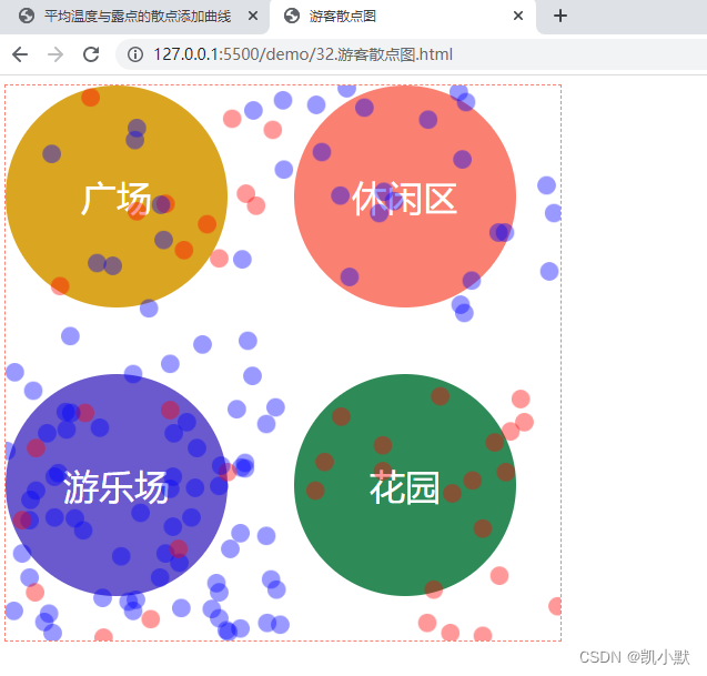
之前 32 节里的公园游客散点图,在表达某个单组变量的分布状况的时候,不是很直观,可以使用饼图进行处理
<!DOCTYPE html>
<html lang="en">
    <head>
        <meta charset="UTF-8" />
        <meta name="viewport" content="width=device-width, initial-scale=1.0" />
        <title>游客饼图</title>
        <style>
            html, body {


                width: 100%;
                height: 100%;
            }
            #container {


                width: 600px;
                height: 600px;
                display: flex;
                flex-wrap: wrap;
                justify-content: space-between;
            }

            #container > div {


                width: 300px;
                height: 300px;
                flex-shrink: 0;
            }
        </style>
    </head>
    <body>
        <div id="container">
            <div id="square"></div>
            <div id="sections"></div>
            <div id="garden"></div>
            <div id="playground"></div>
        </div>
        <script src="https://unpkg.com/spritejs/dist/spritejs.min.js"></script>
        <script src="https://unpkg.com/@qcharts/[email protected]/dist/index.js"></script>
        <script>
            const {

       Scene, Sprite, Polyline, SpriteSvg } = spritejs;
            (async function () {


                const data = await (await fetch("./data/park-people.json")).json();
                console.log(data);

                function count(d, dataset) {


                    let place;
                    if (d.x < 300 && d.y < 300) {


                        place = "square";
                    } else if (d.x >= 300 && d.y < 300) {


                        place = "sections";
                    } else if (d.x >= 300 && d.y >= 300) {


                        place = "garden";
                    } else {


                        place = "playground";
                    }
                    dataset[place] = dataset[place] || [
                        {


                            gender: "男游客",
                            people: 0,
                        },
                        {


                            gender: "女游客",
                            people: 0,
                        },
                    ];
                    if (d.gender === "f") {


                        dataset[place][0].people++;
                    } else {


                        dataset[place][1].people++;
                    }

                    return dataset;
                }

                function groupData(data) {


                    const dataset = {

      };

                    for (let i = 0; i < data.length; i++) {


                        const d = data[i];

                        if (d.time === 12) {


                            const p = count(d, dataset);
                        }
                    }

                    return dataset;
                }

                const dataset = groupData(data);
                console.log(dataset);

                const {

       Chart, Pie, Legend, Tooltip, theme } = qcharts;

                theme.set({


                    colors: ["#6a5acd", "#fa8072"],
                });

                Object.entries(dataset).forEach(([key, dataset]) => {


                    const chart = new Chart({


                        container: `#${
        key}`,
                    });

                    chart.source(dataset, {


                        row: "gender",
                        value: "people",
                        text: "gender",
                    });

                    const pie = new Pie({


                        radius: 0.7,
                        animation: {


                            duration: 700,
                            easing: "bounceOut",
                        },
                    });

                    const legend = new Legend({


                        orient: "vertical",
                        align: ["right", "center"],
                    });
                    const toolTip = new Tooltip();

                    chart.append([pie, legend, toolTip]);
                });
            })();
        </script>
    </body>
</html>
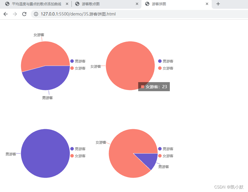
效果如下,饼图表示了公园内四个区域中男女游客的分布情况,可以看到饼图表示的结果非常简单和直观,但不足就是展示的信息很少,并且需要四个饼图。
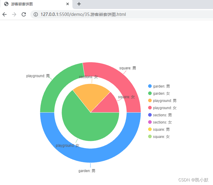
如果要表示更多维度的信息,我们可以考虑使用嵌套饼图,将4张饼图合并起来
<!DOCTYPE html>
<html lang="en">
    <head>
        <meta charset="UTF-8" />
        <meta name="viewport" content="width=device-width, initial-scale=1.0" />
        <title>游客嵌套饼图</title>
        <style>
            html,
            body {


                width: 100%;
                height: 100%;
            }
            #container {


                width: 600px;
                height: 600px;
            }
        </style>
    </head>
    <body>
        <div id="container"></div>
        <script src="https://unpkg.com/spritejs/dist/spritejs.min.js"></script>
        <script src="https://unpkg.com/@qcharts/[email protected]/dist/index.js"></script>
        <script>
            const {

       Scene, Sprite, Polyline, SpriteSvg } = spritejs;
            (async function () {


                const data = await (
                    await fetch("./data/park-people.json")
                ).json();
                console.log(data);

                function count(d, dataset) {


                    let place;
                    if (d.x < 300 && d.y < 300) {


                        place = "square";
                    } else if (d.x >= 300 && d.y < 300) {


                        place = "sections";
                    } else if (d.x >= 300 && d.y >= 300) {


                        place = "garden";
                    } else {


                        place = "playground";
                    }
                    dataset[place] = dataset[place] || [
                        {


                            gender: "男游客",
                            people: 0,
                        },
                        {


                            gender: "女游客",
                            people: 0,
                        },
                    ];
                    if (d.gender === "f") {


                        dataset[place][0].people++;
                    } else {


                        dataset[place][1].people++;
                    }

                    return dataset;
                }

                function groupData(data) {


                    const dataset = {

      };

                    for (let i = 0; i < data.length; i++) {


                        const d = data[i];

                        if (d.time === 12) {


                            const p = count(d, dataset);
                        }
                    }

                    return dataset;
                }

                const dataset = [];
                Object.entries(groupData(data)).forEach(([place, d]) => {


                    d[0].place = `${
        place}: 男`;
                    d[1].place = `${
        place}: 女`;
                    dataset.push(...d);
                });
                console.log(dataset);

                const {

       Chart, Pie, Legend, Tooltip, theme } = qcharts;
                const chart = new Chart({


                    container: `#container`,
                });

                chart.source(dataset, {


                    row: "place",
                    value: "people",
                });
                const ds = chart.dataset;

                const pie = new Pie({


                    radius: 0.4,
                    pos: [0, 0],
                }).source(
                    ds.selectRows(
                        dataset
                            .filter((d) => d.gender === "女游客")
                            .map((d) => d.place)
                    )
                );

                const pie2 = new Pie({


                    innerRadius: 0.5,
                    radius: 0.7,
                }).source(
                    ds.selectRows(
                        dataset
                            .filter((d) => d.gender === "男游客")
                            .map((d) => d.place)
                    )
                );

                const legend = new Legend({


                    orient: "vertical",
                    align: ["right", "center"],
                });

                chart.append([pie2, pie, legend]);
            })();
        </script>
    </body>
</html>
可以看到嵌套饼图表达了男女游客分别在四个区域的分布情况,中间小的饼状图是女性在四个区域的分布情况,大的饼图是男性在四个区域的分布情况。
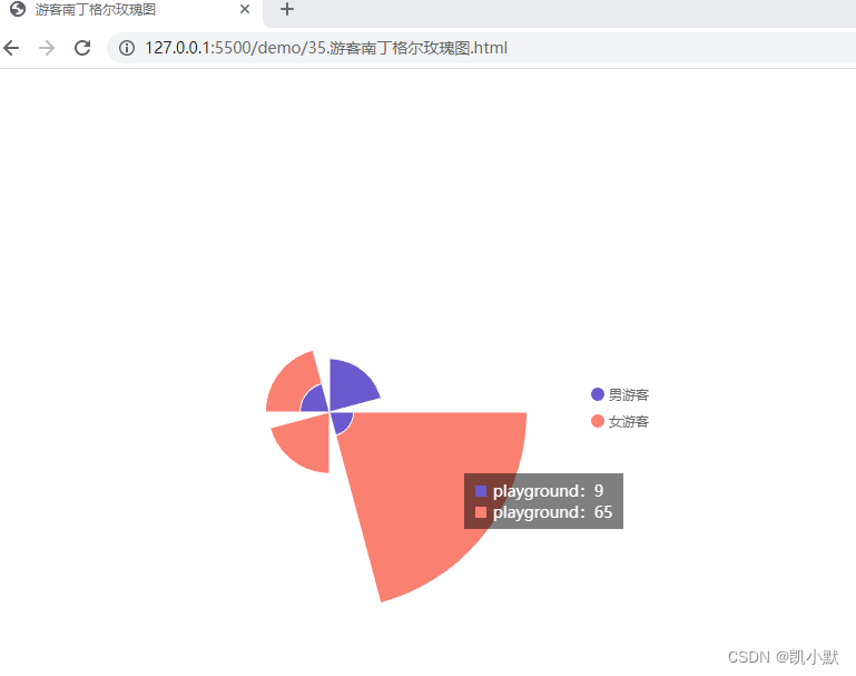
我们还可以使用南丁格尔玫瑰图(一种圆形的直方图)将游客性别和游客区域的分布情况融合在一起表现出来
<!DOCTYPE html>
<html lang="en">
    <head>
        <meta charset="UTF-8" />
        <meta name="viewport" content="width=device-width, initial-scale=1.0" />
        <title>游客南丁格尔玫瑰图</title>
        <style>
            html,
            body {


                width: 100%;
                height: 100%;
            }
            #container {


                width: 600px;
                height: 600px;
            }
        </style>
    </head>
    <body>
        <div id="container"></div>
        <script src="https://unpkg.com/spritejs/dist/spritejs.min.js"></script>
        <script src="https://unpkg.com/@qcharts/[email protected]/dist/index.js"></script>
        <script>
            const {

       Scene, Sprite, Polyline, SpriteSvg } = spritejs;
            (async function () {


                const data = await (
                    await fetch("./data/park-people.json")
                ).json();
                console.log(data);

                function count(d, dataset) {


                    let place;
                    if (d.x < 300 && d.y < 300) {


                        place = "square";
                    } else if (d.x >= 300 && d.y < 300) {


                        place = "sections";
                    } else if (d.x >= 300 && d.y >= 300) {


                        place = "garden";
                    } else {


                        place = "playground";
                    }
                    dataset[place] = dataset[place] || [
                        {


                            gender: "男游客",
                            people: 0,
                        },
                        {


                            gender: "女游客",
                            people: 0,
                        },
                    ];
                    if (d.gender === "f") {


                        dataset[place][0].people++;
                    } else {


                        dataset[place][1].people++;
                    }

                    return dataset;
                }

                function groupData(data) {


                    const dataset = {

      };

                    for (let i = 0; i < data.length; i++) {


                        const d = data[i];

                        if (d.time === 12) {


                            const p = count(d, dataset);
                        }
                    }

                    return dataset;
                }

                const dataset = [];
                Object.entries(groupData(data)).forEach(([place, d]) => {


                    d[0].place = place;
                    d[1].place = place;
                    dataset.push(...d);
                });
                console.log(dataset);

                const {

       Chart, PolarBar, Legend, Tooltip, theme } = qcharts;
                const chart = new Chart({


                    container: `#container`,
                });

                theme.set({


                    colors: ["#6a5acd", "#fa8072"],
                });

                chart.source(dataset, {


                    row: "gender",
                    value: "people",
                    text: "place",
                });
                const bar = new PolarBar({


                    stack: true,
                    radius: 0.8,
                    groupPadAngle: 15,
                }).style("pillar", {


                    strokeColor: "#FFF",
                    lineWidth: 1,
                });
                const tooltip = new Tooltip();
                const legend = new Legend({


                    orient: "vertical",
                    align: ["right", "center"],
                });

                chart.append([bar, tooltip, legend]);
            })();
        </script>
    </body>
</html>
我们可以看到南丁格尔玫瑰图能把人群在公园区域的分布和性别分布规律显示在一张图上,让更多的信息呈现在一张图表里,既节省空间又高效率地获取了更多信息,更加的直观。
改变图形属性,强化数据差异
比如股市中常用的蜡烛图,又叫做 K 线图。里面包含了许多其他有用的信息,能让用户从中分析出商品或者股票的价格走势,再做出相应的决策。