第一种:::after
<template>
	<view>
		<view class="bg">
		</view>
	</view>
</template>
<style>
.bg{
	background-color: pink;
}
.bg::after{
	content: '';
	position: absolute;
	width: 160%;
	height: 100px;
	background: skyblue;
	left: -30%;
	border-radius: 0 0 50% 50%;
}
</style>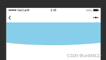
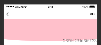
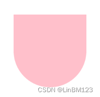
第二种:border-radius
<template>
	<view>
		<view class="bg">
		</view>
	</view>
</template>
<style>
.bg{
	background-color: pink;
	border-radius:0 0 50% 50%/40%;
	height: 100px;
	width: 160%;
	margin-left: -30%;
}
</style>
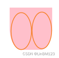
border-radius:* * /*
border-radius:50% 50%/50%;
height: 200px;
width: 200px;
border-radius:0 0 50% 50%/50%;
height: 200px;
width: 200px;
border-radius:0 0 50% 50%/10%;
height: 200px;
width: 200px;
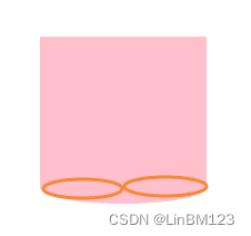
border-radius:0 0 50% 50%/90%;
height: 200px;
width: 200px;