本人非计算机专业,只是沾边而已。所有算法和模型都是从网上学到的,平常上课、复习什么的没有太多精力学原理,只是到会用的程度。你纠错就是你对,大家相互交流。
首先数据集是从Berkeley Earth下载,长这个样子,有一千五百多条数据。这是每年的气温相对于1850-1900年平均气温的相对值(我记得好像是这个解释)

第一步导包
import numpy as np
import pandas as pd
import matplotlib.pyplot as plt
plt.style.use('fivethirtyeight')
from matplotlib.pylab import rcParams
rcParams['figure.figsize'] = 28, 18
import statsmodels.api as sm
from statsmodels.tsa.stattools import adfuller
from statsmodels.tsa.seasonal import seasonal_decompose
import itertools
import warnings
warnings.filterwarnings("ignore")
plt.rcParams['font.sans-serif'] = ['SimHei'] #用来正常显示中文标签
之后进行数据预处理,注释的可以不看。首先读取数据;把Year设置为索引;如果文件中数值格式为字符串类型,需要用to_numeric函数转换为数值型;之后删除缺失值,作图。
df = pd.read_csv("data.csv") #读取CSV数据
# df.head(15) #查看数据集前十五条数据
# df.info() #查看数据变量属性

# dateparse = lambda x: pd.to_datetime(x, format='%Y%m', errors = 'coerce')
df = pd.read_csv("data.csv", parse_dates=['Year'], index_col='Year')
# ts = df[pd.Series(pd.to_datetime(df.index, errors='coerce')).notnull().values]
# ts.info()

df['Monthly Anomaly'] = pd.to_numeric(df['Monthly Anomaly'], errors='coerce')
df.dropna(inplace = True) #删除缺失值
# ts.info()

tem = df['Monthly Anomaly']
plt.plot(tem)
plt.xticks(fontsize = 25)
plt.yticks(fontsize = 25)
plt.xlabel(u'时间(年)', fontsize = 25)
plt.ylabel(u'全球平均气温', fontsize = 26)
plt.show()
数据可视化结果如下:

之后进行SARIMA的重要一步,通过Python中的seasonal_decompose函数可以提取序列的趋势、季节和随机效应。对于非平稳的时间序列,可以通过对趋势和季节性进行建模并将它们从模型中剔除,从而将非平稳的数据转换为平稳数据,并对其残差进行进一步的分析。
#分解趋势、季节、随机效应
decomposition = seasonal_decompose(tem, model='additive', extrapolate_trend='freq', period=12)
trend = decomposition.trend #趋势效应
seasonal = decomposition.seasonal #季节效应
residual = decomposition.resid #随机效应
plt.subplot(411)
plt.plot(tem, label=u'原始数据')
plt.legend(loc='best')
plt.subplot(412)
plt.plot(trend, label=u'趋势')
plt.legend(loc='best')
plt.subplot(413)
plt.plot(seasonal,label=u'季节性')
plt.legend(loc='best')
plt.subplot(414)
plt.plot(residual, label=u'残差')
plt.legend(loc='best')
plt.tight_layout()
plt.show()
作图结果如下,可以看出剥夺了季节性的数据,趋势是逐渐上升的。

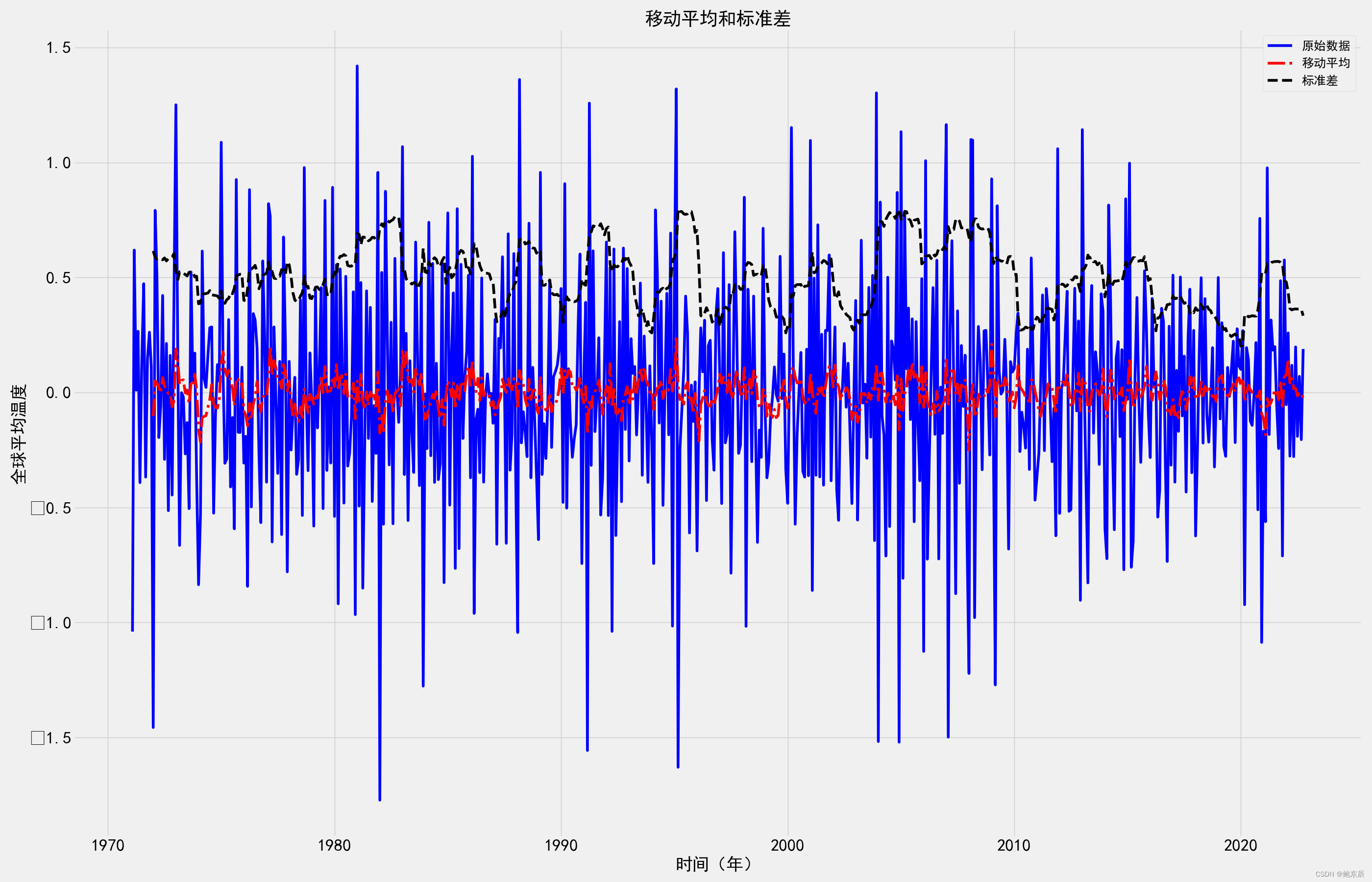
下一步
# 绘制移动平均值和标准差
def TestStationaryPlot(ts):
    rol_mean = ts.rolling(window = 12,center = False).mean()
    rol_std = ts.rolling(window = 12,center = False).std()

    plt.plot(ts, color = 'blue',label = u'原始数据')
    plt.plot(rol_mean, color = 'red', linestyle='-.', label = u'移动平均')
    plt.plot(rol_std, color ='black', linestyle='--', label = u'标准差')
    plt.xticks(fontsize = 25)
    plt.yticks(fontsize = 25)
    plt.xlabel(u'时间(年)', fontsize = 25)
    plt.ylabel(u'全球平均温度', fontsize = 25)
    plt.legend(loc='best', fontsize = 18)
    plt.title(u'移动平均和标准差', fontsize = 27)
    plt.show(block= True)
结果如下:

然后进行ADF检验,看一下数据是否平稳,不平稳就要就行差分处理
# ADF检验
def TestStationaryAdfuller(ts, cutoff = 0.01):
    ts_test = adfuller(ts, autolag = 'AIC')
    ts_test_output = pd.Series(ts_test[0:4], index=['Test Statistic','p-value','#Lags Used','Number of Observations Used'])
    for key,value in ts_test[4].items():
        ts_test_output['Critical Value(%s)'%key] = value
    print(ts_test_output)

    if ts_test[1] <= cutoff:
         print(u"拒绝原假设,即数据没有单位根,序列是平稳的")
    else:
        print(u"不能拒绝原假设,即数据存在单位根,数据是非平稳序列")
这里调用两个函数,之后进行1阶差分,原文说这里是进行1阶12步差分。也是一阶差分,并不是二阶。
# 进行平稳性检验
TestStationaryPlot(tem)
TestStationaryAdfuller(tem)

#消除消除趋势和季节性
tem_first_difference = tem - tem.shift(1) #一阶差分
tem_seasonal_first_difference = tem_first_difference - tem_first_difference.shift(12) #12步差分
TestStationaryPlot(tem_seasonal_first_difference.dropna(inplace=False))
TestStationaryAdfuller(tem_seasonal_first_difference.dropna(inplace=False))
之后进行白噪声检验,Q统计量的P值均小于0.01,所以在0.01的显著性水平下,拒绝原假设,即1阶12步差分后的序列是非白噪声序列,说明差分后的序列可以进行下一步的建模分析
# 白噪声检验
tem_seasonal_first_difference.dropna(inplace = True)
r, q, p = sm.tsa.acf(tem_seasonal_first_difference.values.squeeze(), qstat=True)
data = np.c_[range(1, 28), r[1:], q, p]
table = pd.DataFrame(data, columns=['lag', "AC", "Q", "Prob(>Q)"])
print(table.set_index('lag'))
差分后,再来看,就好多了
之后求解p、q、d的值,这里可以看拖尾、截尾图的,但那样需要人工看,还是用网格法简单些
# 网格法求解图形阶数
p = d = q = range(0, 2)
pdq = list(itertools.product(p, d, q))
pdq_x_PDQs = [(x[0], x[1], x[2], 12) for x in list(itertools.product(p, d, q))]
a = []
b = []
c = []
wf = pd.DataFrame()
for param in pdq:
    for seasonal_param in pdq_x_PDQs:
        try:
            mod = sm.tsa.statespace.SARIMAX(tem, order = param, seasonal_order = seasonal_param, enforce_stationarity = False, enforce_invertibility = False)
            results = mod.fit()
            print('ARIMA{}x{} - AIC:{}'.format(param, seasonal_param, results.aic))
            a.append(param)
            b.append(seasonal_param)
            c.append(results.aic)
        except:
            continue
wf['pdq'] = a
wf['pdq_x_PDQs'] = b
wf['aic'] = c
print(wf[wf['aic'] == wf['aic'].min()])
得出结果,对原序列建立SARIMAX(1,1,1)x(0,1,1,12)模型 ,然后再进行模型的检验。注意这里np.c_里range的数要根据自己的数据来改,具体可以输出一下r[1:],c_这个函数里面的参数要大小一样。
# 模型的建立
mod = sm.tsa.statespace.SARIMAX(tem,
                                order=(1, 1, 1),
                                seasonal_order=(0, 1, 1, 12),
                                enforce_stationarity=False,
                                enforce_invertibility=False)
results = mod.fit()
print(results.summary())

#模型检验
#模型诊断
results.plot_diagnostics(figsize=(15, 12))
plt.show()
#LB检验
r, q, p = sm.tsa.acf(results.resid.values.squeeze(), qstat=True)
data = np.c_[range(1, 29), r[1:], q, p]
table = pd.DataFrame(data, columns=['lag', "AC", "Q", "Prob(>Q)"])
print(table.set_index('lag'))
结果如下,


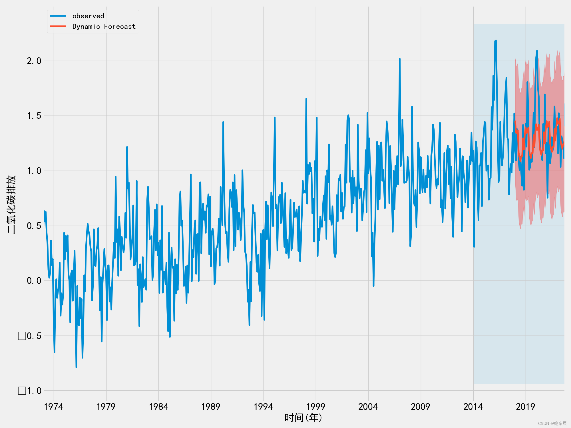
然后进行模型在测试集上的预测,并将结果可视化。注意这里2018/01/1是测试集start的地方。
# 模型的动态预测
pred_dynamic = results.get_prediction(start=pd.to_datetime('2018/01/1'), dynamic=True, full_results=True)
pred_dynamic_ci = pred_dynamic.conf_int()
tem_forecast = pred_dynamic.predicted_mean
tem_orginal = tem['2018/1/1':]
tem_pred_concat = pd.concat([tem_orginal, tem_forecast, pred_dynamic_ci],axis=1)
tem_pred_concat.columns = [u'原始值',u'预测值',u'下限',u'上限']
tem_pred_concat.head(15)
# 结果可视化
ax = tem['1973':].plot(label='observed', figsize=(20, 15))
pred_dynamic.predicted_mean.plot(label='Dynamic Forecast', ax=ax)
ax.fill_between(pred_dynamic_ci.index,pred_dynamic_ci.iloc[:, 0],pred_dynamic_ci.iloc[:, 1],color='r',alpha=.3)
ax.fill_betweenx(ax.get_ylim(),pd.to_datetime('2014-01-31'),tem.index[-1],alpha=.1, zorder=-1)
plt.xticks(fontsize = 25)
plt.yticks(fontsize = 25)
ax.set_xlabel(u'时间(年)',fontsize=25)
ax.set_ylabel(u'全球平均气温',fontsize=25)
plt.legend(loc = 'upper left',fontsize=20)
plt.show()
结果如下
然后预测未来10年的数据,因为我这里是每年每月的数据,所以是预测120个单位。
#预测未来10年的数据
forecast = results.get_forecast(steps= 120)


# 得到预测的置信区间
forecast_ci = forecast.conf_int()
tem_forecast = forecast.predicted_mean
tem_pred_concat = pd.concat([tem_forecast, forecast_ci], axis=1)
np.savetxt('1.csv', tem_forecast, delimiter=',') # 保存预测结果
tem_pred_concat.columns = [u'预测值',u'下限',u'上限']
tem_pred_concat.head()

#绘制时间序列图
ax = tem.plot(label='observed', figsize=(20, 15))
forecast.predicted_mean.plot(ax=ax, label='Forecast')
ax.fill_between(forecast_ci.index,
                forecast_ci.iloc[:, 0],
                forecast_ci.iloc[:, 1], color='g', alpha=.4)
plt.xticks(fontsize = 20)
plt.yticks(fontsize = 18)
ax.set_xlabel('时间(年)',fontsize=18)
ax.set_ylabel('全球平均气温',fontsize=18)
plt.legend(loc = 'upper left',fontsize=20)
plt.show()
预测结果如下。
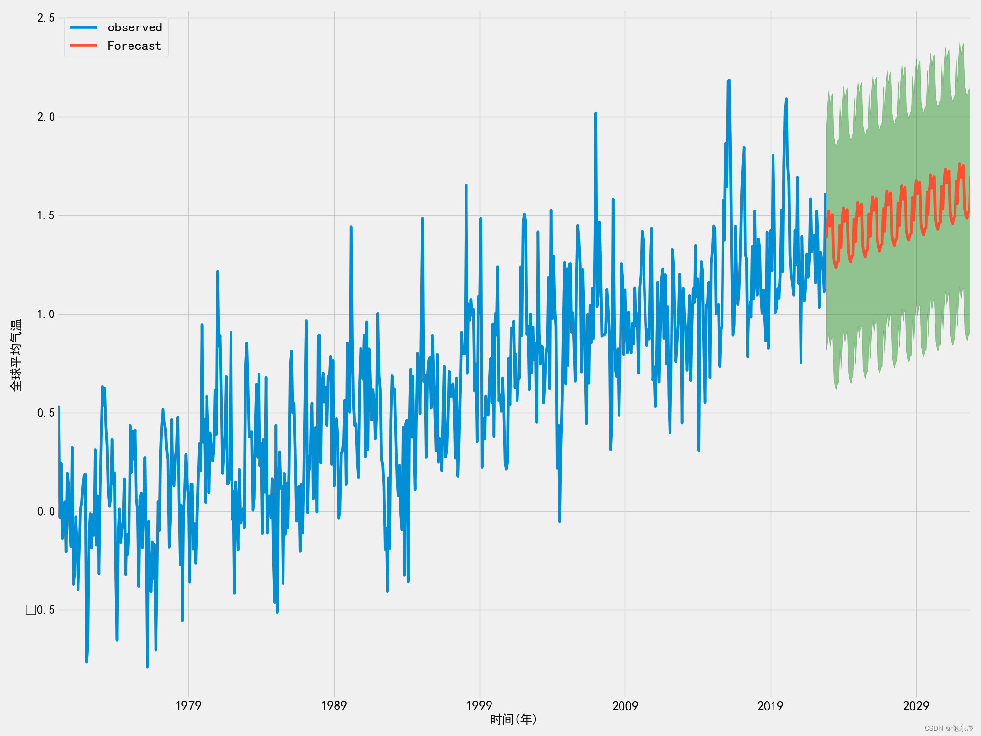
我发现我之前用ARIMA模型预测的时候结果就有点呈线性,结果用SARIMA模型结果也还是可以看作线性,只不过多了上下浮动,但总体还是上升的,我觉得这样的预测结果并不太好。怪不得大佬们那么多优化模型、组合模型,我以后要学的还很多,共勉。