记录使用纯 HTML + CSS 实现圆形 loading 加载动画效果。效果图如下:
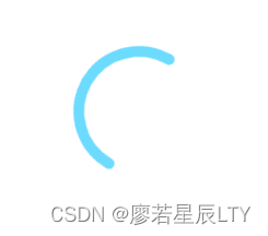
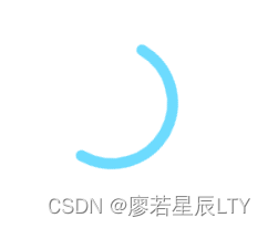
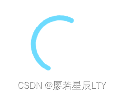
注:是具有旋转的动画效果的。
示例代码
HTML:
<svg class="loading">
    <circle class="circle" cx="60" cy="60" r="55" fill="transparent" stroke="#6DDBFE" stroke-linecap="round" stroke-width="10"></circle>
</svg>
CSS:
<style>
    * {
      margin: 0;
      padding: 0;
      box-sizing: border-box;
    }
    body {
      width: 100%;
      height: 100vh;
      overflow: hidden;
      display: flex;
      align-items: center;
      justify-content: center;
    }
    .loading {
      width: 120px;
      height: 120px;
      border-radius: 50%;
      display: flex;
      align-items: center;
      justify-content: center;
      animation: rotate 1.5s linear infinite;
    }
    @keyframes rotate {
      to {
        transform: rotate(360deg);
      }
    }
    .circle {
       /* 注:使用 document.querySelector('.circle').getTotalLength() 可以得到圆一圈大小约为345 */
      stroke-dasharray: 345;
      stroke-dashoffset: 172;
    }
  </style>