目录:
1 认识大屏设备
2 大屏适配方案
3 开发注意事项
4 大屏项目实
一、大屏适配方案一(rem+fontsize) 需要下载rem.js并且使用rem作为单位开发,可以通过vscode插件 把px自动计算成rem
1、没有使用适配的情况
<!DOCTYPE html>
<html lang="en">
<head>
  <meta charset="UTF-8">
  <meta http-equiv="X-UA-Compatible" content="IE=edge">
  <meta name="viewport" content="width=device-width, initial-scale=1.0">
  <title>Document</title>
  <style>
    body, ul{
      margin: 0;
      padding: 0;
    }
    body{
      width: 1920px;
      height: 1080px;
      box-sizing: border-box;
      border: 3px solid red;
    }

    ul{
      width: 100%;
      height: 100%;
      list-style: none;

      display: flex;
      flex-direction: row;
      flex-wrap: wrap;
    }

    li{
      width: 33.333%;
      height: 50%;
      box-sizing: border-box;
      border: 2px solid green;
      font-size: 30px;
    }
  </style>
</head>
<body>

  <ul>
    <li>1</li>
    <li>2</li>
    <li>3</li>
    <li>4</li>
    <li>5</li>
    <li>6</li>
  </ul>


</body>
</html>
2、使用rem+fontsize实现大屏的适配
<!DOCTYPE html>
<html lang="en">
<head>
  <meta charset="UTF-8">
  <meta http-equiv="X-UA-Compatible" content="IE=edge">
  <meta name="viewport" content="width=device-width, initial-scale=1.0">
  <title>Document</title>
  <style>
    body, ul{
      margin: 0;
      padding: 0;
    }
    body{
      width: 24rem;
      height: 13.5rem;
      box-sizing: border-box;
      border: 3px solid red;
    }

    ul{
      width: 100%;
      height: 100%;
      list-style: none;

      display: flex;
      flex-direction: row;
      flex-wrap: wrap;
    }

    li{
      width: 33.333%;
      height: 50%;
      box-sizing: border-box;
      border: 2px solid green;
      font-size: .375rem;
    }
  </style>
</head>
<body>

  <ul>
    <li>1</li>
    <li>2</li>
    <li>3</li>
    <li>4</li>
    <li>5</li>
    <li>6</li>
  </ul>

  <script src="./rem.js"></script>
</body>
</html>
二、大屏适配的方案二(vw)
1、使用vw实现大屏的适配
<!DOCTYPE html>
<html lang="en">
<head>
  <meta charset="UTF-8">
  <meta http-equiv="X-UA-Compatible" content="IE=edge">
  <meta name="viewport" content="width=device-width, initial-scale=1.0">
  <title>Document</title>
  <style>
    body, ul{
      margin: 0;
      padding: 0;
    }
    body{
      width: 100vw;
      height: 56.25vw;
      box-sizing: border-box;
      border: 3px solid red;
    }

    ul{
      width: 100%;
      height: 100%;
      list-style: none;

      display: flex;
      flex-direction: row;
      flex-wrap: wrap;
    }

    li{
      width: 33.333%;
      height: 50%;
      box-sizing: border-box;
      border: 2px solid green;
      font-size: 1.5625vw;
    }
  </style>
</head>
<body>

  <ul>
    <li>1</li>
    <li>2</li>
    <li>3</li>
    <li>4</li>
    <li>5</li>
    <li>6</li>
  </ul>
</body>
</html>
三、大屏适配方案三(推荐)
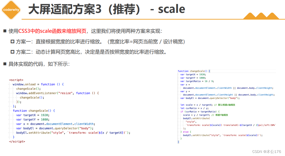
1、使用scale实现大屏的适配
<!DOCTYPE html>
<html lang="en">
<head>
  <meta charset="UTF-8">
  <meta http-equiv="X-UA-Compatible" content="IE=edge">
  <meta name="viewport" content="width=device-width, initial-scale=1.0">
  <title>Document</title>
  <style>
    body, ul{
      margin: 0;
      padding: 0;
    }
    body{
      width: 1920px;
      height: 1080px;
      box-sizing: border-box;
      border: 3px solid red;

      /* 指定缩放的原点在左上角 */
      transform-origin: left top;
    }

    ul{
      width: 100%;
      height: 100%;
      list-style: none;

      display: flex;
      flex-direction: row;
      flex-wrap: wrap;
    }

    li{
      width: 33.333%;
      height: 50%;
      box-sizing: border-box;
      border: 2px solid green;
      font-size: 30px;
    }
  </style>
</head>
<body>

  <ul>
    <li>1</li>
    <li>2</li>
    <li>3</li>
    <li>4</li>
    <li>5</li>
    <li>6</li>
  </ul>

  <script>

    // 设计稿:  1920 * 1080
    // 目标适配:  1920 * 1080   3840 * 2160 ( 2 * 2 ) ;  7680 * 2160( 4 * 2)

    // 1.设计稿的尺寸
    let targetX = 1920
    // let targetY = 1080
    // let targetRatio = 16 / 9 // 宽高比率

    // 2.拿到当前设备(浏览器)的宽度
    let currentX = document.documentElement.clientWidth || document.body.clientWidth
    //  1920 * 1080  -> 3840 * 2160

    // 3.计算缩放比例
    let scaleRatio = currentX / targetX; // 参照宽度进行缩放

    // 4.开始缩放网页
    document.body.style = `transform: scale(${scaleRatio})`


  </script>
</body>
</html>
2、使用scale实现大屏的适配-动态判断
<!DOCTYPE html>
<html lang="en">
<head>
  <meta charset="UTF-8">
  <meta http-equiv="X-UA-Compatible" content="IE=edge">
  <meta name="viewport" content="width=device-width, initial-scale=1.0">
  <title>Document</title>
  <style>
    body, ul{
      margin: 0;
      padding: 0;
    }
    body{
      position: relative;
      width: 1920px;
      height: 1080px;
      box-sizing: border-box;
      border: 3px solid red;

      /* 指定缩放的原点在左上角 */
      transform-origin: left top;
    }

    ul{
      width: 100%;
      height: 100%;
      list-style: none;

      display: flex;
      flex-direction: row;
      flex-wrap: wrap;
    }

    li{
      width: 33.333%;
      height: 50%;
      box-sizing: border-box;
      border: 2px solid green;
      font-size: 30px;
    }
  </style>
</head>
<body>

  <ul>
    <li>1</li>
    <li>2</li>
    <li>3</li>
    <li>4</li>
    <li>5</li>
    <li>6</li>
  </ul>

  <script>

    // 设计稿:  1920 * 1080
    // 目标适配:  1920 * 1080   3840 * 2160 ( 2 * 2 ) ;  7680 * 2160( 4 * 2)

    // 1.设计稿的尺寸
    let targetX = 1920
    let targetY = 1080
    let targetRatio = 16 / 9 // 宽高比率

    // 2.拿到当前设备(浏览器)的宽度
    let currentX = document.documentElement.clientWidth || document.body.clientWidth
    let currentY = document.documentElement.clientHeight || document.body.clientHeight
    //  1920 * 1080  -> 3840 * 2160

    // 3.计算缩放比例
    let scaleRatio = currentX / targetX; // 参照宽度进行缩放 ( 默认情况 )
    let currentRatio = currentX / currentY // 宽高比率

    // 超宽屏
    if(currentRatio > targetRatio) {
      scaleRatio = currentY / targetY // 参照高度进行缩放
      document.body.style = `width:${targetX}px; height:${targetY}px;transform: scale(${scaleRatio}) translateX(-50%); left: 50%`
    } else {
      // 4.开始缩放网页
      document.body.style = `width:${targetX}px; height:${targetY}px; transform: scale(${scaleRatio})`
    }

  </script>
</body>
</html>