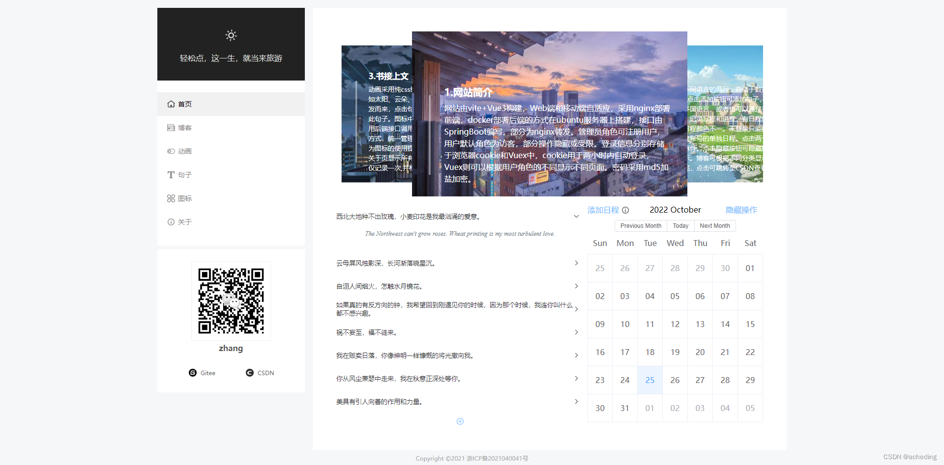
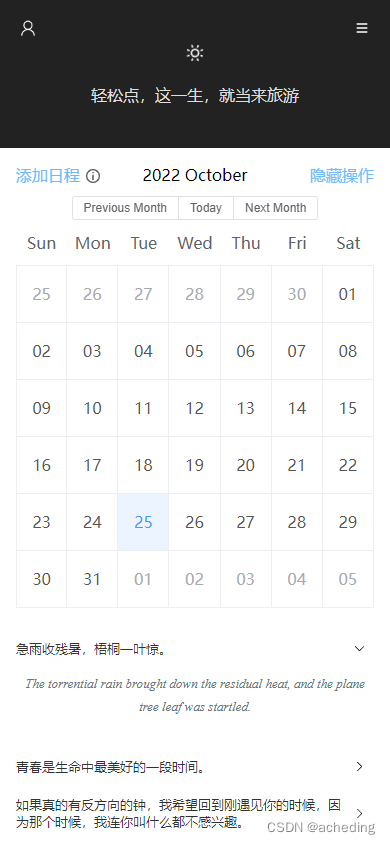
一、效果
1.PC端
2.移动端
二、实现
本文的思路在于通过监听客户端宽度(clientWidth)的方式来实现动态修改布局及样式。
例如我们定义一个smallScreen的属性,默认是false的,即PC端,给window对象添加一个事件监听,当宽度小于某一定值的时候,修改smallScreen为true,即移动端。这里同时更换了一下背景颜色。
代码如下:
<script setup>
// onBeforeMount、onBeforeUnmount属于Vue3语法,相当于Vue2的beforeMount、beforeUnmount
onBeforeMount(() =>
{
  renderResize();
  window.addEventListener("resize", renderResize);
});
onBeforeUnmount(() =>
{
  window.removeEventListener("resize", renderResize);
});
const smallScreen = ref(false);
const renderResize = () =>
{
  let width = document.documentElement.clientWidth;
  if (width < 1229) {
    smallScreen.value = true;
    document.getElementsByTagName("body")[0].style.backgroundColor = "#fff";
  } else {
    smallScreen.value = false;
    document.getElementsByTagName("body")[0].style.backgroundColor = "#f5f7f9";
  }
};
</script>

<template>
  <el-container :class="[smallScreen ? 'smallContainer' : 'bigContainer']">
    <el-aside v-if="!smallScreen">
      <Menu></Menu>
    </el-aside>
    <el-main>
      <Small v-if="smallScreen"></Small>
      <router-view :smallScreen="smallScreen"></router-view>
    </el-main>
  </el-container>
</template>

<style lang="scss">
#app {
  margin-top: 16px;
}

.bigContainer {
  width: 1280px;
  margin: auto;

  .el-aside {
    margin-right: 16px;
  }

  .el-main {
    background: #fff;
    padding: 48px !important;
    min-height: 735px;
  }
}

.smallContainer {
  .el-main {
    margin-top: -16px;
    background: #fff;
    padding: 0;
  }
}
</style>