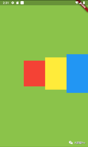
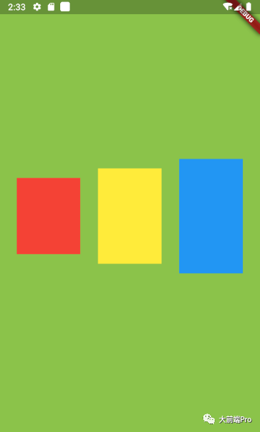
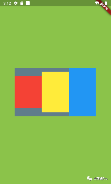
Row意为水平布局,可以使其包含的子控件按照水平方向排列
代码如下:
class _TestState extends State<Test> {
  @override
  Widget build(BuildContext context) {
    return MaterialApp(
      home: Scaffold(
        body: Container(
          width: MediaQuery.of(context).size.width,
          height: MediaQuery.of(context).size.height,
          color: Colors.lightGreen,
          child: Row(
            children: [
              Container(
                width: 100,
                height: 120,
                color: Colors.red,
              ),
              Container(
                width: 100,
                height: 150,
                color: Colors.yellow,
              ),
              Container(
                width: 100,
                height: 180,
                color: Colors.blue,
              ),
            ],
          ),
        ),
      ),
    );
  }
}
效果如下:

如上图所示,我们可以看到三个控件水平的排列在屏幕中间
----------------分割线---------------
这种基本的使用大多数情况都不能满足需求,让我们来看下Row拥有的几个参数
Row({
    Key? key,
    MainAxisAlignment mainAxisAlignment = MainAxisAlignment.start,
    MainAxisSize mainAxisSize = MainAxisSize.max,
    CrossAxisAlignment crossAxisAlignment = CrossAxisAlignment.center,
    TextDirection? textDirection,
    VerticalDirection verticalDirection = VerticalDirection.down,
    TextBaseline? textBaseline, // NO DEFAULT: we don't know what the text's baseline should be
    List<Widget> children = const <Widget>[],
  })
MainAxisAlignment:主轴对齐方式,就是Row中子控件在水平方向的对齐方式(PS:对于Row来说主轴就是水平方向,而对于Column来说主轴就是垂直方向)
mainAxisAlignment有以下几个可选值
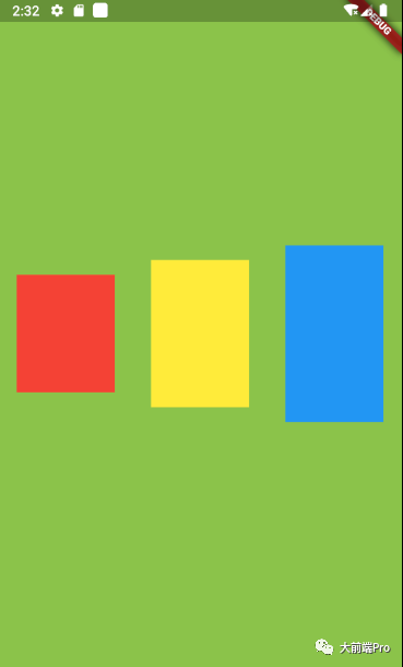
MainAxisAlignment.start:靠左排列(从Row的结构体可以看出这是默认的值)
MainAxisAlignment.end:靠右排列。代码如下:
class _TestState extends State<Test> {
  @override
  Widget build(BuildContext context) {
    return MaterialApp(
      home: Scaffold(
        body: Container(
          width: MediaQuery.of(context).size.width,
          height: MediaQuery.of(context).size.height,
          color: Colors.lightGreen,
          child: Row(
            mainAxisAlignment:MainAxisAlignment.end,
            children: [
              Container(
                width: 100,
                height: 120,
                color: Colors.red,
              ),
              Container(
                width: 100,
                height: 150,
                color: Colors.yellow,
              ),
              Container(
                width: 100,
                height: 180,
                color: Colors.blue,
              ),
            ],
          ),
        ),
      ),
    );
  }
}
效果如下:
MainAxisAlignment.center:居中排列。
代码与上面差不多,就不贴了。效果如下:
MainAxisAlignment.spaceAround:每个子组件左右间隔相等,也就是 margin 相等。效果如下:
MainAxisAlignment.spaceBetween:两端对齐,也就是第一个子组件靠左,最后一个子组件靠右,剩余组件在中间平均分散排列。效果如下:
MainAxisAlignment.spaceEvenly:每个子组件平均分散排列,也就是均分水平空间。效果如下:
CrossAxisAlignment:交叉轴对齐方式,就是Row中子控件在垂直方向的对齐方式,所谓的交叉轴就是与主轴垂直的方向(PS:对于Row来说,它的交叉轴就是垂直方向,对于Column来说,它的交叉轴就是水平方向)
crossAxisAlignment有以下几个可选值
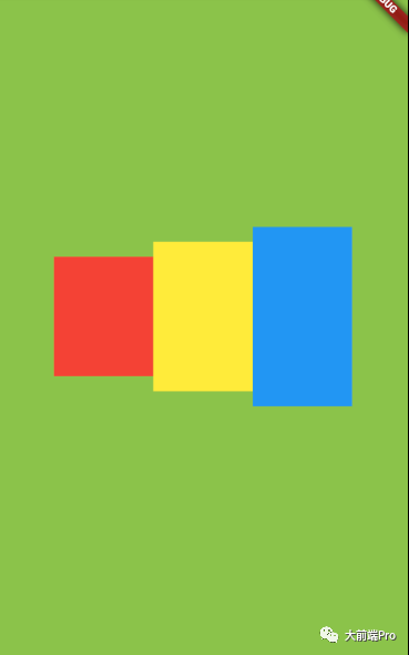
CrossAxisAlignment.center:子组件在 Row 中居中对齐(从Row的结构体可以看出这是默认的值),所以图一里子控件会在垂直方向居中。
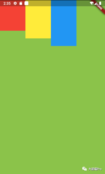
CrossAxisAlignment.start:子组件在 Row 顶部对齐,效果如下
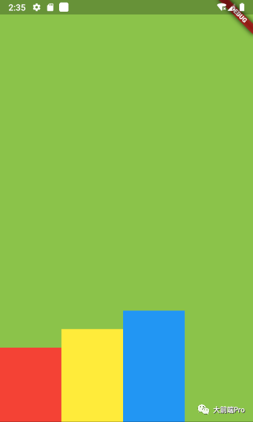
CrossAxisAlignment.end:子组件在 Row 底部对齐。
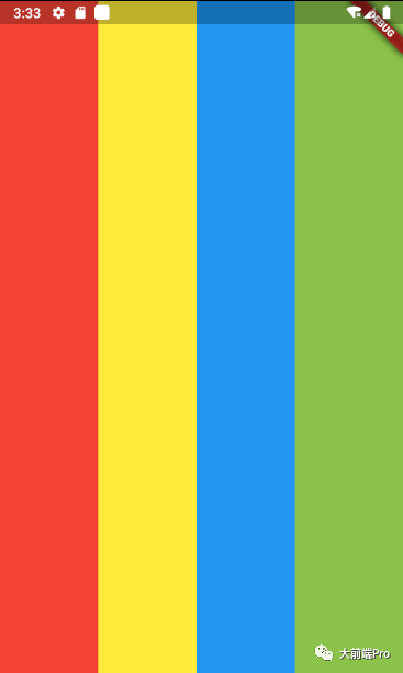
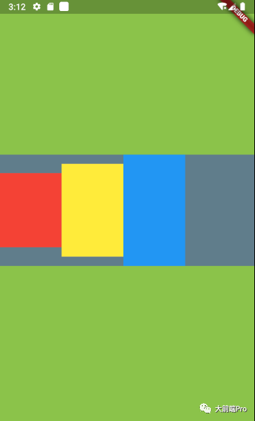
CrossAxisAlignment.stretch:交叉轴拉伸填充满父布局。
效果如下:
CrossAxisAlignment.baseline:基于基线对齐,不常用,意义不明...
MainAxisSize:主轴大小适配,有两个值可选
MainAxisSize.min:宽度与子控件保持一致
代码如下
class _TestState extends State<Test> {
  @override
  Widget build(BuildContext context) {
    return MaterialApp(
      home: Scaffold(
        body: Container(
          width: MediaQuery.of(context).size.width,
          height: MediaQuery.of(context).size.height,
          alignment: Alignment.center,
          color: Colors.lightGreen,
          child: Container(
            color: Colors.blueGrey,
            child: Row(
              mainAxisSize: MainAxisSize.min,
              children: [
                Container(
                  width: 100,
                  height: 120,
                  color: Colors.red,
                ),
                Container(
                  width: 100,
                  height: 150,
                  color: Colors.yellow,
                ),
                Container(
                  width: 100,
                  height: 180,
                  color: Colors.blue,
                ),
              ],
            ),
          ),
        ),
      ),
    );
  }
}
效果如下:
MainAxisSize.max:宽度铺满主轴方向(这个是默认值)
效果如下:
TextDirection:子组件水平方向排列顺序(PS:从上面可以看出,我们Row里的子控件默认是从左往右排序的,如果设置了这个参数,则可以改变默认的排序方向)
可选值有:
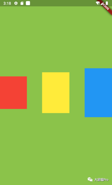
--TextDirection.ltr:从左往右开始排列(这个是默认的方向)
--TextDirection.rtl:从右往左开始排列
代码如下:
class _TestState extends State<Test> {
  @override
  Widget build(BuildContext context) {
    return MaterialApp(
      home: Scaffold(
        body: Container(
          width: MediaQuery.of(context).size.width,
          height: MediaQuery.of(context).size.height,
          color: Colors.lightGreen,
          child: Row(
            textDirection: TextDirection.rtl,
            children: [
              Container(
                width: 100,
                height: 120,
                color: Colors.red,
              ),
              Container(
                width: 100,
                height: 150,
                color: Colors.yellow,
              ),
              Container(
                width: 100,
                height: 180,
                color: Colors.blue,
              ),
            ],
          ),
        ),
      ),
    );
  }
}
效果如下:
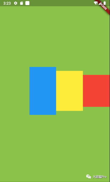
从上图我们看到,原本我们代码里排在第一个红色控件,此时排在了右边第一个
VerticalDirection:子组件垂直方向排列顺序,这个不关Row的事,我们将会在Column里介绍这个属性..
介绍完毕~