echarts进阶阶段练习,拿到后端接口数据,渲染图表,完成调节样式(完整代码在最后)
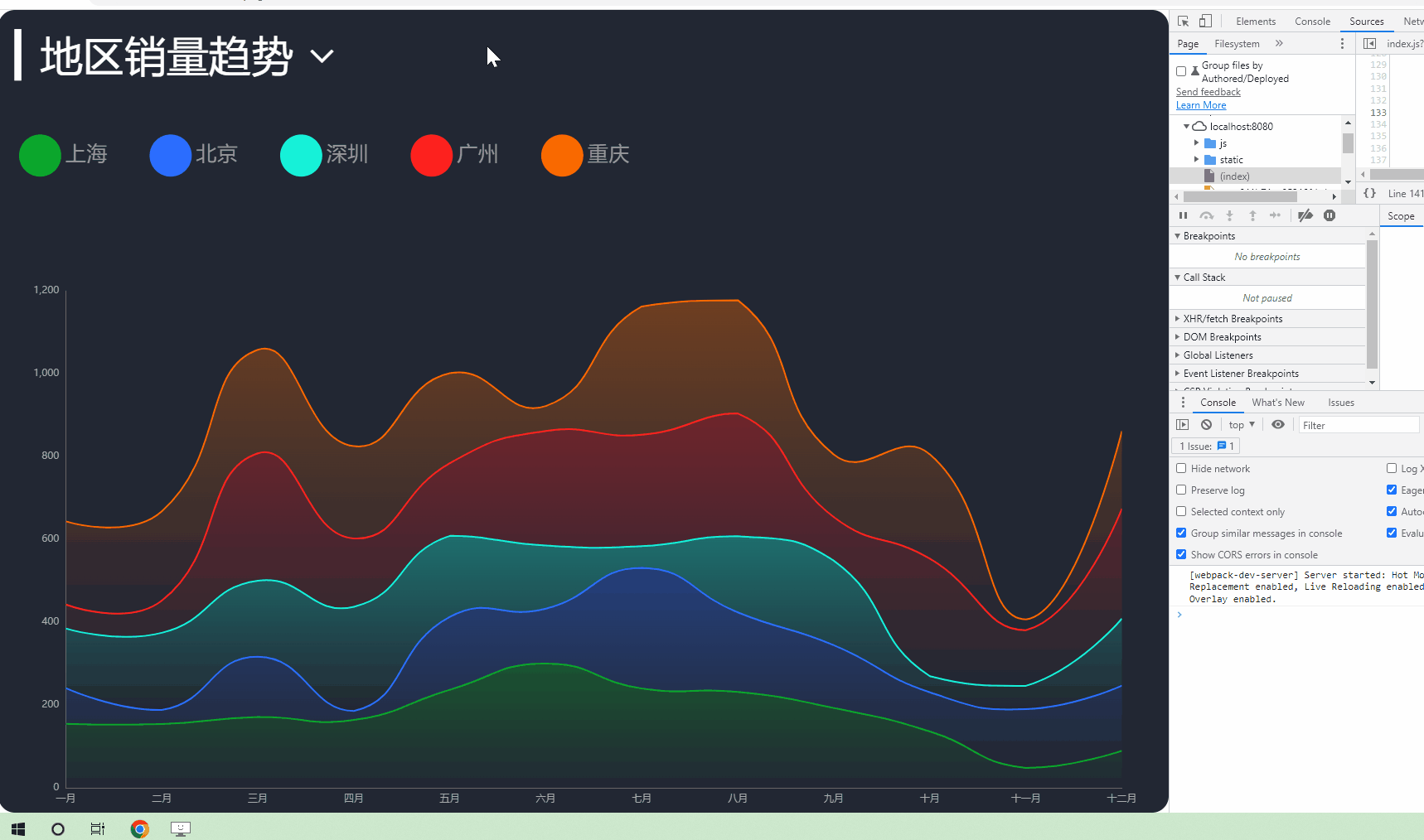
效果图
我们可以将图表的渲染分成三个阶段 初始化阶段、数据更新阶段、分辨率适配阶段
一、初始化阶段
那么我们在初始化阶段要先拿到后端接口数据
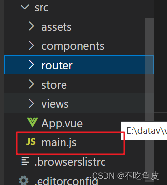
首次需要在根路径下的main.js文件中引入axios并且将axios挂载到Vue原型对象上
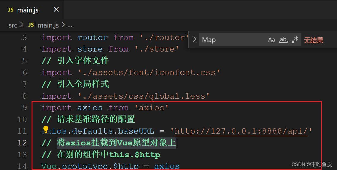
import axios from 'axios'
// 请求基准路径的配置 根据自己的接口路径来修改
axios.defaults.baseURL = 'http://127.0.0.1:8888/api/'
// 将axios挂载到Vue原型对象上
// 在别的组件中this.$http
Vue.prototype.$http = axios
然后我们需要建立一个页面来写我们的图表,并在这个页面的methods中建立getData方法拿到接口数据
async getData () {
// 根据自己的接口路径来修改方法里的参数
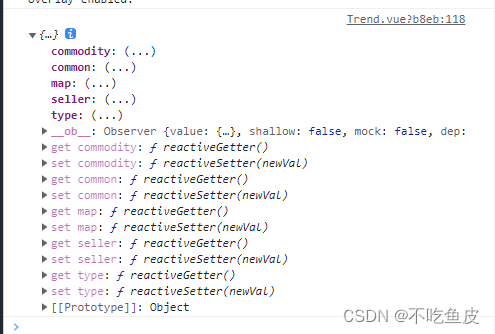
const { data: ret } = await this.$http.get('trend')
this.allData = ret
this.updateChart()
},拿到接口后,我们就需要初始化这个图表
initChart () {
      this.chartInstance = this.$echarts.init(this.$refs.trendRef, 'chalk')
      const initOption = {
        grid: {
          left: '3%',
          top: '35%',
          right: '4%',
          bottom: '1%',
          // 把坐标轴的文字 控制在范围大小以内
          containLabel: true
        },
        tooltip: {
          trigger: 'axis'
        },
        legend: {
          left: 20,
          top: '15%',
          icon: 'circle'
        },
        xAxis: {
          type: 'category',
          // x轴 挤紧挨边缘
          boundaryGap: false
        },
        yAxis: {
          type: 'value'
        }
      }
      this.chartInstance.setOption(initOption)
    },
这时,我们图表的初始化已经完成,但是我们还没有将接口拿到的数据放进去,下面我们需要进行的就是第二阶段,数据更新阶段
二、数据更新阶段
在methods方法中建一个updateChart方法,在此方法中我们来处理接口拿到的数据
我们首先需要在方法中新建一个变量timeArr来拿我们类目轴的数据
const timeArr = this.allData.common.month接着在新建变量拿y轴和series下的数据
const valueArr = this.allData[this.choiceType].data
      const seriesArr = valueArr.map((item, index) => {
        return {
          name: item.name,
          type: 'line',
          data: item.data,
          // 数据堆叠
          stack: this.choiceType,
          areaStyle: {
            color: new this.$echarts.graphic.LinearGradient(0, 0, 0, 1, [
              {
                offset: 0,
                color: colorArr1[index]
              }, // 百分之0的颜色值
              {
                offset: 1,
                color: colorArr2[index]
              } // 百分之100的颜色值
            ])
          }
        }
      })
然后我们在新建一个变量来拿我们的图例数据
// 图例的数据
      const legendArr = valueArr.map(item => {
        return item.name
      })
接下来我们需要重新setOption图表数据,让我们拿到的数据渲染上去
以下是updateChart方法完整代码
updateChart () {
      // 半透明的颜色值
      const colorArr1 = [
        'rgba(11, 168, 44, 0.5)',
        'rgba(44, 110, 255, 0.5)',
        'rgba(22, 242, 217, 0.5)',
        'rgba(254, 33, 30, 0.5)',
        'rgba(250, 105, 0, 0.5)'
      ]
      // 全透明的颜色值
      const colorArr2 = [
        'rgba(11, 168, 44, 0)',
        'rgba(44, 110, 255, 0)',
        'rgba(22, 242, 217, 0)',
        'rgba(254, 33, 30, 0)',
        'rgba(250, 105, 0, 0)'
      ]

      // 处理数据
      // 类目轴的数据
      const timeArr = this.allData.common.month

      // y轴的数据 series下的数据
      const valueArr = this.allData[this.choiceType].data
      const seriesArr = valueArr.map((item, index) => {
        return {
          name: item.name,
          type: 'line',
          data: item.data,
          // 数据堆叠
          stack: this.choiceType,
          areaStyle: {
            color: new this.$echarts.graphic.LinearGradient(0, 0, 0, 1, [
              {
                offset: 0,
                color: colorArr1[index]
              }, // 百分之0的颜色值
              {
                offset: 1,
                color: colorArr2[index]
              } // 百分之100的颜色值
            ])
          }
        }
      })
      // 图例的数据
      const legendArr = valueArr.map(item => {
        return item.name
      })

      const dataOption = {
        xAxis: {
          data: timeArr
        },
        legend: {
          data: legendArr
        },
        series: seriesArr
      }
      this.chartInstance.setOption(dataOption)
    },
接下来我们需要让图表可以根据屏幕的大小来自适应,那么就来到第三阶段分辨率适配阶段
三、分辨率适配
在methods中新建一个screenAdapter 方法来让图表自适应屏幕大小
screenAdapter () {
      this.titleFontSize = this.$refs.trendRef.offsetWidth / 100 * 3.6
      const adapterOption = {
        legend: {
          itemWidth: this.titleFontSize,
          itemHeight: this.titleFontSize,
          itemGap: this.titleFontSize,
          textStyle: {
            fontSize: this.titleFontSize / 2
          }
        }
      }
      this.chartInstance.setOption(adapterOption)
      this.chartInstance.resize()
    },
这样图表就渲染完成了,接下来我们可以做一些小小的优化来使图表给人体验感更好
完整代码如下
<template>
  <div class="com-container">
    <div class="title" :style="comStyle">
      <span>{

   { "▎" + showTitle }}</span>
      <i
        class="iconfont icon-arrow-down"
        :style="comStyle"
        @click="showChoice = !showChoice"
      ></i>
      <div class="select-con" v-show="showChoice" :style="marginStyle">
        <div
          class="select-item"
          v-for="item in selectTypes"
          :key="item.key"
          @click="handleSelect(item.key)"
        >
          {

   { item.text }}
        </div>
      </div>
    </div>
    <div class="com-chart" ref="trendRef"></div>
  </div>
</template>

<script>
export default {
  name: 'Trend',
  data () {
    return {
      chartInstance: null,
      // 从服务器中获取的所有数据
      allData: null,
      // 是否显示可选项
      showChoice: false,
      // 显示的数据类型
      choiceType: 'map',
      // 指明标题字体大小
      titleFontSize: 0
    }
  },
  created () {
    // 组件创建完成后 进行回调函数的注册
    // this.$socket.registerCallBack('trendData', this.getData)
  },
  mounted () {
    this.initChart()
    this.getData()
    window.addEventListener('resize', this.screenAdapter)
    this.screenAdapter()
  },
  destroyed () {
    window.removeEventListener('resize', this.screenAdapter)
  },
  computed: {
    selectTypes () {
      if (!this.allData) {
        return []
      } else {
        return this.allData.type.filter(item => {
          return item.key !== this.choiceType
        })
      }
    },
    showTitle () {
      if (!this.allData) {
        return ''
      } else {
        return this.allData[this.choiceType].title
      }
    },
    // 设置给标题的样式
    comStyle () {
      return {
        fontSize: this.titleFontSize + 'px'
      }
    },
    marginStyle () {
      return {
        marginLeft: this.titleFontSize + 'px'
      }
    }
  },
  methods: {
    initChart () {
      this.chartInstance = this.$echarts.init(this.$refs.trendRef, 'chalk')
      const initOption = {
        grid: {
          left: '3%',
          top: '35%',
          right: '4%',
          bottom: '1%',
          // 把坐标轴的文字 控制在范围大小以内
          containLabel: true
        },
        tooltip: {
          trigger: 'axis'
        },
        legend: {
          left: 20,
          top: '15%',
          icon: 'circle'
        },
        xAxis: {
          type: 'category',
          // x轴 挤紧挨边缘
          boundaryGap: false
        },
        yAxis: {
          type: 'value'
        }
      }
      this.chartInstance.setOption(initOption)
    },

    async getData () {
      const { data: ret } = await this.$http.get('trend')
      this.allData = ret
      console.log(this.allData)
      this.updateChart()
    },

    updateChart () {
      // 半透明的颜色值
      const colorArr1 = [
        'rgba(11, 168, 44, 0.5)',
        'rgba(44, 110, 255, 0.5)',
        'rgba(22, 242, 217, 0.5)',
        'rgba(254, 33, 30, 0.5)',
        'rgba(250, 105, 0, 0.5)'
      ]
      // 全透明的颜色值
      const colorArr2 = [
        'rgba(11, 168, 44, 0)',
        'rgba(44, 110, 255, 0)',
        'rgba(22, 242, 217, 0)',
        'rgba(254, 33, 30, 0)',
        'rgba(250, 105, 0, 0)'
      ]

      // 处理数据
      // 类目轴的数据
      const timeArr = this.allData.common.month

      // y轴的数据 series下的数据
      const valueArr = this.allData[this.choiceType].data
      const seriesArr = valueArr.map((item, index) => {
        return {
          name: item.name,
          type: 'line',
          data: item.data,
          // 数据堆叠
          stack: this.choiceType,
          areaStyle: {
            color: new this.$echarts.graphic.LinearGradient(0, 0, 0, 1, [
              {
                offset: 0,
                color: colorArr1[index]
              }, // 百分之0的颜色值
              {
                offset: 1,
                color: colorArr2[index]
              } // 百分之100的颜色值
            ])
          }
        }
      })
      // 图例的数据
      const legendArr = valueArr.map(item => {
        return item.name
      })

      const dataOption = {
        xAxis: {
          data: timeArr
        },
        legend: {
          data: legendArr
        },
        series: seriesArr
      }
      this.chartInstance.setOption(dataOption)
    },
    screenAdapter () {
      this.titleFontSize = this.$refs.trendRef.offsetWidth / 100 * 3.6
      const adapterOption = {
        legend: {
          itemWidth: this.titleFontSize,
          itemHeight: this.titleFontSize,
          itemGap: this.titleFontSize,
          textStyle: {
            fontSize: this.titleFontSize / 2
          }
        }
      }
      this.chartInstance.setOption(adapterOption)
      this.chartInstance.resize()
    },
    handleSelect (currentValue) {
      this.choiceType = currentValue
      this.updateChart()
      this.showChoice = false
    }
  },
};
</script>

<style lang="less" scoped>
.title {
  position: absolute;
  left: 20px;
  top: 20px;
  z-index: 10;
  color: #fff;
  cursor: pointer;
  .icon-arrow-down {
    cursor: pointer;
    margin-left: 10px;
  }
  .select-con {
    background-color: #222733;
  }
}
</style>