from pyecharts.charts import Bar # 柱状图from pyecharts import options as opts
bar = Bar()
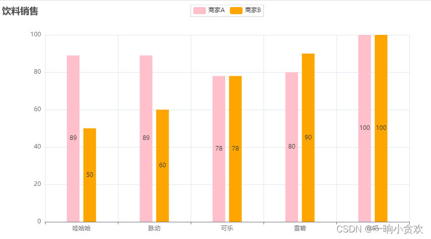
kind =["哇哈哈","脉动","可乐","雪碧","牛奶"]
data1 =[89,89,78,80,100]
data2 =[50,60,78,90,100]
bar.add_xaxis(kind)
bar.add_yaxis("商家A",data1)
bar.add_yaxis("商家B",data2,category_gap ="60%")# 设置矩形宽度百分比
bar.set_colors(["pink","orange"])# 颜色取第一个元素
bar.set_global_opts(title_opts=opts.TitleOpts(title="饮料销售"))
bar.render("./bar.html")
1、柱状图
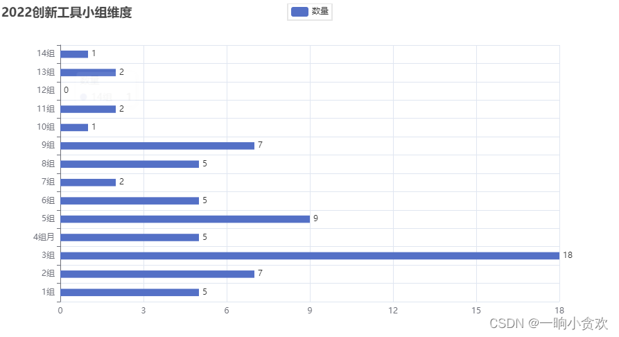
横向
from pyecharts.charts import Bar # 柱状图from pyecharts.charts import Line # 折线图from pyecharts.globalsimport SymbolType
from pyecharts import options as opts
bar = Bar()
kind =["1组","2组","3组","4组月","5组","6组","7组","8组","9组","10组","11组","12组","13组","14组",]
data1 =[5,7,18,5,9,5,2,5,7,1,2,0,2,1]
bar.add_xaxis(kind)# bar.add_yaxis("商家A",data1)
bar.add_yaxis("数量",data1,category_gap ="60%")# 设置矩形宽度百分比# bar.set_colors(["blue","green","yellow","red","pink","orange"]) # 颜色取第一个元素
bar.set_global_opts(title_opts=opts.TitleOpts(title="2022创新工具小组维度"))
bar.reversal_axis()# 将坐标轴颠倒
bar.set_series_opts(label_opts=opts.LabelOpts(position="right"))
bar.render("./2022创新工具小组维度.html")
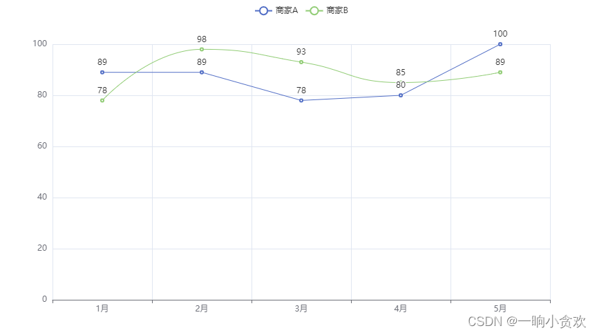
2、折线图(平滑状)
from pyecharts.charts import Bar # 柱状图from pyecharts.charts import Line # 折线图from pyecharts.globalsimport SymbolType
from pyecharts import options as opts
line = Line()
data2 =[89,89,78,80,100]
data3 =[78,98,93,85,89]
m =["1月","2月","3月","4月","5月"]
line.add_xaxis(m)
line.add_yaxis("商家A",data2)
line.add_yaxis("商家B",data3,is_smooth =True)
line.render("./line.html")
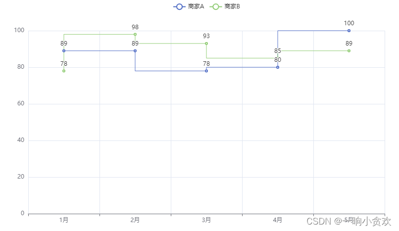
折线图(阶梯状)
from pyecharts.charts import Bar # 柱状图from pyecharts.charts import Line # 折线图from pyecharts.globalsimport SymbolType
from pyecharts import options as opts
line_2 = Line()
data2 =[89,89,78,80,100]
data3 =[78,98,93,85,89]
m =["1月","2月","3月","4月","5月"]
line_2.add_xaxis(m)
line_2.add_yaxis("商家A",data2,is_step =True)
line_2.add_yaxis("商家B",data3,is_step =True)
line_2.render("./line_2.html")