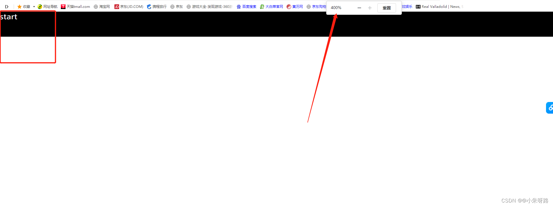
400%效果
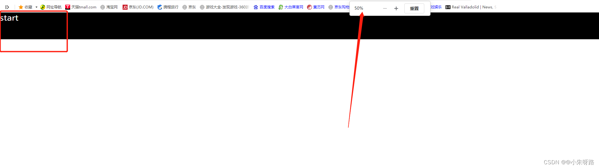
50%效果
<!DOCTYPE html>
<html lang="en">

<head>
    <meta charset="UTF-8">
    <meta http-equiv="X-UA-Compatible" content="IE=edge">
    <meta name="viewport" content="width=device-width, initial-scale=1.0">
    <title>Document</title>
</head>
<style>
    html,
    body {


        margin: 0;
        padding: 0;
        width: 100%;
        height: 100%;
    }

    #app {


        width: 100%;
        height: 100%;
        overflow: hidden;
        /* font-family: "Microsoft Yahei", Arial, sans-serif; */

    }

    #home {


        position: fixed;
        height: 100%;
        top: 0;
        left: 0;
        overflow: hidden;
        transform-origin: left top;
        z-index: 999;

    }
</style>

<body>
    <div id="app">
        <div id="home">
            <div style="font-size:28px;width:100%;height: 100px ;">小马小马</div>
        </div>
    </div>
    <script>
        function add() {


            console.log("resize加载");
            let width = 1920;
            let height = 1080;
            let dom = document.getElementById('home')
            console.log(dom)
            dom.style.width = `${

    width}px`;
            dom.style.height = `${

    height}px`;
            const currentWidth = document.body.clientWidth;
            console.log(currentWidth, 'currentWidth')
            const clientHeight = document.body.clientHeight;
            console.log(clientHeight, 'clientHeight')
            const widthScale = currentWidth / width;
            const heightScale = clientHeight / height; //6.35
            dom && (dom.style.transform = `scale(${

    widthScale},${

    heightScale})`);
        }
        window.addEventListener('load', add)
        window.addEventListener("resize", add);
    </script>
</body>

</html>