前提:在使用以下功能时,都需要引入/导入ElementUI
第一种:消息提示框
包含:成功 / 警告 / 信息 / 错误 四种类型
官方地址:Element - The world's most popular Vue UI framework
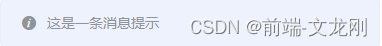
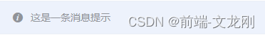
使用方法:消息提示框默认为 信息 模式(也就是灰色)
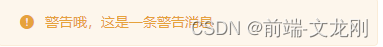
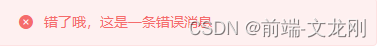
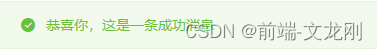
<template>
  <el-button :plain="true" @click="open2">成功</el-button>
  <el-button :plain="true" @click="open3">警告</el-button>
  <el-button :plain="true" @click="open1">消息</el-button>
  <el-button :plain="true" @click="open4">错误</el-button>
</template>
<script> export default { methods: { open1() { this.$message('这是一条消息提示'); }, open2() { this.$message({ message: '恭喜你,这是一条成功消息', type: 'success' }); }, open3() { this.$message({ message: '警告哦,这是一条警告消息', type: 'warning' }); }, open4() { this.$message.error('错了哦,这是一条错误消息'); } } } </script>
第二种:确认框

this.$confirm('此操作将永久删除该文件, 是否继续?', '提示', {
          confirmButtonText: '确定',
          cancelButtonText: '取消',
          type: 'warning'
        }).then(() => {
          this.$message({
            type: 'success',
            message: '点击确定时调用的方法!'
          });
        }).catch(() => {
          this.$message({
            type: 'info',
            message: '点击取消时调用的方法'
          });
        });