动动发财的小手,点个赞吧!
曾几何时,我们很多人都遇到过这个问题。除非您有天赋或者之前碰巧参加过设计课程,否则制作同时对观众直观的视觉美学图表可能非常具有挑战性且耗时。
当时我的想法是:我想更加有意识地制作图表,以便直观地向观众传达信息。我的意思是,不要仅仅为了理解正在发生的事情而过度消耗他们的脑力和时间。
我曾经认为从 Matplotlib 切换到 Seaborn,最后切换到 Plotly 可以解决美学问题。确实,我错了。可视化不仅仅是美学。下面是我试图从 Cole Nussbaumer Knaflic 的《用数据讲故事》中复制两个可视化,它们真正激励我改变我的可视化方法。它们看起来干净、优雅、目标明确。我们将尝试在本文中复制这些图表!
这是这篇文章的要点。如果您正在寻找对出色的可视化背后的概念的深入解释,请查看“用数据讲故事”,每一页都是值得您花时间的瑰宝。如果您正在寻找特定于工具的实用建议,那么您来对地方了。 Cole 在书的开头提到,她提出的建议是通用的且与工具无关,尽管她承认书中的示例是使用 Excel 创建的。由于多种原因,有些人(包括我自己)不喜欢 Excel 和拖放工具。有些人喜欢使用 Python、R 和其他一些编程语言创建可视化。如果您属于此部分并使用 Python 作为主要工具,那么本文适合您。
链接——Pandas 图
如果您是使用 Pandas 进行数据整理的专家或经验丰富的玩家,您可能会遇到甚至采用“链接”的想法。简而言之,链接使您的代码更具可读性、更易于调试并且可以投入生产。这是我所指的一个简单示例。您不必逐行阅读,只需快速浏览即可了解“链接”背后的想法。每个步骤都清晰易懂,代码组织良好,没有不必要的中间变量。
(epl_10seasons
 .rename(columns=lambda df_: df_.strip())
 .rename(columns=lambda df_: re.sub('\W+|[!,*)@#%(&$_?.^]', '_', df_))
 .pipe(lambda df_: df_.astype({column: 'int8' for column in (df_.select_dtypes("integer").columns.tolist())}))
 .pipe(lambda df_: df_.astype({column: 'category' for column in (df_.select_dtypes("object").columns.tolist()[:-1])}))
 .assign(match_date=lambda df_: pd.to_datetime(df_.match_date, infer_datetime_format=True))
 .assign(home_team=lambda df_: np.where((df_.home_team == "Arsenal"), "The Gunners", df_.home_team),
         away_team=lambda df_: np.where((df_.away_team == "Arsenal"), "The Gunners", df_.away_team),
         month=lambda df_: df_.match_date.dt.month_name())
 .query('home_team == "The Gunners"')
)
这很棒,但是您知道您也可以继续链接过程来创建基本的可视化图表吗?默认情况下,Pandas Plot 使用 Matplotlib 后端来实现此目的。让我们看看它是如何工作的,并重现 Cole 在她的书中创建的一些示例。
import pandas as pd
import numpy as np
import matplotlib.pyplot as plt
import seaborn as sns
import plotly.graph_objects as go
%matplotlib inline
pd.options.plotting.backend = 'plotly'
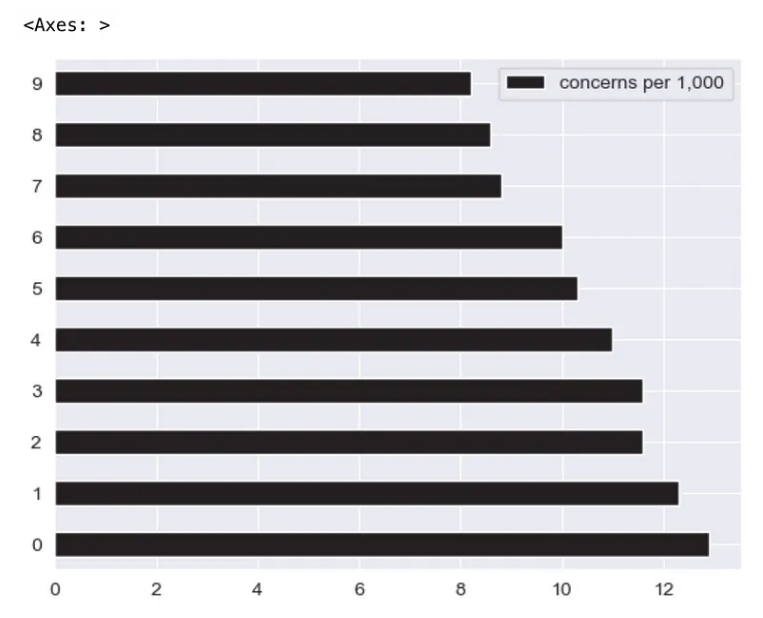
df = pd.DataFrame({"concerns": ["Engine power is less than expected",
"Tires make excessive noise while driving",
"Engine makes abnormal/excessive noise",
"Seat material concerns",
"Excessive wind noise",
"Hesitation or delay when shifting",
"Bluetooth system has poor sound quality",
"Steering system/wheel has too much play",
"Bluetooth system is difficult to use",
"Front seat audio/entertainment/navigation controls"
],
"concerns per 1,000": [12.9, 12.3, 11.6, 11.6, 11.0, 10.3, 10.0, 8.8, 8.6, 8.2],},
index=list(range(0,10,1)))
我们有一个如下所示的 DataFrame。
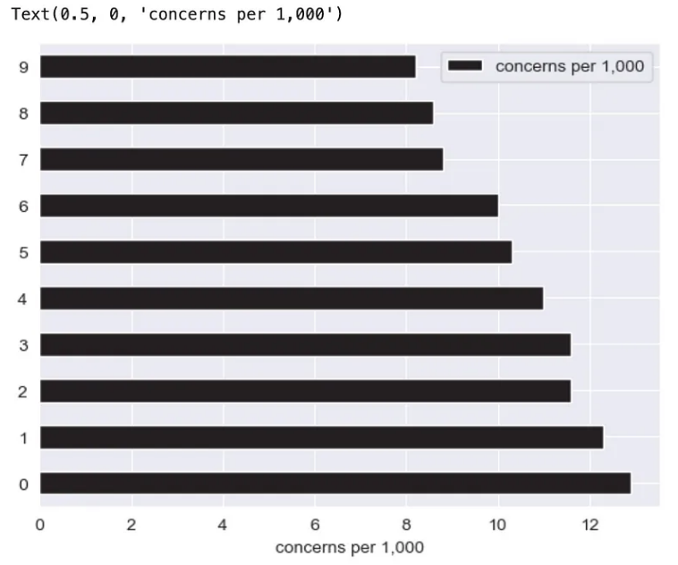
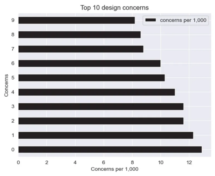
(df
 .plot
 .barh()
)
这是生成基本可视化图表的最快方法。通过直接从 DataFrame 链接 .plot 属性和 .line 方法,我们获得了下面的图。

如果您认为上面的情节没有通过美学检查,请保留您的反应和判断。事实上,至少可以说它看起来很丑。让我们来调味并做得更好。诀窍是,将 Pandas 绘图后端从 Matplotlib 切换到 Plotly,以获得即将解开的魔力。
pd.options.plotting.backend = 'plotly'
你可能会问,“为什么我要把它改成 Plotly? Matplotlib 不能做同样的事情吗?”嗯,这就是区别。
如果我们在 Pandas 中使用 Matplotlib 后端,它会返回一个 Axes 对象,请尝试使用内置 type() 方法进行验证。这很棒,因为坐标区对象允许我们访问方法来进一步修改图表。查看此文档²,了解在 Axes 对象上执行的可能方法。让我们快速选一个来说明。
(df
 .plot
 .barh()
 .set_xlabel("concerns per 1,000")
)
我们成功地将 x 轴标签设置为“每 1,000 个关注点”,但这样做时,我们返回了一个 Text 对象并丢失了宝贵的 Axis 对象,该对象允许我们访问宝贵的方法来进一步修改图表。太糟糕了!
这是解决上述限制的另一种方法,
(df
 .plot
 .barh(xlabel="Concerns per 1,000", ylabel="Concerns", title="Top 10 design concerns")
)
然而,我们仍然无法进行广泛的修改,因为 Pandas 的实现非常限制集成。
另一方面,Plotly 不返回 Axes 对象。它返回一个 go.Figure 对象。此处的区别在于,负责更新图表的方法还会返回一个 go.Figure 对象,该对象允许您继续链接方法以进一步更新图表。让我们尝试一下吧!
顺便说一句,如果您想知道我如何获得下面的方法和参数的组合,它们都可以在此处的官方文档中找到。 以下是一些帮助您入门的重要方法 - .update_traces、.add_traces、.update_layout、.update_xaxes、.update_yaxes、.add_annotation、.update_annotations。
水平条形图
让我们为下面的可视化定义一组调色板。
GRAY1, GRAY2, GRAY3 = '#231F20', '#414040', '#555655'
GRAY4, GRAY5, GRAY6 = '#646369', '#76787B', '#828282'
GRAY7, GRAY8, GRAY9, GRAY10 = '#929497', '#A6A6A5', '#BFBEBE', '#FFFFFF'
BLUE1, BLUE2, BLUE3, BLUE4, BLUE5 = '#25436C', '#174A7E', '#4A81BF', '#94B2D7', '#94AFC5'
BLUE6, BLUE7 = '#92CDDD', '#2E869D'
RED1, RED2, RED3 = '#B14D4A', '#C3514E', '#E6BAB7'
GREEN1, GREEN2 = '#0C8040', '#9ABB59'
ORANGE1, ORANGE2, ORANGE3 = '#F36721', '#F79747', '#FAC090'

gray_palette = [GRAY1, GRAY2, GRAY3, GRAY4, GRAY5, GRAY6, GRAY7, GRAY8, GRAY9, GRAY10]
blue_palette = [BLUE1, BLUE2, BLUE3, BLUE4, BLUE5, BLUE6, BLUE7]
red_palette = [RED1, RED2, RED3]
green_palette = [GREEN1, GREEN2]
orange_palette = [ORANGE1, ORANGE2, ORANGE3]

sns.set_style("darkgrid")
sns.set_palette(gray_palette)
sns.palplot(sns.color_palette())

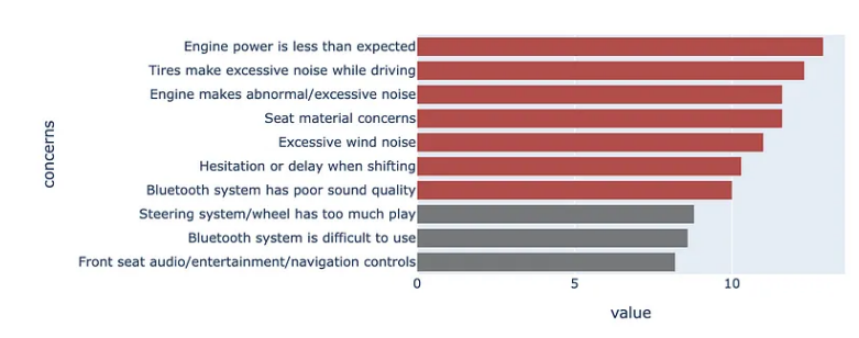
在这里,我们希望通过定义单独的颜色来突出显示等于或高于 10% 的问题。
color = np.array(['rgb(255,255,255)']*df.shape[0])
color[df
      .set_index("concerns", drop=True)
      .iloc[::-1]
      ["concerns per 1,000"]>=10] = red_palette[0]
color[df
      .set_index("concerns", drop=True)
      .iloc[::-1]
      ["concerns per 1,000"]<10] = gray_palette[4]
然后我们直接从 DataFrame 创建绘图。
(df
 .set_index("concerns", drop=True)
 .iloc[::-1]
 .plot
 .barh()
 .update_traces(marker=dict(color=color.tolist()))
)
更新布局会产生以下结果。在这里,我们指定模板,向绘图添加标题和边距,并指定图形对象的大小。我们暂时评论一下注释。
(df
.set_index("concerns", drop=True)
.iloc[::-1]
.plot
.barh()
.update_traces(marker=dict(color=color.tolist()))
.update_layout(template="plotly_white",
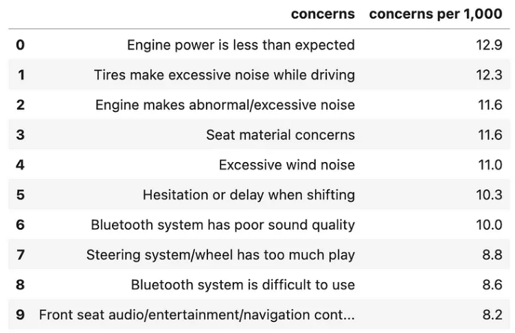
title=dict(text="<b>Top 10 design concerns</b> <br><sup><i>concerns per 1,000</i></sup>",
font_size=30,
font_color=gray_palette[4]),
margin=dict(l=50,
r=50,
b=50,
t=100,
pad=20),
width=1000,
height=800,
showlegend=False,
#annotations=annotations
)
)
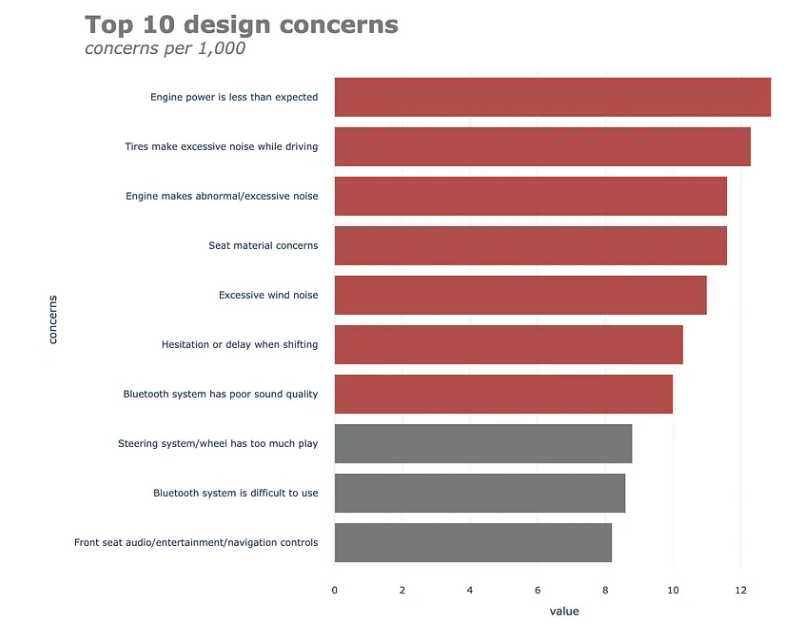
更新 x 和 y 轴属性会产生以下结果。
(df
 .set_index("concerns", drop=True)
 .iloc[::-1]
 .plot
 .barh()
 .update_traces(marker=dict(color=color.tolist()))
 .update_layout(template="plotly_white",
                title=dict(text="<b>Top 10 design concerns</b> <br><sup><i>concerns per 1,000</i></sup>",
                           font_size=30,
                           font_color=gray_palette[4]),
                margin=dict(l=50,
                            r=50,
                            b=50,
                            t=100,
                            pad=20),
                width=1000,
                height=800,
                showlegend=False,
                #annotations=annotations
               )
 .update_xaxes(title_standoff=10,
               showgrid=False,
               visible=False,
               tickfont=dict(
                        family='Arial',
                        size=16,
                        color=gray_palette[4],),
               title="")
 .update_yaxes(title_standoff=10,
               tickfont=dict(
                        family='Arial',
                        size=16,
                        color=gray_palette[4],),
               title="")
)

最后但并非最不重要的一点是,我们将在图表中添加一些注释。在这里,我们有一些注释 - 将数据标签添加到水平条形图和脚注。让我们一起来做吧。首先,我们在单独的单元格上定义注释。
annotations = []

y_s = np.round(df["concerns per 1,000"], decimals=2)

# Adding data labels
for yd, xd in zip(y_s, df.concerns):
    # labeling the bar net worth
    annotations.append(dict(xref='x1',
                            yref='y1',
                            y=xd, x=yd - 1,
                            text=str(yd) + '%',
                            font=dict(family='Arial', size=16,
                                      color=gray_palette[-1]),
                            showarrow=False))

# Adding Source Annotations
annotations.append(dict(xref='paper',
                        yref='paper',
                        x=-0.72,
                        y=-0.050,
                        text='Source: Lorem ipsum dolor sit amet, consectetur adipiscing elit, sed do eiusmod tempor incididunt ut labore et dolore magna aliqua. Ut enim ad minim veniam, quis nostrud exercitation ullamco'
                             '<br>laboris nisi ut aliquip ex ea commodo consequat.',
                        font=dict(family='Arial', size=10, color=gray_palette[4]),
                        showarrow=False,
                        align='left'))
(df
 .set_index("concerns", drop=True)
 .iloc[::-1]
 .plot
 .barh()
 .update_traces(marker=dict(color=color.tolist()))
 .update_layout(template="plotly_white",
                title=dict(text="<b>Top 10 design concerns</b> <br><sup><i>concerns per 1,000</i></sup>",
                           font_size=30,
                           font_color=gray_palette[4]),
                margin=dict(l=50,
                            r=50,
                            b=50,
                            t=100,
                            pad=20),
                width=1000,
                height=800,
                showlegend=False,
                annotations=annotations
               )
 .update_xaxes(title_standoff=10,
               showgrid=False,
               visible=False,
               tickfont=dict(
                        family='Arial',
                        size=16,
                        color=gray_palette[4],),
               title="")
 .update_yaxes(title_standoff=10,
               tickfont=dict(
                        family='Arial',
                        size=16,
                        color=gray_palette[4],),
               title="")
)

相对于最初的默认版本,这不是一个更好的图表吗?让我们继续探索另一种流行的图表——折线图。
请注意,下面的示例比上面的示例更复杂。尽管如此,这个想法仍然是一样的。
折线图
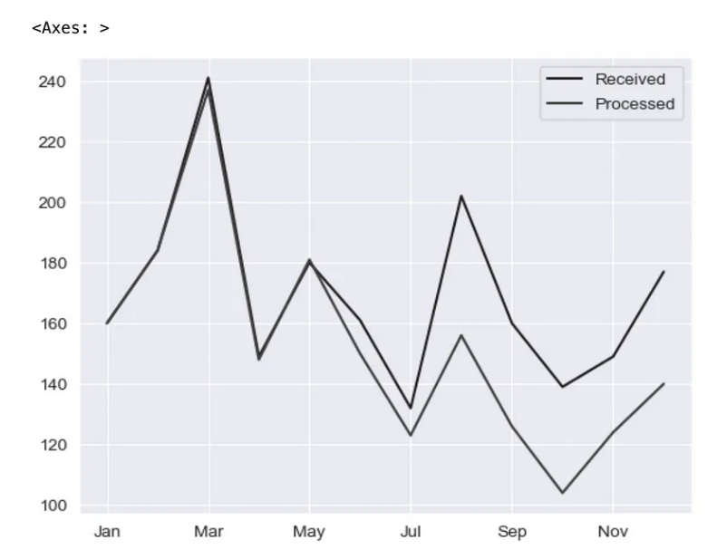
让我们快速浏览一下折线图的默认 Matplotlib 绘图后端。
pd.options.plotting.backend = 'matplotlib'

df = pd.DataFrame({"Received": [160,184,241,149,180,161,132,202,160,139,149,177],
                   "Processed":[160,184,237,148,181,150,123,156,126,104,124,140]},
                  index=['Jan', 'Feb', 'Mar', 'Apr', 'May', 'Jun', 'Jul', 'Aug', 'Sep', 'Oct', 'Nov', 'Dec'])

(df
 .plot
 .line()
);
让我们将绘图后端切换到 Plotly!
pd.options.plotting.backend = 'plotly'

(df
 .plot(x=df.index,
       y=df.Received,
       labels=dict(index="", value="Number of tickets"),)
)
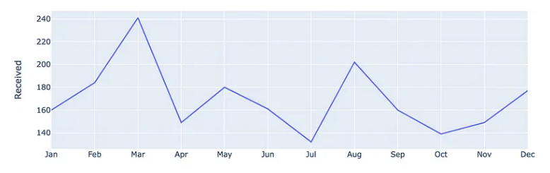
将 Pandas 绘图后端切换到 Plotly 后,上面的代码给出了以下内容。在这里,我们首先仅绘制已接收序列。
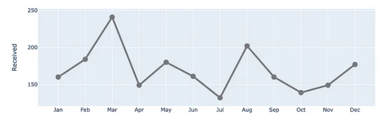
让我们通过进一步链接上面的方法来更新线属性。在这里,我们修改颜色、宽度并在数据点处放置标记。
(df
 .plot(x=df.index,
       y=df.Received,
       labels=dict(index="", value="Number of tickets"),)
 .update_traces(go.Scatter(mode='lines+markers+text',
                           line={"color": gray_palette[4], "width":4},
                           marker=dict(size=12)),)
)
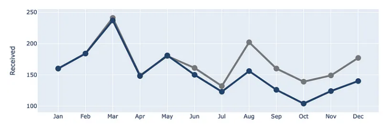
让我们将处理后的系列添加到图表中!
(df
 .plot(x=df.index,
       y=df.Received,
       labels=dict(index="", value="Number of tickets"),)
 .update_traces(go.Scatter(mode='lines+markers+text',
                           line={"color": gray_palette[4], "width":4},
                           marker=dict(size=12)),)
 .add_traces(go.Scatter(x=df.index, #Add Processed col
                        y=df.Processed,
                        mode="lines+markers+text",
                        line={"color": blue_palette[0], "width":4},
                        marker=dict(size=12)))
)
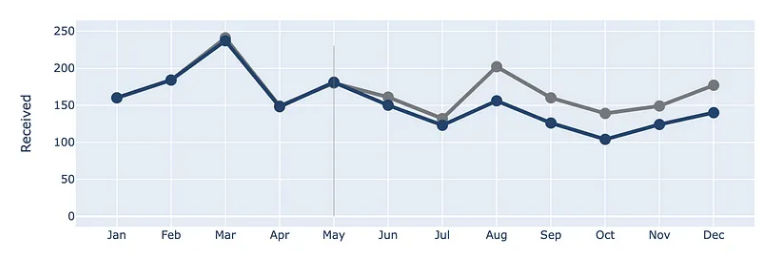
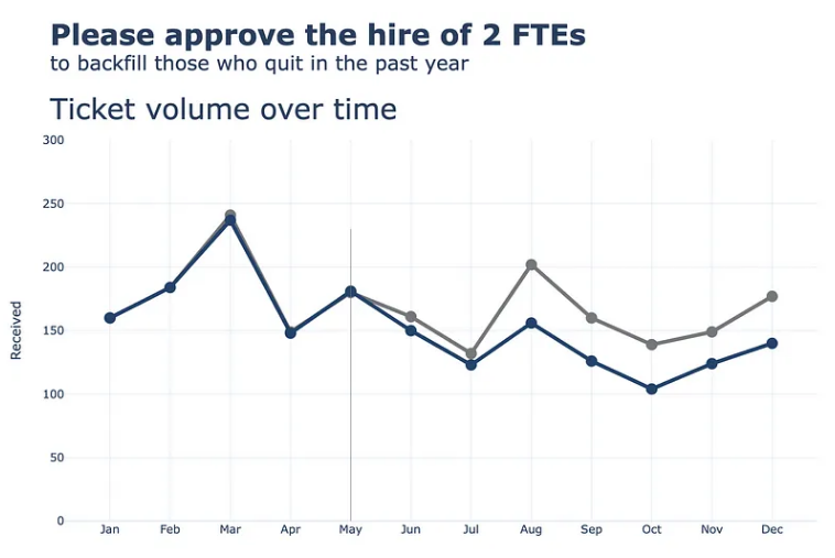
让我们在索引 May 处添加一条垂直线,以显示两条线开始分歧的点。
(df
 .plot(x=df.index,
       y=df.Received,
       labels=dict(index="", value="Number of tickets"),)
 .update_traces(go.Scatter(mode='lines+markers+text',
                           line={"color": gray_palette[4], "width":4},
                           marker=dict(size=12)),)
 .add_traces(go.Scatter(x=df.index, #Add Processed col
                        y=df.Processed,
                        mode="lines+markers+text",
                        line={"color": blue_palette[0], "width":4},
                        marker=dict(size=12)))
 .add_traces(go.Scatter(x=["May", "May"], #Add vline
                        y=[0,230],
                        fill="toself",
                        mode="lines",
                        line_width=0.5,
                        line_color= gray_palette[4]))
)
接下来,让我们更新整体布局,将背景更改为白色,并添加标题、边距和一些其他元素。对于注释,我们暂时注释掉。
(df
.plot(x=df.index,
y=df.Received,
labels=dict(index="", value="Number of tickets"),)
.update_traces(go.Scatter(mode='lines+markers+text',
line={"color": gray_palette[4], "width":4},
marker=dict(size=12)),)
.add_traces(go.Scatter(x=df.index, #Add Processed col
y=df.Processed,
mode="lines+markers+text",
line={"color": blue_palette[0], "width":4},
marker=dict(size=12)))
.add_traces(go.Scatter(x=["May", "May"], #Add vline
y=[0,230],
fill="toself",
mode="lines",
line_width=0.5,
line_color= gray_palette[4]))
.update_layout(template="plotly_white",
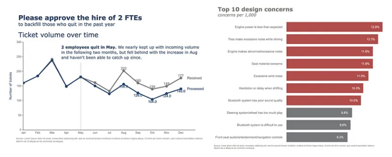
title=dict(text="<b>Please approve the hire of 2 FTEs</b> <br><sup>to backfill those who quit in the past year</sup> <br>Ticket volume over time <br><br><br>",
font_size=30,),
margin=dict(l=50,
r=50,
b=100,
t=200,),
width=900,
height=700,
yaxis_range=[0, 300],
showlegend=False,
#annotations=right_annotations,
)
)
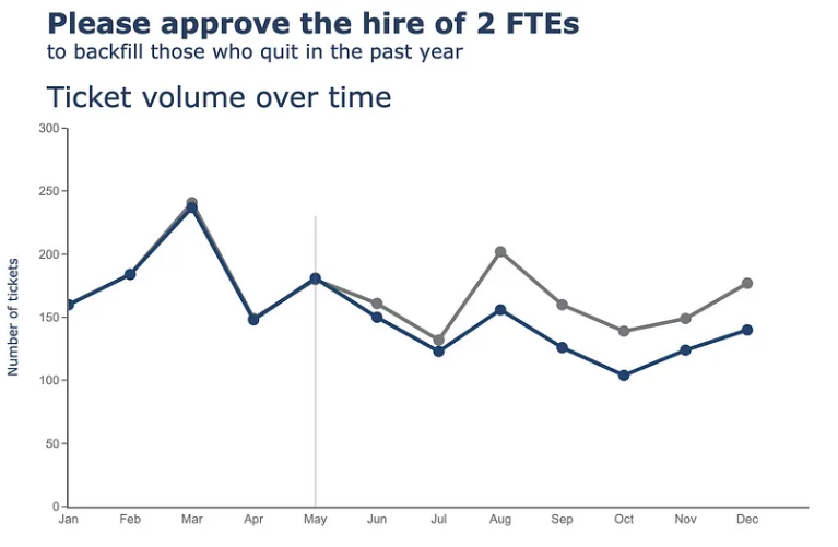
接下来,我们将对 x 轴和 y 轴执行更新。
(df
 .plot(x=df.index,
       y=df.Received,
       labels=dict(index="", value="Number of tickets"),)
 .update_traces(go.Scatter(mode='lines+markers+text',
                           line={"color": gray_palette[4], "width":4},
                           marker=dict(size=12)),)
 .add_traces(go.Scatter(x=df.index, #Add Processed col
                        y=df.Processed,
                        mode="lines+markers+text",
                        line={"color": blue_palette[0], "width":4},
                        marker=dict(size=12)))
 .add_traces(go.Scatter(x=["May", "May"], #Add vline
                        y=[0,230],
                        fill="toself",
                        mode="lines",
                        line_width=0.5,
                        line_color= gray_palette[4]))
 .update_layout(template="plotly_white",
                title=dict(text="<b>Please approve the hire of 2 FTEs</b> <br><sup>to backfill those who quit in the past year</sup> <br>Ticket volume over time <br><br><br>",
                           font_size=30,),
                margin=dict(l=50,
                            r=50,
                            b=100,
                            t=200,),
                width=900,
                height=700,
                yaxis_range=[0, 300],
                showlegend=False,
                #annotations=right_annotations,
                )
 .update_xaxes(dict(range=[0, 12],
                    showline=True,
                    showgrid=False,
                    linecolor=gray_palette[4],
                    linewidth=2,
                    ticks='',
                    tickfont=dict(
                        family='Arial',
                        size=13,
                        color=gray_palette[4],
                    ),
 ))
 .update_yaxes(dict(showline=True,
                    showticklabels=True,
                    showgrid=False,
                    ticks='outside',
                    linecolor=gray_palette[4],
                    linewidth=2,
                    tickfont=dict(
                        family='Arial',
                        size=13,
                        color=gray_palette[4],
                    ),
                    title_text="Number of tickets"
 ))
)
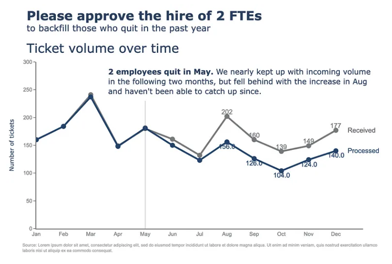
最后但并非最不重要的一点是,我们将在图表中添加一些注释。在这里,我们有一些注释 - 向折线图添加标签(已接收、已处理),以及向散点添加标签,这可能有点复杂。让我们一起来做吧。首先,我们在单独的单元格上定义注释。
y_data = df.to_numpy()
colors = [gray_palette[3], blue_palette[0]]
labels = df.columns.to_list()

right_annotations = []

# Adding labels to line
for y_trace, label, color in zip(y_data[-1], labels, colors):

    right_annotations.append(dict(xref='paper',
                                  x=0.95,
                                  y=y_trace,
                                  xanchor='left',
                                  yanchor='middle',
                                  text=label,
                                  font=dict(family='Arial',size=16,color=color),
                                  showarrow=False))

# Adding labels to scatter point
scatter_annotations = []

y_received = [each for each in df.Received]
y_processed  = [float(each) for each in df.Processed]
x_index = [each for each in df.index]
y_r = np.round(y_received)
y_p = np.rint(y_processed)

for ydn, yd, xd in zip(y_r[-5:], y_p[-5:], x_index[-5:]):

    scatter_annotations.append(dict(xref='x2 domain',
                                    yref='y2 domain',
                                    y=ydn,
                                    x=xd,
                                    text='{:,}'.format(ydn),
                                    font=dict(family='Arial',size=16,color=gray_palette[4]),
                                    showarrow=False,
                                    xanchor='center',
                                    yanchor='bottom',
                                    ))

    scatter_annotations.append(dict(xref='x2 domain',
                                    yref='y2 domain',
                                    y=yd,
                                    x=xd,
                                    text='{:,}'.format(yd),
                                    font=dict(family='Arial',size=16,color=blue_palette[0]),
                                    showarrow=False,
                                    xanchor='center',
                                    yanchor='top',
                                    ))
定义注释后,我们只需要将注释变量放入链接方法中,如下所示。
(df
 .plot(x=df.index,
       y=df.Received,
       labels=dict(index="", value="Number of tickets"),)
 .update_traces(go.Scatter(mode='lines+markers+text',
                           line={"color": gray_palette[4], "width":4},
                           marker=dict(size=12)),)
 .add_traces(go.Scatter(x=df.index, #Add Processed col
                        y=df.Processed,
                        mode="lines+markers+text",
                        line={"color": blue_palette[0], "width":4},
                        marker=dict(size=12)))
 .add_traces(go.Scatter(x=["May", "May"], #Add vline
                        y=[0,230],
                        fill="toself",
                        mode="lines",
                        line_width=0.5,
                        line_color= gray_palette[4]))
 .update_layout(template="plotly_white",
                title=dict(text="<b>Please approve the hire of 2 FTEs</b> <br><sup>to backfill those who quit in the past year</sup> <br>Ticket volume over time <br><br><br>",
                           font_size=30,),
                margin=dict(l=50,
                            r=50,
                            b=100,
                            t=200,),
                width=900,
                height=700,
                yaxis_range=[0, 300],
                showlegend=False,
                annotations=right_annotations,
                )
 .update_layout(annotations=scatter_annotations * 2)
 .update_xaxes(dict(range=[0, 12],
                    showline=True,
                    showgrid=False,
                    linecolor=gray_palette[4],
                    linewidth=2,
                    ticks='',
                    tickfont=dict(
                        family='Arial',
                        size=13,
                        color=gray_palette[4],
                    ),
 ))
 .update_yaxes(dict(showline=True,
                    showticklabels=True,
                    showgrid=False,
                    ticks='outside',
                    linecolor=gray_palette[4],
                    linewidth=2,
                    tickfont=dict(
                        family='Arial',
                        size=13,
                        color=gray_palette[4],
                    ),
                    title_text="Number of tickets"
 ))
 .add_annotation(dict(text="<b>2 employees quit in May.</b> We nearly kept up with incoming volume <br>in the following two months, but fell behind with the increase in Aug <br>and haven't been able to catch up since.",
                      font_size=18,
                      align="left",
                      x=7.5,
                      y=265,
                      showarrow=False))
 .add_annotation(dict(xref='paper',
                        yref='paper',
                        x=0.5,
                        y=-0.15,
                        text='Source: Lorem ipsum dolor sit amet, consectetur adipiscing elit, sed do eiusmod tempor incididunt ut labore et dolore magna aliqua. Ut enim ad minim veniam, quis nostrud exercitation ullamco'
                             '<br>laboris nisi ut aliquip ex ea commodo consequat.',
                        font=dict(family='Arial',
                                  size=10,
                                  color='rgb(150,150,150)'),
                        showarrow=False,
                        align='left'))
 .update_annotations(yshift=0)
 .show()
)
本文由mdnice多平台发布