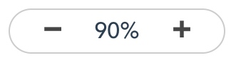
效果图如下:
操作效果:
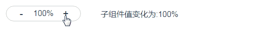
用途:
实际工作中对图片或文档预览时会用到
子组件代码
<template>
<div class="flex border border-radius-l padding-left-l padding-right-l">
<div class="zoom-btn flex flex-center-sp flex-center-cz pointer cannotselect" @click="smallClick">➖</div>
<div class="flex zoom-text flex-center-sp flex-center-cz">{
{value}}%</div>
<div class="zoom-btn flex flex-center-sp flex-center-cz pointer cannotselect" @click="bigClick">➕</div>
</div>
</template>
<script>
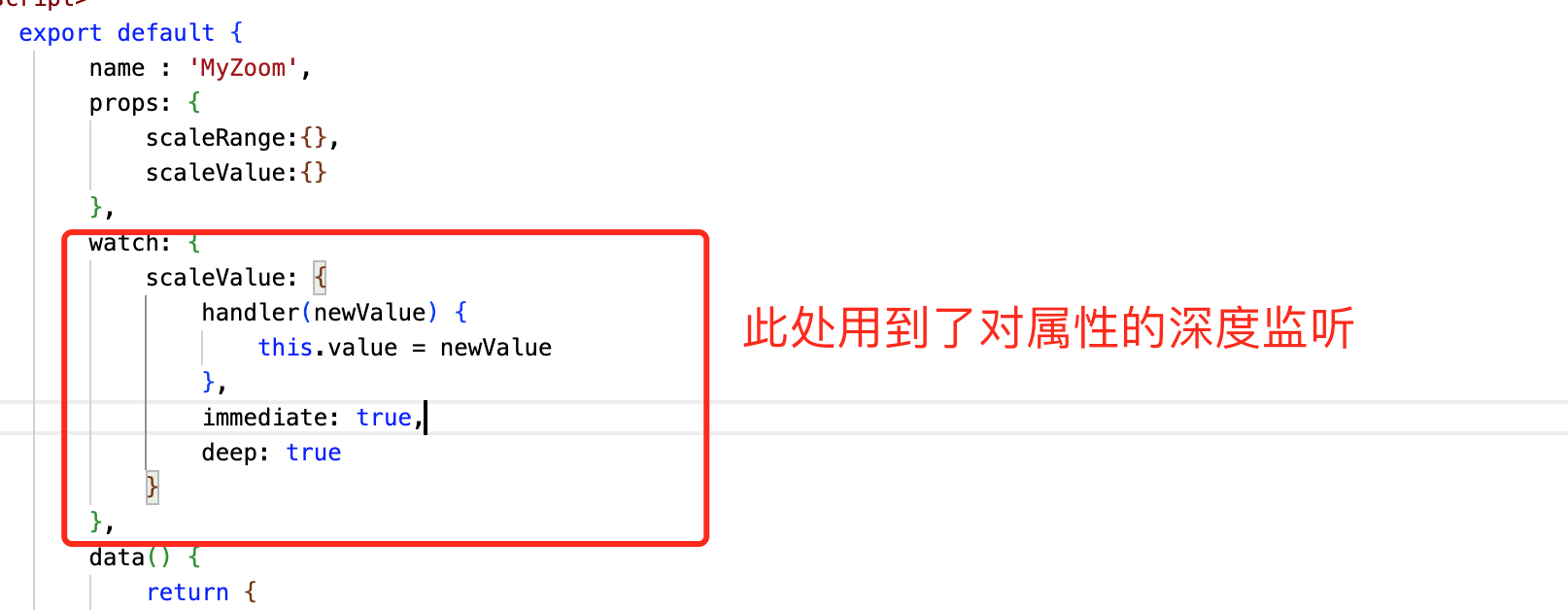
export default {
name : 'MyZoom',
props: {
scaleRange:{},
scaleValue:{}
},
watch: {
scaleValue: {
handler(newValue) {
this.value = newValue
},
immediate: true,
deep: true
}
},
data() {
return {
value: null
}
},
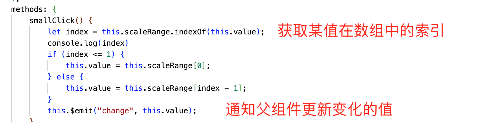
methods: {
smallClick() {
let index = this.scaleRange.indexOf(this.value);
console.log(index)
if (index <= 1) {
this.value = this.scaleRange[0];
} else {
this.value = this.scaleRange[index - 1];
}
this.$emit("change", this.value);
},
bigClick() {
let index = this.scaleRange.indexOf(this.value);
console.log(index)
if (index >= this.scaleRange.length - 1) {
this.value = this.scaleRange[this.scaleRange.length - 1];
} else {
this.value = this.scaleRange[index + 1];
}
this.$emit("change", this.value);
}
}
}
</script>
<style>
.zoom-btn {
width: 30px;
height: 30px;
}
.zoom-text {
font-size: 16px;
font-weight: 500;
width: 60px;
height: 30px;
}
</style>重点说明
父组件代码
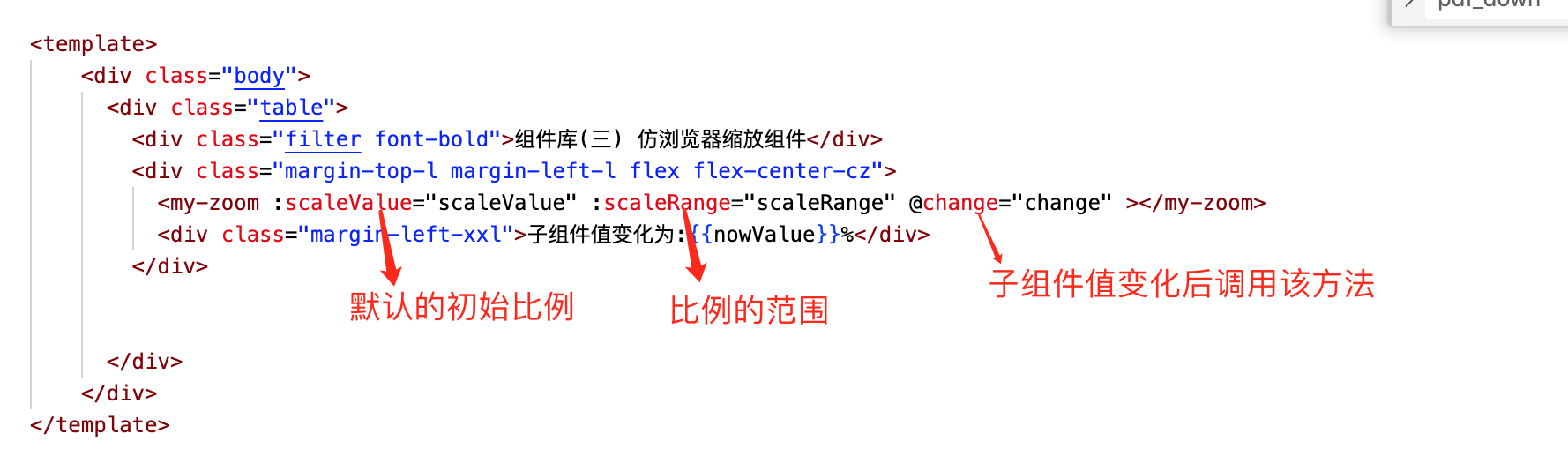
<template>
    <div class="body">
      <div class="table">
        <div class="filter font-bold">组件库(三) 仿浏览器缩放组件</div>
        <div class="margin-top-l margin-left-l flex flex-center-cz">
          <my-zoom :scaleValue="scaleValue" :scaleRange="scaleRange" @change="change" ></my-zoom>
          <div class="margin-left-xxl">子组件值变化为:{

    {nowValue}}%</div>
        </div>


      </div>
    </div>
</template>

<script>
/*
       名称:组件库(三) 仿浏览器缩放比例组件
       作者:唐赢
       时间:2023-3-19
*/

  import MyZoom from '@/components/zoom/Zoom'
  export default {
    name: 'ZoomDemo',
    components: {
        MyZoom
    },
    data () {
      return {
        nowValue : 110,
        scaleValue : 110,
        scaleRange:[90,100,110,125,150,180,200]
      }
    },
    methods: {
        change(value) {
            this.nowValue = value

        }

    }
  }
</script>

<style scoped>
  .body {
    display: flex;
    justify-content: center;
    margin-top: 73px;
    width: 100%;
  }
  .table {
    background-color: #fff;
    width: 1080px;
    min-height: 800px;
    box-shadow: 0px 3px 6px rgba(0, 0, 0, .1);
    margin-bottom: 10px;
  }
  .filter {
    display: flex;
    height: 60px;
    align-items:center;
    background-color: #fff;
    font-size: 18px;
    justify-content: center;
    border-bottom: 1px solid rgba(0, 0, 0, .2);;
  }

</style>
重点说明
源码下载:https://download.csdn.net/download/gdgztt/87591067