前言
在此记录echarts使用过程中的一些配置。
开始
一、整体使用
以一个环形图为例:

html
<div id="myChart" :style="{width: '100%', height: '180px'}"></div>
js部分
drawChart(list) {


            let myChart= this.echarts.init(document.getElementById("myChart"));
            myChart.setOption({


                tooltip: {


                    trigger: 'item'
                },
                legend: {


                    data:['轻微','严重','一般','不可用'],
                    orient: 'vertical',  //垂直显示
                    y: 'center',    //延Y轴居中
                    x: '55%',
                    icon: "circle",
                    itemWidth: 10,
                    itemHeight: 10,
                    itemGap: 20,
                },
                color:['#302E77','#FFAB00','#9095FD','#FB6D40'],
                series: [
                    {


                        name: '告警信息',
                        type: 'pie',
                        center:['25%','50%'],
                        radius: ['65%', '85%'],
                        avoidLabelOverlap: false,
                        label: {


                            show: false,
                            position: 'center'
                        },
                        labelLine: {


                            show: false
                        },
                        data:list
                    }
                ]
            })
        },
二、详细用法
1、图例显示
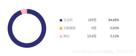
1> 图例显示多条数据信息,包括数值和百分比等,并设置一些样式,文字大小,左右对齐等。
例:
myChart.setOption({


		legend: {


                    data:['云主机','云数据库','其它'],
                    orient: 'vertical',  //垂直显示
                    y: 'center',    //延Y轴居中
                    x: '45%',
                    icon: "circle",
                    itemWidth: 10,
                    itemHeight: 10,
                    itemGap: 20,
                    formatter:function(name){

      //该函数用于设置图例显示后的百分比
                        let value;
                        let total=0;
                        list.forEach((item)=>{


                            total += item.value;
                            if (item.name == name) {


                                value = item.value;
                            }
                        })
                        let arr=[];
                        if(total){


                            arr = [
                                '{a|' + name + '}',
                                '{c|' + value + '元}',
                                '{b|' + (((value / total) * 100).toFixed(2)) + '%}'
                            ];
                        }else{


                            arr = [
                                '{a|' + name + '}',
                                '{c|' + value + '元}',
                                '{b|' + '0%}'
                            ];
                        }
                        return arr.join('');
                    },
                    textStyle: {


                        rich: {


                            a: {


                            fontSize: 12,
                            verticalAlign: 'center',
                            width:50,
                            align: 'left',
                            padding: [0, 0, 0, 0],
                            color: '#9d9d9d'
                            },
                            b: {


                            fontSize: 12,
                            width:80,
                            align: 'right',
                            padding: [0, 0, 0, 10],
                            color: '#000'

                            },
                            c: {


                            fontSize: 12,
                            width:80,
                            align: 'right',
                            padding: [0, 0, 0, 0],
                            color: '#302E77'
                            }
                        }
                    }
                },
     })
2>图例显示部分,自定义隐藏某图例
如果数据格式是这样的 list : [ {name:‘包年包月’,value:50},{name:‘按需付费’,value:50} ],
图例想隐藏按需付费,只显示包年包月,则可以像如下这样设置。
legend: {


            orient: 'vertical',
            icon: 'circle',
            data:['包年包月'],
            selected:{


              '按需付费':true
            }
          },
3>去掉(饼图)高亮
扫描二维码关注公众号,回复:
15697898 查看本文章

*******鼠标移入图上 禁止高亮:
 series:{


			silent:true
		}
*******鼠标移入图注 禁止高亮:
 legend:{


			selectedMode:false
		}
2、图注
鼠标移入图标某项,图注显示百分比或者其他信息。
tooltip里的formatter函数,我打印了一下它的参数param,是这样的。
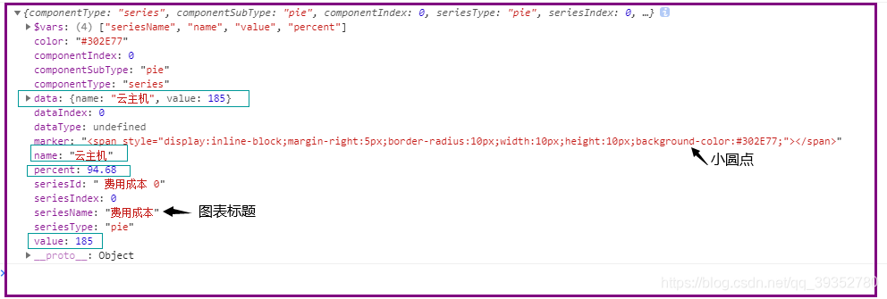
里面的有各种需要的参数,且formatter函数里return可以写标签,想要什么自己随意拼接就可以。
如:
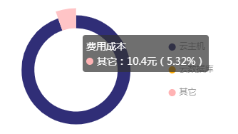
myChart.setOption({


   tooltip: {


                    trigger: 'item',
                    formatter: function(params){


                        console.log(params)
                        return `<div>${

      params.seriesName}<br/>${

      params.marker}${

      params.name}:${

      params.value}元(${

      params.percent}%)</div>`
                    }
                },
 })
3、图形
如图,移入环形图某一项,环形图消失。这是因为颜色设置太浅导致。

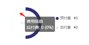
解决办法:
		//去掉圆环默认hover时高亮效果
        myChart.on('mouseover', e => {


          let op = myChart4.getOption()
          myChart.dispatchAction({


            type: 'downplay',
            seriesIndex: 0,
            dataIndex: e.dataIndex,
            color: e.color
          })
          myChart.setOption(op, true)
        })
摘自:https://www.cnblogs.com/x-llin/p/13825194.html
折线图
1.图形铺满整个区域
grid:{


	top:"50px",
	left:"5px",
	right:"5px",
	bottom:"50px",
	backgroundColor: '#fff',
	width:"auto", //图例宽度
	height:"100%", //图例高度
},
2.折线图从头开始
xAxis:{


	boundaryGap:false
}
3.加网格线
xAxis:{


	splitLine:{


			show:true
	},
},
yAxis:{


	splitLine:{


			show:true
	},
}
4.改变横纵坐标轴颜色
xAxis:{


	axisLine:{


		show:true,
			lineStyle:{


				color:'#c1c1c1'
		}
	},
},
yAxis:{


	axisLine:{


		show:true,
			lineStyle:{


				color:'#c1c1c1'
		}
	},
}
5.移入有标线显示
tooltip:{


	trigger:'axis',
	axisPointer:{


		type:'cross'
	}
},
6.去掉折线图上的小圆点
series:[
	{


		symbol:false
	}
]
7.折线图数据过多,横坐标轴只显示部分
(如:只显示8的倍数的)
xAxis:{


	axisLabel:{


		interval:(index,value)=>{


			if((index+1)%8 == 0){


				return true;
			}else{


				return false;
			}
		}
	},
}
8.改变折现颜色
series:[
	{


		itemStyle:{


			normal:{


				lineStyle:{


					color:'#529dff'
				}
			}
		}
	}
]
后记
以上,会陆续记录echarts的一些常用配置,方便自己和小伙伴们查看。