1.先设置一个DIV,里面套4个子div,并设置样式,width用像素或者%百分比表示时:
<template>
<div id="contain">
<div ref="main" class="main"></div>
<div ref="main1" class="main"></div>
<div ref="main2" class="main"></div>
<div ref="main3" class="main"></div>
</div>
</template>
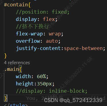
#contain{
display: flex;
//挤不下换行
flex-wrap: wrap;
//展开铺满,justify-content:center;则代表居中
justify-content:space-between;
}
.main{
width: 500px;
height:350px;
}
2.width用vh表示时,父div中要加上position: fixed;:
<template>
    <div id="contain">
        <div ref="main" class="main"></div>
        <div ref="main1" class="main"></div>
        <div ref="main2" class="main"></div>
        <div ref="main3" class="main"></div>
    </div>
</template>
#contain{


    position: fixed;
    display: flex;
    //挤不下换行
    flex-wrap: wrap;
    justify-content:space-between;
}
.main{


    width: 40vh;
    height:350px;
}
可以注意到子div无需加display: inline-block; 也可以实现。
–
效果如下
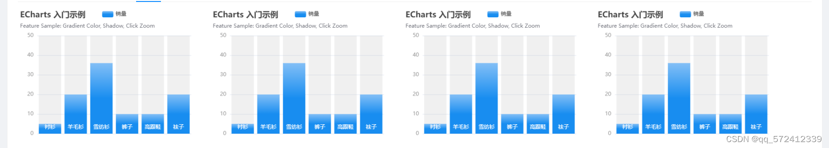
当width为40vh时,此时一行可装下:
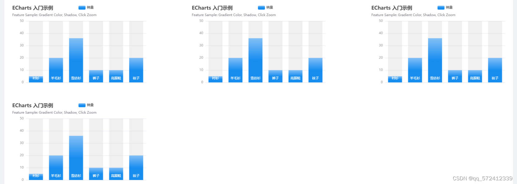
当width为50vh时,此时一行装不下,自动换行:
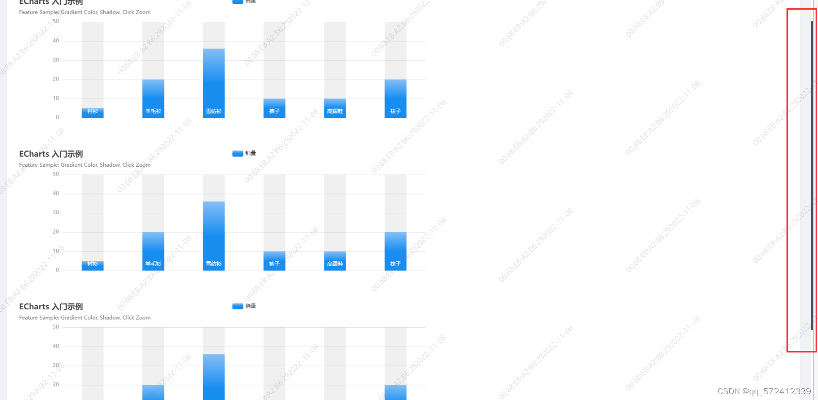
**注意:**当一页装不下时,可在父DIV中设置 overflow: auto;使其未展示部分可上下滑动,不过此时父DIV不能用 position: fixed属性,也就是width不能用vh或vw表示,否则滑动条失效。
补充:也可以用antd组件中的space组件,将若干个DIV或者组件放在space中,设置size大小即space组件中每个组件的间隔。另外Row与Col组件的结合使用也可以达到以上效果,当无法确定具体间隔时推荐Row与Col组件。