一. 内容简介
QML中RowLayout和row区别,想实现类似于前端那样的布局方式
二. 软件环境
2.1 QT 5.14.1
编译器用的,

三. 主要流程
3.1 Row
QT官方文档中Row继承于item,也就是说item有的,row也都有的
item的属性,
activeFocus : bool
activeFocusOnTab : bool
anchors
anchors.alignWhenCentered : bool
anchors.baseline : AnchorLine
anchors.baselineOffset : real
anchors.bottom : AnchorLine
anchors.bottomMargin : real
anchors.centerIn : Item
anchors.fill : Item
anchors.horizontalCenter : AnchorLine
anchors.horizontalCenterOffset : real
anchors.left : AnchorLine
anchors.leftMargin : real
anchors.margins : real
anchors.right : AnchorLine
anchors.rightMargin : real
anchors.top : AnchorLine
anchors.topMargin : real
anchors.verticalCenter : AnchorLine
anchors.verticalCenterOffset : real
antialiasing : bool
baselineOffset : int
children : list<Item>
childrenRect
childrenRect.height : real
childrenRect.width : real
childrenRect.x : real
childrenRect.y : real
clip : bool
containmentMask : QObject*
data : list<QtObject>
enabled : bool
focus : bool
height : real
implicitHeight : real
implicitWidth : real
layer.effect : Component
layer.enabled : bool
layer.format : enumeration
layer.live : bool
layer.mipmap : bool
layer.samplerName : string
layer.samples : enumeration
layer.smooth : bool
layer.sourceRect : rect
layer.textureMirroring : enumeration
layer.textureSize : size
layer.wrapMode : enumeration
opacity : real
palette : Palette
parent : Item
resources : list<QtObject>
rotation : real
scale : real
smooth : bool
state : string
states : list<State>
transform : list<Transform>
transformOrigin : enumeration
transitions : list<Transition>
visible : bool
visibleChildren : list<Item>
width : real
x : real
y : real
z : real
和前端的比较:
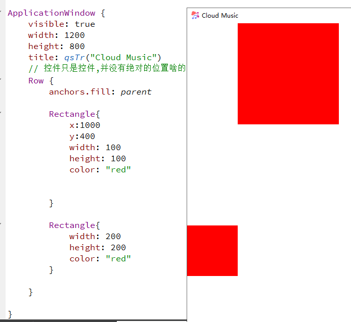
- Row排列方式和前端是一样的(横竖堆叠),Row设置的x是没办法生效的,然后元素就按着写的顺序排列的
- 前端元素间添加margin很方便,Row或者是说没有布局时候,添加margin都要先指定锚点,然后再设置margin,而且其他元素想要和该元素对齐时候,margin基本都被忽略了,还要自己手动算一下的,手动加上去
- 如果1,2间距10,.2,3间距20的话,Row是没有办法满足需求的,Row又只能设置所有的间隔,单个间隔又要设置锚点,
add : Transition
bottomPadding : real
effectiveLayoutDirection : enumeration
layoutDirection : enumeration
leftPadding : real
move : Transition
padding : real
populate : Transition
rightPadding : real
spacing : real
topPadding : real
3.2 RowLayout
RowLayout也是继承item,下面是他自己的属性,
// 设置元素尺寸
Layout.minimumWidth // 最小尺寸
Layout.minimumHeight // 最小尺寸
Layout.preferredWidth // 最小尺寸
Layout.preferredHeight // 最小尺寸
Layout.maximumWidth // 最小尺寸
Layout.maximumHeight // 最小尺寸
// 设置元素尺寸
Layout.fillWidth // 去除其他元素后,充满剩余尺寸
Layout.fillHeight // 去除其他元素后,充满剩余尺寸
// 设置对齐方式(对齐文本)
Layout.alignment
Qt::AlignLeft
Qt::AlignHCenter
Qt::AlignRight
Qt::AlignTop
Qt::AlignVCenter
Qt::AlignBottom
Qt::AlignBaseline
// 设置margin
Layout.margins
Layout.leftMargin
Layout.rightMargin
Layout.topMargin
Layout.bottomMargin
// 设置拉伸因子
Layout.horizontalStretchFactor
Layout.verticalStretchFactor
// https://blog.csdn.net/qq_45179361/article/details/130480514(这个里面讲了拉伸因子)
和前端比较,要吐槽的点太多了
- RowLayout管的事情太多了,x,y没有办法设置了,而且部分控件的大小都会由layout管理了(button),而且间距,横向纵向都被layout管理(自己不能设置),使用起来不方便,感觉和前端的逻辑很不相符,刚开始使用时不知道这些,就会返现layout难用的要死,好多东西都改不了,总结就是位置控件大小以及控件间隔(横向纵向)都不能由自己管理
- 开始解决上面的问题,第一个问题控件位置,感觉QMl中之前的,x,y直接设置位置其实并不是很好,row那样就很类似前端的逻辑了,只是magin及其不方便,而RowLayout里面是这样的,会发现右边那个控件的位置的精确位置不知道,就很难受,如果向row那样就好了,
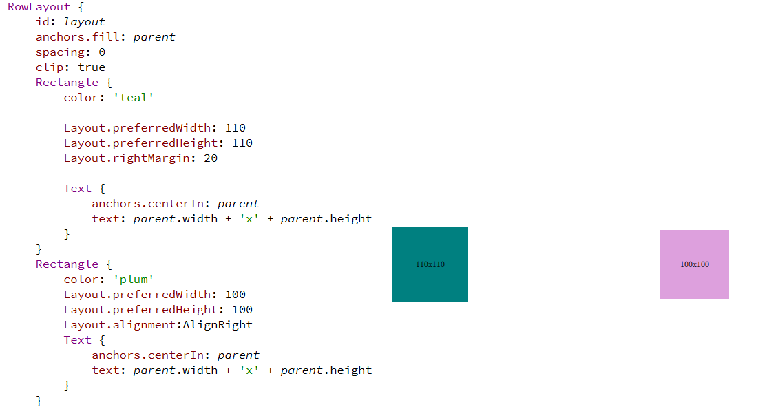
然后就可以用上Layout.preferredWidth这个属性了,在最下面加一个包含这个属性的控件,这个逻辑就很像前端里面的逻辑了,间隔时因为spacing由默认值,改成0就可以了,然后这个时候Layout.Margins用来设置空间的margin,因为QML中布局什么查看不如前端方便,我都会在家一个clip: true,就是会给超出父控件大小的子控件进行裁剪,就是有些大小没写,就可以直接看出来了,
还可以这样放.
- 控件大小用width,height设置是没有效果的,部分控件由layout管理的,就直接用Layout.preferredWidth这些设置就可以了
- 控件间隔,一种是Layout.margins设置,和前端逻辑一样,另外一种用锚点先到给对齐,然后设置间隔,直接设置间隔是没有效果的
- 也就是说些控件大小,间隔什么的都要layout里面的那些东西写,原来的都不能用了,养成习惯就好了,而且在用了layout布局以后,锚点那些东西就会用的很少很少了,基本用不上,都按着前端那套逻辑走就可以了
RowLayout {
id: layout
anchors.fill: parent
spacing: 0
clip: true
Rectangle {
color: 'teal'
Layout.preferredWidth: 110
Layout.preferredHeight: 110
Layout.rightMargin: 20
Text {
anchors.centerIn: parent
text: parent.width + 'x' + parent.height
}
}
Rectangle {
color: 'plum'
Layout.preferredWidth: 100
Layout.preferredHeight: 100
Text {
anchors.centerIn: parent
text: parent.width + 'x' + parent.height
}
}
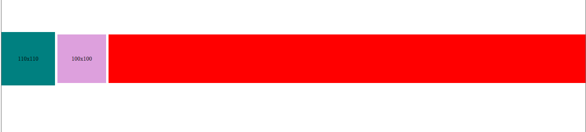
RowLayout {
id: layout
anchors.fill: parent
spacing: 0
clip: true
Rectangle {
color: 'teal'
Layout.preferredWidth: 110
Layout.preferredHeight: 110
Layout.rightMargin: 20
Text {
anchors.centerIn: parent
text: parent.width + 'x' + parent.height
}
}
Rectangle {
color: 'plum'
Layout.preferredWidth: 100
Layout.preferredHeight: 100
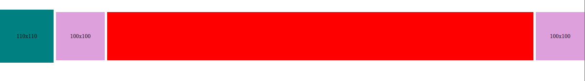
Layout.alignment:AlignRight
Text {
anchors.centerIn: parent
text: parent.width + 'x' + parent.height
}
}
Rectangle {
height:100
color: 'red'
Layout.fillWidth: true
}
}
}
- fillWidth使用,现在这种情况呢,就是被按钮分成了三块区域,这三块区域等分,

Rectangle{


    Layout.preferredWidth: parent.width*1/10
    Layout.fillWidth: true
}
Button{


    layout.preferredWidth: 50
}

Rectangle{


    Layout.preferredWidth: parent.width*1/10
    Layout.fillWidth: true
}
Button{


    layout.preferredWidth: 50
}
Rectangle{


    Layout.preferredWidth: parent.width*1/10
    Layout.fillWidth: true
}
然后中间那个改成2/10,就可以通过这个来设置这些占位的大小了

补充:
ColumnLayout在布局时候,对元素竖向排列都是和前端一样的,但是在水平方向上,他会直接让Rectangle居中,上边的例子也可以看出
但是当里面是这样的时候,image,text,时候他们还是会竖向排列,但是水平方向上就不是水平排列的了,就是靠着左边排列的
// contentItem: ColumnLayout{
// width: parent.width
// height: parent.height
// Layout.alignment: Qt.AlignHCenter
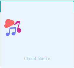
// Image{
// Layout.preferredHeight: 60
// source: "qrc:/images/music"
// Layout.fillWidth:true
// fillMode: Image.PreserveAspectFit
// }
// Text {
// text: qsTr("续加仪")
// Layout.fillWidth: true
// horizontalAlignment: Text.AlignHCenter
// font.pixelSize: 18
// color: "#8573a7ab"
// font.family: window.mFONT_FAMILY
// font.bold: true
// }
// Text {
// text: qsTr("这是我的Cloud Music Player")
// Layout.fillWidth: true
// horizontalAlignment: Text.AlignHCenter
// font.pixelSize: 16
// color: "#8573a7ab"
// font.family: window.mFONT_FAMILY
// font.bold: true
// }
// Text {
// text: qsTr("www.hyz.cool")
// Layout.fillWidth: true
// horizontalAlignment: Text.AlignHCenter
// font.pixelSize: 16
// color: "#8573a7ab"
// font.family: window.mFONT_FAMILY
// font.bold: true
// }
// }
用Rectangle包裹一下是这样
        contentItem: ColumnLayout{


            anchors.fill: parent
            clip: true
            spacing: 0
            Layout.alignment: Qt.AlignHCenter

            // Layout在放置时候都是自动居中的,所以宽度合适,他就自己居中了
            Rectangle{


                Layout.alignment: Qt.AlignHCenter
                clip: true

                Layout.preferredHeight: 60
                Layout.preferredWidth: 60
                color: "red"
                Image{


                    // 可以让里面文字或者内容居中对齐
                    width: 60
                    height: 60
                    source: "qrc:/images/music"
                    // 宽度自适应
                }

            }


            Rectangle{


                color: "red"
                clip: true
                Layout.preferredHeight: 40
                Layout.fillWidth: true
                Layout.alignment: Qt.AlignHCenter
                Text {


                    width: parent.width
                    height: parent.height
                    text: qsTr("Cloud Music")

                    font.pixelSize: 16
                    color: "#8573a7ab"
                    font.family:  window.mFONT_FAMILY
                    font.bold: true
                    horizontalAlignment: Text.AlignHCenter
                    verticalAlignment: Text.AlignVCenter
                }
            }

            Rectangle{


                Layout.fillHeight: true


            }


        }
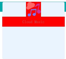
感觉布局还是先用Rectangle划分好就行了,就和前端一样用div划分的,
直接在布局中还是不要用text,image这些控件,感觉不是特别可控,写好的样式,可能改一些其他东西,他的布局就路乱了(看视频里面调了好久,然后还不太理解,Rectangle更好理解一些),Rectangle设置背景色比较容易,还是比较容易调整布局的,还是尽量都用Rectangle,在Layout下面
四. 参考
Item QML Type https://doc.qt.io/qt-6/qml-qtquick-item.html
Row QML Type https://doc.qt.io/qt-6/qml-qtquick-row.html
RowLayout QML Type https://doc.qt.io/qt-6/qml-qtquick-layouts-rowlayout.html