项目中用到了实现二级tab的一个功能 自定义代码实现该需求。
源码:
<template>
<div>
<div class="headerd">
<ul>
<!-- 循环数据在点击调用changeli方法时将当前索引和本条数据传进去,并使用当前数据show的bool值添加或移除样式 -->
<li :class="[{ active: item.show }]" @click="changeli(index, item)" v-for="(item, index) in headerData"
:key="index">
<!-- 在这里打印出boll值方便查看 -->
{
{ item.name }}
<!-- 判断当前这条数据的bool值如果是true就打开二级菜单,如果是false就关闭二级菜单 -->
<ol v-show="item.show">
<!-- 循环二级菜单数据并使用.stop阻止冒泡 -->
<li :class="[{ 'itemClass': (indexChild == indexActive && index == indexPar) }]"
v-for="(a, indexChild) in item.list" :key="indexChild"
v-on:click.stop="doThis(indexChild, a, $event, index)">{
{
a
}}
</li>
</ol>
</li>
</ul>
</div>
</div>
</template>
<script>
export default {
data() {
return {
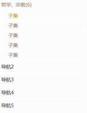
headerData: [{
name: '哲学、宗教(6)',
list: ['子集', '子集', '子集', '子集', '子集'],
show: false
}, {
name: '导航2',
list: ['子集', '子集', '子集', '子集', '子集'],
show: false
}, {
name: '导航3',
list: ['子集', '子集', '子集', '子集', '子集'],
show: false
}, {
name: '导航4',
list: ['子集', '子集', '子集', '子集', '子集'],
show: false
}, {
name: '导航5',
list: ['子集', '子集', '子集', '子集', '子集'],
show: false
}],
indexPar: null,
indexActive: null,
}
},
methods: {
changeli: function (ind, item) {
// 先循环数据中的show将其全部置为false,此时模板里的v-if判断生效关闭全部二级菜单,并移除样式
this.headerData.forEach(i => {
// 判断如果数据中的headerData[i]的show属性不等于当前数据的show属性那么headerData[i]等于false
if (i.show !== this.headerData[ind].show) {
i.show = false;
};
});
// 取反(true或false)
item.show = !item.show;
// console.log(item.name)
},
//拿到当前选中的子集
doThis: function (index, event, e, indPar) {
console.log(index, indPar)
this.indexActive = index;
this.indexPar = indPar;
}
}
}
</script>
<style lang="scss">
.headerd {
width: 200px;
// background-color: #ff5722;
color: #907D5A;
ul {
width: 100%;
padding: 6px 6px;
box-sizing: border-box;
font-size: 16px;
font-family: PingFangSC-Light, PingFang SC;
font-weight: 400;
color: #2E2E2E;
li {
width: 100%;
border: 1px solid #ffffff;
cursor: pointer;
color: 20px;
line-height: 40px;
&:hover {
color: #907D5A;
}
ol {
width: 100%;
li {
display: flex;
align-items: center;
line-height: 30px;
padding-left: 22px;
box-sizing: border-box;
&:hover {
color: #c31111;
}
}
}
}
.active {
// background-color: #ff9800;
color: pink;
}
.itemClass {
color: yellow;
}
}
}
</style>功能实现图: