文章目录
前言
Common UI给虚幻的UI系统带来了很多新特性,这些新特性往往面向不同的使用场景。目前我看到很多的Common UI教程,都是把这些特性很笼统地展示一遍,这就很容易造成初学者的困惑:“我当前做的这些工作,到底是为了实现什么?”所以本文采用分场景介绍的方式,希望能够帮初学者理清一下Common UI的工作逻辑。
0. 通用设置
只要使用Common UI就要做的设置
0.1 开启插件
开启Common UI插件

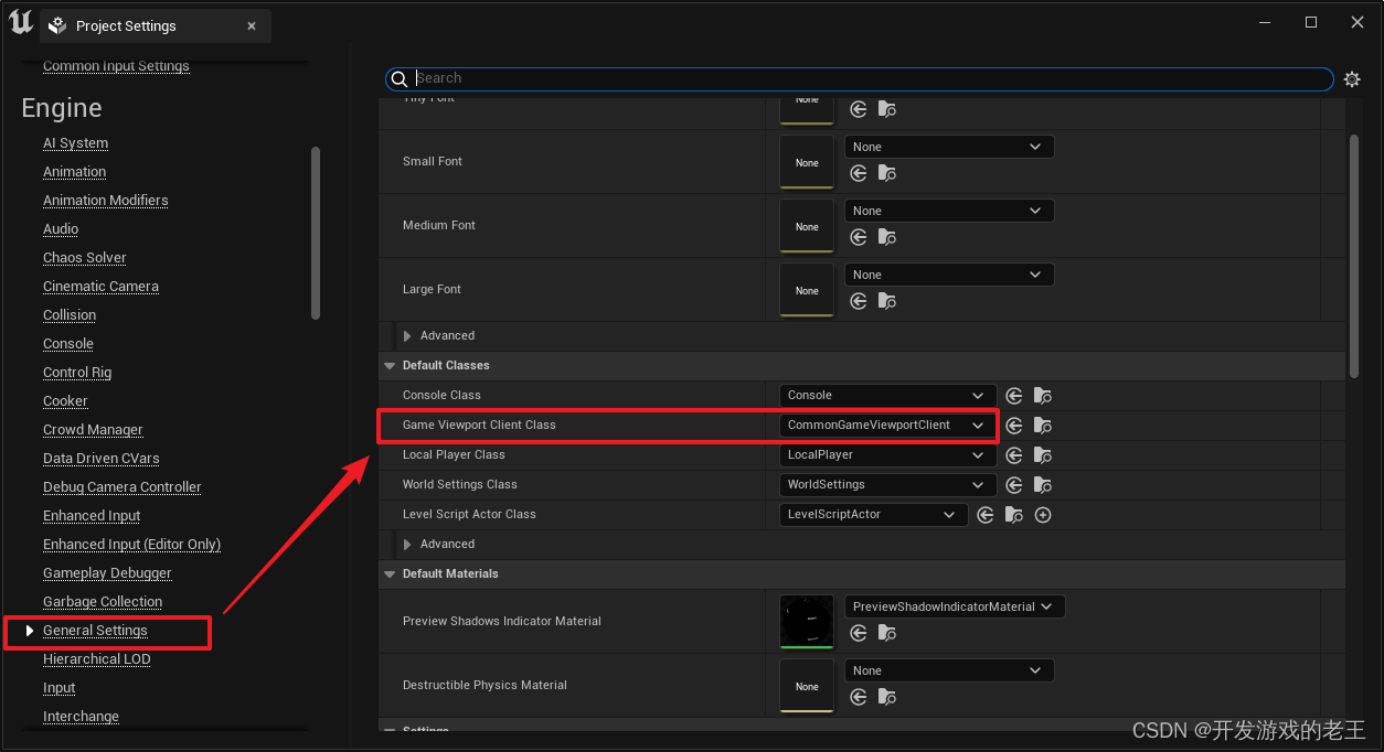
0.2 设置Viewport
Viewport是程序运行时Widget的容器及管理器,Common UI从原来的Widget继承树上又派生了新的分支,新分支自然需要扩展后的新Viewport(CommonGameViewportClient)去管理。
1. 分场景教程
1. 1 在仅使用鼠标控制的场景下
如果你游戏完全用鼠标控制,那么除了上述通用设置以外,Common UI中最值得关注的部分就是新增的Common Activatable Widget 以及Common Activatable Stack
Common Activatable Widget
Common Activatable Stack

Common Activatable Stack
Common Activatable Stack 顾名思义就是一个栈。UI中的Widget经常会有上下堆叠的状态,处于顶层的Widget处于可用状态(Activate)(当用键盘或游戏手柄控制的时候,它会获得控制焦点),而非顶层的Widget会处于不可用状态,被置灰或者隐藏。这时候我们往往要自己动手实现一个Stack,来管理这些Widget的行为。Common Activatable Stack 就是Common UI为我们内置的这样一个Stack。
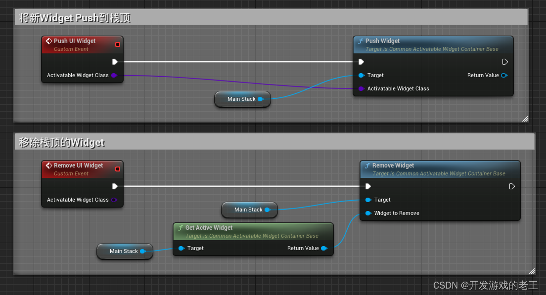
当Common Activatable Stack 对Common Activatable Widget进行Push Widget操作时,会将原来栈顶的Common Activatable Widget进行DeactivateWidget。当然也可以手动ActivateWidget和DeactivateWidget
void UCommonActivatableWidgetContainerBase::SetSwitcherIndex(int32 TargetIndex, bool bInstantTransition /*= false*/)
{


	if (MySwitcher && MySwitcher->GetActiveWidgetIndex() != TargetIndex)
	{


		if (DisplayedWidget)
		{


			DisplayedWidget->OnDeactivated().RemoveAll(this);
			if (DisplayedWidget->IsActivated())
			{


				DisplayedWidget->DeactivateWidget();
			}
			else if (MySwitcher->GetActiveWidgetIndex() != 0)
			{


				// The displayed widget has already been deactivated by something other than us, so it should be removed from the container
				// We still need it to remain briefly though until we transition to the new index - then we can remove this entry's slot
				bRemoveDisplayedWidgetPostTransition = true;
			}
		}

		MySwitcher->TransitionToIndex(TargetIndex, bInstantTransition);
	}
}
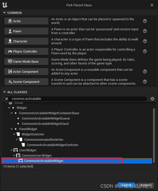
Common Activatable Widget
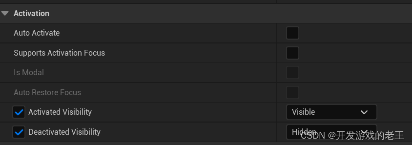
只有Common Activatable Widget才可以被Common Activatable Stack 管理,在Common Activatable Widget的Activation中设置ActivateWidget和DeactivateWidget时Common Activatable Widget的行为:

void UCommonActivatableWidget::NativeOnActivated()
{


	if (ensureMsgf(bIsActive, TEXT("[%s] has called NativeOnActivated, but isn't actually activated! Never call this directly - call ActivateWidget()")))
	{


		if (bSetVisibilityOnActivated)
		{


			SetVisibility(ActivatedVisibility);
			UE_LOG(LogCommonUI, Verbose, TEXT("[%s] set visibility to [%s] on activation"), *GetName(), *StaticEnum<ESlateVisibility>()->GetDisplayValueAsText(ActivatedVisibility).ToString());
		}

		if (CommonUI::IsEnhancedInputSupportEnabled() && InputMapping)
		{


			if (const ULocalPlayer* LocalPlayer = GetOwningLocalPlayer())
			{


				if (UEnhancedInputLocalPlayerSubsystem* InputSystem = LocalPlayer->GetSubsystem<UEnhancedInputLocalPlayerSubsystem>())
				{


					InputSystem->AddMappingContext(InputMapping, InputMappingPriority);
				}
			}
		}

		BP_OnActivated();
		OnActivated().Broadcast();
		BP_OnWidgetActivated.Broadcast();
	}
}

void UCommonActivatableWidget::NativeOnDeactivated()
{


	if (ensure(!bIsActive))
	{


		if (bSetVisibilityOnDeactivated)
		{


			SetVisibility(DeactivatedVisibility);
			UE_LOG(LogCommonUI, Verbose, TEXT("[%s] set visibility to [%d] on deactivation"), *GetName(), *StaticEnum<ESlateVisibility>()->GetDisplayValueAsText(DeactivatedVisibility).ToString());
		}

		if (CommonUI::IsEnhancedInputSupportEnabled() && InputMapping)
		{


			if (const ULocalPlayer* LocalPlayer = GetOwningLocalPlayer())
			{


				if (UEnhancedInputLocalPlayerSubsystem* InputSystem = LocalPlayer->GetSubsystem<UEnhancedInputLocalPlayerSubsystem>())
				{


					InputSystem->RemoveMappingContext(InputMapping);
				}
			}
		}

		// Cancel any holds that were active
		ClearActiveHoldInputs();

		BP_OnDeactivated();
		OnDeactivated().Broadcast();
		BP_OnWidgetDeactivated.Broadcast();
	}
}
关于如何定义一个Common Activatable Widget,在《官方项目《内容示例》中Common UI部分笔记: 1.1 Activatable Widgets》一文中有较详细的叙述。
1.2 当焦点落到一个按钮时显示默认确认(Click/Accept)按键图标
上面是仅用鼠标的场景,接下来聊的都是主要用键盘或游戏手柄的场景。
当一个按钮获取到控制焦点时,按钮上显示默认的确认按键会提升玩家的使用体验。
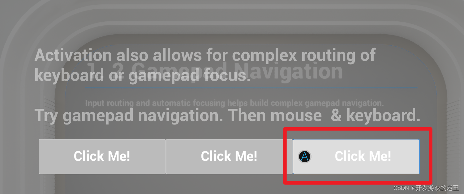
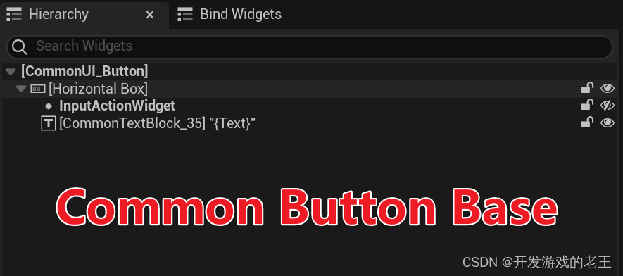
实现这样的效果,需要实现一个派生自UCommonButtonBase的按钮,在UCommonButtonBase有一个UCommonActionWidget类型的InputActionWidget,从它的meta中可以看到,它是一个BindWidget,也就是说,允许我们在蓝图中定义一个同名(即名为"InputActionWidget")的UCommonActionWidget。
	UPROPERTY(BlueprintReadOnly, Category = Input, meta = (BindWidget, OptionalWidget = true, AllowPrivateAccess = true))
	TObjectPtr<UCommonActionWidget> InputActionWidget;
在UCommonActionWidget的UpdateActionWidget方法中会从游戏的预设**(Common Input Seetings)**中读取到默认Click按键的图标显示出来,这个UpdateActionWidget在很多情况下都会被调用,包括按钮的Hover状态。
void UCommonActionWidget::UpdateActionWidget()
{


	if (!IsDesignTime() && GetWorld())
	{


		const UCommonInputSubsystem* CommonInputSubsystem = GetInputSubsystem();
		if (GetGameInstance() && ensure(CommonInputSubsystem) && CommonInputSubsystem->ShouldShowInputKeys())
		{


			const FCommonInputActionDataBase* InputActionData = GetInputActionData();
			if (InputActionData || (EnhancedInputAction && CommonUI::IsEnhancedInputSupportEnabled()))
			{


				if (bAlwaysHideOverride)
				{


					SetVisibility(ESlateVisibility::Collapsed);
				}
				else
				{


					Icon = GetIcon();

					if (Icon.DrawAs == ESlateBrushDrawType::NoDrawType)
					{


						SetVisibility(ESlateVisibility::Collapsed);
					}
					else if (MyIcon.IsValid())
					{


						MyIcon->SetImage(&Icon);

						if (GetVisibility() != ESlateVisibility::Collapsed)
						{


							// The object being passed into SetImage is the same each time so layout is never invalidated
							// Manually invalidate it here as the dimensions may have changed
							MyIcon->Invalidate(EInvalidateWidgetReason::Layout);
						}

						if (IsHeldAction())
						{


							MyProgressImage->SetVisibility(EVisibility::SelfHitTestInvisible);
						}
						else
						{


							MyProgressImage->SetVisibility(EVisibility::Collapsed);
						}

						MyKeyBox->Invalidate(EInvalidateWidget::LayoutAndVolatility);
						SetVisibility(ESlateVisibility::SelfHitTestInvisible);

						return;
					}
				}
			}
		}

		SetVisibility(ESlateVisibility::Collapsed);
	}
}
接下来我们再看看刚才提到的 (Common Input Seetings)
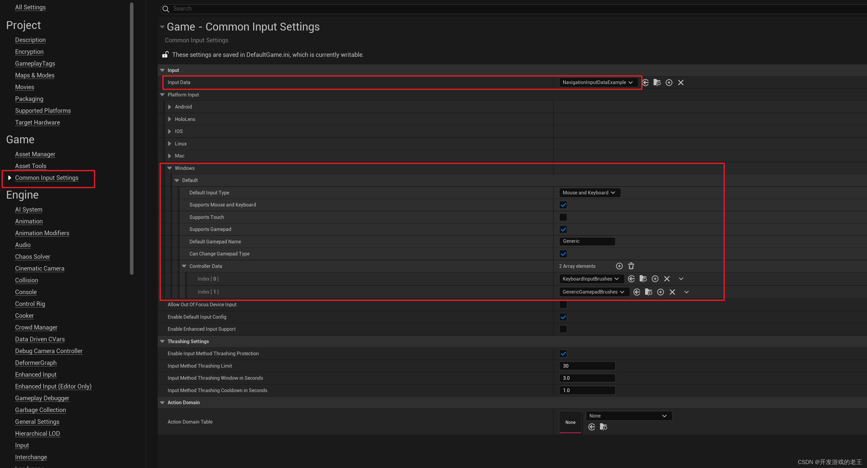
Common Input Action DataBase
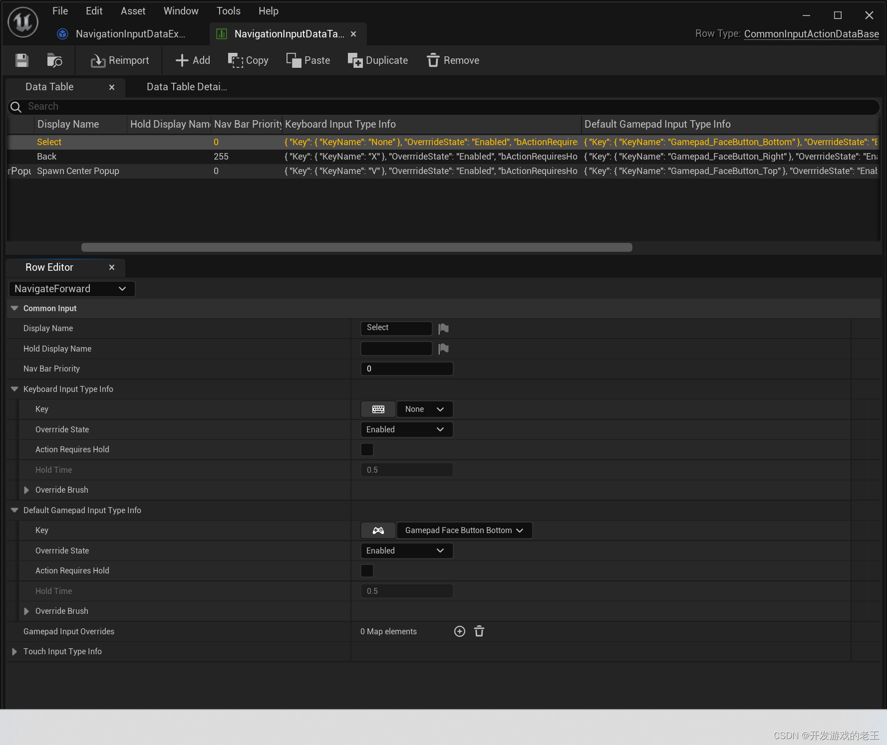
首先我们要创建一个格式为Common Input Action DataBase的数据表备用,这个数据表的作用其实就如同我们在Input或Enhanced Input中配置的按键和Action的映射表
Input Data
再回到Common Input Seetings中,新建一个Common UIInput Data类的对象,在其中选择刚才创建的数据表并配置如下两个选项:
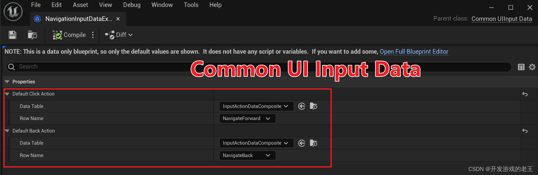
Default Click Action: 默认的按钮确认事件Default Back Action: 默认的返回(撤回)事件
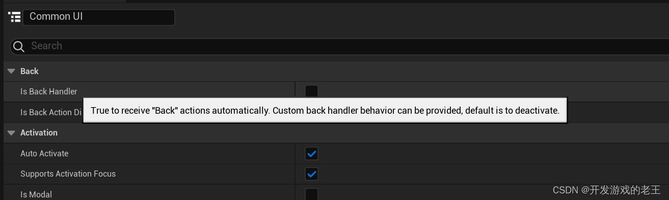
Common Activatable Widget可以选择是否接受Back Action事件,如果勾选Is Back Handler默认情况下,接收到Back Action事件,该Common Activatable Widget会被Deactivate。
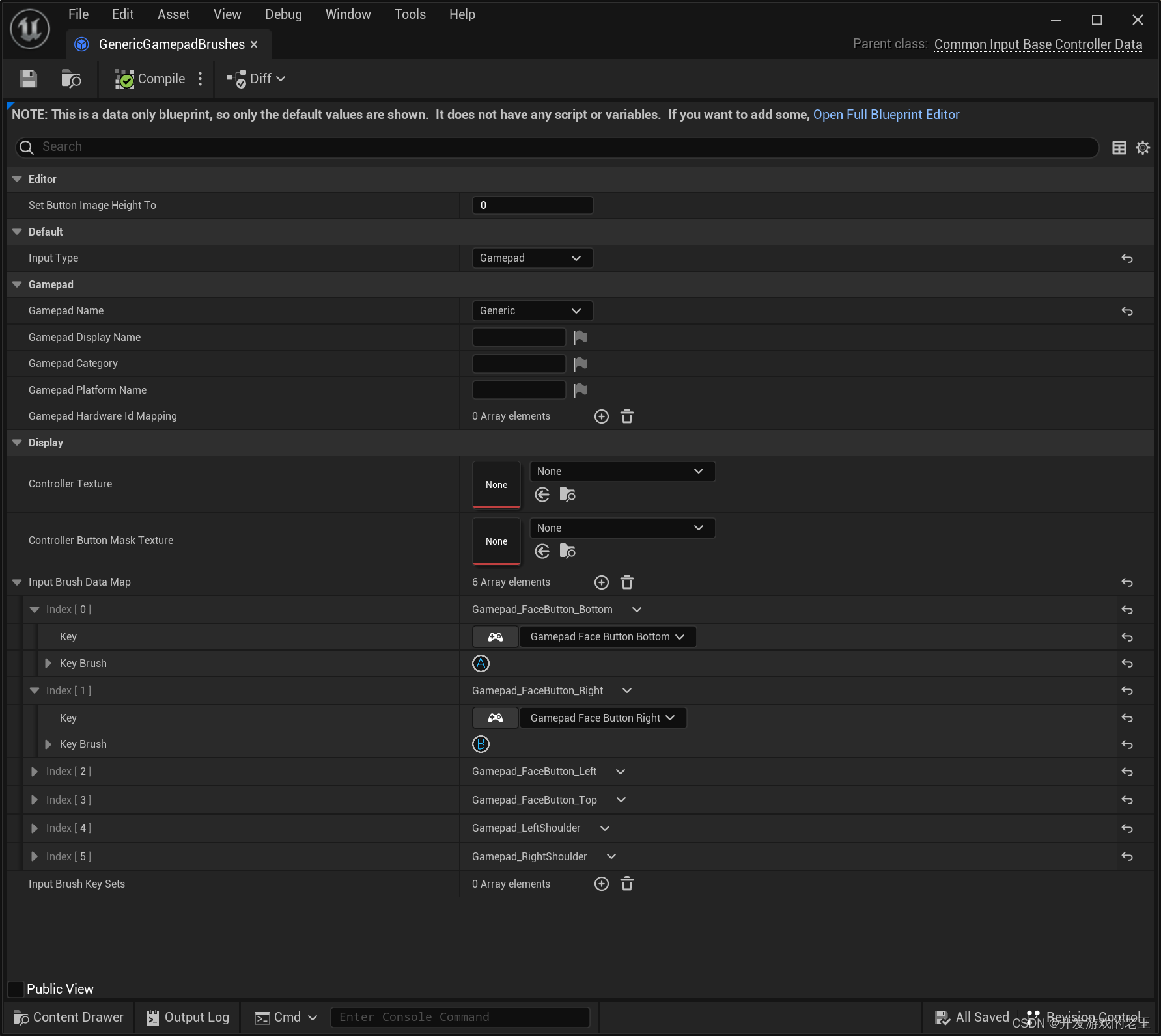
Common Input Base Controller Data
在Common Input Seetings中的Controller Data下面可以就是配置针对各个平台控制器按键图标的地方
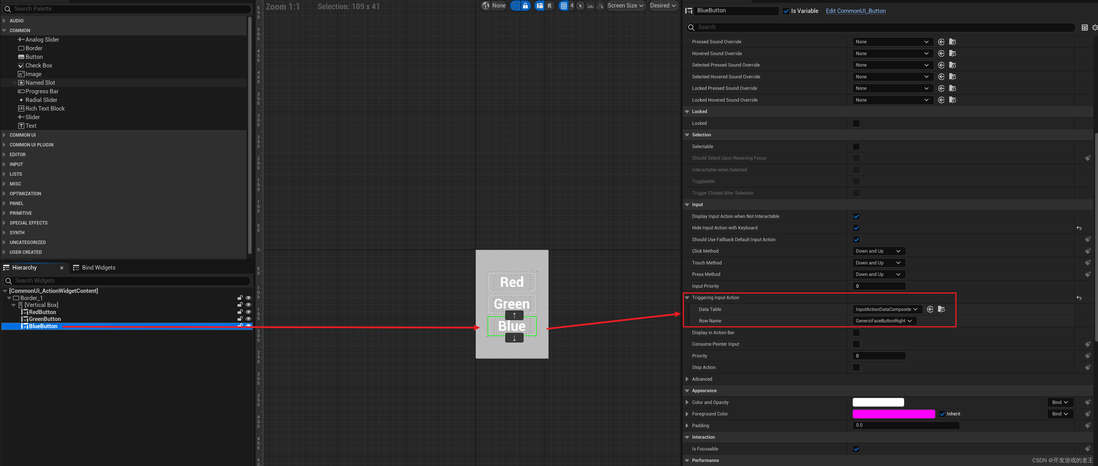
1.3 即使焦点没有落到该按钮上,也可以使用指定按键触发该按钮,并且按钮上会显示按键提示图标(Input Action和Triggering Input Action)
如果UI上的按钮较多或着有些常用按钮距离较远,我们常常希望即使控制焦点没有在那个按钮上,也能够用键盘或游戏手柄的某个特定按键触发这个按钮,这就是Common UI中的Input Action,类似快捷键。
实现Input Action的也要基于上面1.2中的若干设置,接下来实现Input Action有两种方式:
- 使用名为"InputActionWidget"的
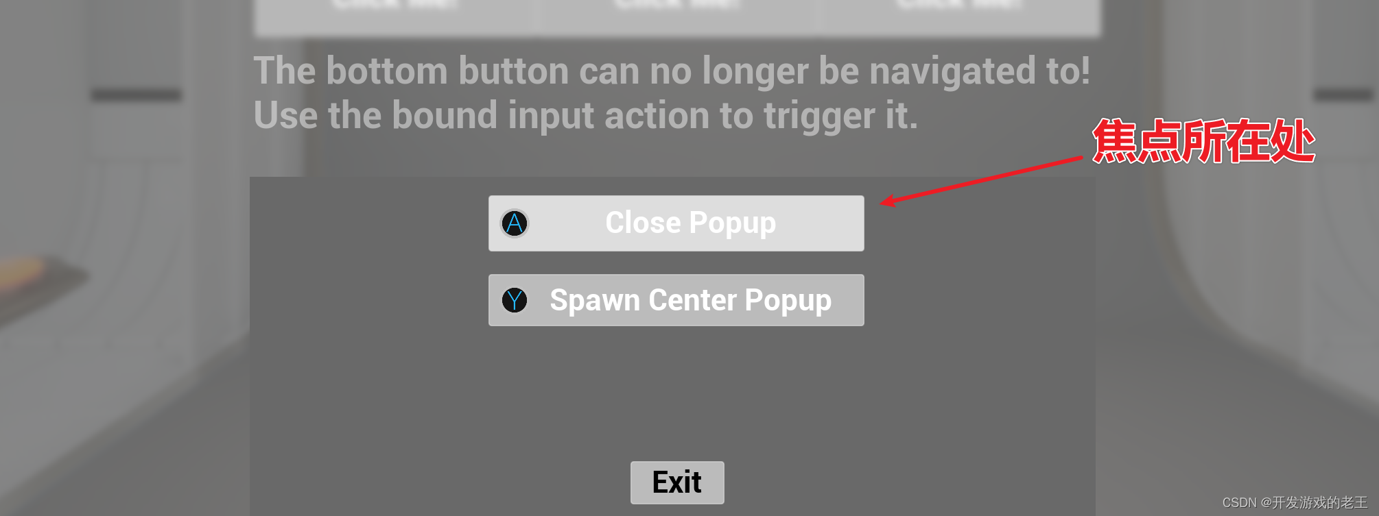
UCommonActionWidget,也就是上文中可以接受并显示默认Click事件图标的那个UCommonActionWidget,这时只需要在Triggering Input Action中配置触发它的事件即可,配置方法和上文中配置默认事件的方法一样。注意:Input Action无论是否获得控制焦点均会显示。这说明它就不再显示默认Click图标了。
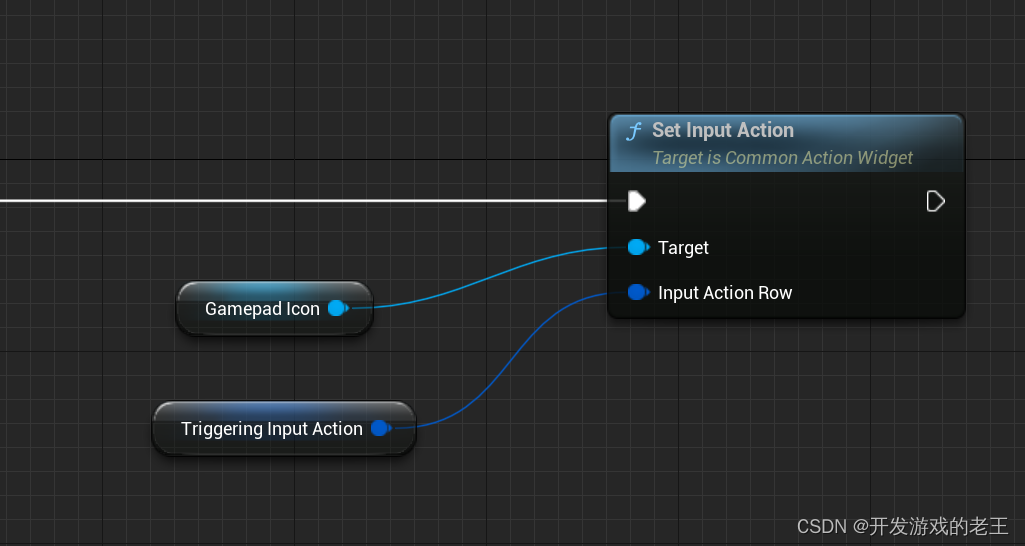
2. 自定义一个UCommonActionWidget
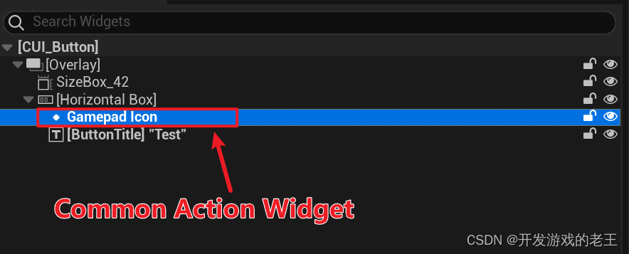
这时我们需要在构造函数(Construct)或预构造函数(Pre Construct)中将它设置给Triggering Input Action
1.4 当前UI触发按键提示栏(Common Bound Action Bar)
当一个UI有很多按钮都有Input Action触发键的时候,我们想在一目了然的地方(比如屏幕左下角)做一个显示全部或部分触发键图标的提示栏。
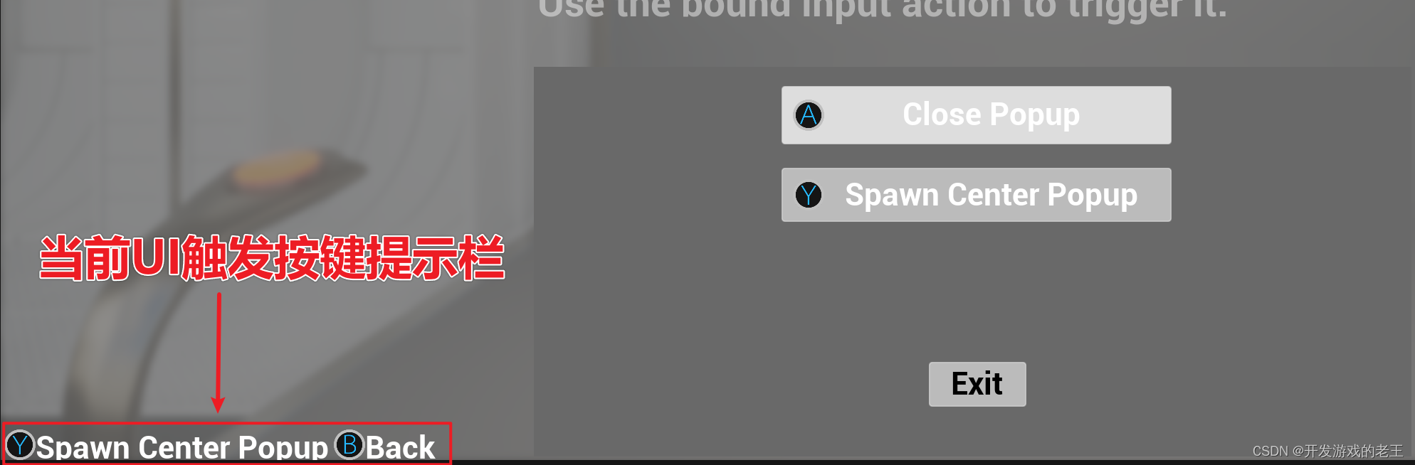
这个功能的实现需要用到Common UI为我们提供的Common Bound Action Bar
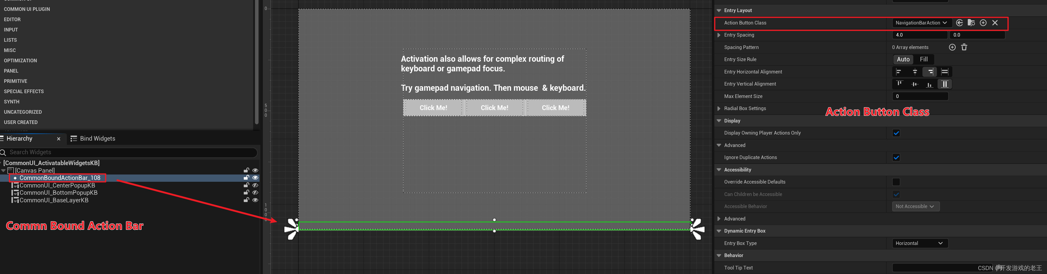
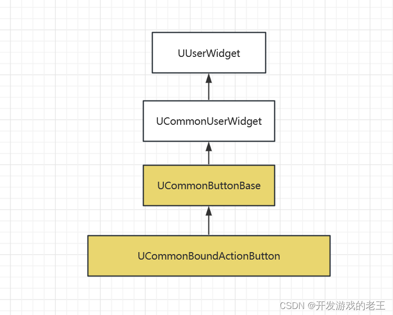
Common Bound Action Bar中的按键图标以及按键功能提示依赖于Action Button Class中提供的Common Bound Action Button类,这个类派生自刚才我们使用过的UCommonButtonBase
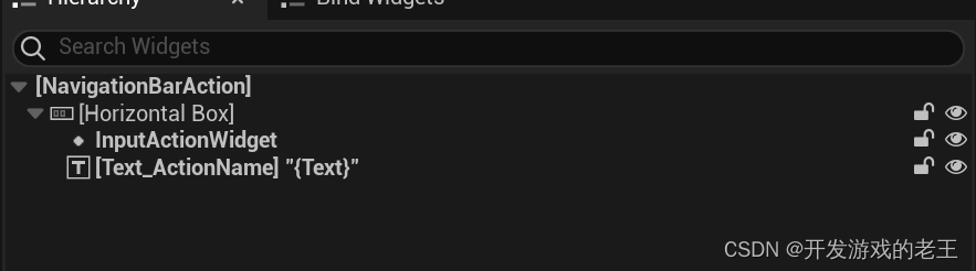
它们的工作逻辑也是一样的,只不过里面又多了一个UCommonTextBlock类型的Text_ActionName,和InputActionWidget一样,Text_ActionName也是和蓝图绑定的用于显示按键说明文字。
protected:
	UPROPERTY(BlueprintReadOnly, meta = (BindWidget), Category = "Text Block")
	TObjectPtr<UCommonTextBlock> Text_ActionName;
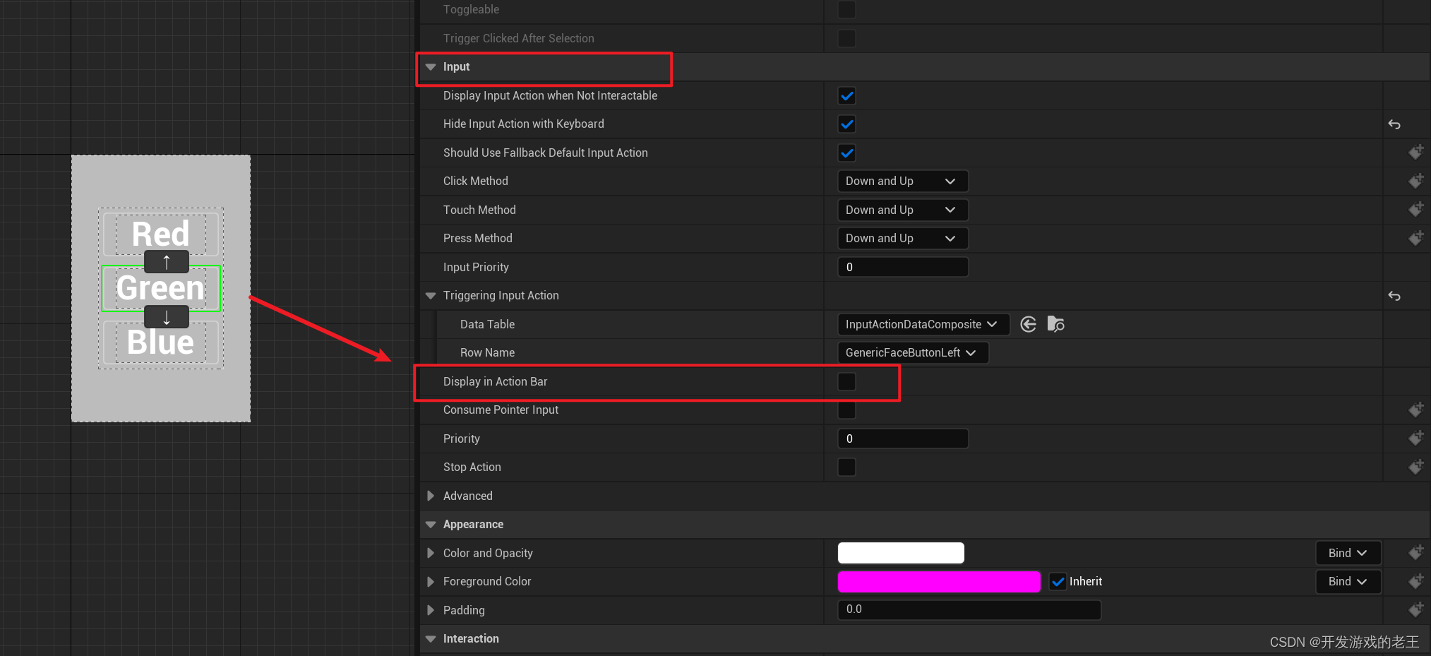
如果一个按钮的触发按键想显示在Action Bar中,只需要配置其Triggering Input Action并勾选下面的选项即可。
2. 小结
码了这么多字,好累!