需求:项目做类型文件j夹列表树,设计需要将三角图标替换成UI设计的icon,UI设计的icon放在了阿里图标库
// main.js中先引入iconfont的css和js
import '@/assets/iconfont/iconfont.css'
import '@/assets/iconfont/iconfont.js'
解决方案1、
<el-tree
            :data="getPerSrcTree"
            default-expand-all
            :expand-on-click-node="false"
            node-key="id"
            ref="atree"
            highlight-current
            :check-strictly="true"
            :props="defaultProps"
            @node-click="nodeClick"
          >
             <span class="custom-tree-node"  slot-scope="{ node }">
                <span style="display: flex;align-items: center;">
                  <i calss="iconfont icon-wendangdakai" width="20px" height="20px"></i>{

    {

     node.label  }}
                </span>
            </span>
          </el-tree>
这种方式出来的icon就会没有颜色,就要在css内设置需要的颜色,如果用svg的话直接就可以将原有颜色显示出来
<el-tree
    :data="getPerSrcTree"
      default-expand-all
      :expand-on-click-node="false"
      node-key="id"
      ref="atree"
      highlight-current
      :check-strictly="true"
      :props="defaultProps"
      @node-click="nodeClick"
    >
      <span class="custom-tree-node"  slot-scope="{ node }">
          <span style="display: flex;align-items: center;">
            <iconSvg name="wendangdakai" width="20px" height="20px"></iconSvg>{

    {

     node.label  }}
          </span>
      </span>
    </el-tree>
封装的iconSvg
<template>
  <svg
    :class="getClassName"
    :width="width"
    :height="height"
    aria-hidden="true">
    <use :xlink:href="getName"></use>
  </svg>
</template>

<script>
  export default {


    name: 'icon-svg',
    props: {


      name: {


        type: String,
        required: true
      },
      className: {


        type: String
      },
      width: {


        type: String,
        default:"40px"
      },
      height: {


        type: String,
        default:"40px"
      }
    },
    computed: {


      getName () {


        return `#icon-${

      this.name}`
      },
      getClassName () {


        return [
          'icon-svg',
          `icon-svg__${

      this.name}`,
          this.className && /\S/.test(this.className) ? `${

      this.className}` : ''
        ]
      }
    }
  }
</script>

<style>
  .icon-svg {


    fill: currentColor;
    overflow: hidden;
  }
</style>
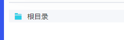
实现效果图
如果想要每个一级目录是不同的icon的话,直接在data数据内每级加个icon字段
getPerSrcTree: [{


          label: '一级 1',
          icon:'wendangdakai',
          children: [{


            label: '二级 1-1',
            children: [{


              label: '三级 1-1-1'
            }]
          }]
        }, {


          label: '一级 2',
          children: [{


            label: '二级 2-1',
            children: [{


              label: '三级 2-1-1'
            }]
          }, {


            label: '二级 2-2',
            children: [{


              label: '三级 2-2-1'
            }]
          }]
        }, {


          label: '一级 3',
          children: [{


            label: '二级 3-1',
            children: [{


              label: '三级 3-1-1'
            }]
          }, {


            label: '二级 3-2',
            children: [{


              label: '三级 3-2-1'
            }]
          }]
        }],


<el-tree
    :data="getPerSrcTree"
      default-expand-all
      :expand-on-click-node="false"
      node-key="id"
      ref="atree"
      highlight-current
      :check-strictly="true"
      :props="defaultProps"
      @node-click="nodeClick"
    >
      <span class="custom-tree-node"  slot-scope="{ node,data }">
          <span style="display: flex;align-items: center;">
            <iconSvg :name="data.icon" width="20px" height="20px"></iconSvg>{

    {

     node.label  }}
          </span>
      </span>
    </el-tree>
但是这种没办法实现展开和收起两个不同的icon
解决方案2
通过css样式进行修改
<el-tree
:data="getPerSrcTree"
default-expand-all
:expand-on-click-node="false"
node-key="id"
ref="atree"
highlight-current
:check-strictly="true"
:props="defaultProps"
@node-click="nodeClick"
></el-tree>
<style scoped>
.el-tree /deep/ .el-icon-caret-right:before{
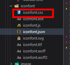
content: "\e85a"; //在引入的iconfont文件夹找到iconfont.css
font-size: 25px;
font-family: "iconfont"; //想要显示icon这个必须加
color:rgb(43, 206, 229) //想要的颜色
}
.el-tree /deep/ .el-tree-node__expand-icon.expanded.el-icon-caret-right:before
{
content: "\e85b";
font-size: 25px;
font-family: "iconfont";
color:rgb(43, 206, 229)
}
.el-tree /deep/ .el-tree-node__expand-icon.expanded
{
-webkit-transform: rotate(0deg);
transform: rotate(0deg);
}
/* 没有子节点 */
.el-tree /deep/.el-tree-node__expand-icon.is-leaf::before
{
font-size: 25px;
content: '\e85d';
font-family: "iconfont";
color:rgb(43, 206, 229)
}
</style>
在css里面content的内容是在引入的iconfont文件夹找到iconfont.css中找到对应的内容,font-family: “iconfont”;一定要写,这样才能出现图标

最后实现效果如图,展开何未展开就会有两种显示效果,且目录下面如果没有子集的话就会显示出文件icon而不是文件夹icon了
