代码大部分来自boxplot()函数的帮助文件,可以通过阅读帮助文件,调整代码中相应参数看下效果,进而可以理解相应的作用,帮助快速掌握barplot()函数的用法。
语法
Usage(来自帮助文件)
barplot(height, ...)

## Default S3 method:
barplot(height, width = 1, space = NULL,
        names.arg = NULL, legend.text = NULL, beside = FALSE,
        horiz = FALSE, density = NULL, angle = 45,
        col = NULL, border = par("fg"),
        main = NULL, sub = NULL, xlab = NULL, ylab = NULL,
        xlim = NULL, ylim = NULL, xpd = TRUE, log = "",
        axes = TRUE, axisnames = TRUE,
        cex.axis = par("cex.axis"), cex.names = par("cex.axis"),
        inside = TRUE, plot = TRUE, axis.lty = 0, offset = 0,
        add = FALSE, ann = !add && par("ann"), args.legend = NULL, ...)

## S3 method for class 'formula'
barplot(formula, data, subset, na.action,
        horiz = FALSE, xlab = NULL, ylab = NULL, ...)
可以从上述barplot()函数的帮助文件中看到,这个函数用法可以分为两类。
箱线图
该实例为heigh是一个矩阵。
rand.data <- replicate(8, rnorm(100, 100, sd =1.5) ) #生成数据 100 X 8
boxplot(rand.data) #绘制箱线图
分类变量的箱线图
data(mtcars)
mtcars$cyl.f <- factor(mtcars$cyl,
                       levels = c(4,6,8),
                       labels = c("4", "6", "8"))# 创建气缸数量的因子
mtcars$am.f <- factor(mtcars$am, levels=c(0,1), labels=c("auto", "standard")) #创建变速箱类型的因子

boxplot(mpg~ am.f * cyl.f,
        data = mtcars,
        varwidth = TRUE,
        col=c("gold", "darkgreen"),
        main ="MPG Distribution by Auto Type",
        xlab="Auto Type",
        ylab="Miles Per Gallon")  #绘制箱线图

> barplot(VADeaths, beside = TRUE,
+         col = c("lightblue", "mistyrose", "lightcyan",
+                 "lavender", "cornsilk"),
+         legend.text = rownames(VADeaths), ylim = c(0, 100))
> title(main = "Death Rates in Virginia", font.main = 4) 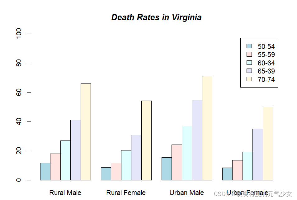
> require(grDevices)
> hh <- t(VADeaths)[, 5:1]
> mybarcol <- "gray20"
> mp <- barplot(hh, beside = TRUE,
+               col = c("lightblue", "mistyrose",
+                       "lightcyan", "lavender"),
+               legend.text = colnames(VADeaths), ylim = c(0,100),
+               main = "Death Rates in Virginia", font.main = 4,
+               sub = "Faked upper 2*sigma error bars", col.sub = mybarcol,
+               cex.names = 1.5)
> VADeaths
      Rural Male Rural Female Urban Male Urban Female
50-54       11.7          8.7       15.4          8.4
55-59       18.1         11.7       24.3         13.6
60-64       26.9         20.3       37.0         19.3
65-69       41.0         30.9       54.6         35.1
70-74       66.0         54.3       71.1         50.0
> segments(mp, hh, mp, hh + 2*sqrt(1000*hh/100), col = mybarcol, lwd = 1.5)
> stopifnot(dim(mp) == dim(hh))  # corresponding matrices
> mtext(side = 1, at = colMeans(mp), line = -2,
+       text = paste("Mean", formatC(colMeans(hh))), col = "red")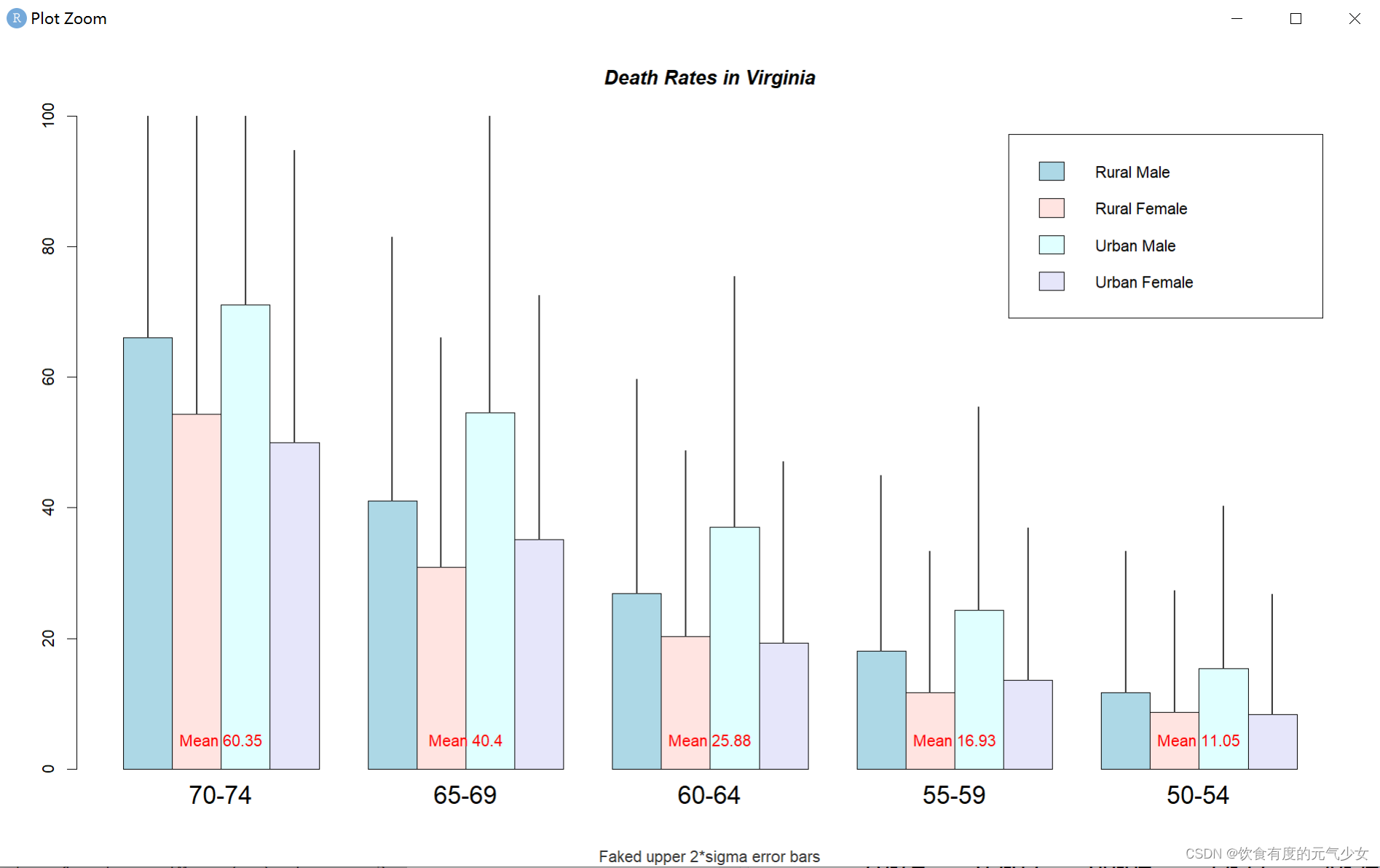
> barplot(VADeaths, angle = 15+10*1:5, density = 20, col = "black",
+         legend.text = rownames(VADeaths))
> title(main = list("Death Rates in Virginia", font = 4))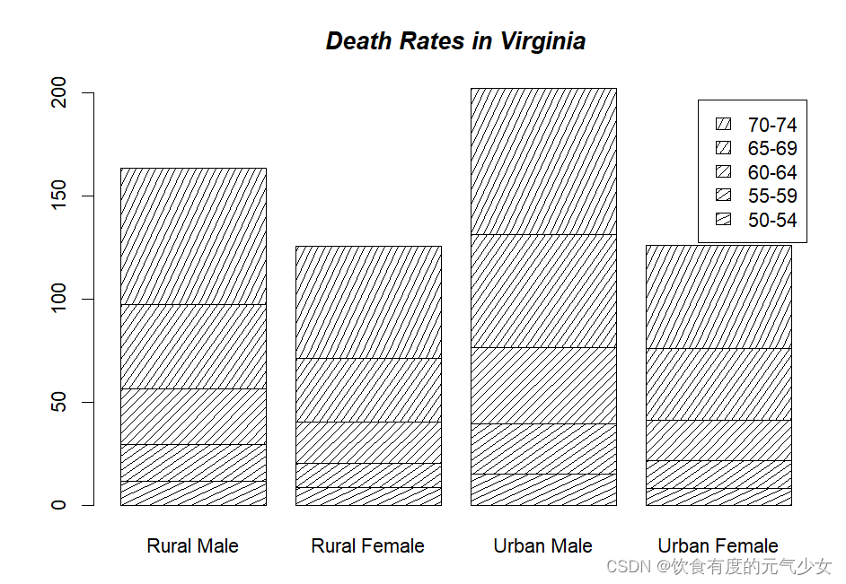
> # Border color
> barplot(VADeaths, border = "dark blue") 
> # Formula method
> barplot(GNP ~ Year, data = longley)
> barplot(cbind(Employed, Unemployed) ~ Year, data = longley) 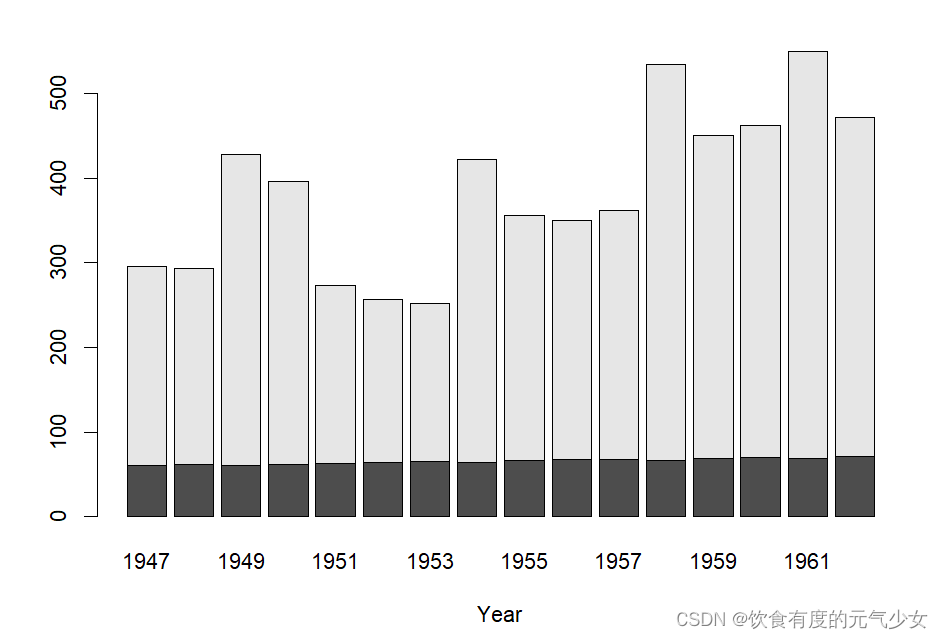
> barplot(Freq ~ Class + Survived, data = d.Titanic,
+         subset = Age == "Adult" & Sex == "Male",
+         main = "barplot(Freq ~ Class + Survived, *)", ylab = "# {passengers}", legend.text = TRUE)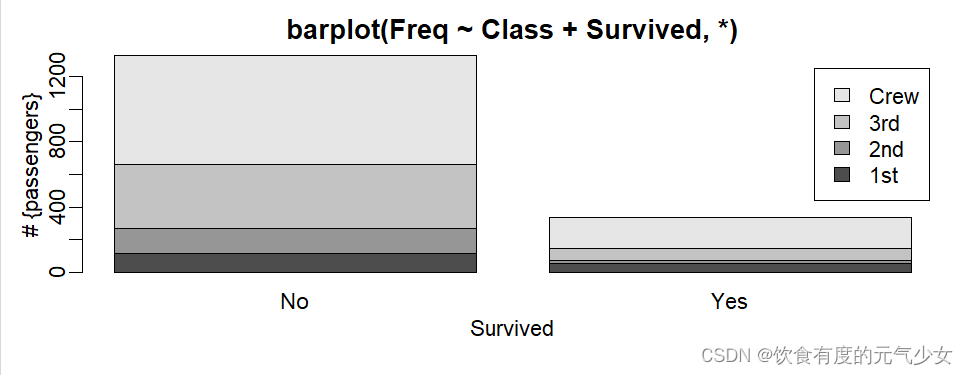
> # Alternatively, a mosaic plot :
> mosaicplot(xt[,,"Male"], main = "mosaicplot(Freq ~ Class + Survived, *)", color=TRUE)
> par(op) 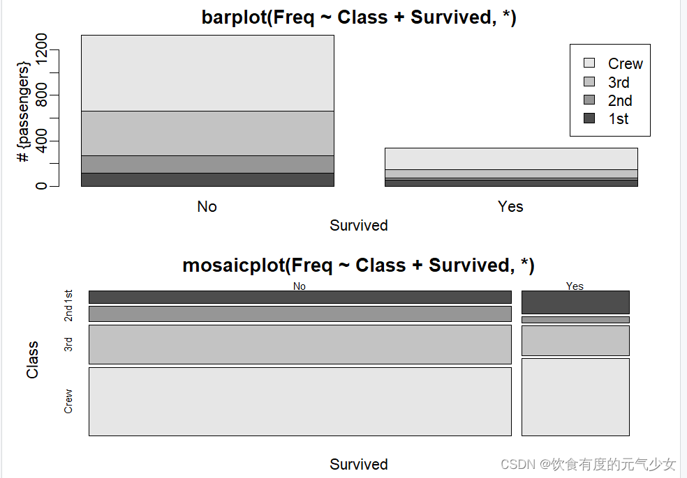
> # Default method
> require(grDevices) # for colours
> tN <- table(Ni <- stats::rpois(100, lambda = 5))
> r <- barplot(tN, col = rainbow(20))
> #- type = "h" plotting *is* 'bar'plot
> lines(r, tN, type = "h", col = "red", lwd = 2)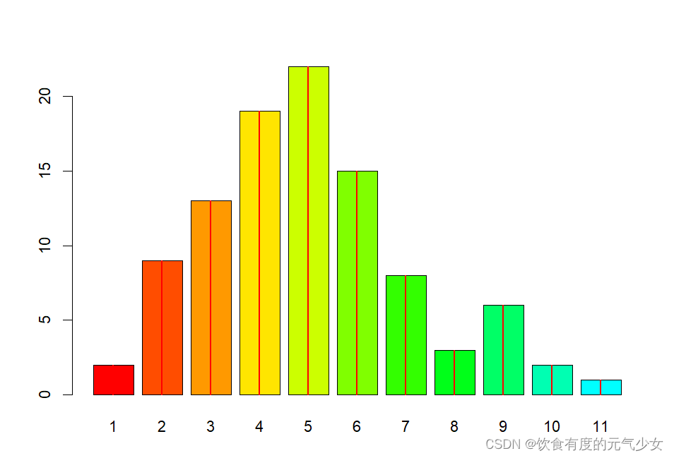
barplot(tN, col = heat.colors(12), log = "y") 
barplot(tN, col = gray.colors(20), log = "xy")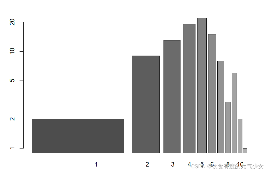
> barplot(height = cbind(x = c(465, 91) / 465 * 100,
+                        y = c(840, 200) / 840 * 100,
+                        z = c(37, 17) / 37 * 100),
+         beside = FALSE,
+         width = c(465, 840, 37),
+         col = c(1, 2),
+         legend.text = c("A", "B"),
+         args.legend = list(x = "topleft"))
> barplot(tN, space = 1.5, axisnames = FALSE,
+ sub = "barplot(..., space= 1.5, axisnames = FALSE)") 
> barplot(VADeaths, plot = FALSE)
[1] 0.7 1.9 3.1 4.3
> barplot(VADeaths, plot = FALSE, beside = TRUE)
     [,1] [,2] [,3] [,4]
[1,]  1.5  7.5 13.5 19.5
[2,]  2.5  8.5 14.5 20.5
[3,]  3.5  9.5 15.5 21.5
[4,]  4.5 10.5 16.5 22.5
[5,]  5.5 11.5 17.5 23.5
mp <- barplot(VADeaths) # default 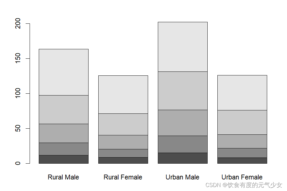
> tot <- colMeans(VADeaths)
> tot
  Rural Male Rural Female   Urban Male Urban Female
       32.74        25.18        40.48        25.28
> text(mp, tot + 3, format(tot), xpd = TRUE, col = "blue") 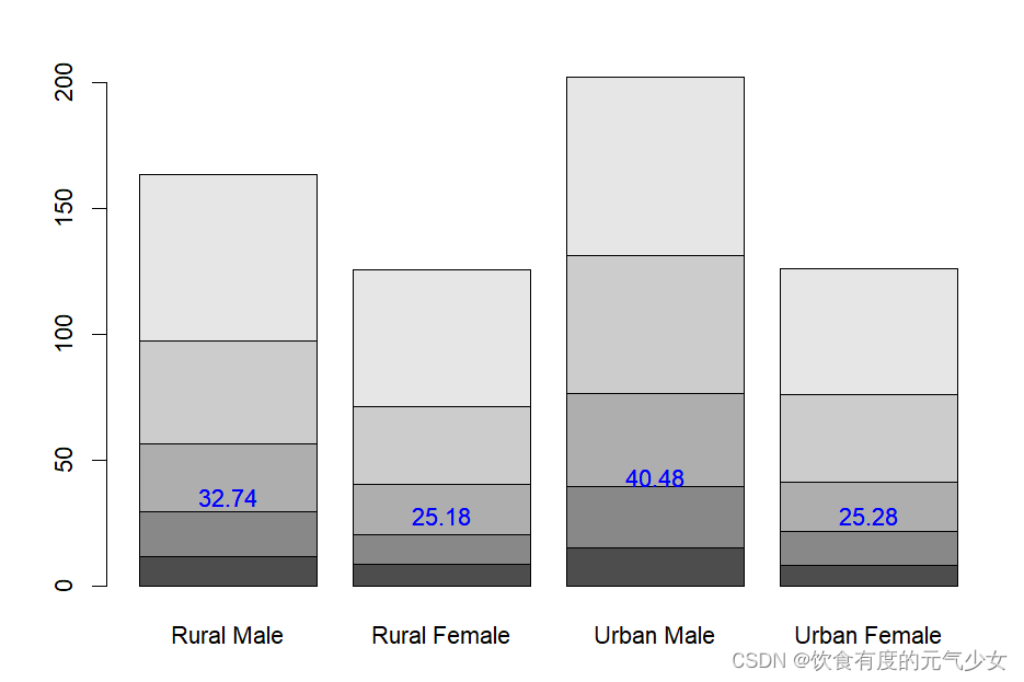
参考:
《R语言实战》(第2版)(2016年5月出版,人民邮电出版社)
帮助文件