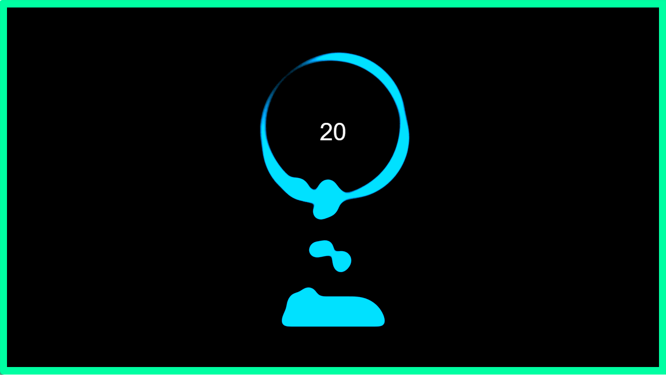
1. 实现效果
2. index.vue 页面
<template>
  <div class="home">
    <div class="body">
      <vab-charge :end-val="endVal" :start-val="startVal" />
    </div>
  </div>
</template>

<script>
  import VabCharge from '@/components/VabCharge'

export default {


  name: 'Demo',
  components: {

       VabCharge },

  data() {


    return {


      startVal: 0,
      endVal: 20,
      timeInterval: null,
    }
  },
  mounted() {


    this.timeInterval = setInterval(() => {


      if (this.endVal < 100) {


        this.startVal = this.endVal
        this.endVal++
      }
    }, 5000)
  },
  beforeDestroy() {


    if (this.clearInterval) {


      clearInterval(this.timeInterval)
    }
  },
  methods: {


  },
}
</script>

<style scoped lang="scss">
.home {


  .body {


    width: 890px;
    height: 500px;
    border: #00ffa2 solid 10px;
    box-sizing: border-box;
    // padding: 20px;
    box-sizing: border-box;
    display: flex;
    justify-content: center;
    align-items: center;
    flex-direction: column;

    .qrcode2 {


    }
  }
}
</style>
3. VabCharge.vue 组件代码
<template>
<div class="content">
<div class="g-container" :style="styleObj">
<div class="g-number">
{
{ endVal }}
</div>
<div class="g-contrast">
<div class="g-circle"></div>
<ul class="g-bubbles">
<li v-for="(item, index) in 15" :key="index"></li>
</ul>
</div>
</div>
</div>
</template>
<script>
export default {
name: 'VabCharge',
props: {
styleObj: {
type: Object,
default: () => {
return {
}
},
},
startVal: {
type: Number,
default: 0,
},
endVal: {
type: Number,
default: 100,
},
},
data() {
return {
decimals: 2,
prefix: '',
suffix: '%',
separator: ',',
duration: 3000,
}
},
created() {
},
mounted() {
},
methods: {
},
}
</script>
<style lang="scss" scoped>
.content {
position: relative;
display: flex;
align-items: center;
justify-content: center;
width: 100%;
height: 100%;
background: #000;
.g-number {
position: absolute;
top: 27%;
z-index: 99;
width: 300px;
font-size: 32px;
color: #fff;
text-align: center;
}
.g-container {
position: relative;
width: 300px;
height: 400px;
margin: auto;
}
.g-contrast {
width: 300px;
height: 400px;
overflow: hidden;
background-color: #000;
filter: contrast(15) hue-rotate(0);
animation: hueRotate 10s infinite linear;
}
.g-circle {
position: relative;
box-sizing: border-box;
width: 300px;
height: 300px;
filter: blur(8px);
&::after {
position: absolute;
top: 40%;
left: 50%;
width: 200px;
height: 200px;
content: '';
background-color: #00ff6f;
border-radius: 42% 38% 62% 49% / 45%;
transform: translate(-50%, -50%) rotate(0);
animation: rotate 10s infinite linear;
}
&::before {
position: absolute;
top: 40%;
left: 50%;
z-index: 99;
width: 176px;
height: 176px;
content: '';
background-color: #000;
border-radius: 50%;
transform: translate(-50%, -50%);
}
}
.g-bubbles {
position: absolute;
bottom: 0;
left: 50%;
width: 100px;
height: 40px;
background-color: #00ff6f;
filter: blur(5px);
border-radius: 100px 100px 0 0;
transform: translate(-50%, 0);
}
li {
position: absolute;
background: #00ff6f;
border-radius: 50%;
}
@for $i from 0 through 15 {
li:nth-child(#{
$i}) {
$width: 15 + random(15) + px;
top: 50%;
left: 15 + random(70) + px;
width: $width;
height: $width;
transform: translate(-50%, -50%);
animation: moveToTop #{
random(6) + 3}s ease-in-out -#{
random(5000) / 1000}s infinite;
}
}
@keyframes rotate {
50% {
border-radius: 45% / 42% 38% 58% 49%;
}
100% {
transform: translate(-50%, -50%) rotate(720deg);
}
}
@keyframes moveToTop {
90% {
opacity: 1;
}
100% {
opacity: 0.1;
transform: translate(-50%, -180px);
}
}
@keyframes hueRotate {
100% {
filter: contrast(15) hue-rotate(360deg);
}
}
}
</style>