源码下载
https://download.csdn.net/download/qq_31939617/10487660 下载

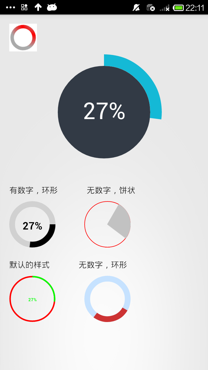
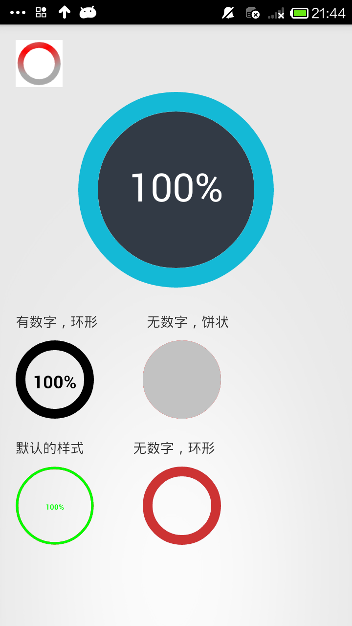
上面三个图分别是 开始时的样子,走进度时候的样子,最后完成的样子
这是我在两个大神的Demo基础上修改后的结果,我们先来看看自定义view是怎么做到的。
1.自己写一个类继承View类,然后处理。
2.在values中建立一个attrs.xml文件来存放自定义view的属性。
3.自定义的view类中的各个属性都从xml文件中获取
4.在布局文件中使用该视图,通过属性值即可设定该视图的样子
我们先在values中建立一个attrs.xml文件,看看我们进度条需要的属性。
max 最大进度
startAngle 进度从圆环的哪个角度开始走
backColor 圆环内部的填充色
roundColor 圆环的颜色
roundProgressColor 圆环进度的颜色
roundWidth 圆环宽度
textColor 中心文字的颜色
textSize 中心文字的大小
textIsDisplayable 中心文字是否显示
style = 0/1 进度的风格,实心或者空心
这里是通过键值对的形式来存放的。键(name):属性名 值(format):属性的类型(限制输入的类型)
<attr name="max" format="integer"></attr>
这个就是表明了,max这个属性,输入的值必须为整形

<?xml version="1.0" encoding="utf-8"?>
<resources>

    <!--
        max                 最大进度
        startAngle             进度从圆环的哪个角度开始走
        backColor             圆环内部的填充色
        roundColor             圆环的颜色
        roundProgressColor  圆环进度的颜色
        roundWidth             圆环宽度
        textColor             中心文字的颜色
        textSize             中心文字的大小
        textIsDisplayable     中心文字是否显示
        style = 0/1          进度的风格,实心或者空心
     -->
    <declare-styleable name="RoundProgressBar">
        <attr name="max" format="integer"></attr>
        <attr name="startAngle" format="integer"></attr>
        <attr name="roundColor" format="color"/>
        <attr name="roundProgressColor" format="color"/>
        <attr name="roundWidth" format="dimension"></attr>
        <attr name="backColor" format="color" />
        <attr name="textColor" format="color" />
        <attr name="textSize" format="dimension" />
        <attr name="textIsDisplayable" format="boolean"></attr>
        <attr name="style">
            <enum name="STROKE" value="0"></enum>
            <enum name="FILL" value="1"></enum>
        </attr>
    </declare-styleable>

</resources>
然后,我们就需要在自定义的view中获得这些属性。将代码和xml文件联系起来
1.定义TypedArray ,2.将变量的值和属性关联
TypedArray mTypedArray = context.obtainStyledAttributes(attrs,R.styleable.RoundProgressBar);
(获取自定义属性和默认值,第一个参数是从用户属性中得到的设置,如果用户没有设置,那么就用默认的属性,即:第二个参数)
int roundColor = mTypedArray.getColor(R.styleable.RoundProgressBar_roundColor, Color.RED); //粉色的是默认的值
这样通过xml文件初始化变量的过程就完成了,下面就是代码的操作了。代码中就是用画笔画圆环和圆形。
package com.kale.progressbar02;

import android.content.Context;
import android.content.res.TypedArray;
import android.graphics.Canvas;
import android.graphics.Color;
import android.graphics.Paint;
import android.graphics.RectF;
import android.graphics.Typeface;
import android.util.AttributeSet;
import android.view.View;

/**
 * 仿iphone带进度的进度条,线程安全的View,可直接在线程中更新进度
 * @author xiaanming
 * http://blog.csdn.net/xiaanming/article/details/10298163
 *
 */
public class RoundProgressBar extends View {
    /**
     * 画笔对象的引用
     */
    private Paint paint;

    /**
     * 圆环的颜色
     */
    private int roundColor;

    /**
     * 圆环进度的颜色
     */
    private int roundProgressColor;

    /**
     * 中间进度百分比的字符串的颜色
     */
    private int textColor;

    /**
     * 中间进度百分比的字符串的字体
     */
    private float textSize;

    /**
     * 圆环的宽度
     */
    private float roundWidth;

    /**
     * 最大进度
     */
    private int max;

    /**
     * 当前进度
     */
    private int progress;
    /**
     * 是否显示中间的进度
     */
    private boolean textIsDisplayable;

    /**
     * 进度的风格,实心或者空心
     */
    private int style;

    /**
     * 进度开始的角度数
     */
    private int startAngle;

    private int backColor;


    public static final int STROKE = 0;
    public static final int FILL = 1;

    public RoundProgressBar(Context context) {
        this(context, null);
    }

    public RoundProgressBar(Context context, AttributeSet attrs) {
        this(context, attrs, 0);
    }

    public RoundProgressBar(Context context, AttributeSet attrs, int defStyle) {
        super(context, attrs, defStyle);

        paint = new Paint();


        TypedArray mTypedArray = context.obtainStyledAttributes(attrs,
                R.styleable.RoundProgressBar);

        //获取自定义属性和默认值,第一个参数是从用户属性中得到的设置,如果用户没有设置,那么就用默认的属性,即:第二个参数
        //圆环的颜色
        roundColor = mTypedArray.getColor(R.styleable.RoundProgressBar_roundColor, Color.RED);
        //圆环进度条的颜色
        roundProgressColor = mTypedArray.getColor(R.styleable.RoundProgressBar_roundProgressColor, Color.GREEN);
        //文字的颜色
        textColor = mTypedArray.getColor(R.styleable.RoundProgressBar_textColor, Color.GREEN);
        //文字的大小
        textSize = mTypedArray.getDimension(R.styleable.RoundProgressBar_textSize, 15);
        //圆环的宽度
        roundWidth = mTypedArray.getDimension(R.styleable.RoundProgressBar_roundWidth, 5);
        //最大进度
        max = mTypedArray.getInteger(R.styleable.RoundProgressBar_max, 100);
        //是否显示中间的进度
        textIsDisplayable = mTypedArray.getBoolean(R.styleable.RoundProgressBar_textIsDisplayable, true);
        //进度的风格,实心或者空心
        style = mTypedArray.getInt(R.styleable.RoundProgressBar_style, 0);
        //进度开始的角度数
        startAngle = mTypedArray.getInt(R.styleable.RoundProgressBar_startAngle, -90);
        // 圆形颜色
        backColor = mTypedArray.getColor(R.styleable.RoundProgressBar_backColor, 0);
        mTypedArray.recycle();
    }


    @Override
    protected void onDraw(Canvas canvas) {
        super.onDraw(canvas);

        /**
         * 画最外层的大圆环
         */
        int centre = getWidth()/2; //获取圆心的x坐标
        int radius = (int) (centre - roundWidth/2); //圆环的半径
        paint.setColor(roundColor); //设置圆环的颜色
        paint.setStyle(Paint.Style.STROKE); //设置空心
        paint.setStrokeWidth(roundWidth); //设置圆环的宽度
        paint.setAntiAlias(true);  //消除锯齿
        canvas.drawCircle(centre, centre, radius, paint); //画出圆环

        //Log.e("log", centre + "");
        if (backColor != 0) {
            paint.setAntiAlias(true);
            paint.setColor(backColor);
            paint.setStyle(Paint.Style.FILL);
            canvas.drawCircle(centre, centre, radius, paint);
        }

        /**
         * 画进度百分比
         */
        paint.setStrokeWidth(0);
        paint.setColor(textColor);
        paint.setTextSize(textSize);
        paint.setTypeface(Typeface.DEFAULT_BOLD); //设置字体
        int percent = (int)(((float)progress / (float)max) * 100);  //中间的进度百分比,先转换成float在进行除法运算,不然都为0
        float textWidth = paint.measureText(percent + "%");   //测量字体宽度,我们需要根据字体的宽度设置在圆环中间

        if(textIsDisplayable && percent != 0 && style == STROKE){
            canvas.drawText(percent + "%", centre - textWidth / 2, centre + textSize/2, paint); //画出进度百分比
        }


        /**
         * 画圆弧 ,画圆环的进度
         */
        //设置进度是实心还是空心
        paint.setStrokeWidth(roundWidth); //设置圆环的宽度
        paint.setColor(roundProgressColor);  //设置进度的颜色
        RectF oval = new RectF(centre - radius, centre - radius, centre
                + radius, centre + radius);  //用于定义的圆弧的形状和大小的界限

        switch (style) {
            case STROKE:{
                paint.setStyle(Paint.Style.STROKE);

                /*第二个参数是进度开始的角度,-90表示从12点方向开始走进度,如果是0表示从三点钟方向走进度,依次类推
                 *public void drawArc(RectF oval, float startAngle, float sweepAngle, boolean useCenter, Paint paint)
                    oval :指定圆弧的外轮廓矩形区域。
                    startAngle: 圆弧起始角度,单位为度。
                    sweepAngle: 圆弧扫过的角度,顺时针方向,单位为度。
                    useCenter: 如果为True时,在绘制圆弧时将圆心包括在内,通常用来绘制扇形。
                    paint: 绘制圆弧的画板属性,如颜色,是否填充等
                 *
                */
                canvas.drawArc(oval, startAngle, 360 * progress / max, false, paint);  //根据进度画圆弧
                break;
            }
            case FILL:{
                paint.setStyle(Paint.Style.FILL_AND_STROKE);
                if(progress !=0)
                    canvas.drawArc(oval, startAngle, 360 * progress / max, true, paint);  //根据进度画圆弧
                break;
            }
        }


    }

    public synchronized int getMax() {
        return max;
    }

    /**
     * 设置进度的最大值
     * @param max
     */
    public synchronized void setMax(int max) {
        if(max < 0){
            throw new IllegalArgumentException("max not less than 0");
        }
        this.max = max;
    }

    /**
     * 获取进度.需要同步
     * @return
     */
    public synchronized int getProgress() {
        return progress;
    }

    /**
     * 设置进度,此为线程安全控件,由于考虑多线的问题,需要同步
     * 刷新界面调用postInvalidate()能在非UI线程刷新
     * @param progress
     */
    public synchronized void setProgress(int progress) {
        if(progress < 0){
            throw new IllegalArgumentException("progress not less than 0");
        }
        if(progress > max){
            progress = max;
        }
        if(progress <= max){
            this.progress = progress;
            postInvalidate();
        }
    }


    public int getCircleColor() {
        return roundColor;
    }

    public void setCircleColor(int CircleColor) {
        this.roundColor = CircleColor;
    }

    public int getCircleProgressColor() {
        return roundProgressColor;
    }

    public void setCircleProgressColor(int CircleProgressColor) {
        this.roundProgressColor = CircleProgressColor;
    }

    public int getTextColor() {
        return textColor;
    }

    public void setTextColor(int textColor) {
        this.textColor = textColor;
    }

    public float getTextSize() {
        return textSize;
    }

    public void setTextSize(float textSize) {
        this.textSize = textSize;
    }

    public float getRoundWidth() {
        return roundWidth;
    }

    public void setRoundWidth(float roundWidth) {
        this.roundWidth = roundWidth;
    }


}
下面我们需要在布局文件中用这个视图,第一步是将命名空间进行注册
xmlns:android_custom=”http://schemas.android.com/apk/res/com.kale.progressbar02” 前缀是一样的,后面是这个项目的包名。之后我们就可以用android_custom这个空间名来使用我们的自定义空间的属性了。
<!-- 设置命名空间 -->
<LinearLayout
    xmlns:android="http://schemas.android.com/apk/res/android"
    xmlns:android_custom="http://schemas.android.com/apk/res/com.kale.progressbar02"
    xmlns:tools="http://schemas.android.com/tools"
    android:layout_width="match_parent"
    android:layout_height="match_parent"
    android:padding="16dp"
    android:orientation="vertical">

     <LinearLayout
         android:layout_width="match_parent"
         android:layout_height="wrap_content"
         android:layout_marginTop="20dp">

         <TextView
             android:layout_width="wrap_content"
             android:layout_height="wrap_content"
             android:text="有数字,环形" />

         <TextView
             android:layout_width="wrap_content"
             android:layout_height="wrap_content"
             android:layout_marginLeft="50dp"
             android:text="无数字,饼状" />

     </LinearLayout>

     <LinearLayout
         android:layout_width="match_parent"
         android:layout_height="wrap_content"
         android:layout_marginTop="10dp">

         <com.kale.progressbar02.RoundProgressBar
             android:id="@+id/roundProgressBar01_id"
             android:layout_width="80dp"
             android:layout_height="80dp"

             android_custom:backColor="#ffffff"
             android_custom:startAngle="0"
             android_custom:roundColor="#D1D1D1"
             android_custom:roundProgressColor="@android:color/black"
             android_custom:roundWidth="10dp"
             android_custom:textColor="#000000"
             android_custom:textSize="18sp" />

         <com.kale.progressbar02.RoundProgressBar
             android:id="@+id/roundProgressBar02_id"
             android:layout_width="80dp"
             android:layout_height="80dp"
             android:layout_marginLeft="50dp"

             android_custom:startAngle="-60"
             android_custom:style="FILL"
             android_custom:roundProgressColor="#C2C2C2"
             android_custom:roundWidth="1dp" />

     </LinearLayout>

     <LinearLayout
         android:layout_width="match_parent"
         android:layout_height="wrap_content"
         android:layout_marginTop="20dp">

         <TextView
             android:layout_width="wrap_content"
             android:layout_height="wrap_content"
             android:text="默认的样式" />

         <TextView
             android:layout_width="wrap_content"
             android:layout_height="wrap_content"
             android:layout_marginLeft="50dp"
             android:text="无数字,环形" />

     </LinearLayout>

     <LinearLayout
         android:layout_width="match_parent"
         android:layout_height="wrap_content"
         android:layout_marginTop="10dp">

         <com.kale.progressbar02.RoundProgressBar
            android:id="@+id/roundProgressBar03_id"
            android:layout_width="80dp"
            android:layout_height="80dp"/>

         <com.kale.progressbar02.RoundProgressBar
            android:id="@+id/roundProgressBar04_id"
            android:layout_width="80dp"
            android:layout_height="80dp"
            android:layout_marginLeft="50dp"

            android_custom:startAngle="30"
            android_custom:roundColor="#C6E2FF"
            android_custom:roundWidth="10dip"
            android_custom:roundProgressColor="#CD3333"
            android_custom:textIsDisplayable="false" />
     </LinearLayout>

</LinearLayout>
右上角的那个进度条是用shape画的,这里贴一下代码。
common_pressbar_bar.xml
<?xml version="1.0" encoding="utf-8"?>
<rotate xmlns:android="http://schemas.android.com/apk/res/android"
    android:fromDegrees="0"
    android:pivotX="50%"
    android:pivotY="50%"
    android:toDegrees="360" >

    <!-- 这里画了一个灰色的环形 -->
    <shape
        android:innerRadiusRatio="3"
        android:shape="ring"
        android:thicknessRatio="8"
        android:useLevel="false" >
        <!-- 径向渐变 -->
        <gradient
            android:centerColor="#FF0000"
            android:centerX="1.0"
            android:centerY="1.0"
            android:endColor="@android:color/darker_gray"
            android:gradientRadius="90"
            android:startColor="@android:color/darker_gray"
            android:type="radial"
            android:useLevel="false" />
    </shape>

</rotate>
对应的布局文件
     <ProgressBar
        android:layout_width="wrap_content"
        android:layout_height="wrap_content"
        android:background="#ffffff"

        android:indeterminate="false"
        android:indeterminateDrawable="@drawable/common_pressbar_bar" />
最后是用简单的代码来看看,进度条的效果。
MainActivity.java
package com.kale.progressbar02;

import android.app.Activity;
import android.os.Bundle;
import android.view.Menu;
import android.view.MenuItem;
import android.view.Window;

public class MainActivity extends Activity {

private TasksCompletedView mTasksView;

    private int mTotalProgress;
    private int mCurrentProgress;
    private RoundProgressBar rpBar01, rpBar02 ,rpBar03, rpBar04;

    @Override
    protected void onCreate(Bundle savedInstanceState) {
        super.onCreate(savedInstanceState);
        requestWindowFeature(Window.FEATURE_NO_TITLE);
        setContentView(R.layout.activity_main);
        initVariable();
        viewInit();

        new Thread(new ProgressRunable()).start();
    }

    private void initVariable() {
        mTotalProgress = 100;
        mCurrentProgress = 0;
    }

    private void viewInit() {
        mTasksView = (TasksCompletedView) findViewById(R.id.tasks_view);

        rpBar01 = (RoundProgressBar) findViewById(R.id.roundProgressBar01_id);
        rpBar02 = (RoundProgressBar) findViewById(R.id.roundProgressBar02_id);
        rpBar03 = (RoundProgressBar) findViewById(R.id.roundProgressBar03_id);
        rpBar04 = (RoundProgressBar) findViewById(R.id.roundProgressBar04_id);
    }

    class ProgressRunable implements Runnable {

        @Override
        public void run() {

            while (mCurrentProgress < mTotalProgress) {
                mCurrentProgress += 1;

                mTasksView.setProgress(mCurrentProgress);

                rpBar01.setProgress(mCurrentProgress);
                rpBar02.setProgress(mCurrentProgress);
                rpBar03.setProgress(mCurrentProgress);
                rpBar04.setProgress(mCurrentProgress);

                try {
                    Thread.sleep(100);
                }
                catch (Exception e) {
                    e.printStackTrace();
                }
            }
        }

    }

}
源码下载
https://download.csdn.net/download/qq_31939617/10487660 下载