来源:https://www.r-graph-gallery.com/130-ring-or-donut-chart/
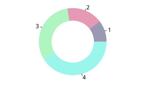
A donut chart is essentially a Pie Chart with an area of the centre cut out.
Pie Charts are sometimes criticised for focusing readers on the proportional areas of the slices to one another and to the chart as a whole. This makes it tricky to see the differences between slices, especially when you try to compare multiple Pie Charts together.
A Donut Chart somewhat remedies this problem by de-emphasizing the use of the area. Instead, readers focus more on reading the length of the arcs, rather than comparing the proportions between slices.
Also, Donut Charts are more space-efficient than Pie Charts because the blank space inside a Donut Chart can be used to display information inside it.
# The doughnut function permits to draw a donut plot
doughnut <-
function (x, labels = names(x), edges = 200, outer.radius = 0.8,
          inner.radius=0.6, clockwise = FALSE,
          init.angle = if (clockwise) 90 else 0, density = NULL,
          angle = 45, col = NULL, border = FALSE, lty = NULL,
          main = NULL, ...)
{
    if (!is.numeric(x) || any(is.na(x) | x < 0))
        stop("'x' values must be positive.")
    if (is.null(labels))
        labels <- as.character(seq_along(x))
    else labels <- as.graphicsAnnot(labels)
    x <- c(0, cumsum(x)/sum(x))
    dx <- diff(x)
    nx <- length(dx)
    plot.new()
    pin <- par("pin")
    xlim <- ylim <- c(-1, 1)
    if (pin[1L] > pin[2L])
        xlim <- (pin[1L]/pin[2L]) * xlim
    else ylim <- (pin[2L]/pin[1L]) * ylim
    plot.window(xlim, ylim, "", asp = 1)
    if (is.null(col))
        col <- if (is.null(density))
          palette()
        else par("fg")
    col <- rep(col, length.out = nx)
    border <- rep(border, length.out = nx)
    lty <- rep(lty, length.out = nx)
    angle <- rep(angle, length.out = nx)
    density <- rep(density, length.out = nx)
    twopi <- if (clockwise)
        -2 * pi
    else 2 * pi
    t2xy <- function(t, radius) {
        t2p <- twopi * t + init.angle * pi/180
        list(x = radius * cos(t2p),
             y = radius * sin(t2p))
    }
    for (i in 1L:nx) {
        n <- max(2, floor(edges * dx[i]))
        P <- t2xy(seq.int(x[i], x[i + 1], length.out = n),
                  outer.radius)
        polygon(c(P$x, 0), c(P$y, 0), density = density[i],
                angle = angle[i], border = border[i],
                col = col[i], lty = lty[i])
        Pout <- t2xy(mean(x[i + 0:1]), outer.radius)
        lab <- as.character(labels[i])
        if (!is.na(lab) && nzchar(lab)) {
            lines(c(1, 1.05) * Pout$x, c(1, 1.05) * Pout$y)
            text(1.1 * Pout$x, 1.1 * Pout$y, labels[i],
                 xpd = TRUE, adj = ifelse(Pout$x < 0, 1, 0),
                 ...)
        }
        ## Add white disc
        Pin <- t2xy(seq.int(0, 1, length.out = n*nx),
                  inner.radius)
        polygon(Pin$x, Pin$y, density = density[i],
                angle = angle[i], border = border[i],
                col = "white", lty = lty[i])
    }

    title(main = main, ...)
    invisible(NULL)
}


# Let's use the function, it works like PiePlot !
# inner.radius controls the width of the ring!
doughnut( c(3,5,9,12) , inner.radius=0.5, col=c(rgb(0.2,0.2,0.4,0.5), rgb(0.8,0.2,0.4,0.5), rgb(0.2,0.9,0.4,0.4) , rgb(0.0,0.9,0.8,0.4)) )